The BRAWL² Tournament Challenge has been announced!
It starts May 12, and ends Oct 17. Let's see what you got!
https://polycount.com/discussion/237047/the-brawl²-tournament
It starts May 12, and ends Oct 17. Let's see what you got!
https://polycount.com/discussion/237047/the-brawl²-tournament
Legend of Zelda - Disting's Take
I'm re-writing this post to show what I've got so far.
My goal with this project is to re-create as much as possible from the Zelda universe.
This is how Link looks so far:

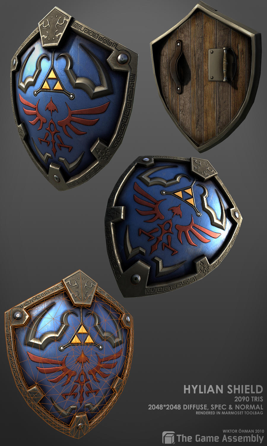
This is the Hylian Shield:

I'm also working on the Master Sword, but I'm nowhere near final on that yet, so I won't post it in this post yet.
Hope you like what I have so far!
My goal with this project is to re-create as much as possible from the Zelda universe.
This is how Link looks so far:

This is the Hylian Shield:

I'm also working on the Master Sword, but I'm nowhere near final on that yet, so I won't post it in this post yet.
Hope you like what I have so far!

Replies
I agree with others and should add that your color balance is looking a bit strange- orange, purple, red and metal. Try to play wit colors
I'll see if I can correct the things you said when I get back to it tomorrow.
Meanwhile, here's a small update on it:
Thanks!
Something on par with this....
http://www.zbrushcentral.com/showthread.php?p=746731
Looks great
hes both.
Would make sense, seeing as link means left in german, but I guess you knew that. :P
Thanks!
I'll start fixing up the shield today. Thanks for all your feedback!
Hope you like it!
Please let me know what you think.
I'm a little iffy on the specular color of the blue, it's a tad too cyan for my tastes, maybe drop some of the saturation on that. Also, the rivets holding the arm strap need some color to them instead of them being the same brown as the strap.
Keep it up, it's looking wicked.
can see in some of these- with yours i think you could do some masking of the areas back, or fade it out a little smoother, and maybe lighten the diffuse slightly to punch it a little more.
I absolutely agree! Making the scratches more natural was actually next on my agenda.
Thanks for the crits!
I'm not completely sure what you mean I'm afraid. Do you want me to lighten the border of the blue up a bit?
i posted that other image for reference, look at the innter parts of the buttons where the holes are, the dirt in those cracks vary in width and most of them the dirt is not even all the way around. They noise of the dirt in those cracks also mirrors the metal texture, cracks, dents, and is somethin to think about that could be cool to include in your texture.
That's a good point.
Thanks for clearing that up!
Been experimenting with nDo, and I absolutely love it! Nifty little gadget!
I'm getting pretty happy with everything except the main, blue area. I can't seem to figure out how to make it look like painted metal. Any help is appreciated!
As for painted metal, try doing some color scrapeoffs here and there and experiment with the specular map to really bring out the material
I've blurred out the occlusion around the border and made it a bit more vague. It looks a lot better now!
Cheers!
Got another Zelda prop I want to start working on.
Thanks for all your help!
Here's the final render:
Hoping to one day have modelled all of Link's accessories. I probably won't, but it's a fun thought.
I was inspired by the Comicon Old Link when I modeled this, but I still wanted to make it personal to me.
Please let me know what you think before I start baking!
http://www.apyrodesign.com/joomla/images/Master%20sword%20original.jpg
The crossguard looks like two wings and doesn't have those emblems/decorations on them. Might need a little redesign if you want to be accurate. If making something new was your objective, then by all means, keep it up! Great texturing work!
I was trying to make a sword that looks like it fits into the Zelda Universe, and make it look special enough to be the Master Sword.
I hope that made sense. x)
Edit: Realized that I didn´t specify what I though should be changed about them. I think it would look better if it was a bit dragged out so the angle wouldn´t be as sharp.
I do agree with you about the pointy things, but I decided to keep them the way they are because they were an element from (most of) the original design(s) that I wanted to keep to keep the resemblance as good as possible.
Thanks for the input though!
My only crit is that the small details on the hilt are kinda getting lost towards the ends of the protrusions. Maybe if they stayed as thick and large as they start out in the center it would read better
That's a good point. Thanks for letting me know!
Cheers.
Honest to gosh, I think the original Master Sword looks like crap! Looks like a freakin' toy sword you can find in a toy store.
I think I have to remake it a bit.
Anything you think I should change?
I always thought the Master Sword's design from ALttP looked very industrial, and not at all like a toy:
http://www.zeldainformer.com/Images/articles/mc_logo_old.jpg
http://bestgamewallpapers.com/files/zelda-link-to-the-past/master-sword.jpg
Twilight Princess' design looks fairly believable to me as well:
http://img412.imageshack.us/img412/2846/collectionpx8.png
Also, just wanted to point out that your first version looks a lot like the Picori Blade aka the Four Sword:
http://www.rankopedia.com/CandidatePix/43382.gif
I was actually looking at the sword from The Minish Cap, and I still think I will change mainly the crossguard to look more like that one.
Will probably be a kitbash from all different zelda games in the end. :P
Cheers!
I'm just making a few different ones to see what I like the most.
I will probably make another Hylian Shield as well.