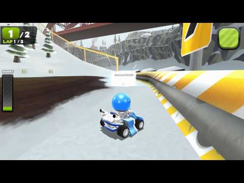
Zero Gear is physically-fueled, online multiplayer kart combat PC madness that me and 2 other guys have been developing for the past 2 years and change.
we have been keeping a development blog for almost the entire time that has a lot of the details behind the project. You can check it out here: http://nimblebit.com
Zero Gear is available for pre-order! Players who pre-order will get 25% off the price of the game, as well as immediate access to the beta version! Visit the Zero Gear product page for pricing information. Zero Gear is slated for release on January 12th, 2010. Stay tuned for more release information in the weeks ahead, including a 4 package deal!
I have already experimented with a rim lighting shader in our engine, I knew that I wanted that kind of look the moment I saw the mario galaxy and TF2 screenshots. I am not a large fan of the traditional "cartoon" shading with a big black outline.
the roads could spare some extra polygons if they're available - the only thing that detracted from the sleek smooth visual was the lines on the road tessellating in the hard turns.
I agree, I hope to be able to add more tessellation on the road sections, for collision purposes as well as visually.
One area in particular I feel is my weakest point in the character faces, I have no background in characters, and I'm not happy yet with the direction as a whole of the mouth/eye textures. I want it to be unique and simple but not cliche anime or too simple and look like a lego character. The plan is to have a bunch of different options to swap between but they all need to share a certain style of course. If anyone can point to any other references for Ideas and stuff it would be appreciated.
Yeah, you could probably work on the eyes a bit, they seem a little long and close together. They're pretty "cute" but i think could have a little love spent there to make them a bit more round ish. You could still change their race up by altering the eyelid, but they feel very oval.
I love the mouth expressions, but they eyes could use a little work.
Best reference i could suggest would be South Park, but anything from Disney/Pixar may work :P
I wanted to keep the rendering in the game as inexpensive as possible to make the game lightweight and playable on very low-spec machines. (I never mentioned it but the target platform is PC/Mac) So at least for now, the environments are vertex lit without any shaders, for the fastest drawing speed possible. Performance permitting, it would not be much trouble to add some simple effects like specularity on some surfaces that really scream for it. For now I am going to focus on effects like shaders on things like the karts that people are going to pay the most attention to.
There are many parts like the ice and the metal pipes and bridge that I will probably experiment with adding some effects on to gauge the expense. I would like to serve the lowest common denominator as much as possible, especially in regards to making people choose different gfx settings and such.
check out Kid Robot for some awesome kinda-cutesy/kinda-not characters-- right now your characters remind me of Duplo toys, but wit the right textures they could easily resemble cool big kid figures!
I love the style of the karts - excellent work. How many polygons are you working with on those? I agree that the characters are the weak point, especially compared to the karts themselves. I'll second the South Park suggestion, but moreso the style of the celebrity characters, which are more detailed than the main cast.
A couple more small suggestions:
- Make the hands chunkier. I think bigger hands would balance out their oversized heads and make them more visually appealing.
- Compared to the karts, the colors of the character's faces and accessories are a bit washed out. I think some more color would help keep them eye catching. For the same reasons, it might be better to avoid using the same color for the racer's jumpsuit and the car itself.
- Have you considered kart decals at all?
I think I'm just gonna re-do the base character model, I agree for sure about the bigger hands, they will look much bigger than the little nub hands on there now and then they could also sport some kick-ass driving gloves. I like the kid robot style hands. I have considered decals yea, kind of like how mario kart DS has a poly somewhere on every kart where they can display a custom logo or such. Customization is main goal for sure, the plan is to hook up a shader on the kart and character textures so that you can use a slider to change the hue of your kart/character.
I don't know the poly counts of the karts offhand, but they are conservative compared to next-gen standards. I can make some wire shots later if anyone is interested.
Oh, and I got to play super mario galaxy last night . . . . gave me a lot of inspiration for sure! I'm going to see how a rim lighting shader looks on the entire environment as well as the karts and characters. It gives the entire scene a nice consistent glowy/dusty style in galaxy.
so after playing super mario galaxy I wanted to try adding rim lighting to an entire environment and see how it looks. This was probably the wrong level to try it on since it's already so bright, but here it is anyway. I'm trying this vimeo site to host videos, not too sure about the quality:
I can think of a pretty big competitor on that platform
I never could really get into the wiimote as a racing wheel to be honest. I hope mario kart for the wii has the option to steer with the joystick / dpad. The lack of resistance of holding a steering wheel floating in midair is disconcerting to me.
About the eyes : try a really small pupil/iris rather than a great big one. Showing a lot of white in the eyes of toony characters generally looks better than a slightly creepy giant iris
[ QUOTE ]
About the eyes : try a really small pupil/iris rather than a great big one. Showing a lot of white in the eyes of toony characters generally looks better than a slightly creepy giant iris
I'd suggest putting a few edge highlights in the texture mapping, but not with the scene lights over every object. The gif example just washes out most of the detail in the scene. It's also making things appear flat (like the water tower and cacti). It's also strange because the light source isn't really indicated anywhere in the scene and there's an absense of shadows. You'd need the sun setting directly behind the mountains to explain the edge highlights. The style of your racers look like everything should be more 3d in their world than flat to me. Try using more saturated color on highlights for objects rather than white and see what you think.
I have heard the same opinion from other 3d artists too. The way I was hoping to use the highlights is not as an accurate effect of the lighting in the scene, but as an over all stylistic effect, similar to the black outlines of a cel shaded game, etc. I actually really like the way it's working on the objects like the cactuses, it almost looks like a white outline and it gives things a really different look. I'm hoping to figure out something which gives the entire scene and the characters a stylized look that gives it a unique personality. The parts where I don't really like the way it's working right now are on the large flat surfaces, where I agree that it just washes out the entire polygon. Perhaps there is a way to weight it so it stays mostly as an outline effect like on the cactuses.
as a reference, since this game was what got me curious about it initially:
the way mario galaxy implemented it is not accurate, the shading is based on the camera angle and not the actual light positions in the scene. You can see in these scenes that the light sources are pretty much opposite what would give off that rim lighting realistically. I think it lends the whole game a kind of shimmery, different and neat style though.
I will continue to play with the falloff amount of the rimlighting too, since that can have a dramatic effect on the thickness and amount of highlighting. What I have in the scene is probably a larger gradient than mario galaxy used.
everyone is telling me that the rim lighting is too strong so I will probably tone it down in the future It's so hard to restrain yourself when you start playing with a new effect! (see: bloom, bumpmapping)
if you could have the rim lighting be more adative, or still show texture detail i think it may tone it down enough to keep a similar look to what you're looking at currently, and what may feel more polished. Addative may not be the proper word or idea, but having some sort of rim mask for the effect may go a long way.
using the rocks in the background as an example, where it gets darker the rim could be shorter/less aparent. You can see the effects of the mask on Bowser's arms and legs - he has a rim shader on him, but the scales are masked out, and its more addative to brighten the edges as opposed to purely whitening them out.
Agreed with Moose on intensity varieties on certain pieces that look especially washed out.
If you were to have rim lighting, I'd imagine it'd be best to have it based on distance from the camera/player anywho, as it'd most definitely help with performance and prevent those distant objects from looking so washed out. Since it's a real time shader anyways, a gradual progression of generating objects coming closer would help a lot to fight that wash out.
In addition, I didn't see what engine you were using but flagging specific meshes/textures with having rim lighting would help sort out things like the houses and giant rocks as they probably wouldn't work well with it either way.
Very neat little guys so far, and the western env looks very cool! The cacti in the background look awesome with the rim lighting applied.
thanks kovac, I hadn't even considered using distance as a factor. We are using ogre, which has a far from idea shader system, the most control I would have at the moment is altering the intensity and falloff amount per scene material. For instance in that movie, the intensity if far greater on the cactus than on the ground material. I think I could get it satisfactory if I spent a decent amount of time adjusting everything, my programmer and I will sort out how to handle it eventually. Right now we are in more of a pre-production mode trying to figure what we need to achieve the look and feel we want.
By the way, I thank everybody for their feedback, I have gotten the most constructive crits from here on polycount.
Customization is very near and dear to both Brian and my own heart, so it's no surprise that a high level of customization is a big goal of ours in ZeroGear. While Brian has been working on our physics and camera system, I had some time to play with Ogre's material system. After a little bit of poking around I developed a system to let us have user-customizable color on most anything we wish. After implementing it on most of our existing assets I spent a while time trying out different color combinations. Here are a compilation of some straight out of the Ogre model viewer.
I start out by making sure that all the areas that are going to be re-colored in the material system are desaturated. Things that are not going to change color (such as the tail lights or mud splatters in this example) remain full color.
Then I make a solid white color mask of the parts of the texture I am going to be filling with an RGB value. Then in the material file I tell the engine to fill the mask color with the desired color and then combine it with the black and white base texture.
We will hook up a color picker widget in the game gui to supply the material with whatever color the user wishes to use for his kart or character or other accessories.
the only kind of flaw I can see is that your drivers have no tactical variations. In mariokart and other good racers, the drivers have different skillsets that make them appealing to drive. Like big and heavy but high top speed & small and light with fast acceleration.
Hey Marshmonkey, did you teach at the Guildhall in Dallas, TX? Just was wondering if it was the same David Marsh that I had met before. Great stuff nonetheless and looking forward to seeing more.
Kart statistics are a big part of the strategy of any racing game. We aren't to the stage of implementing any specific system yet but we have a few ideas of how we would like to handle everyone tuning their stats to their individual driving strategy.
Replies
that would look awesome with tf2 specs and engine.
[/ QUOTE ]
Yeah definitly needs a nice rimlight shader in game (pretty much like you rendered the models).
Nice work!
the roads could spare some extra polygons if they're available - the only thing that detracted from the sleek smooth visual was the lines on the road tessellating in the hard turns.
the western themed track is rad!
cool look to it though
One area in particular I feel is my weakest point in the character faces, I have no background in characters, and I'm not happy yet with the direction as a whole of the mouth/eye textures. I want it to be unique and simple but not cliche anime or too simple and look like a lego character. The plan is to have a bunch of different options to swap between but they all need to share a certain style of course. If anyone can point to any other references for Ideas and stuff it would be appreciated.
I love the mouth expressions, but they eyes could use a little work.
Best reference i could suggest would be South Park, but anything from Disney/Pixar may work :P
There are many parts like the ice and the metal pipes and bridge that I will probably experiment with adding some effects on to gauge the expense. I would like to serve the lowest common denominator as much as possible, especially in regards to making people choose different gfx settings and such.
A couple more small suggestions:
- Make the hands chunkier. I think bigger hands would balance out their oversized heads and make them more visually appealing.
- Compared to the karts, the colors of the character's faces and accessories are a bit washed out. I think some more color would help keep them eye catching. For the same reasons, it might be better to avoid using the same color for the racer's jumpsuit and the car itself.
- Have you considered kart decals at all?
Nice touch with the music
I've not got much to say, only that I think it's a winner project and I'm jealous because it appears to be a lot of fun to make!!
The characters are too static, and bare in mind you mostly be looking at them from behind so thats where to focus the detail / identifying marks
I don't know the poly counts of the karts offhand, but they are conservative compared to next-gen standards. I can make some wire shots later if anyone is interested.
Oh, and I got to play super mario galaxy last night . . . . gave me a lot of inspiration for sure! I'm going to see how a rim lighting shader looks on the entire environment as well as the karts and characters. It gives the entire scene a nice consistent glowy/dusty style in galaxy.
Any chance we can get a wallpaper size screenshot of all the drivers/cars??
But it seems to me that you have inversed the direction of tires grooves? (I think that's the word )
example
http://www.vimeo.com/387045
so far my impression is that the rim lighting works especially well in super mario becuase of how rounded all the environment elements are.
I never could really get into the wiimote as a racing wheel to be honest. I hope mario kart for the wii has the option to steer with the joystick / dpad. The lack of resistance of holding a steering wheel floating in midair is disconcerting to me.
About the eyes : try a really small pupil/iris rather than a great big one. Showing a lot of white in the eyes of toony characters generally looks better than a slightly creepy giant iris
[/ QUOTE ]
ahhhh! thanks! Thats an awesome crit.
http://nimblebit.blogspot.com/2007/11/rimlighting-test-2.html
and a little gif showing the difference
as a reference, since this game was what got me curious about it initially:
the way mario galaxy implemented it is not accurate, the shading is based on the camera angle and not the actual light positions in the scene. You can see in these scenes that the light sources are pretty much opposite what would give off that rim lighting realistically. I think it lends the whole game a kind of shimmery, different and neat style though.
I will continue to play with the falloff amount of the rimlighting too, since that can have a dramatic effect on the thickness and amount of highlighting. What I have in the scene is probably a larger gradient than mario galaxy used.
Man keep it up.
You could limit the rimlight to normals which are pointing upward, within a tolerance. That's the way it is in TF2 anyway.
[/ QUOTE ] Ah, yea? Thats a good little tidbit to know. Was that in the paper they released a while back?
This presentation from ATI contains some HLSL shader code for rim lights (I think... still new to that shader stuff).
using the rocks in the background as an example, where it gets darker the rim could be shorter/less aparent. You can see the effects of the mask on Bowser's arms and legs - he has a rim shader on him, but the scales are masked out, and its more addative to brighten the edges as opposed to purely whitening them out.
If you were to have rim lighting, I'd imagine it'd be best to have it based on distance from the camera/player anywho, as it'd most definitely help with performance and prevent those distant objects from looking so washed out. Since it's a real time shader anyways, a gradual progression of generating objects coming closer would help a lot to fight that wash out.
In addition, I didn't see what engine you were using but flagging specific meshes/textures with having rim lighting would help sort out things like the houses and giant rocks as they probably wouldn't work well with it either way.
Very neat little guys so far, and the western env looks very cool! The cacti in the background look awesome with the rim lighting applied.
By the way, I thank everybody for their feedback, I have gotten the most constructive crits from here on polycount.
Customization is very near and dear to both Brian and my own heart, so it's no surprise that a high level of customization is a big goal of ours in ZeroGear. While Brian has been working on our physics and camera system, I had some time to play with Ogre's material system. After a little bit of poking around I developed a system to let us have user-customizable color on most anything we wish. After implementing it on most of our existing assets I spent a while time trying out different color combinations. Here are a compilation of some straight out of the Ogre model viewer.
I start out by making sure that all the areas that are going to be re-colored in the material system are desaturated. Things that are not going to change color (such as the tail lights or mud splatters in this example) remain full color.
Then I make a solid white color mask of the parts of the texture I am going to be filling with an RGB value. Then in the material file I tell the engine to fill the mask color with the desired color and then combine it with the black and white base texture.
We will hook up a color picker widget in the game gui to supply the material with whatever color the user wishes to use for his kart or character or other accessories.
unwrapping next
you might want to keep this in mind
Spark
Kart statistics are a big part of the strategy of any racing game. We aren't to the stage of implementing any specific system yet but we have a few ideas of how we would like to handle everyone tuning their stats to their individual driving strategy.
oh man. this is awesome! pretty sweet dude!
keep it up!
I added another color mask for the flames, and kept playing with different colors, gotta start doing some more real work now!
finished modeling a buggy type kart, unwrapping and texture next . . .