115 Madison Avenue in the Style of "The Division"
Final scene update:
Hi everyone, it's time to call this project done.
It's been a tremendous learning experience and a lot of fun.
I am quite happy with how it turned out.
There is a lot of things I would have done differently where I to start over but one must stop at some point.
Thank you all for your amazing and encouraging feedback
Edit 2016: Updated the video links
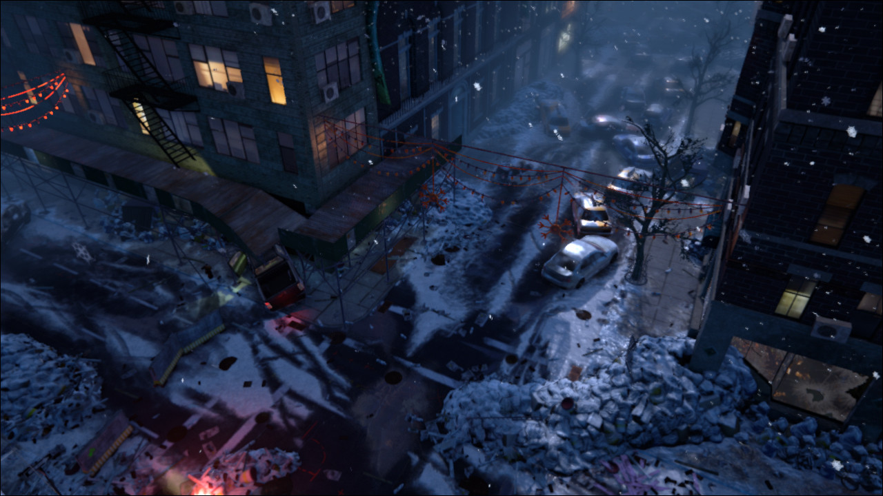
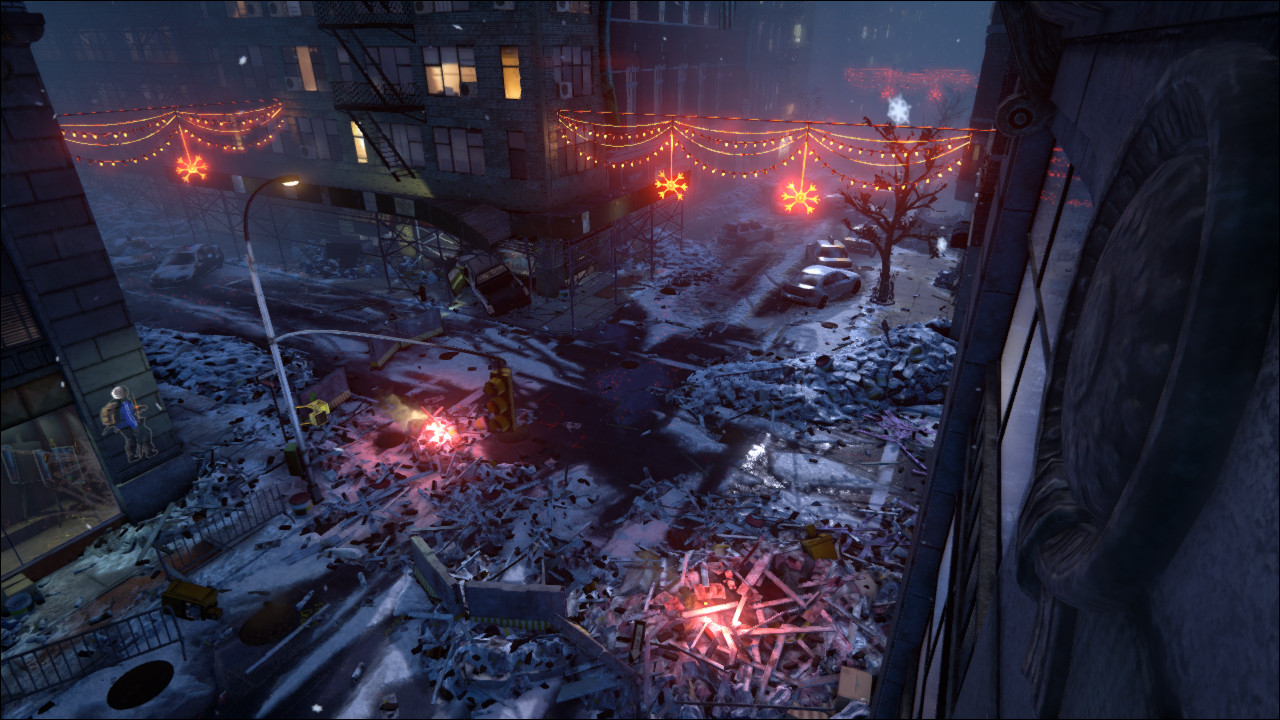
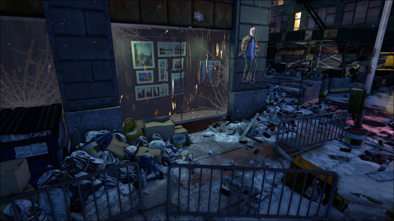
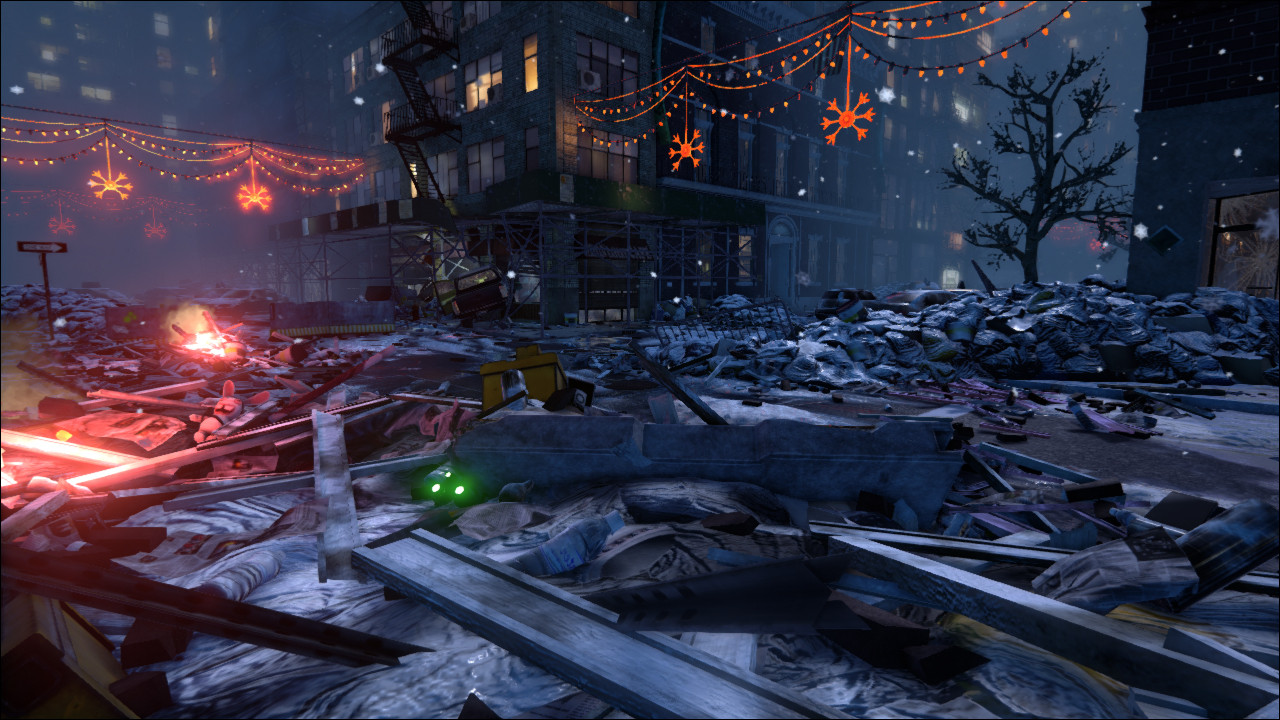
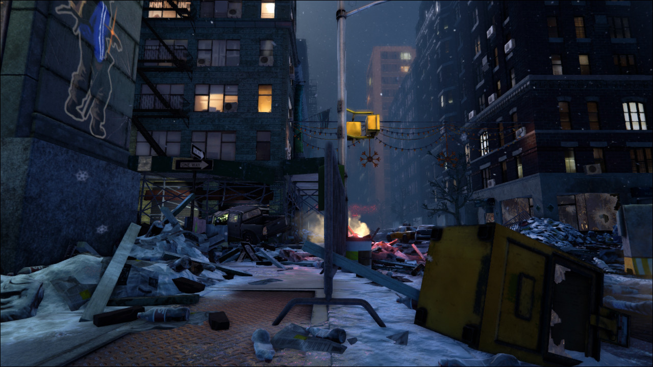
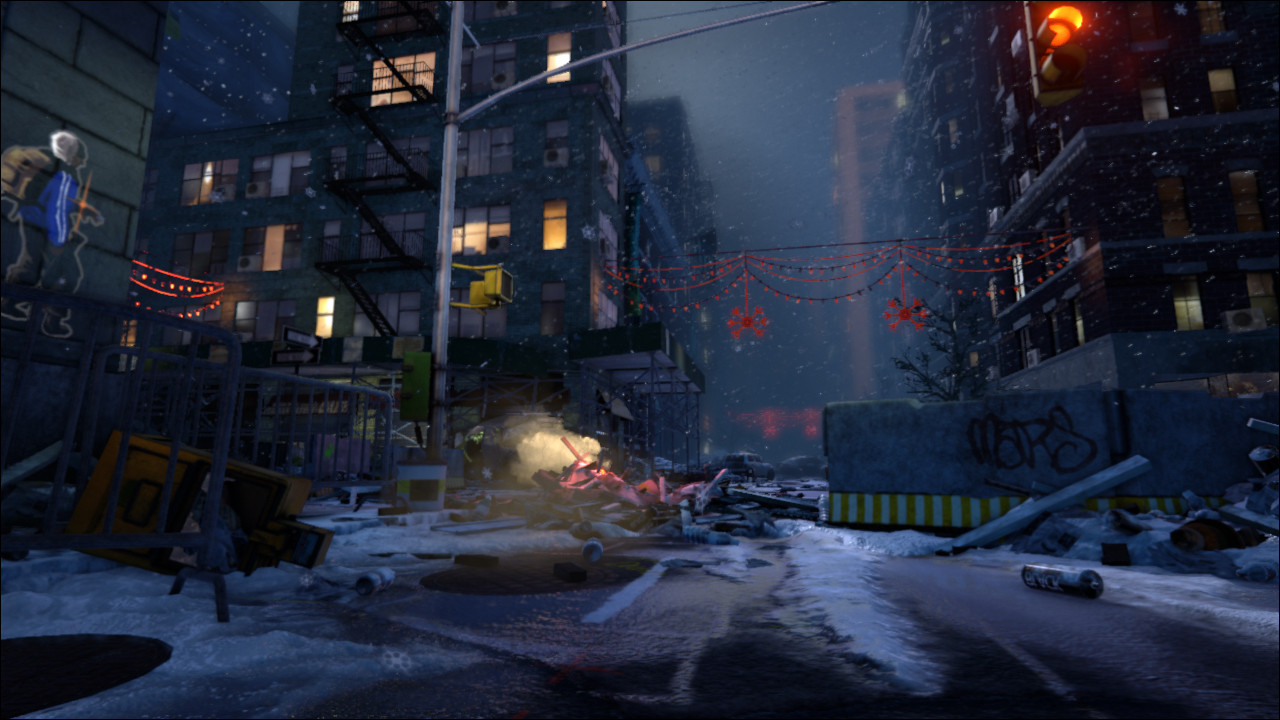
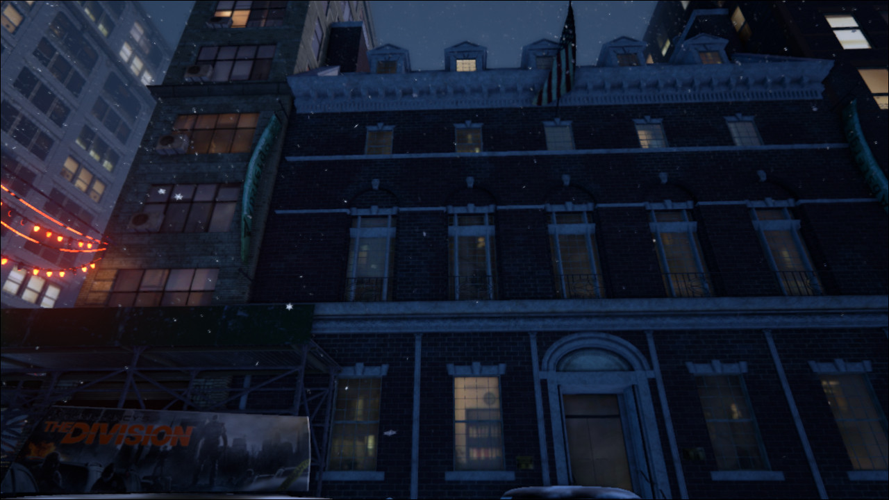
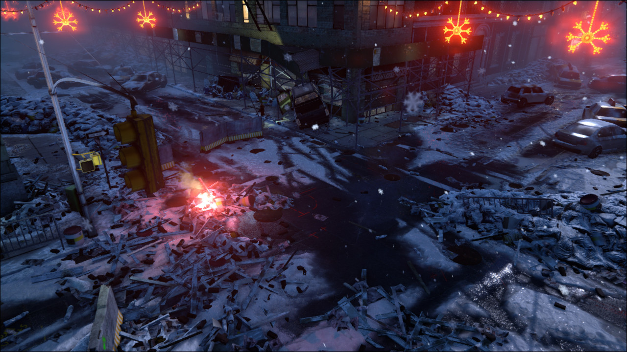
I am looking into packaging everything up and offering it for download but I don't know what I'd have to upload for a UE4 version. As soon as I figure it out I'll post it.
Thank you all and see you next project
Original Post:
Hi everyone, happy 4th of July
Last E3 was full of surprises, one of them was Ubisoft's new game 'The Division'. I love the art style and want to try and create a scene that evokes a similar mood.
I chose a real life setting as my jumping off point and will then make it match the setting of the game.
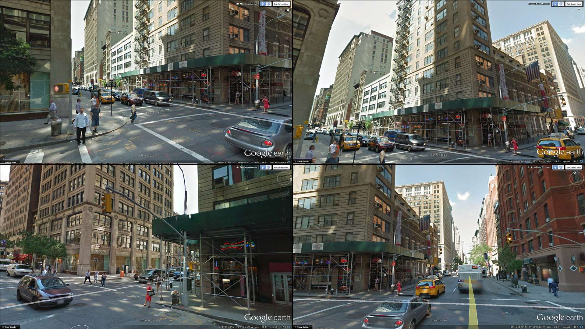
I was thinking of going for a snowy night setting.
From what we have seen so far, I believe the game is set in winter after christmas (the lights are still up).
I want to recreate the corner facing the convenience store.
There are still many questions that need answering and I'm far from finalizing the asset list.
Below, you can see a rough blockout with some notes:
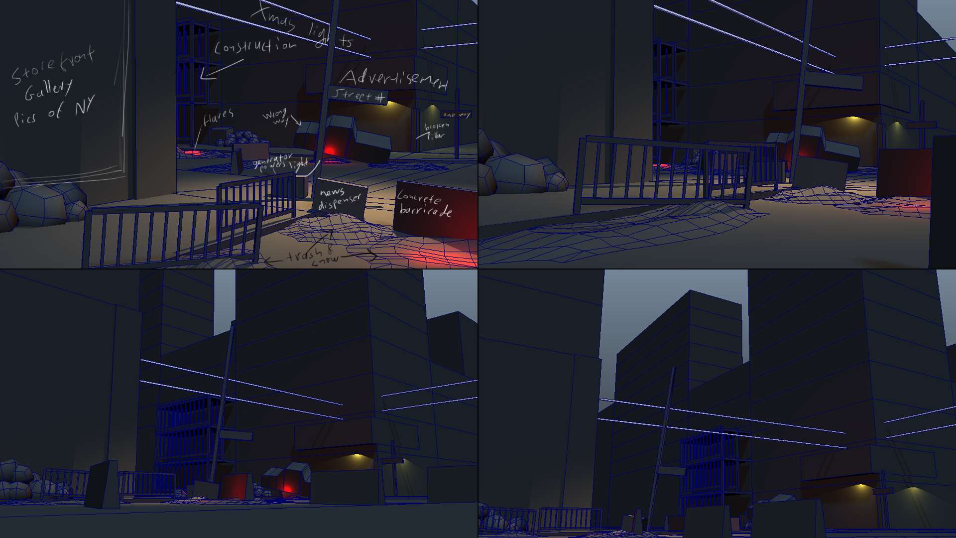
Some ideas I'm still toying around with are:
> Should there be a damaged EMT tent, that the truck crashed into?
> Should the intersection be one of those cobbled raised intersections?
It's not there in real life but it would make for a more interesting pattern on the snow.
>Should I add a withered tree anywhere in there?
Anything goes and I would appreciate any feedback.
Cheers,
Hi everyone, it's time to call this project done.
It's been a tremendous learning experience and a lot of fun.
I am quite happy with how it turned out.
There is a lot of things I would have done differently where I to start over but one must stop at some point.
Thank you all for your amazing and encouraging feedback
Edit 2016: Updated the video links


I am looking into packaging everything up and offering it for download but I don't know what I'd have to upload for a UE4 version. As soon as I figure it out I'll post it.
Thank you all and see you next project
Original Post:
Hi everyone, happy 4th of July
Last E3 was full of surprises, one of them was Ubisoft's new game 'The Division'. I love the art style and want to try and create a scene that evokes a similar mood.
I chose a real life setting as my jumping off point and will then make it match the setting of the game.

I was thinking of going for a snowy night setting.
From what we have seen so far, I believe the game is set in winter after christmas (the lights are still up).
I want to recreate the corner facing the convenience store.
There are still many questions that need answering and I'm far from finalizing the asset list.
Below, you can see a rough blockout with some notes:

Some ideas I'm still toying around with are:
> Should there be a damaged EMT tent, that the truck crashed into?
> Should the intersection be one of those cobbled raised intersections?
It's not there in real life but it would make for a more interesting pattern on the snow.
>Should I add a withered tree anywhere in there?
Anything goes and I would appreciate any feedback.
Cheers,
Replies
I think I can call this done soon.
There are four different manhole covers.
Of course in the game they are just simple geometry but I created High res versions of all of them and used them to create my maps.
There is very little photosourcing going on in the scene in most textures.
If any it'll be a 10-20% overlay to add some definition.
btw whats your name? can i add u somewhere more "social" if u dont mind?
Another quick update.
As promised here's a video preview.
I started work on the particle systems.
Please let me know what you think.
[vv]87350888[/vv]
https://vimeo.com/87350888
I decided to revisit tessellation and added some displacement to the snow. I'm very happy with how it turned out
The problem now is how to get it to tessellate smoothly across geometry seams.
The UVs are lined up and the textures all line up as well but still there's seams.
Does anyone know of any workarounds to address that?
Please drop a comment and let me know if you can think of a way to fix that.
If you haven't yet, check out the preview fly through with some particle systems added.
Cheers
Time for another update.
As requested, there are now abandoned cars littering the roads
Also, I followed Progg's amazing thread on how to do a tangent to world fall of material and the solution suggested by polycounter Vailias (http://www.polycount.com/forum/showthread.php?t=87452) and now there is snow on the trashpiles, debris and cars.
Here's another shot of the cars. They are very low res but the camera will never get that close.
For reference on where the cameras will be in the final fly-through check out the video preview, two posts above.
Cheers
Looking nice overall though
Urgaffel:
I dropped the DOF from a kernel size of 4 down to a 2 and set it back another 800 units. You're right, some destruction on some of the buildings would look nice.
The concept had some areas that suggested rebar so that would mean that severe property damage must have occurred somewhere. I'll knock the buildings around a bit and see what falls off
Wirrexx:
I adjusted the heightfog intensity up and the color shifted to a 'colder' blue.
Desktoppirate:
One of the reasons for the concept was the flares and how the smoke billowed off to one side. But you are right, the snow doesn't match. I adjusted the snow to have a blizzard like quality and pulling strongly to one side. I looks a lot better now
[vv]88351764[/vv]
You can find a more detailed breakdown on my blog, including settings for the cloth.
http://www.g-cg.com/blog/
There's still work being done to everything.
Trying to dirty and beat up the scene some more.
Latest changes:
Toned down DOF
Finally got AA working, it was in the wrong place in the PPC
Tripled the snow particles and increased their speed to match the smoke of the flares
Fixed tessellation errors
Finished textures on the Academy of Arts building
121 Madison Ave building textures 50%
Added construction rigging similar to the one in the concept to the building behind the Italian eatery.
Added branches and foliage to the trees
Added burn damage to 121 Madison Ave
All windows have been moved over to the new format
Added dirt and brake damage to the street level windows
Still lots to do but it's slowly getting there
Grafiti decals are planned to dirty up the buildings some more.
Do you think I should add structural damage?
Cheers
The only thing I feel I should mention is the lack of structural damage, which you just mentioned. There is a lot of metal and wood at the corners of the buildings, but the buildings are still intact. Kind of looks like someone just flew by and dropped a bunch of junk there, rather than them coming from in the vicinity. Maybe less metal girders and more large stone bricks laying around to alleviate the noise?
To be honest, I don't know in what direction to take the damage.
The way I thought about it, the rioters just tore off whatever they could get their hands on, so that would be window frames, traffic posts, anything that isn't nailed down inside the buildings they looted etc.
That's why there is so much wooden boards and metal rods.
I figured they where probably unarmed and would not have the ability to do any damage to the heavy stone structures.
But it does need something and looking around for images from riots there would have to be some seriously heavy fighting going on involving military grade equipment to damage the buildings. They would have to be completely burned out too.
For now, I'll remove some of the noise in the debris and dirty up the buildings (grafiti, cracks etc) some more.
If you have any ideas on how/what damage to the buildings could come to from an unarmed mob please let me know. I want to do this right but can't think of anything.
I can see you've faked it a lot using textures but there's really no real depth to the snow that's supposed to have fallen on the objects.
I'm not entirely sure on how you would achieve this (Add snow to geo prior to engine or something?.) But it can defiantly be seen in the division which really goes towards the realism factor.
So as we all know last week was xmas
I picked up Unreal Engine 4 and started toying with it.
Eventually I started porting my scene into UE4.
I spent a day reading through documentation and watching tutorials and another
getting the base city pieces in so this is still very early.
The UE4 conversion is almost done.
I still need to add some of the particle effects and the cloth.
For this version I also reworked some of the snow quality, added more snow buildup on areas where there was a lot of tight surfaces to smooth out the noise of the debris and added slushy/dirty snow to the sidewalks.
I didn't dirty the snow on the streets up too much as I increased the number of snow falling and even though not everything is covered yet, I feel that it snows enough to cover the dirty areas up. If you feel it's still too clean I can go back and add some more dirt though.
Let me know what you think
While the devision has some really high-detail environments I got the feeling that this is never distracting the player from points of interests, paths / passages and the like, instead the details and assets are very clever used to guide the player.
Your last screenshots have a lack of visual guidance in my opinion. Nearly all areas are equally lit, exept the area beneath the street light. This particular area pops out the most but seems to me very unimportant from a gameplay or narative standpoint.
Looking back to the devision trailer, places like the corner shop, the abandoned car with the blinking lights, the tunnel entrance or the passage leading to the police station all had a unique way of communicating that they are points of interest. E.g.: The black car with the lights blinking in the alley could have been a location to find a tool or some kind of supply, at least it was there to guide the player to the next intersection. The shop at the first intersection had distinctive lighting setup to set it apart from the rest of the scene. The tunnel with orange lights and smoke effects did the same. The burning car down the street to the police-station was also a hint to follow this route.
What I basicly want to say: Your scene is very detailed, for my taste a bit too much cluttered with rubble and could use the following things:
1. 1-2 destinctive assets that really pop out and give some visual landmarks. Those must not be too small. E.g.: the orange ladder-lift-thingy in the alley, or the yellow taxi
2. 1-2 Points of interest: A corner shop that could be entered, an open entrance to the subway. Add things to your scene that will guide the player to those places.
3. a bit less repetitive rubble
Thank you for the extensive critique, I really appreciate it.
Lighting has always been my weakest link.
I will try to focus more lighting to the store and experiment with removing some pieces of rubble and breaking it up with some bigger more distinct pieces.
There is a reason for the strong focus of the street light, I am planning on adding a message board to the side of the building kinda like the Crysis2 trailer did where there where missing posters and messages for loved ones. Then in the rubble under the light, there will be a lost teddy bear wearing splinter cell goggles.
What I can't decide about the messaging area is if I want to have the messages straight on the wall or if someone propped up a board for that purpose.
I reworked the debris reducing it by more than half across the scene and replacing it in other areas by bigger more distinct pieces. Also reworked the lighting a bit and added another light to the truck to draw the eye more to that area.
I exported a new flythrough so that you can see how the individual areas work in their respective shots.
[vv]90645883[/vv]
Also, here's a before/after shot though this isn't an angle that will be used in the final flythrough.
It gets fuzzy after uploading it to vimeo
I'm trying to find a way to fix it though, the final should have better quality encoding.
Anywho, what would you change about the flyover the debris pile?
Should I scrap it altogether?
I'll see what I can do, I had an idea to hide some eastereggs in it but I might scrap it or do another shot instead.
Thank you
I decided that this is a good stopping point, I'm ready to call it done.
Here's a last WIP video, whatever feedback I get this weekend will be incorporated and then I'll post final renders.
@luge, I shortened the shot over the debris but left the camera almost the same, you'll see why
Since the last version, I reworked some of the shaders, textured some final objects that remained un-textured and added some Easter eggs. The graffiti on the wall was inspired by the painting mini-game found in Infamous, the character is from the original The Division concept I used to make this piece. It still needs some love as the current Unreal 4 solution decals doesn't do well with translucency.
[vv]91763231[/vv]
Please let me know what you think and what Easter eggs you can find in the scene
They're not all as obvious
Looks awesome thought!
Try telling the story with your props.
It's been a tremendous learning experience and a lot of fun.
I am quite happy with how it turned out.
There is a lot of things I would have done differently where I to start over but one must stop at some point.
Thank you all for your amazing and encouraging feedback
[vv]91905881[/vv]
I am looking into packaging everything up and offering it for download but I don't know what I'd have to upload for a UE4 version. As soon as I figure it out I'll post it.
Thank you all and see you next project
but thats it, great flythroughs, love how you changed up the one of the debris, and I can't wait to see your next project.
I think the final result is really good, I love the little references to other Ubisoft games in the scene. Overall a really solid environment, any crits would be subjective in my opinion.
Well done.
Thank you JamieRIOT for your kind words.
Haven't worked on this since I called it done a while ago but with all the advancements in UE4 since, I wanted to see what has changed.
To my dismay I found that I had forgotten to invert two of my most reused normal maps and other numerous blunders. So I spent a little more time one it than (2 days) than I thought I would.
What came out on the other end though, really surprised me. My skills/assets haven't gotten any better but the new features inside Unreal really impressed me.
Anyway, here's a direct side by side comparison of UE 4.2 and UE 4.6
Cheers