115 Madison Avenue in the Style of "The Division"
Final scene update:
Hi everyone, it's time to call this project done.
It's been a tremendous learning experience and a lot of fun.
I am quite happy with how it turned out.
There is a lot of things I would have done differently where I to start over but one must stop at some point.
Thank you all for your amazing and encouraging feedback
Edit 2016: Updated the video links
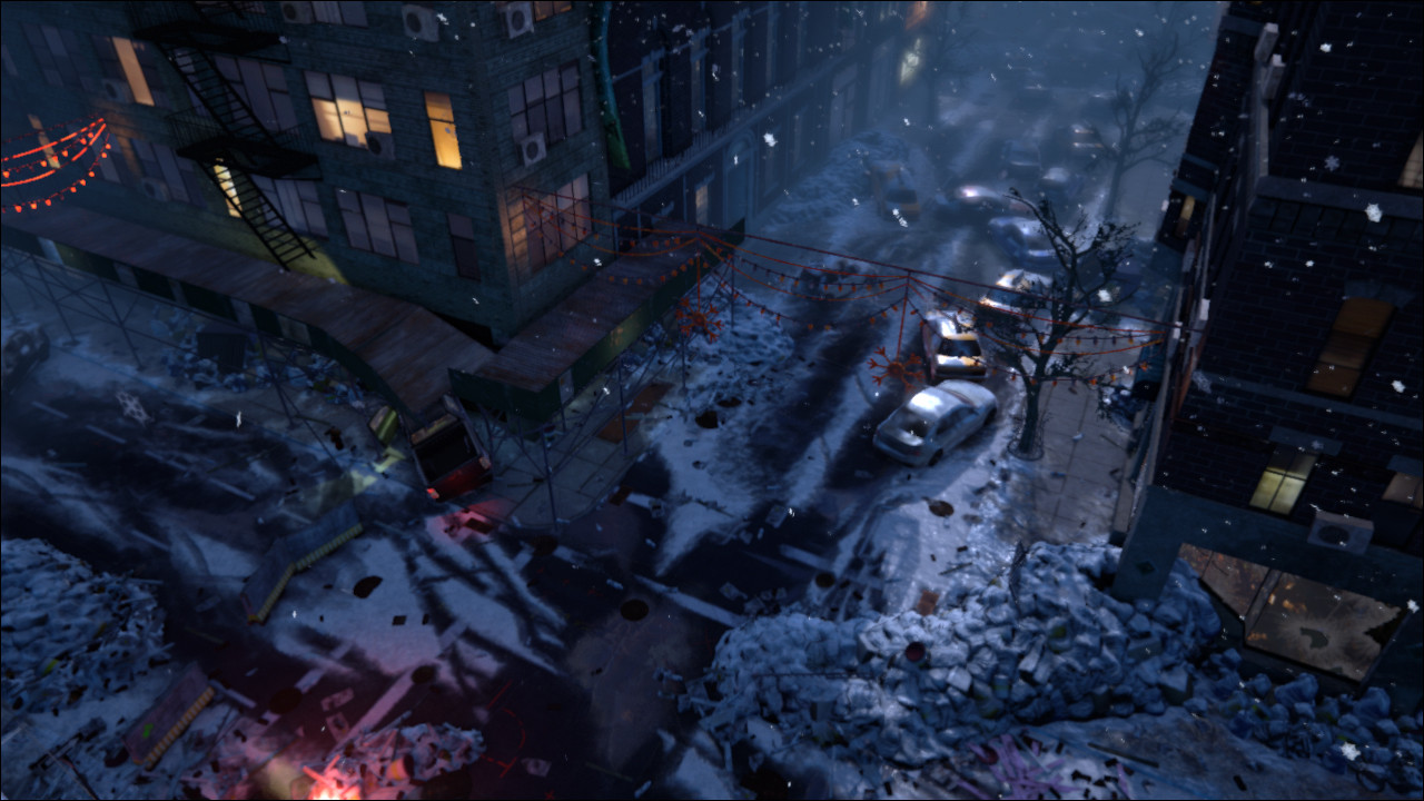
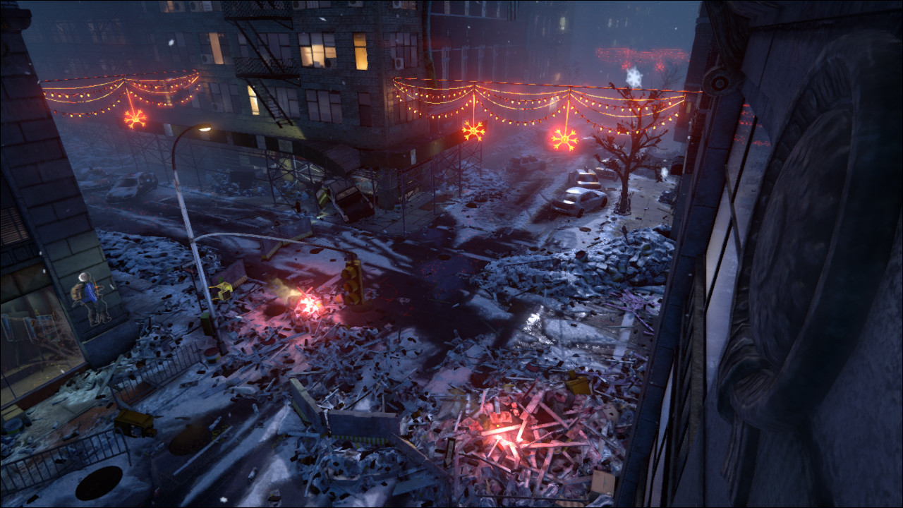
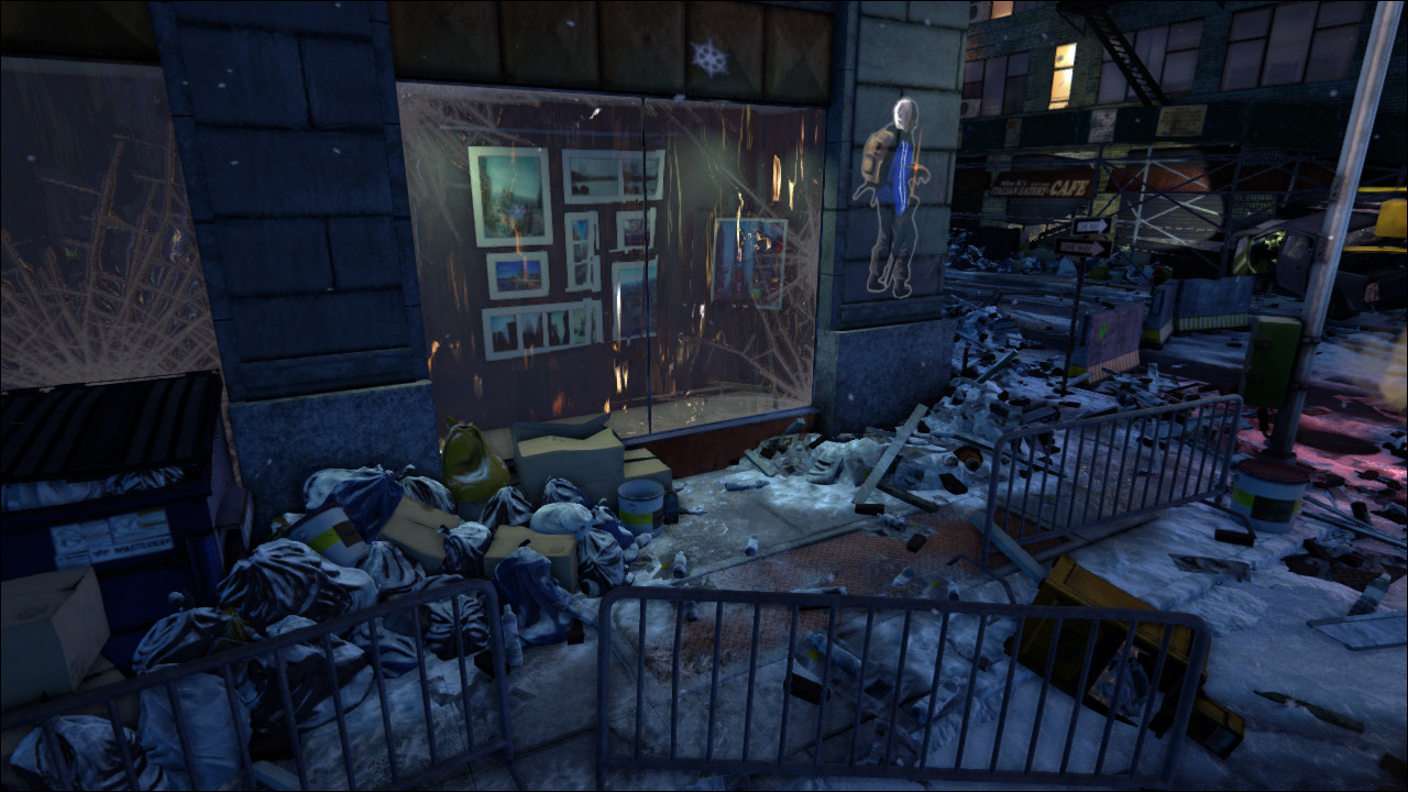
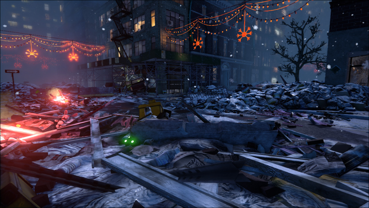
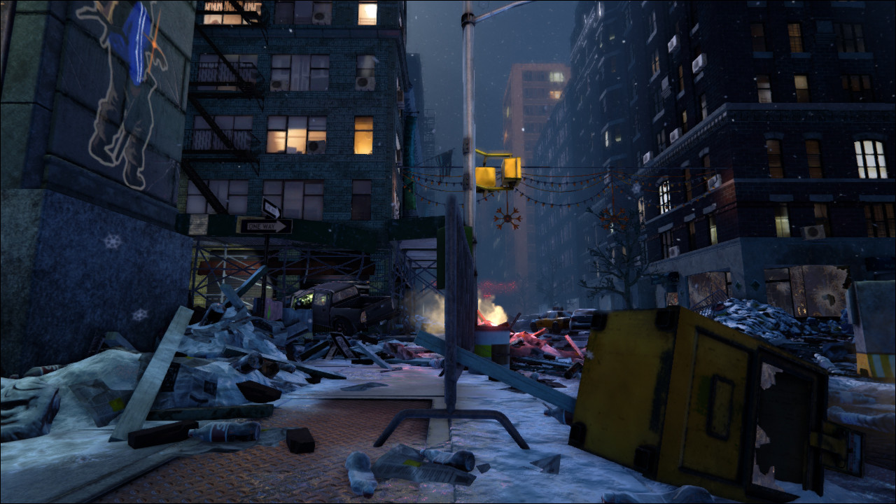
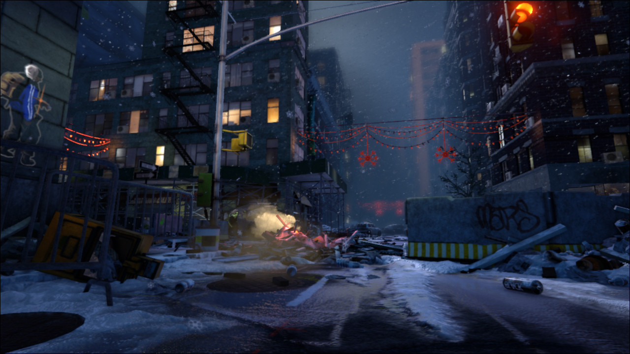
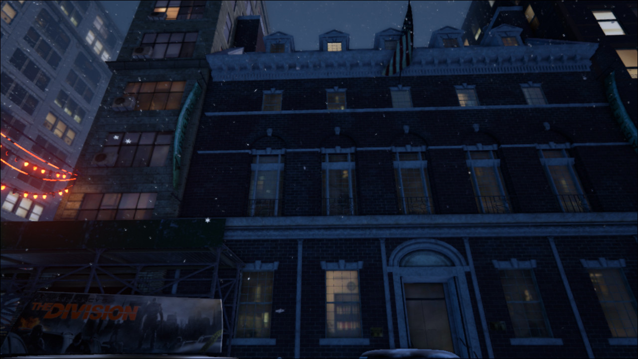
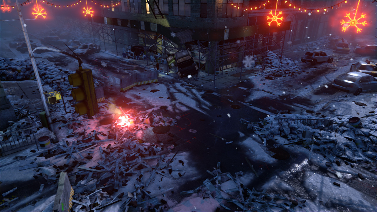
I am looking into packaging everything up and offering it for download but I don't know what I'd have to upload for a UE4 version. As soon as I figure it out I'll post it.
Thank you all and see you next project
Original Post:
Hi everyone, happy 4th of July
Last E3 was full of surprises, one of them was Ubisoft's new game 'The Division'. I love the art style and want to try and create a scene that evokes a similar mood.
I chose a real life setting as my jumping off point and will then make it match the setting of the game.
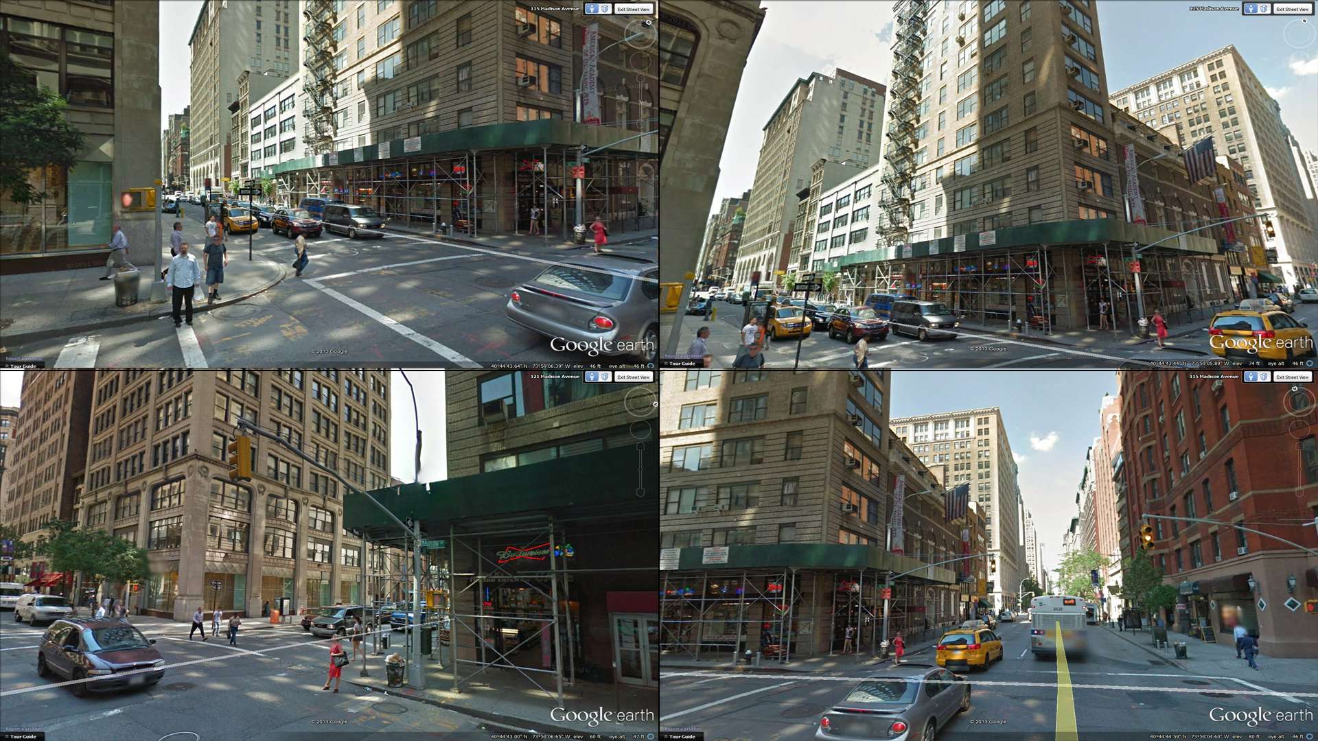
I was thinking of going for a snowy night setting.
From what we have seen so far, I believe the game is set in winter after christmas (the lights are still up).
I want to recreate the corner facing the convenience store.
There are still many questions that need answering and I'm far from finalizing the asset list.
Below, you can see a rough blockout with some notes:
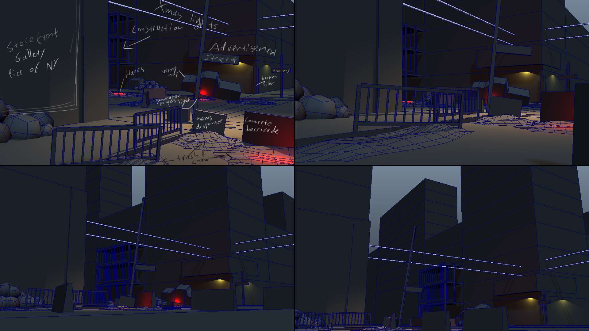
Some ideas I'm still toying around with are:
> Should there be a damaged EMT tent, that the truck crashed into?
> Should the intersection be one of those cobbled raised intersections?
It's not there in real life but it would make for a more interesting pattern on the snow.
>Should I add a withered tree anywhere in there?
Anything goes and I would appreciate any feedback.
Cheers,
Hi everyone, it's time to call this project done.
It's been a tremendous learning experience and a lot of fun.
I am quite happy with how it turned out.
There is a lot of things I would have done differently where I to start over but one must stop at some point.
Thank you all for your amazing and encouraging feedback
Edit 2016: Updated the video links


I am looking into packaging everything up and offering it for download but I don't know what I'd have to upload for a UE4 version. As soon as I figure it out I'll post it.
Thank you all and see you next project
Original Post:
Hi everyone, happy 4th of July
Last E3 was full of surprises, one of them was Ubisoft's new game 'The Division'. I love the art style and want to try and create a scene that evokes a similar mood.
I chose a real life setting as my jumping off point and will then make it match the setting of the game.

I was thinking of going for a snowy night setting.
From what we have seen so far, I believe the game is set in winter after christmas (the lights are still up).
I want to recreate the corner facing the convenience store.
There are still many questions that need answering and I'm far from finalizing the asset list.
Below, you can see a rough blockout with some notes:

Some ideas I'm still toying around with are:
> Should there be a damaged EMT tent, that the truck crashed into?
> Should the intersection be one of those cobbled raised intersections?
It's not there in real life but it would make for a more interesting pattern on the snow.
>Should I add a withered tree anywhere in there?
Anything goes and I would appreciate any feedback.
Cheers,
Replies
Here is a more formalized asset list:
Asset List
Bldg_Gallery_Base_Corner
Bldg_Gallery_Base_Middle
Bldg_Gallery _Corner
Bldg_Gallery _Middle
Bldg_Store_Entrance - Just the entrance, no supports, will reuse on long side
Bldg_Store_Corner - Is just the corner support
Bldg_Store_Showcase - two glass fronts with one support in the middle
Bldg_Store_Support - One support, goes left and right of entrance
Bldg_Store_Hatch_A
Bldg_Store_Hatch_B
Bldg_Store_Hatch_C
Bldg_Store_ApA_Corner Corner, entire right side and the first tall pane and row of 3 on the left
Bldg_Store_ApA_Middle just one tall pane
Bldg_Store_ApB_Corner Corner, entire right side and the first tall pane and row of 3 on the left
Bldg_Store_ApB_Middle just one tall pane
Bldg_Store_FireEscape
Bldg_Store_Scaffolding Green wrap around
Bldg_A_Groundfloor
Bldg_A_Floor
Bldg_A_Roof
Bldg_B_Groundfloor
Bldg_B_Floor
Bldg_B_Roof
Bldg_B_Scaffolding
Prop_Norm_AC
Prop_Norm_MuseumBanner
Prop_Norm_Flag
Prop_Norm_FireHydrant - http://alturl.com/3mjrz
Prop_Norm_TrafficLight - Img 0018, traffic light with street name and lamp
Prop_Norm_SignOneWay
Prop_Norm_PhoneBooth
Prop_Norm_XmasLights
Prop_Norm_NewsStand - http://alturl.com/g7vg7
Prop_Norm_Generator
Prop_Norm_GasCannister
Prop_Norm_LubricationBucket
Prop_Riot_BarricadeMetal - http://alturl.com/z8ex7, http://tinyurl.com/k8pdh6n
Prop_Riot_BarricadeConcrete - http://alturl.com/xjr4j, http://alturl.com/498kd
Prop_Riot_Tape
Prop_Riot_MeshA Wrapped around Barricade Metal
Prop_Riot_MeshB Wrapping tore off
Prop_Riot_MeshC Shield attachment for BarricadeConcrete
Prop_Riot_GarbagePile
Prop_Riot_BottlesGrp
Prop_Riot_BricksGrp
Prop_Riot_DebrisPileA
Prop_Riot_DebrisPileB
Prop_Riot_Truck http://alturl.com/hdg6a
Strt_Madison_N
Strt_Madison_S
Strt_34th_E
Strt_34th_W
Strt_Intersection
Swlk_NE Sidewalk by gallery http://alturl.com/biywm
Swlk_SE Sidewalk by store
Swlk_NW
Swlk_SW
Please leave a comment if you think anything is missing or if I should take something off.
Cheers
Promising start. The Division was definitely one of my E3 highlights. I look forward to seeing your project progress. Best of luck with it!
I am super excited to start modeling.
It's also a great opportunity to learn UDK
Another update:)
I started work on the looted/destroyed store.
I tried to imagine how people would go about destroying the shutters, trying to get into the store. Probably the hinges would be the first to go and then they'd get bent and torn. I tried to add that into the model.
What do you think of the shutters?
More damage, less damage?
Should I go about the damage type in an all together different direction?
I'd love to hear your thoughts
Cheers
Great start!
edit - I think your shutters are fine for now. They convey a nice level of damage, which can be pushed further when it comes to normal map time
Since I'm going for the style of a next gen game there are certain details that will be modeled that otherwise would have been texture.
So there are bolts on the back of the traffic light, for instance.
Most of those I consider pretty close to game res.
They haven't been optimized yet and I'm keeping everything quaded for now to use them as a jumping off point for high poly bake versions later.
Except for the shutter, I modeled that one straight to high poly and will not be optimizing it until I lock down the shape/damage.
Don't tempt me with the cryengine, lol
I am more familiar and comfortable with it and would love to do this in CE3
But I've been avoiding UDK for so long and now it's time to learn about all the new features
A pickup truck ran through it at high speeds and crashed into the store.
It tore through the first row of supports and then there was a ripple effect backwards.
Please let me know what you think.
Could it happen this way or should I apply a completely different logic to the damage?
leleuxart, that is a great idea.
It would hide another little story away in the environment.
On the other hand I was really looking forward creating a beat up version of the truck, where it struck the wall.
Decisions, decisions, lol
My city is now ready to face the riots, lol
I also tried my hand at some sculpting.
The result was dismaying
As you see the geometry pinched something aweful and the result was a streaming mess.
What are good/different ways to set up sculpt bases?
So far I've been creating an all new model with cleaner topology but I'm not sure that's the best way to go.
Please help, the answer to that has eluded me for a long while now.
Started placing some assets in UDK.
Being new to UDK I was having a hard time placing assets and organizing the scene until I found the Scene and Layers tab in the content browser window.
Now everything is a lot easier and clearer
What would be good tutorials to start with?
When I was using unreal engine 2, UDN was awesome but now I find it kind of bare bones.
What would you recommend?
Also are there mudbox specific tutorials that cover how to prep your model for mudbox?
Thank you all, in advance.
After all of the sculpting is done, I then create the low poly, in game resolution model. This is unwrapped and then thrown in a baking program, such as xNormal, and then the High poly sculpted mesh is baked into normal maps onto the low poly.
This was just a simple break down of my basic workflow. Works anything and everything for the most part. I have seen it used from characters all the way up to entire environments with success. Always good to aide your workflow with programs like nDo, dDo, crazy bump, etc. Will speed up your normals process, and with an entire environment piece like this... Efficiency is EVERYTHING. I know you are going next gen with everything, but to even be run on your own computer when working on it, has to be taken into account. There is next gen, and then there is wasteful. We are almost at that point where there is a definite grey area when it comes to tri use and when to use textures (normals and displacement).
Goodluck with your project.
So I was on the right track, just had the process backwards
I'd try to re-cut my mesh after I'd get done with the game asset.
Your process makes a lot more sense.
This has been a tremendously fun project so far.
It's been a while I've had time for a personal project.
Here are some shots from the maya viewport.
No placement is final yet, so if anything jumps out at you please let me know.
I've been watching and re-watching 'the division' footage from E3 and my mind gets blown every day by how much detail there is in this game.
There's a tiny modeled icicle under the fire escape, right next to the fully modeled bricks that surround the windows!
I think its safe to go quite a bit higher with detail with this but I must avoid the temptation to go all out to the realm of wasteful.
It will lay on its side in the scene.
The crumpled newspapers inside will make sense then.
I stumbled across a page the other day that could maybe be useful for references (maybe for the rust or whatever). Take a look at this, maybe you can use something there.
Anyway, keep it up.
But yeah dude
MiAlx, thank you so much for the link, what a great resource!
chrisradsby, I've been thinking a lot about how I'd want to do UVs and textures.
What would be customary in such a case? Watching watching the E3 footage I can't determine a preference for tiling over custom.
For the ground you could try using a good 1x1 tiling, then break it up with vertex painting and good prop placement / additional newspapers / leaves etc.
Couple weeks back I modeled one of those newsstands myself, interested to see how yours will turn out. I surely would do some things different, if I had to model it again
Sounds like a good idea to do the road that way.
The original location has these really interesting construction tags/markings on it so I was thinking of doing that with projectors but then I didn't know how to do the snow that's covered them.
Are there any good tutorials on how to vert paint in udk?
That might sound odd, but I'm having difficulty finding tutorials that are not video based
Anyway, I couldn't resist and threw what I have so far into a scene.
It's very premature as everything is still in flux but the allure of the game engine won, lol
looks nice so far, but I have to ask: What is wrong with tutorials being a video?!
There's nothing wrong with video tuts but I like having a pdf or an article open and read. I just like reading.
Same for any kind of walkthrough. Ideally we'd get both.
well of course I respect your wishes
there you go:
http://udn.epicgames.com/Three/MeshPaintReference.html (this may be the best one)
http://www.carlk3d.com/udk-vertex-painting-basics-post-21/
http://www.laurenscorijn.com/vertex-blending-snow.html
and althought you don't want, if you don't mind nevertheless, a video tutorial: https://www.3dmotive.com/f100601
Thank you so much.
And of course I'll watch the video tuts too.
I wont ever turn away a possibility to learn;)
That is one of the things I love about these types of projects,
You learn so much about all sorts of topics.
Today I learned about the history of NY fire hydrants
http://www.firehydrant.org/pictures/nyc.html
Are you going to be texture blending/vertex painting across the top row of the building? You might get seams as you made them separate pieces.
I have been working on a similar building and ran into this issue. Just thought I would throw it out there.
Can't wait to see this progress.
CHeers.
Sunergy11, I haven't given the buildings much thought yet.
I was going to use vert painting on the sidewalk and the main road.
For the buildings I was thinking of doing a mix of custom and tile but vert painting seems the way to go. What was the problem in your experience?
Also, if I plan for vert painting, will I need more verts?
In the mean time here's a dumpster
I know it's a staple exercize to make one of these, which I managed to dodge until now, lol
The Left one is tipped over and there will be piles of garbage pushing up the flaps.
Cheers
The first test was kind of disheartening
I threw together rough asphalt and snow textures and tried them out on the intersection. It looked like I'd have to increase the amount of geometry exponentially to get anything close to a natural looking transition and placement.
But then I found Christopher Albeluhn's amazing tutorial on vert painting:
http://www.chrisalbeluhn.com/UDK_Advanced_Vertex_Painting.html
The results are quite impressive. I still think I'll need more polys on everything though.
So is there a way to blend more than two materials together?
If I use R for the first mask, could I use G or B for subsequent materials?
Also, the snow and asphalt are no where near finished, but please let me know what you think. Snow especially is really difficult to wrap my head around.
Cheers
You can. You could do something like a lerp for 2 materials than lerp that again for another material. Just depends how you want to do it. I'd advise taking a close look at your material and really try to understand what's going on. It's not too bad, just requires a lot of logical thinking and a bit of basic math.
If you want a better transition for the snow, you'll have to really think hard about how you're using that texture mask to manipulate the transition. The one in the tutorial is just a simple cloud filter and might not be right for the kind of snow you're going for.
One of the things I loved about The Division trailer was how they nailed slushy snow. Might be something you want to consider.
As far as the snow texture, I think you should include a soft and lumpy normal map(a cloud texture might be a good base) to give it more depth and make it look like it's building on top of the asphalt. And a noisy spec map
Edit: EvanL kind of beat me to it. I agree with the slushy part and the normal map should help, but you may have to use a channel to vertex paint in wet parts around the edge of the snow.
Great work so far!
As for the snow and vertex painting thing, I can tell you that realistic snow is (atleast for me when I tried it) really hard to achieve.
For the vertex painting itself, I would try to blend your materials by heightmaps to get a way smoother and realistic transition between them.
Sadly I can't say anything about blending more than two materials in one shader because I've not tried it myself yet.
Keep it up!
EDIT: Woha, too late!
So yeah, seems to be easy stuff!
As for the slushyness of the snow...basically what EvanL and leluxart said. Try to get a nice normal and especially spec map, maybe with camera direction based "sparkles" like you find them when sun shines on snow.
This is a breakdown of the snow shader so far:
For the next version I'll try a softer normal and a noisier spec.
For the slushy part, are you referring to that 'dirty' quality snow gets when its been on the ground for a while?
Would that primarily be in the diffuse?
AkiRa, how can you tell me more about that 'camera direction' effect?
Would that function as a camera based spec on top of the original spec?
Cheers
What this basically does is that it takes a two same sparkle textures (just random white dots on black background) and maps one to the position of your camera and one to the world normals and everytime those textures overlay each other, you see a sparkle.
This is plugged into the emissive channel of your material in the end.
I made a quick set up for you so you can see better what I mean.
This is the effect you can achieve with that:
(gif starts a bit late)
You can see that the effect itself is not very strong and you see sparkles all over the place (which is due to the grey diffuse, maybe should've taken a black) but you can control that with a constant vector I'am referring to in the explanation of the material setup.
This is the texture you need (basically just scaled up photoshop noise but you can go a lot fancier with that!)
And this is the shader network that makes it all work
I just took a grey diffuse so you can see the effect better.
As you can see, its actually pretty simple. Its your both textures multiplied with each other. One is mapped to the camera position and the other to the world normals. Your world normal texture has a texture coordinate plugged in its UV's input so you can change the tiling of it. Its multplied by an append vector which controls the repetetion of your sparkles in the U and V (so you can control how often you get sparkles).
The multiply before the actual emissive slot is just to control the strenght of the sparkles with a constant vector.
Just a very basic example, you can go way further with that!
Hope this helps!
This is absolutely awesome!
I'm new to the material editor and the versatility is just amazing.
Thank you for this.
I'm going over everything again and making adjustments.
Unrelated to this and out of convenience I was working with my maya set to centimeters but seeing as I'd like to use the UDK grid more efficiently I converted to feet:)
Anyhow, I can't get UDK to render face/vert normals the same way they render in maya.
What are the optimal settings for the FBX exporter?
I have 'Smoothing Groups', 'Tangents and Binormals' and 'Smooth Mesh' checked.
Any help on the issue would be appreciated.
Cheers