115 Madison Avenue in the Style of "The Division"
Final scene update:
Hi everyone, it's time to call this project done.
It's been a tremendous learning experience and a lot of fun.
I am quite happy with how it turned out.
There is a lot of things I would have done differently where I to start over but one must stop at some point.
Thank you all for your amazing and encouraging feedback
Edit 2016: Updated the video links
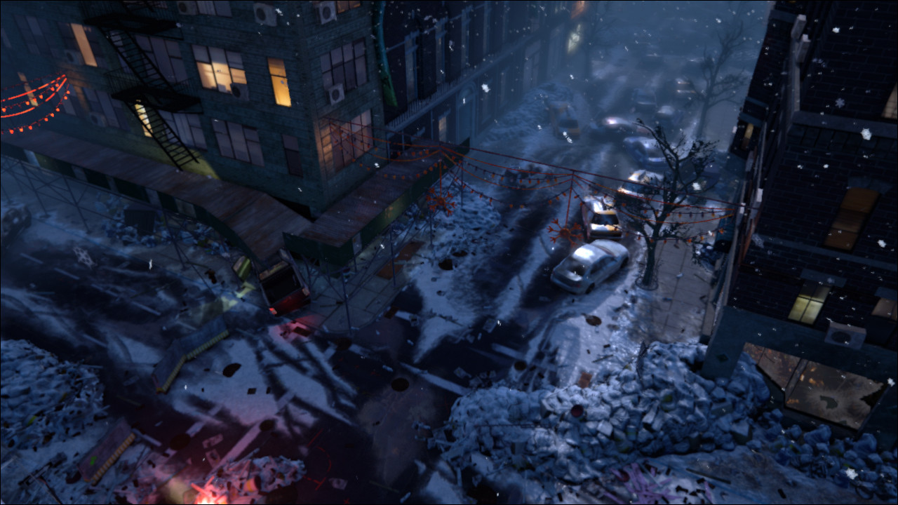
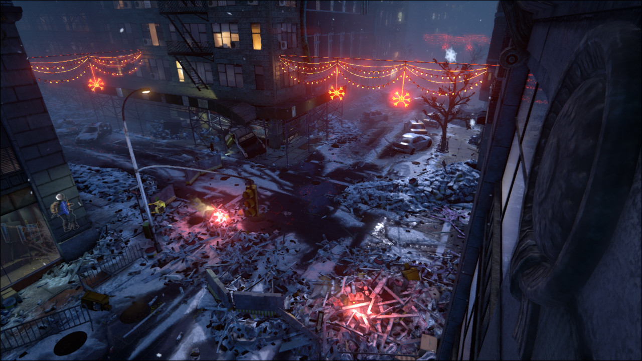
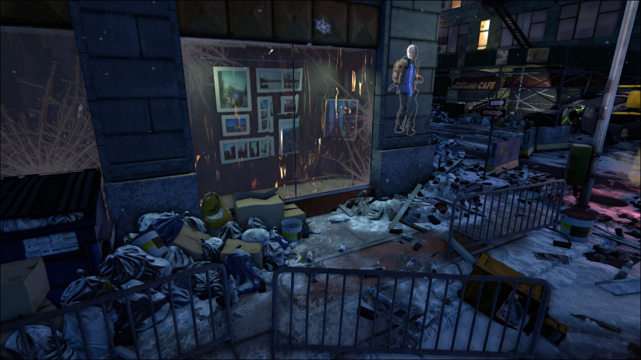
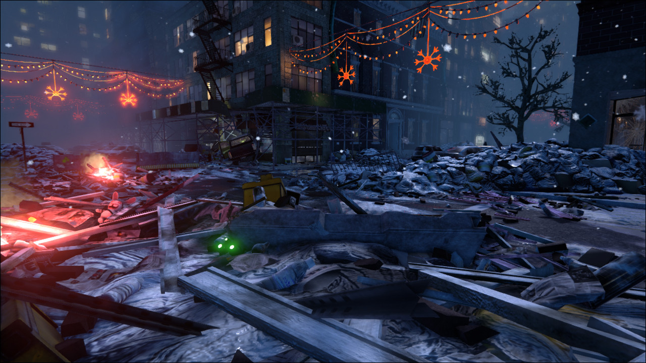
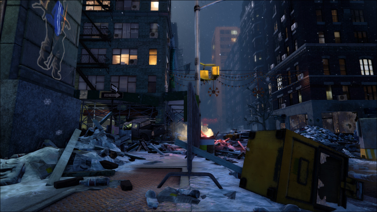
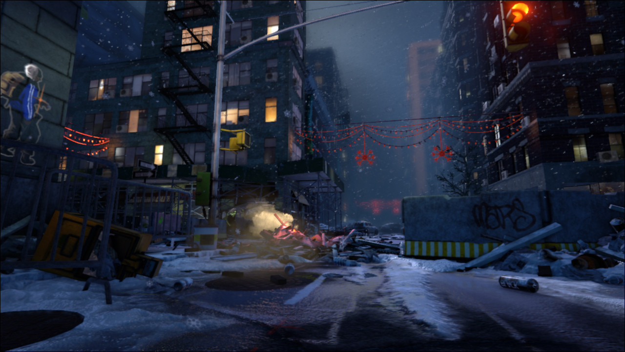
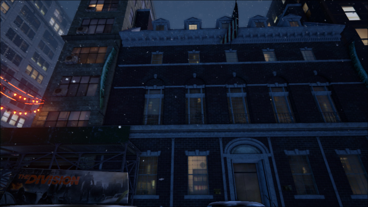
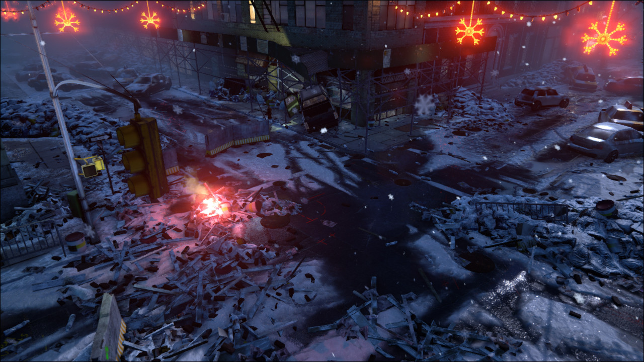
I am looking into packaging everything up and offering it for download but I don't know what I'd have to upload for a UE4 version. As soon as I figure it out I'll post it.
Thank you all and see you next project
Original Post:
Hi everyone, happy 4th of July
Last E3 was full of surprises, one of them was Ubisoft's new game 'The Division'. I love the art style and want to try and create a scene that evokes a similar mood.
I chose a real life setting as my jumping off point and will then make it match the setting of the game.
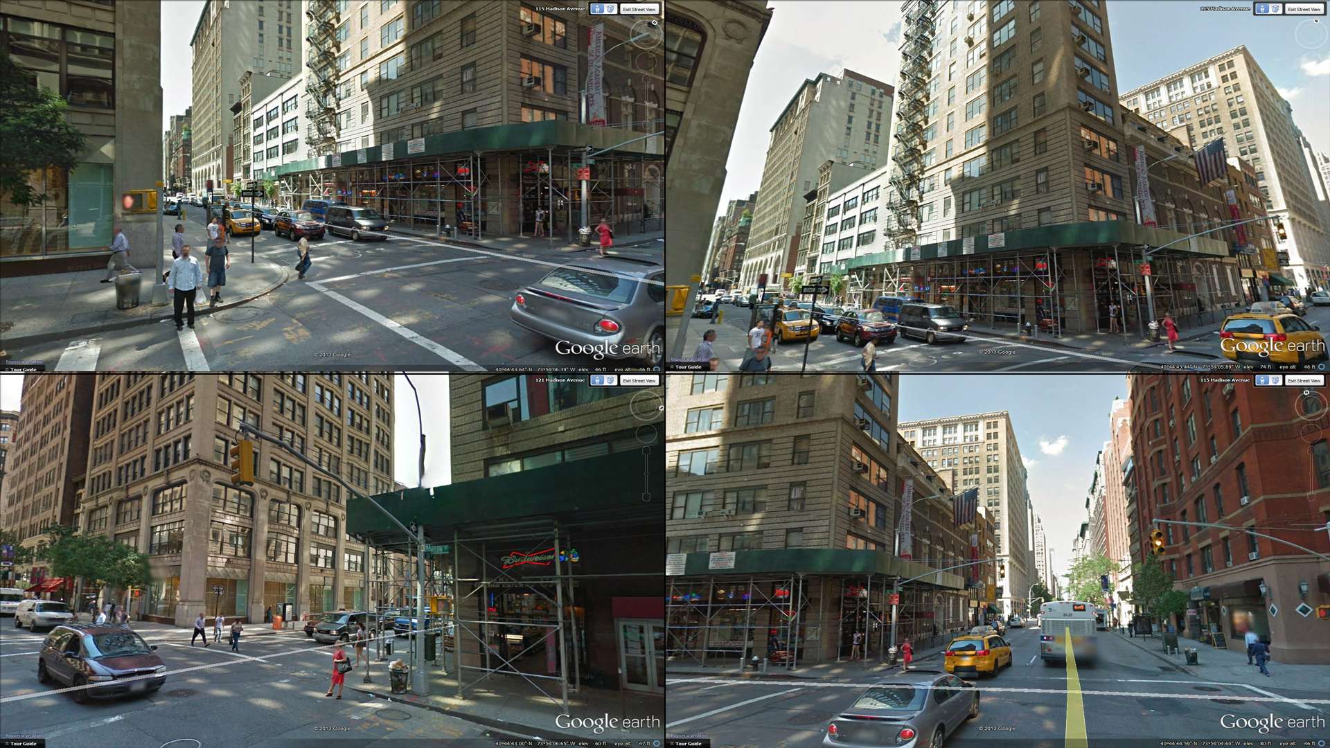
I was thinking of going for a snowy night setting.
From what we have seen so far, I believe the game is set in winter after christmas (the lights are still up).
I want to recreate the corner facing the convenience store.
There are still many questions that need answering and I'm far from finalizing the asset list.
Below, you can see a rough blockout with some notes:
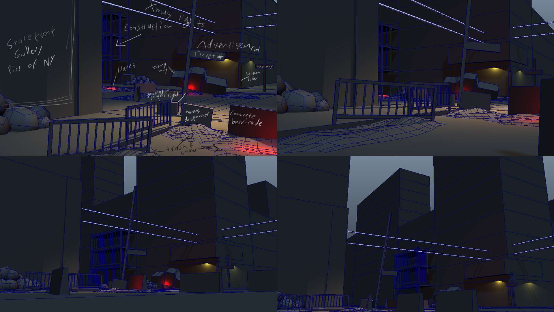
Some ideas I'm still toying around with are:
> Should there be a damaged EMT tent, that the truck crashed into?
> Should the intersection be one of those cobbled raised intersections?
It's not there in real life but it would make for a more interesting pattern on the snow.
>Should I add a withered tree anywhere in there?
Anything goes and I would appreciate any feedback.
Cheers,
Hi everyone, it's time to call this project done.
It's been a tremendous learning experience and a lot of fun.
I am quite happy with how it turned out.
There is a lot of things I would have done differently where I to start over but one must stop at some point.
Thank you all for your amazing and encouraging feedback
Edit 2016: Updated the video links


I am looking into packaging everything up and offering it for download but I don't know what I'd have to upload for a UE4 version. As soon as I figure it out I'll post it.
Thank you all and see you next project
Original Post:
Hi everyone, happy 4th of July
Last E3 was full of surprises, one of them was Ubisoft's new game 'The Division'. I love the art style and want to try and create a scene that evokes a similar mood.
I chose a real life setting as my jumping off point and will then make it match the setting of the game.

I was thinking of going for a snowy night setting.
From what we have seen so far, I believe the game is set in winter after christmas (the lights are still up).
I want to recreate the corner facing the convenience store.
There are still many questions that need answering and I'm far from finalizing the asset list.
Below, you can see a rough blockout with some notes:

Some ideas I'm still toying around with are:
> Should there be a damaged EMT tent, that the truck crashed into?
> Should the intersection be one of those cobbled raised intersections?
It's not there in real life but it would make for a more interesting pattern on the snow.
>Should I add a withered tree anywhere in there?
Anything goes and I would appreciate any feedback.
Cheers,
Replies
There's really no set way to achieve that. You could put it all in the diffuse. That dirty color seems to be a combination of the ground and the dirt on the ground mixing with snow and a bit of water from melting snow (which stains it a bit darker). So you could simply put that information in your ground texture (even vertex paint wet dirt onto it if you want) and then use a mask and/or vertex paint to blend the snow on top of that.
There's many ways to approach it. It can get frustrating, but just take your time and think it through very carefully and meticulously.
Also for your importing problem. Make sure use explicit normal is check when importing to UDK. You can also try UDK's actorX importer. They phased it out I believe and I think FBX is most common now? But I notice I sometimes do get different results using actorX. Also is it a re-importing problem? One thing that drove me crazy was that right clicking and using re-import directly in the content browser doesn't really work right for me. I always have to click import new mesh and override it for it work correctly.
edit: Also, I know you're using another street for reference and you might already know this. But the street in the trailer is based of off the intersection at 119 Water Street, Brooklyn, NY.
I will try your method asap.
I thought I did something wrong, though I feel bad that it's also happening to you at least now I know I'm not going crazy.
I did not know they where using 119 Water Street, that is awesome
Thanks for that info.
For slushy snow, I'm planning on two variations in addition to the relatively more pristine snow.
I thought I'd have cleaner snow in corners with no traffic and then in the middle of the road I'd have slushy snow with tire marks and on the sidewalks slushy snow with foot prints. If all goes well I could blend between those materials and also have the original asphalt/sidewalk materials show through.
Please let me know if my thinking is on the right track:
>You probably want your topology to be even (unless you're trying to use edge length for a specific effect)
>If you're using a mask, you don't want your topology to be too dense.
>If you're using a mask, the mask size should be dictated by the density of your mesh.
>In vert mode, Brush Falloff does nothing
The biggest surprise to me here is that I expected the paint to interpolate 50/50 between the verts. No matter what I set my brush to I always get this 90/10 look.
Other than using a mask, is there a way to affect that?
Also, where can I check the effect vert painting has on drawcalls?
All the existing assets have been ported over to feet and fit into the new grid.
Also, I re-topologized the buildings to allow for better vert painting.
Now that I can get back to building more assets.
I took a first stab at the garbage piles that would build up after services break down. Please let me know what you think.
I'd definitely say bevel those edges if you're going for the PS4/XB1 gen. At the same time sometimes work in some variation in things like concrete stairs. Give them a little history.
Makes sure the lower floors of the buildings get the lions share of polygons too. You're going to be very close in FPS/3PS view to the bottom floor and not nearly as close to the floors above.
I like the idea of the truck crashing into the metal girders, but the destruction is unnatural right now. Try to find some reference. Metal don't tend to crinkle up like that, but rather bend or just disconnect from where it's fastened and get shoved out of the way.
So get some bevels on those concrete blocks and rock on. Good progress!
Thank you for your feedback.
More detail you say? I am happy to oblige
I was thinking of doing a lot with tessellation and that's why I'm trying to keep my geo evenly spaced. I did some tests to that effect but the results weren't that promising. I got some ugly artifacts
Do you think I could get away with adding the major blocks into the geometry or would that be overkill?
Also, thank you for the tip on the crash scene. I will do more research and change it.
Cheers
If it's blocks of concrete on floors or walls you can definitely add geometry to push them out and create sillhouette. Just make sure to be smart about it and add it where it counts and let normal maps and parallax mapping do the rest.
It's hard to give a polycount to aim for, especially since you're not actually using an engine optimized for next gen.
The more I think about how to texture this, the more confused I get.
For instance, the footage shown of the game at E3 panned down this building:
Every brick in that shot has silhouette. I thought that it must be tessellation doing that, but from doing simple little tests like a brick pattern on a fairly dense square in UDK I get the feeling that the technology isn't quite there yet.
Now I'd love to add this kind of detail to my meshes, but wouldn't that almost mean that I'd have to use custom textures for almost everything?
The other thing I was thinking is that maybe that one building is using ultra high res assets for cinematic purposes and that they switched to game-res on the out-of-focus close up of the main character.
This is the result I got with tessellation:
Of course I haven't delved too far into it as I'm still modeling assets but I'd like to figure it out early in the pipeline before I have to go back and do a bunch of avoidable reworks.
Once again, thank you for the feedback
I wouldn't be surprised if there was a swap happening, since that kind of detail would be wasted on the gameplay camera. That said, you could do something similar even just using a tileable brick texture - map it to a plane, then cut out individual brick meshes and place them at the corners where you'll see the silhouette.
You an me both, man!
This scene looks really promising, and you've given me some insight myself about doing modular work
@Auldbenkenobi, Thank you! It has been a while since I had time for such a project and it's been tons of fun so far.
@inwar, wow the implications of next gen are scary, lol
I finished another of the filler buildings.
I'm starting to have enough buildings to populate the scene and close off gaps.
I think I'll need 3 more and then I can start focusing on props, destruction from the riots and weather effects such as pilled up snow.
As always c&c welcome
Cheers
Finally another filler building is done, though I think I might have to give this one a more prominent place
You can't really see it in these shots yet, but I got to play with nCloth to get the torn fabric of the screens.
Hadn't had to mess with nDynamics since college, so that was fun.
Now I only need a couple more and then on to the riots and collapse of civilization stuff.
Cheers S
This is the first time I create a texture purely from extracted maps.
It's part of a trim set I hope to reuse throughout the project.
In UDK it's a simple d/n/s setup with a multiply on the spec and a constant going to the spec power.
I know it needs a lot of work, so please let me know what you think.
The truck is finally in the scene and 34th street extends for another five blocks into the distance.
I also started placing some debris from the riots and building some snow banks.
I still haven't gone back to change the way the scaffold damaged around the truck but it's on my todo list.
Also I want to add larger piles of debris that formed when the contents of stores got dumped into the road, as seen here:
http://static9.cdn.ubi.com/resource/en-US/game/tomclancy-thedivision/game/Dumbo_Street_web_100158.jpg
After that, I think I can start UVs and textures
Please let me know what you think
Should I arrange the scene differently?
Do you think I should have more or less objects scattered around?
Anything that pops to mind just let me know.
Cheers
Looking good though! You're showing off some solid modeling-skills!
I'll get started on some textures then, I can always add more props later
I actually love UVing.
It's like meditation therapy, lol
haha I'm glad I'm not the only one
Also: Great progress and detail. As the others said: Time for some color ^^
With regards to vertex painting you should totally check out the 3D motive tutorial that was linked on the previous page ( https://www.3dmotive.com/f100601 ) if you can it's definitely worth buying a membership as they have some very useful tuts, especially that one.
I think the material they create would be perfect for your scene, although it would mean going back and re-doing they floors. In a nutshell they have one vertex colour channel control the snow, another control the falloff (wetmap) and the third channel raises and lowers verts to make it look like snow had pilled up.
I have to admit this thread is particularly inspiring, thank you.
Keep up the good work and good luck with the UV mapping. I'll be following
This has grown to be a multi month project and getting this great feedback is so encouraging.
@Treboras, I know a lot of people diss them, but I like mayas stock tools the most.
I tried my hand at roadkill and even 3DS but maya just feels intuitive
@steppan, thank you for pointing me to 3dmotive again. I keep forgetting to check them out. I saw they have a lot of UDK related tutorial and especially material related ones so I'll get a membership.
@Hamish, thank you
I hope that it will all come together with textures, stay tuned.
have you tried "Headus UV Layout"? It's quite geeky with lot's of shortcuts but for me the fastest, most intuitive and fun way to make UV Layouts.
Regarding tesselation, if your underlying mesh is well constructed, tesselation can help round out forms but using it to create a brick wall with depth might be a bit ott. It seems to be geared more towards smoothing out silhouettes in games that do use it rather than creating actual geometric detail on a flat(ish) surface.
Treboras,
No I had never heard of Headus UV LAyout.
I will surely look it up.
Urgaffel,
You are absolutely right, the heavy handed DoF is history.
I had intended to have both roads run into T intersections and the DOF was to hide that I was repeating assets.
Now that you can see a couple of blocks down, I toned it down by a lot.
You're also right about tesselation, the right tool for the right job.
But hey, I had to try
I'll try to post new images with progress from the UVs soon.
Still trying to wrap (ba dum tssshhh) my head around all the textures I'll need and how I want to tackle things.
Cheers
Keep up the awesome work
I make a news on my french community of The Division and I follow your thread!
http://thedivision-france.com/suivi-dun-artiste-3d-se-lance-the-division/
I started laying out UVs and creating basic color maps to balance my color palette.
Seeing as I'm recreating a real life location, how much should I let that dictate the colors? Should I change some of the materials to fit into a more limited color scheme?
Also, for the first time I'm pixel snapping my UVs. Is anyone else being as OCD about their UVs? Is it worth it?
Thank you all again for the wonderful feedback, it really means a lot
I'd say I'm about 25% done UVing.
As I re-import the UVd assets into the scene I also go through and assign them a texture to gauge out how many materials I'll need.
Also, I took a first pass at changing the lighting.
I'm trying to evoke the winter feel found in this concept for the game:
In the concept, the light seems to be coming from behind the building towards the viewer. If I did that, how would I bring enough light to shine on my intersection to make it interesting?
Cheers
Concepts tend to do what they want regarding lighting without physically correct resemblance
I would take a good screenshot from your scene to photoshop and try some things out, just to see where the focus could bring a good composition. And after that try to reproduce it in the engine and see what it does to your scene.
Think about what you want to achieve with the final image. If the focus is on the intersection: Why is it there? In the concept it's to bring attention to the characters.
Good idea Treboras, I haven't painted in years
Time to sharpen those painting skills, i guess.
Lighting has always been one of my weakest disciplines, any good tutorials out there?
Benjam, I agree with you about the polycount. Usually I'll pore over every last edge but earlier in this thread there was a discussion, about vert painting most of the localized detail. I'm not sure if I drew the correct conclusions though.
I guess once I reach that stage and if it doesn't work the way I expect it to work at the moment, I'll revisit my topology.
Cheers
----
not especially for your scene, but I like these tutorials nonetheless and some basics never hurt
http://www.amaanakram.com/lightingT/part1.htm
http://www.3dtotal.com/pages/tutorials/general/lighting_in_lightwave/lighting_in_lightwave1.php
Thank you so much!
It has been a while since my last update
Last week I was struck with a corrupt package file.
I guess I'm so used to version control, from work, that I forgot to set-up a backup system at home. Anyway, I had to start the UDK portion from scratch.
Turns out that's the best thing that could have happened.
Whiling away in the game engine is so much fun that I was progressing at a snail's pace. Having to start over, I'm only bringing fully UVd objects back in, so that is a motivator to work faster
Here's the progress so far:
Cheers
Also:
http://imageshack.us/a/img38/5306/nxep.jpg
The texture is this:
http://imageshack.us/a/img46/5141/9cyc.jpg
Unfortunately I've been using it since my college years and don't remember where I got it to give credit.
As I'm planning out my materials and memory consumption I create every texture I'll be needing in PS. The grid is used as greyscale and added over some mask colors in soft light mode.
Edit: I looked around and found the source.
It can be found on Ashraf Aiad's site http://www.pixelcg.com/blog/?p=146
It's been a while and progress is slow, but here's another update.
I only need to UV a couple more buildings, the pickup and the debris, then I can begin textures in earnest.
I will redo the garbage piles, as I was not happy with the way they turned out.
Dimmed the overall lighting in the scene to bring it more in line with the previous version and will try to find ways to get artificial lighting to the foreground by using more localized light sources.
Cheers
Also, it helps if you pick a good composition with a focal point although if you're going to do a fly through then you'll have to put a bit more thought into it
I had seen that thread in the past, Remember Me looked amazing!
I'll go back and look at what they did more closely.
So far all that there is in the scene is a dominant directional light for the moon that is positioned behind the camera. I want to go for a early dawn type of feel so I have it at a very shallow angle, but that way everything is steeped in shadows.
The concept I wanted to emulate works because of that strong flood light that is in the scene. Right now I'm thinking of adding something like that so that I can place my primary light source wherever works best
The final product is to be a fly-through, similar to that introductory shot in 'The Division' trailer that trails down the building. I have 8 points I want to showcase.
My company got hit with layoffs yesterday and so I will be moving back to Switzerland at the end of the month. I don't think I'll be able to post more updates for the next couple of weeks until after I made the move and settled in.
I'll be hitting up the job trail immediately, so if you know of anyone looking for an environment artist, don't hesitate to shoot me a message
The reception of this project has been so inspiring and I will return to it as soon as possible. See you all on the other side
Cheers
You can see that : http://www.gamesindustry.biz/jobs/ubisoft-international/sweden/uk-and-europe/level-designer-tom-clancy-s-the-division-id64176
I applied for the environment position a while back but it wasn't the right time.
Now I can focus on a new portfolio though and who knows, maybe next time
I found this forum and thread because it was feature on:
http://tomclancy-thedivision.ubi.com/game/en-US/news/detail.aspx?c=tcm:152-114873-16&ct=tcm:148-76770-32
Its so beautiful and bold. I can't wait for it to get done.
Even more because i just started a open game project and was inspired by watch dog and the details in the environment. After i saw The division i as mesmerized.
Such amazing details. Every single thing on the map shown on demo was heavily detailed.
My goal is to make a open world demo, fully functional. just like how you see in The division. Not a complete world. But a demo world. But it will be fully functional. Just constrain to a particular location. Weather its indoor or outdoor i really don't care at this point.
WatchDogs kind of graphics is what I'm really aiming for.
You my friend what you are doing is amazing.
I'm still a beginner when it comes to modeling though i do alot of average designing in photoshop all the time.
I have recently started using 3d Max.
Being an advance programmer and software developer, graphic design has always been my week point. Though I'm starting to get the hang of modeling. But My god when you are done. I would pay you to make a entire tutorial.
So the move is now complete and the Job search in full swing.
That means I can also devote a couple of hours to Madison Avenue again
Thank you for your kind words Bladers, the new ubisoft games do look amazing.
Can't wait to play them on nextgen.
I started doing some rough blockouts for the materials.
They still need a lot of clean-up and tweaking but I was thinking I'd only devote a couple of hours on each material and then see how they all work together once they're in the scene.
Here are the first three blockouts;
And here they are in the scene;
I will try to update this more often.
As always, please don't hesitate to drop comments and critiques
Cheers