It starts May 12, and ends Oct 17. Let's see what you got!
https://polycount.com/discussion/237047/the-brawl²-tournament
Best Of
Re: Sketchbook: Frank Polygon
It ain't pretty but, in Maya, so far as I know, this may be the best way with the least fuss, to fill it; connect the inside cylinder to the outside with one polygon using the Append to polygon tool; then you can use fill hole to fill in the rest. Then you can delete the one extra edge you'll be left with.

It's possible there's a better way, but opening Maya up to take a look, this is the first way that came to me as a long-time Maya user.
 Joopson
Re: How The F*#% Do I Model This? - Reply for help with specific shapes - (Post attempt before asking)
line up the segments of the two cylinders.
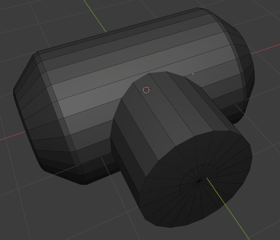
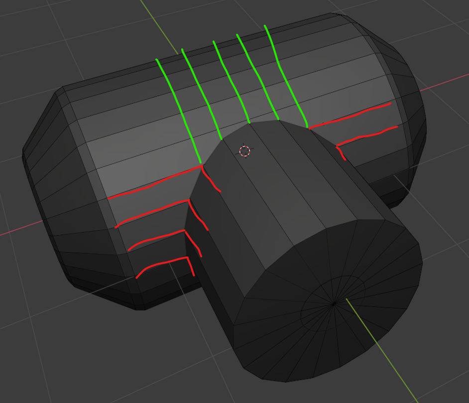

 wirrexx
Re: topology for subdivide
The curves in the base mesh subdivide cleanly because both sides of the grooves have the same number of segments. Adding the support loops to the two adjacent splits in the shape below the groove changes the segment spacing on the lower half of the curve. Which does sharpen the corners but also causes them to overlap with the upper half of the curved groove.
There's a few different ways to resolve this kind of smoothing artifact. Deciding which approach makes the most sense will depend on how soft the edges need to be and whether or not the model needs to be split into separate meshes.
If the subdivision model will only be used for rendering then it probably makes sense to keep the relatively tight support loops and mesh splits along the object's parting lines. Since the model's existing topology looks workable: the easiest solution would be to shrink down the outer vertices of the sharpened corners, preferably before adding the support loops.

Moving the corner geometry down compensates for the upward distortion caused by the abrupt change in the segment spacing. This will leave a small gap between the individual meshes but everything will fall in line with the larger curve when the subdivision is applied. How far the corner vertices need to be moved will depend on the shape of the arc, number of segments in the curve and the width of the support loops that are causing the distortion.
Enabling subdivision preview will make it easier to line everything up. It may also be a good idea to constrain any move operations to the edge normals of the surface. This will help prevent the adjustments from disrupting the compound curvature of the underlying surface.

If the subdivision model will only be used as a high poly for baking then it probably makes sense to use looser support loops and it may even be worth merging some of the mesh components to simplify the shapes. A simple block out can be used to establish the topology flow of the larger forms and this can be refined in stages to resolve any potential issues around the smaller shapes. Creases and edge weighted bevel modifiers can be used to preview loop smoothing behavior while working through the topology.
Once the basic loop flow is established, the loop path can be created with a single bevel / chamfer operation or multiple inset operations. The depth of the parting lines can be added by shrinking the middle loop on the path inwards. Final support loops can be generated using an edge weighted bevel modifier. Below is an example of what that process could look like.
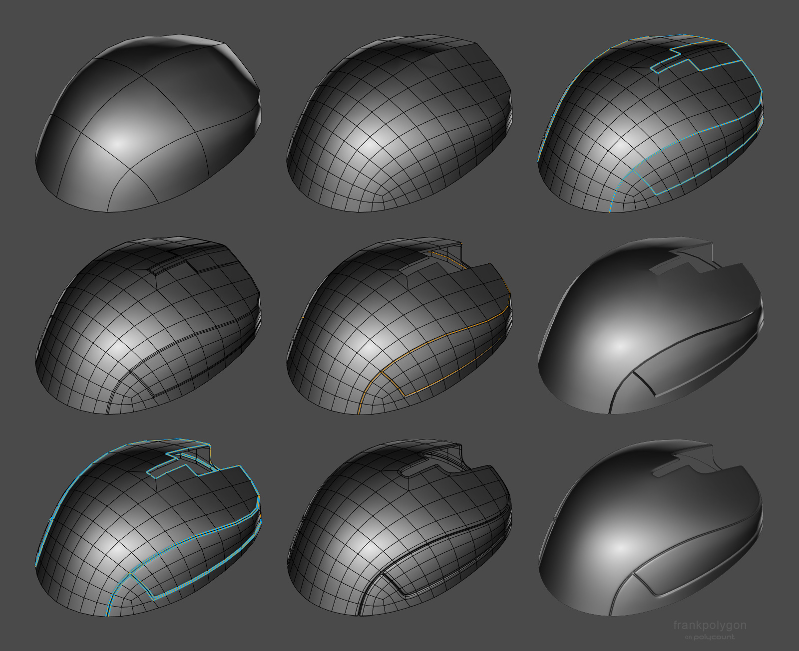
Having a continuous base mesh provides some additional options for the topology routing. It's possible to use a 5 sided E pole to direct the flow around the split in the shapes or use a triangular quad to reduce the perpendicular support loops without adding segments to the primary curvature. Here's a close up look at the topology near where the corners meet the top curvature of the parting line.
Support loops can be organized with several different routing strategies but the goal should be to constrain any minor smoothing artifacts to the narrow area between the support loops where it won't be visible. Generating the support loops with an edge weighted bevel modifier means it's possible to adjust the number of segments and width of the support loops as required. Without having to manually re-work each individual loop.

While a continuous mesh can be used to simplify the high poly geometry for baking, it may not be the right choice for every shape. Large, complex objects should generally be broken up into individual components that match the desired fidelity of the in-game model. Splitting a mesh along an object's seam lines also allows each part to have a slightly different polygon density. Which can make it a lot easier to establish seperate topology flows on individual surfaces. Just be sure that the adjacent shapes deform as expected when subdivision is applied and adjust the shape of the base mesh as required.

Recap: Complex objects should generally be broken down into individual parts that are modeled separately. It may be necessary to adjust the shape of separate mesh elements that are adjacent but have mismatched segment counts or additional support loops. Certain shapes can be simplified by merging adjacent shapes. Establishing the topology flow in several different stages can make it easier to create continuous meshes but it can be challenging to plan for every surface detail. Take the time to think about how the subdivision model will be used and optimize workflow decisions around the desired results.
Re: The Bi-Monthly Environment Art Challenge | May - June (78)
Since I likely won't have the time to finish this as I'm going on a trip and working on university stuff, here's the furthest I got with my project.

This was the first time I sculpted and properly baked normal maps, so I'm quite happy that I at least managed to make it this far! I might try to push myself to finish this in the last week of June, but I'm not too confident in managing that.
 PeculiarSana
Re: What Are You Working On? (3D) 2022
Happy New Year everyone :) Just sharing this hero prop I made for my 3D environment scene. Thinking of adding it to a complete Character Art, so feedback are still very welcome :) Many thanks!
HD views here : https://www.artstation.com/artwork/aG0mXz
 vivimercado
Re: Show your hand painted stuff, pls!
Hi guys! This is my last project, I hope you like it! thanks! :)
https://www.artstation.com/artwork/qQR8EP

 matheusoliveira
Re: Show your hand painted stuff, pls!
Hi all!
My most recent hand-painted project and first of this year :)
https://www.artstation.com/artwork/RngA2E


 andrewmelfi
Re: [WIP][UE5] Alps scene
It was a difficult decision, but I still disabled the virtual shadow map in the project due to the fps drop too much when working with such a huge amount of foliage.
But I turned on the distance field shadow for them, the fps increased significantly, without much loss in quality. I guess
this move can help in some project to boost frame rate)

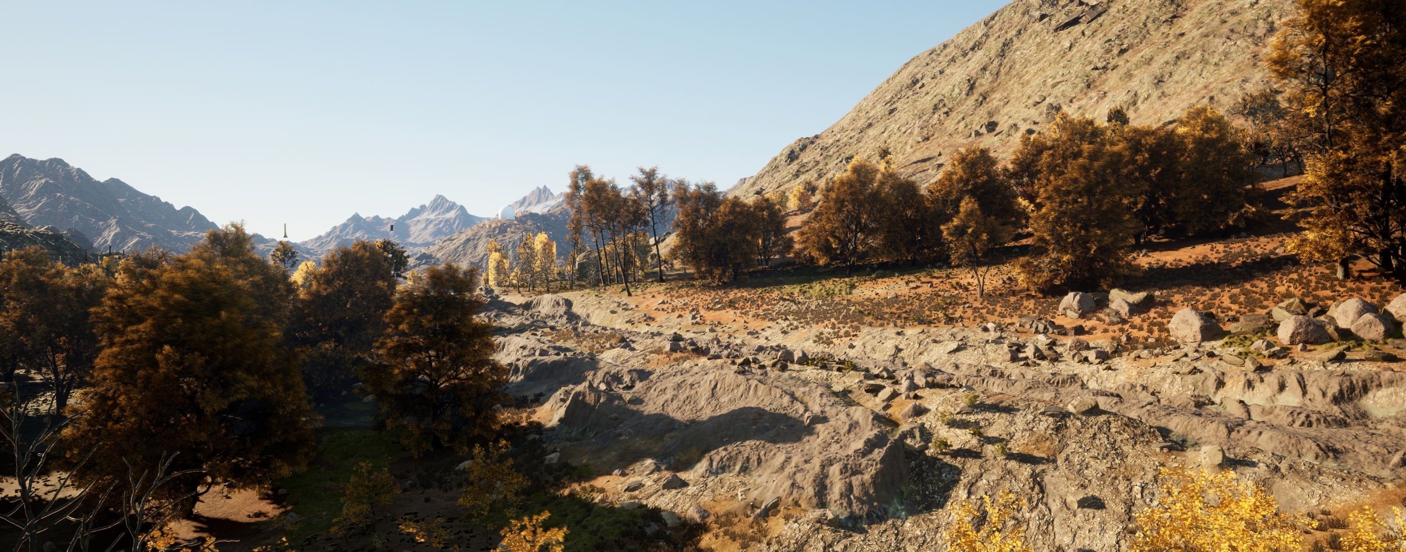
Also. I didn’t have the right moss
model, but I saw broccoli in the store, took a photo scan and added it to the project)

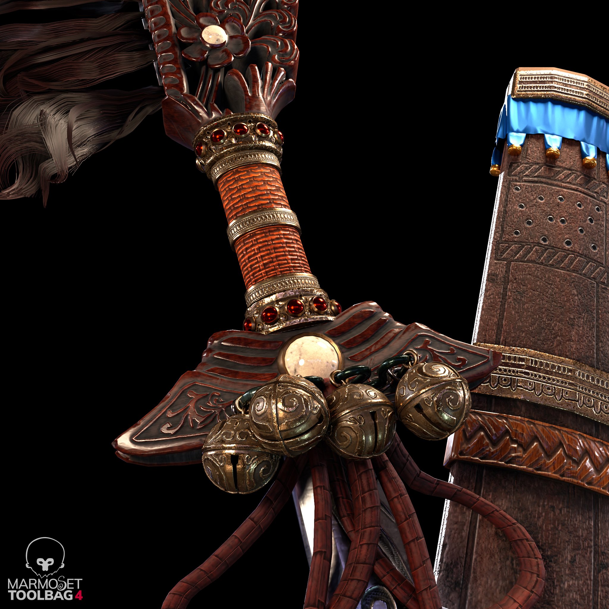
Tommy Shelby (Peaky Blinders)
Hi everyone,
This is a Tommy Shelby likeness I made during Pete Zoppi’s CGMA course. The first realistic character I ever made, pretty challenging but I had fun making it.
There is plenty of room for improvement, especially the hair. I used xgen core for the hair, but somehow I couldn’t get the exact hair style as him in Peaky Blinders. But I hope he’s still recognizable. After learning all the techniques, next project I will try to implement them into a real-time character, it should be fun!
Feel free to leave a comment or feedback. Thanks for viewing!
ArtStation: https://www.artstation.com/artwork/mDDyeZ
HDRIs are from: https://hdrihaven.com/hdris/
Softwares used: Maya, Mudbox, ZBrush, Arnold, Substance Painter, Marvelous Designer,Texturing XYZ, Photoshop


 Chung_Jui
Re: The Bi-Monthly Environment Art Challenge | May - June (78)
Hi everyone! So here's my final result. I got some of the dead trees from Quixel, along with the hanging vines and debris floating on the water. I'm really happy with how everything turned out and it was a lot of fun to work on. I hope you all like it too! I posted it on Artstation in case you want to view it there as well: https://www.artstation.com/artwork/G8VPvz


 Its0urFate