Best Of
Re: [WIP] Ghibli Kiki's delivery service, inspired enviroment UH Main project
The house and ground textures look great!
As for the flowers, one way to simplify the scene is to "summarize" them to form connected blocks of blooms like you've done now, at least in parts, but since many of the inflorescences are tall and thin spikes, that doesn't work too well in this context.
If you look at your reference, you'll see that there is very little optical overlap between blooms/infloresences and even individual plant cluster. The huge majority are separated visually, be it by greenery or other things, and even when shaded, that shading rarely overpowers the contrast to the respective background, unless the blooms themselves become background. One example of that would be the blooms behind the white flowers in the lower left corner. The yellow flowers basically become green, and the blue flowers melt into the background in a similar fashion (very little distance in color, value and saturation).
Additionally, there are fewer spikes, with some of them having individual forms and curves. Basically, the huge majority of blooms stands next to each other and the individual patches are different by shape, color and size, often all three, while on the right side of your render, they basically all have the same color and overlap heavily.
This is, of course, a very "2D" approach, and you'll have to decide how much you want to set up your scene for that one camera.
Other than that, you probably tried to get a dark foreground to frame the scene, which could work in principle if you lighten the background some more, but it's not how the original scene was set up, at least not to that degree. (You could try to play with the contrast of your reference a bit, though, as per how it was shown in the movie as d1ver pointed out.) Either way, in your scene, the background looks almost as dark as the foreground at the moment.
If you want to keep the dark foreground, you'll have to seperate the middle ground somehow and reducing the internal contrast of the blooms and leaves some more might help. Could maybe done with some kind of (fake) translucency/SSS or with post-processing like Eric showed (maybe with additional local adjustments).
You'll also want to be careful to not lose your path by covering it with flowers. It's a bit cliche, but the path is where the viewer can enter the image.
1 ·
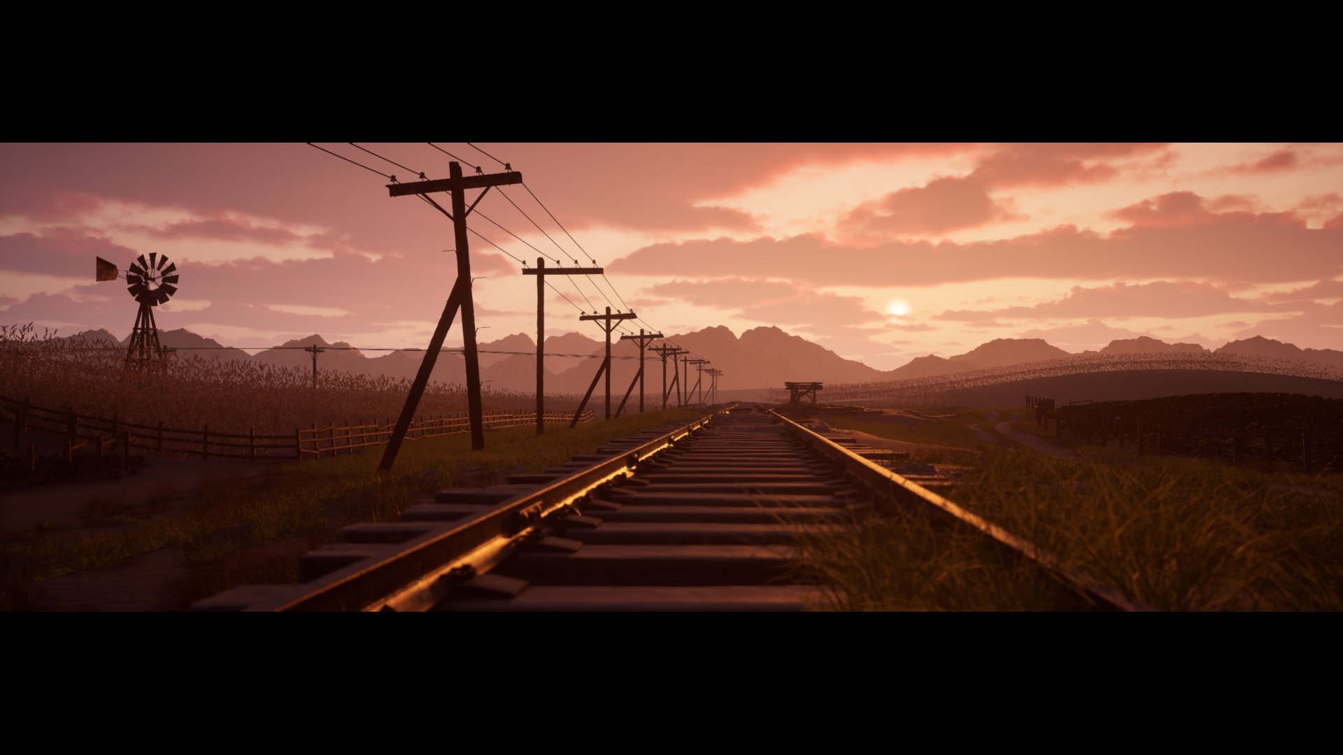
Re: 1900's Western Fields
Update: I'm calling this done! Just have to make some minor adjustments and add decals. I very proud the way this turned out, spent about a year on this project.


 AtomicArmy
1 ·
Re: The Bi-Monthly Environment Art Challenge | July - August (97)
hi thank you guys again for setting up another challenge, i absolutely love the style for all of these concepts.
im getting started on the hard surface challenge, ive recently had to relearn alot of things about this form of modelling and had to switch over to blender since its free.
ive just got a simple orthographic blockout, need to fix the goemetry and im dreading the materials and lighting

pt2 5/7/25

im getting started on the hard surface challenge, ive recently had to relearn alot of things about this form of modelling and had to switch over to blender since its free.
ive just got a simple orthographic blockout, need to fix the goemetry and im dreading the materials and lighting
pt2 5/7/25
5 ·
Re: Portfolio advice/feedback
Well you clearly are making guns! They look good to me as a non-expert in guns.
I find the thumbnails with Military Conflict Vietnam disruptive. It's nice to know they are in an actual game but the space the text takes is too much for me, especially compared to other similar thumbnails on Artstation. Also if you insist on it, make sure all the texts are the same spacing and size; the owen gun is different from the two others. Also I would make it so the thumbnails with text are all bunched together, right now the flare pistol is breaking them apart.
As for the choice of pieces, I'm not sure the bayonet, scope and the machete and sickle are as good/relevant as the others.
I think you could show some wireframes and texture sheets, especially for the assets that are in an actual game.
Finally, I went to your Artstation page (not the folio) and your banner is the knife, you have better images that you can put there now.
Hope this helps, good luck!")
Hope this helps, good luck!
 Grindy
1 ·
Primal Blade
I've just really wanted to try my hand at this type of creating models and texturing them for a very long time. It turned out to be quite difficult, especially regarding materials. I think that it was a good experience.
Please critique my work! I'd appreciate suggestions not only on what could be improved, but also, ideally, a possible path to that improvement.
https://www.artstation.com/artwork/Ezm5L4
Please critique my work! I'd appreciate suggestions not only on what could be improved, but also, ideally, a possible path to that improvement.
https://www.artstation.com/artwork/Ezm5L4
1 ·


Re: BRAWL2 [Environment] Landing Plaza, northoftherain
That makes me feel quite a bit better, thank you I'll do my best but stressing really is only going to make things worse now that I realize
 northoftherain
4 ·
Re: Sketchbook: Zetheros
The Automaton race is baked and in engine. It's the last race I'll create for now, excluding a secret sixth race planned that'll be revealed in a DLC or expansion far in the future. Future plans are a bunch of minor improvements across all races, defect check all races for baking issues, and take these base meshes to the next level by actually painting them in Substance; at the moment they only have Zbrush polypaint vertex colour. Afterwards - basic locomotion animation tree in UE5 & FACS facial animation system.


Have a great week!
 zetheros
3 ·
Re: [WIP] RED V-Raptor camera, Plasticity practice
Another 3 panels are ready.


Top grill was quite hard to make. However it was enjoyable.


Top grill was quite hard to make. However it was enjoyable.
 3d_legionary
5 ·
Re: AI Art, Good or Bad? A (hopefully) nuanced take on the subject.
RE: Using AI for feedback.
Writing feedback is it's own valuable art form and can also greatly help the person writing it. It helps you better understand how to articulate the "why" behind things and better train your eye. Some of the strongest periods of artistic growth I've had were when I was giving a ton of feedback to people here on Polycount. It's also a job that is becoming more common with people needing to give feedback to external vendors.
I think by offloading that sort of thing to AI it does yourself and the artistic community a huge disservice.
 Alemja
12 ·