Search
-
Insomniac Spiderman Retopo (Help)

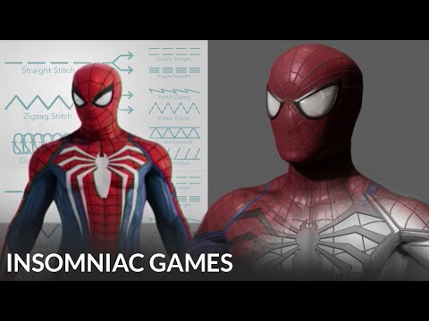 My question is very confusing, so I will do my best to word it. This is the Spider-Man model from Insomniac Games Marvel Spider-Man 2. The only model that is from Spider-Man 1 is the photo taken in Maya (blue wireframe). During the 2018 ZBrush Summit, the modeler for Spider-Man at the time (Leroy Chen) said that he cut the…
 -
Re: Typography I'm lost
Start by making a black and white version (as in two color). It forces you to be more creative and helps ensure your logo has good contrast and can be used in almost any situation. This is standard practice for graphic designers. You can also use one of the colors as negative space, which makes a great watermark. Plus flat… -
Re: Polycount Store lives again
 Using the Polycount ‘Greentooth’ Logo The ‘Greentooth’ Logo is Polycount’s unofficially official logo. That is, it is not ours but it is yours. It was created by our community and adopted by our community as the sole representation of the entire Polycount Community. As we see it, the Greentooth logo falls in to the…
 -
Merchandizing: Conflicts with Trademarks/Copyrites
![[MILES]](https://us.v-cdn.net/5021068/uploads/userpics/navatar16155_3.gif) I'm seeking some advice from those of you who have done a significant amount of contract work. I may have an opportunity to compete in the creation of a logo for a small university as one of several venders. The contract I would have to agree to basically says I'd need to create a minimum number of icons, fonts, and…
I'm seeking some advice from those of you who have done a significant amount of contract work. I may have an opportunity to compete in the creation of a logo for a small university as one of several venders. The contract I would have to agree to basically says I'd need to create a minimum number of icons, fonts, and… -
Gresley J50 Locomtoive
I'm after some texturing feedback on a locomotive I've built. I'm mostly after texture techniques which I could use to improve the texturing on the loco. I'm quite happy with the texturing on the exterior model, however in the cab model is looking very...Unrealistic. Something just isn't right and it's really bothering me.… -
Re: Manhole Cover
 If this was to be a decal type overlay you would want to include the slight depression around the outer edge and possibly the mossy bits too. Alternatively if the center logo didn't matter, you cut the texture in half or quarter it and still keep the same pixel density. 8 tris. 9 tris if you map the logo uniquely. 4 tris.…
 -
Re: HAI GUISE
 Loo loo loo, I've got some apples, Loo loo loo, You've got some too. Loo loo loo, let's make some applesauce... take off our clothes and Loo loo loo.
 -
Re: The Last Bastion Project - Feedback
 Going to try to flex my graphic design muscles here: Rules of thumb you should abide by generally: Logos should not be using mroe than two fonts, and ideally should only be using one. Crystals are the highest value, and brightest hue, of the logo and immediately distracts my attention. Either incorporate somehow into the…
 -
Re: Building my 3D Rig...
 That sounds sensible, though I'd go with 8gigs for the dual channel support. I'd say no, unless you go with a new CPU as well, which puts you back in the new system category vs upgrade. Usually people will get the best CPU/mobo/ram they can and reuse the rest. You're looking at doing the opposite. The slowest ram for the…
 -
Looking for actual Critiques

 Hello. I'm looking for feedback, and hopefully I've finally come to the right place. This is the cover I drew for my 1k-page book: Now the first (and at times the only) question I tend to get is, "What is that unreadable graphic at the top of the image?" That's the word "Duality" spelled as a death metal logo. The logo's…
>4623 results