The BRAWL² Tournament Challenge has been announced!
It starts May 12, and ends Sept 12. Let's see what you got!
https://polycount.com/discussion/237047/the-brawl²-tournament
It starts May 12, and ends Sept 12. Let's see what you got!
https://polycount.com/discussion/237047/the-brawl²-tournament
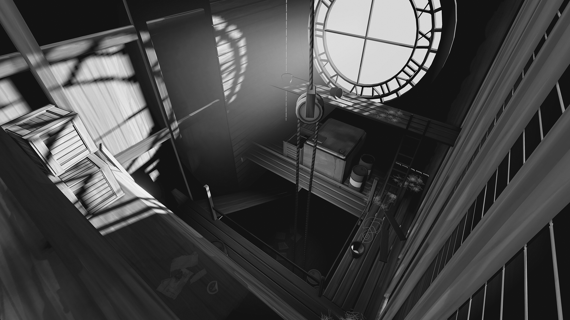
[UDK] The Noire Clocktower Environment
Hey,
So it's been long due for me to make another personal environment, at least posting one. I decided to step out of my comfort zone and do something more in the lines of Team Fortress 2 and Sin City.
I came across this awesome concept, I don't plan on mimicking 100% of the concept, but it has a lot of things I like and I plan on implementing/keeping.(I have to look for the artist, I'll edit this when I get his/her name):

Here is my really rough and early progress so far and don't mind the camera view, it's a bit off:

Goals:
Things to do (as of 9/06/13):
So it's been long due for me to make another personal environment, at least posting one. I decided to step out of my comfort zone and do something more in the lines of Team Fortress 2 and Sin City.
I came across this awesome concept, I don't plan on mimicking 100% of the concept, but it has a lot of things I like and I plan on implementing/keeping.(I have to look for the artist, I'll edit this when I get his/her name):

Here is my really rough and early progress so far and don't mind the camera view, it's a bit off:

Goals:
- Create and atmospheric piece
- Get better at shaders
- Practice Hand-painting textures (regardless if they will be black & white)
- Maintain a consistent art style
Things to do (as of 9/06/13):
- Add some more props
- Fix some props that I already made
- Tweak lightmaps
- Add minor color, I intend to have the barrels red
- Work on the clock section

Replies
Update:
9/06/13
Looks interesting, subscribed to looking forward how it's evolved. I think the atmoshere/ambient light will do the main work. It's like greenish or something like that.
One thing: the spider webs (my PRO enlgish, sorry
I'll be following this!
EDIT: I agree about the city, I personally think it's a bit distracting at the moment, but perhaps the DoF will help. Also think you should give the barrels a brighter red, to make them pop even more.
Thanks for the crits guys.
@Mikhga: Thanks! I added some green to it, hopefully it's better now?
@Mr Significant: I got rid of it , I totally agree with you about it. Great suggestions on the spiderwebs, I'll take those on next update.
Will be following this!