SketchBook: cholden
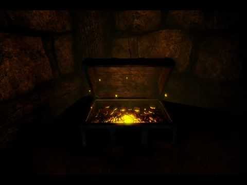
Dungeon Escape is a first person adventure UDK level. The goal is escape, there is hidden treasure and speed bonuses.
DOWNLOAD
http://www.indiedb.com/games/dungeon-escape/downloads/dungeon-escape
VIDEO
[ame=" https://www.youtube.com/watch?v=XLNq8YKmpF0"]Dungeon Escape! UDK Level (Released!) - YouTube[/ame]
SCREENSHOTS


*original post*
Feedback appreciated.
I wanted to play more with UT levels. Making quick layout tests in ut2k4 got serious after tossed in some unused art from a previous project. The main inspirations from this is Metroid Prime Hunters, Prey and classic Quake deathmatch levels.
Here's a construction shot showing the layout and the texture (single 1024x1024)
http://chrisholden.net/dm01_07.jpg
These are, right to left, max with normals versus ut2k4 game shots with a single diffuse. Most of this is tossed together, needs cleanup, ceiling in main area and detail.
http://chrisholden.net/dm01_05.jpg
The idea is to eventually port this all over the ut3. More of a test than anything too serious. Overall, this inspired me to start making some more interesting designs in UT. I'll see what I can come up with to post here.
DOWNLOAD
http://www.indiedb.com/games/dungeon-escape/downloads/dungeon-escape
VIDEO
[ame="
 https://www.youtube.com/watch?v=XLNq8YKmpF0"]Dungeon Escape! UDK Level (Released!) - YouTube[/ame]
SCREENSHOTS


*original post*
Feedback appreciated.
I wanted to play more with UT levels. Making quick layout tests in ut2k4 got serious after tossed in some unused art from a previous project. The main inspirations from this is Metroid Prime Hunters, Prey and classic Quake deathmatch levels.
Here's a construction shot showing the layout and the texture (single 1024x1024)
http://chrisholden.net/dm01_07.jpg
These are, right to left, max with normals versus ut2k4 game shots with a single diffuse. Most of this is tossed together, needs cleanup, ceiling in main area and detail.
http://chrisholden.net/dm01_05.jpg
The idea is to eventually port this all over the ut3. More of a test than anything too serious. Overall, this inspired me to start making some more interesting designs in UT. I'll see what I can come up with to post here.
Replies
At a glance the room is confusing due to the textures all looking pretty similar.
Alex
Visibility Study
Visibility refers to how much the player can see. Games have limitations to how much can be seen on screen at once, and you will have to build around it creatively to look as detailed as possible without a significant drop to frame rate. It can also be used purely artistically for a grand reveal such as exiting a tunnel into a beautiful mountain scene. Casino layouts are often a warped and distorted maze to keep the customers in as long as possible.
A few classic examples of blocking visibility:
The S-Hall is using an "S" shape between two rooms. This is the most basic visibility break between two rooms. The S hall has two close relatives, the Y-hall and U-hall.
The I-Hall is essentially breaking two rooms with a big letter "i". It is a great because it always works and gives the player the illusion of choice as well as double the play area as an S-Hall.
There's limitless ideas from there just be creative with your visibility.
http://chrisholden.net/tutor/ds_vis01.jpg
Deathmatch Level Design Study
Man to man combat based is reality takes place an arena type environment such as a boxing ring. An arena can be any large open area. Most levels are a series of connected arenas with the total number of arenas based on number of players or events to happen within that level. These are the fun rooms, where the big things happen.
Things that help make a level fun:
A room with at least two floors. The multiple floors allow for vertical combat Snipe your enemies from above or stalk them from below.
-Three ways to get between those floors. Be it stairs, ramp, elevator, jump pad or teleporter, the player must be able to navigate the room quickly and smoothly.
-Three exits is a great starting place for a fun deathmatch level. Three exits ensures an escape plan.
-Columns and propping. What better to hide behind in a quick situation, and make the level appear strong and supported? Crates is the classic prop to hide behind. Be creative and build unique objects that better tell the story of the level.
Here's an example room featuring those concepts.
http://chrisholden.net/tutor/ds_dm01.jpg
TIP: Build a human ref. It can even be a box, as long as it's the scale of the player character. This will help in judging the size and shape of things.
A larger, second room.
http://chrisholden.net/tutor/ds_dm02.jpg
Putting the two together by creating fun, small rooms out of the visibility halls for final result.
http://chrisholden.net/tutor/ds_dm04.jpg
Download final version in .MAX 8 and .3DS format
http://chrisholden.net/tutor/room01.rar
Test early, test often! The more that's right from the start, the less you have to change in the end.
http://chrisholden.net/tutor/ds_dm05.jpg
This is only the basic gist of deathmatch level design. The best ideas come from testing and designing the most fun environment to suit your game play.
More on this later...
Keep it up, mate.
-caseyjones
thx!
Originally, the idea called for three bridges. They span across a room in a curved nature for multiple elevations using these circular shapes to make what appears to be an eye. The back sides of the walls were simply a walkway to allow the player to run from ground level to the top bridge.
http://chrisholden.net/wacky01.jpg
The downside to a gimmick layout is the game play might not be that fun. So I spent a lot of time testing new additions. I added ramps to the back for another way to the top, a lowered center area (creating another bridge) and a few strategic visibility blockers for game play.
http://chrisholden.net/wacky02.jpg
From there I started pouring on detail. Again for this I started with new details, but then scavenged an older, unfinished level. My plan was to simply go detail crazy until I liked it, then break it up into modular chunks I can bake down to low poly assets and recompile into a playable game level.
http://chrisholden.net/wacky03.jpg
Here's a quick color composition I doodled with
I'm still nailing down the main detail in the back area, once that's complete, I'll be ready to move on to making everything modular.
Very interesting
I think i am actually learning from this.
I too lovin your sketchbook cause its inspiring and knowledgeable at the same time!
It would definitely be something new in terms of everyday environments and makes you think about the room in more imaginative ways.
What is this room designed around? fusion reactor, robot building room? etc. Looks nice tho.
Newer version with night lighting test and ground transition rocks/dirt.
http://chrisholden.net/blockhouse_wip04.jpg
I'll post some source files and maybe some steps once I'm happier with how it's coming together.
I agree with Adam about the straw roof it's looking plastic now.
Is that medieval building made from individual bricks? How many stones make up one lego piece? My guess is around 3 or maybe 5? In an interlocking pattern? I'm looking for texture/shape repeats but I can't seem to find any!
2400 triangles, 1x128x128 texture, unoptimized.wireframe, based on this original UT3 screenshot reference.
Final Scene
Next, started helping out dummeh with his game.
The blocked out ship deck, and a few close-ups. All this will change as we nail the look in game. No real textures used yet.
http://chrisholden.net/deck05_01.jpg
Finally, I was ridiculously inspired by Kevin's pimp, I went back to my biotech themed level and made a column over the weekend. I'll give it a unique top, a mudbox pass for the organics, etc.
I'm sorry but I can't allow anything that looks better than what's in many games today to be called a doodle
I've laid out a 2-8 player DM level, and am shifting focus to art. Here's a preview of a couple normal map tests for walkways.
http://chrisholden.net/walkway04.jpg
Very inspiring indeed.
maintain current workflow for all modular pieces (in game with basic normal and "blank" diffuse/spec).
Once all materials are previewable in game, finalize materials
pieces currently in game
walkways straight, 90-turn, 3-way, 4-way, centerpiece, column and column base
pieces to be made:
walkway support structure
Noticable in the top image, the walkways appear thin and weak. This will provide strength and silhoutte
center support pillar
currently represented as a cylindar in the top image. Something glowy and interesting.
inclined walkway
to replace stairs
rebuild old entryways
built at lower spec, in serious need of love.
wall trims, optional column top, unique pieces, and anything that stands out wanting.
Lots more to come, I'll try to keep regular updates.
http://chrisholden.net/bd01.jpg
Btw Cholden, TOO MUCH BLACK!
http://chrisholden.net/bdtrims01.jpg
Edit: Lulz
http://chrisholden.net/bio_arch02.jpg
http://chrisholden.net/bd02.jpg
Here's some more stuff I've been tinkering around with
Awesome work this is going into the inspiration folder. Just a question about the highpoly models if you dont mind how do you render them out? what lighting set-up?