Best Of
Re: The Bi-Monthly Environment Art Challenge | January - February (100)
Hello back again! I progressed a bit on the project, I've only doing simple changes and additions every few days. I'm nearing the end, only some things need to be textured. As well as add some small details, such as litter, cardboard, and posters. Here's the gallery of previous renders: https://i.imgur.com/cjcfSLd.jpeg . I'll probably do the prop challenge in the next one, I need to get the hang of Substance Painter. 


3 ·
Re: What Are You Working On? (3D) 2026
While I wait to renew my MD subscription to work on cloth simulations, I'm chipping away at my character model's accessories, starting with her book!
Link to thread: https://polycount.com/discussion/238154/wip-game-ready-3d-character-sabriel-fanart
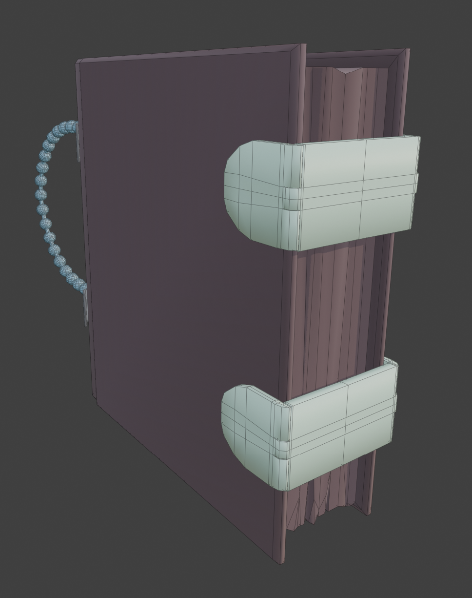
Link to thread: https://polycount.com/discussion/238154/wip-game-ready-3d-character-sabriel-fanart


 Djenna
3 ·
Re: The Bi-Monthly Environment Art Challenge | January - February (100)
Congrats @ThomCorfield looking good 
To push it further, could break up straight edges and detail silhouettes. Looking at pillars, shape could be widened towards bottom? Some grouts/ texture details read a bit too faint in my opinion and as a result, the structure visually becomes one continuous piece. Lighting-wise, could try get in some more diffused fill-light, countering direction of the main light source?
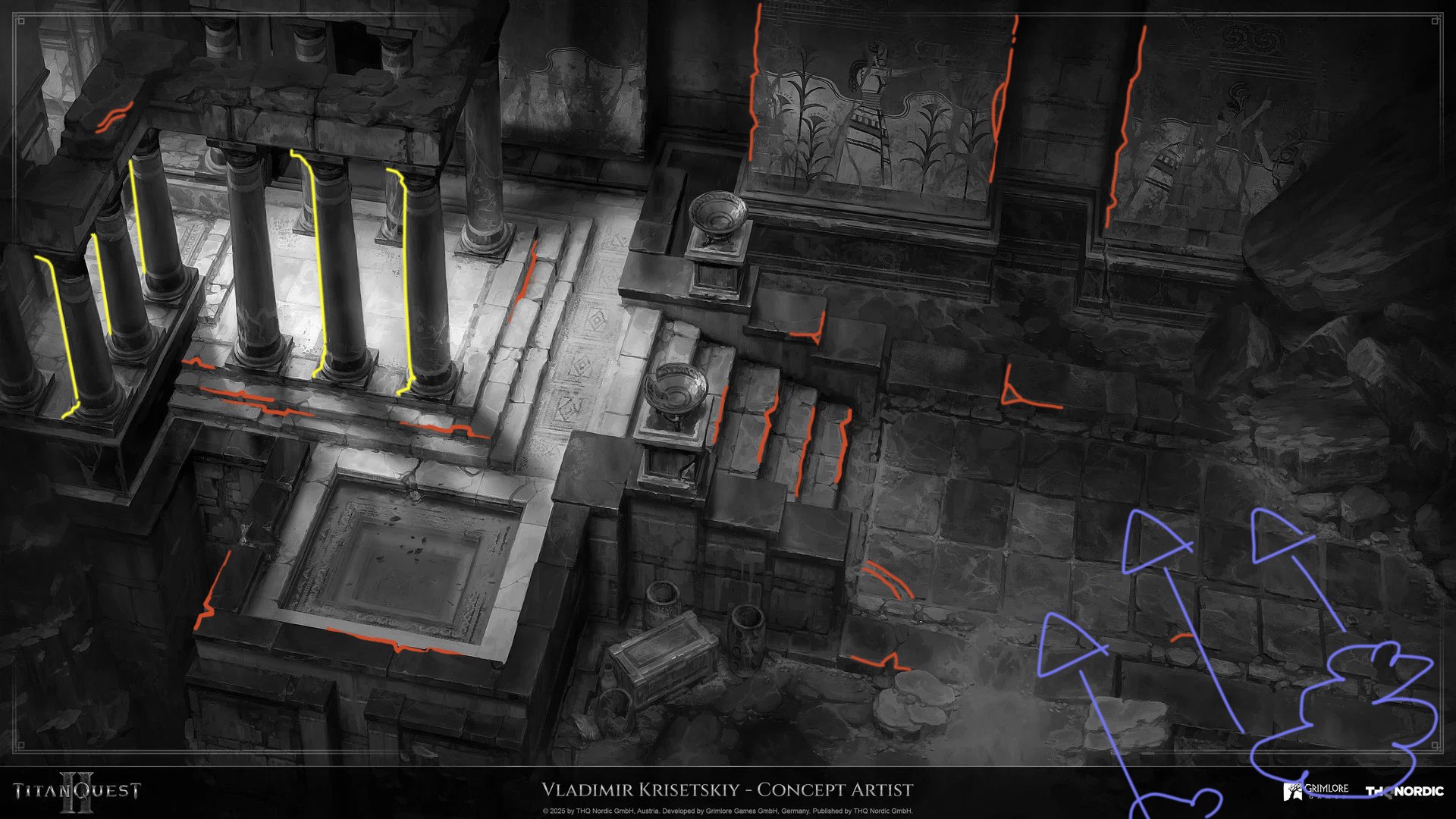
General questions: What software/ engine did you use for rendering? Which parts did you end up sculpting? Any use of trim sheets? Any special shaders/ materials being used?
Keep it up!
To push it further, could break up straight edges and detail silhouettes. Looking at pillars, shape could be widened towards bottom? Some grouts/ texture details read a bit too faint in my opinion and as a result, the structure visually becomes one continuous piece. Lighting-wise, could try get in some more diffused fill-light, countering direction of the main light source?

General questions: What software/ engine did you use for rendering? Which parts did you end up sculpting? Any use of trim sheets? Any special shaders/ materials being used?
Keep it up!
 Fabi_G
3 ·
Re: The Bi-Monthly Environment Art Challenge | January - February (100)
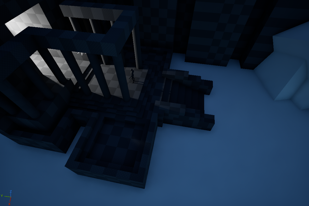
Hello everybody! I'm excited to give this challenge a go It's my first one here is I'll try my best. Here is my first blockout.
 StarbirdUlt
5 ·
Re: How to fix this bake error?
This topic might help you: Understanding averaged normals and ray projection/Who put waviness in my normal map?
 Eric Chadwick
3 ·
mgtools - blender power tools
Hey.
This pack of tools originates from a toolset I wrote for 3ds max nearly 20 years ago which I converted to blender when I switched on version 2.8.
They where used in a few productions so far and shaped around typical needs to streamline processes blender does not very good.
There might be still some incompatibilities with blender 5 - so If you find something let me know.
I could have posted them already way earlier but was waiting for the moment I got the readme set up.
Today is this glorious day!
Check the page for some images and feature overview.
https://github.com/mctrollin/mgto-tools-4-blender
Cheers!
 rollin
8 ·
Re: What Are You Working On? (3D) 2026
Starting a new character, and her little smelly sidekick she found in a dungeon somewhere.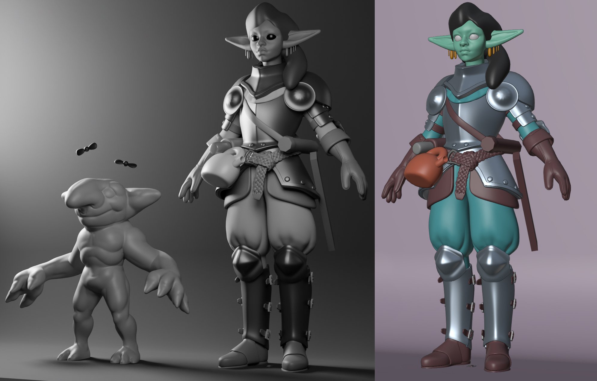

3 ·
Lords of the Fallen - Pieta, Realtime
Hi everyone! I finally finished my Lords of the Fallen project. Hope you like it!
For more information:
ArtStation - Lords of the Fallen - Pieta, Realtime [Fan Art], Hoscorton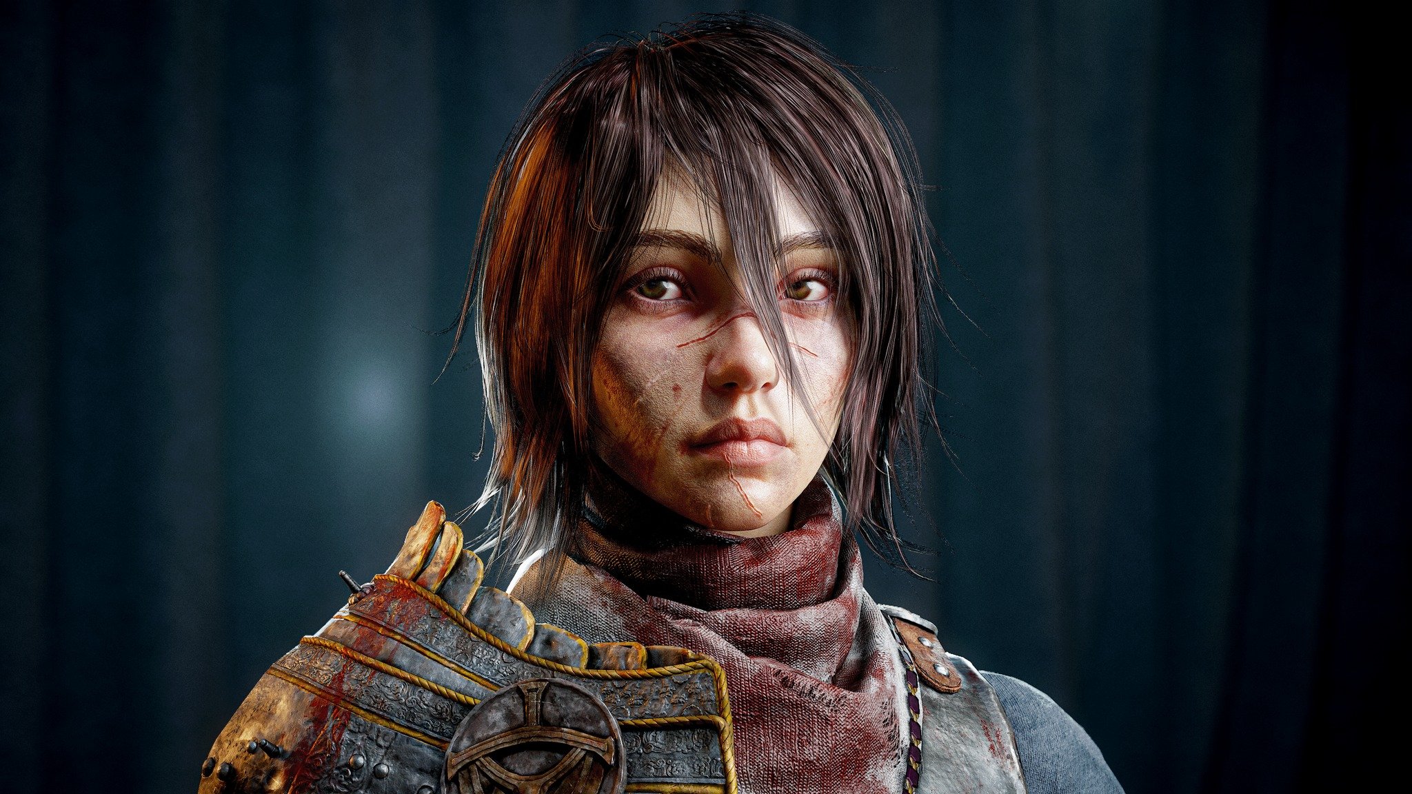
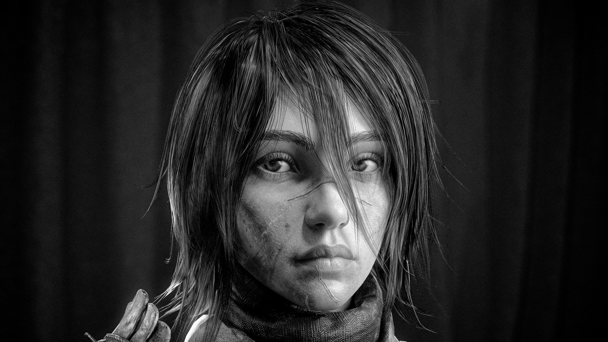
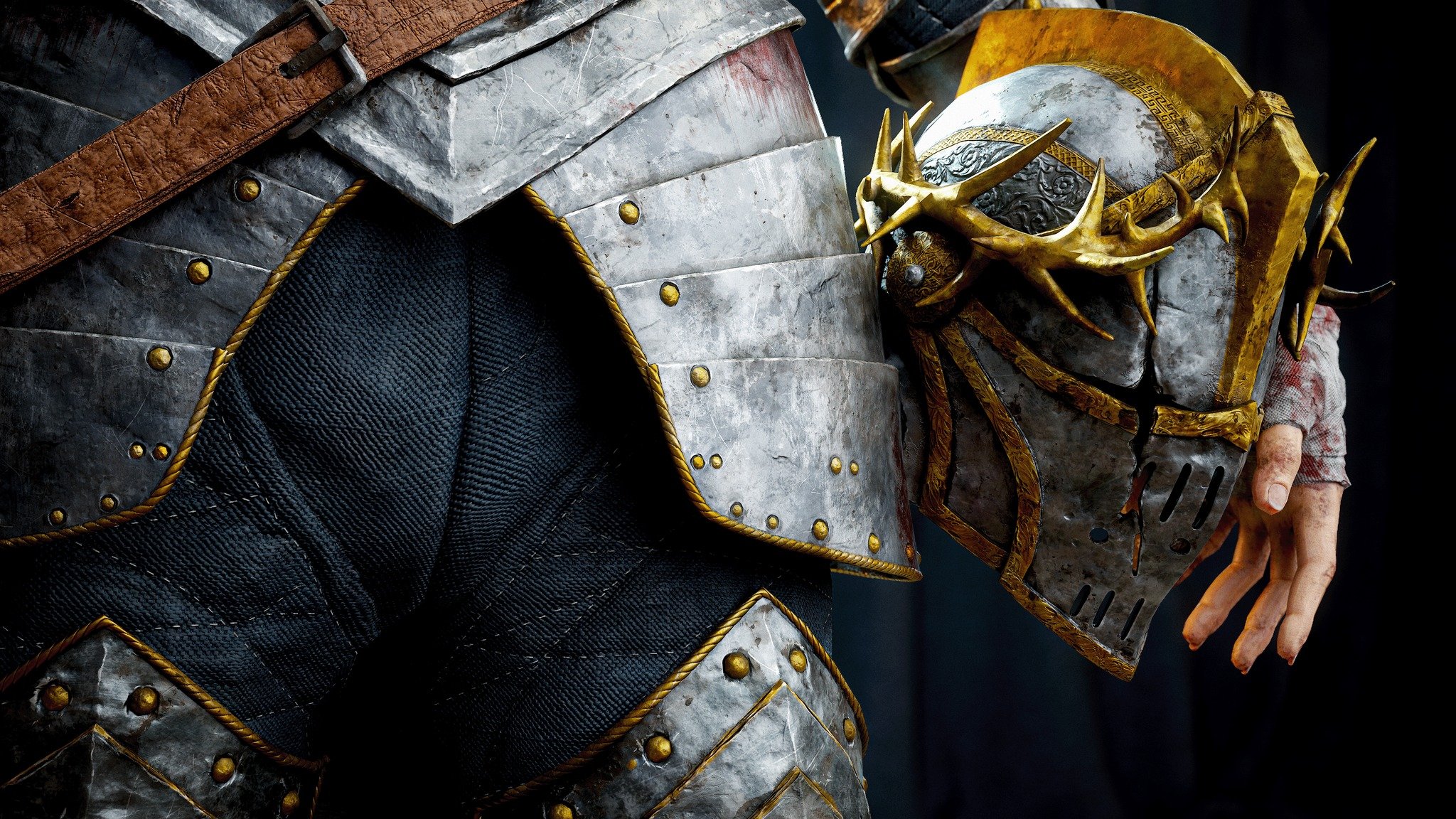
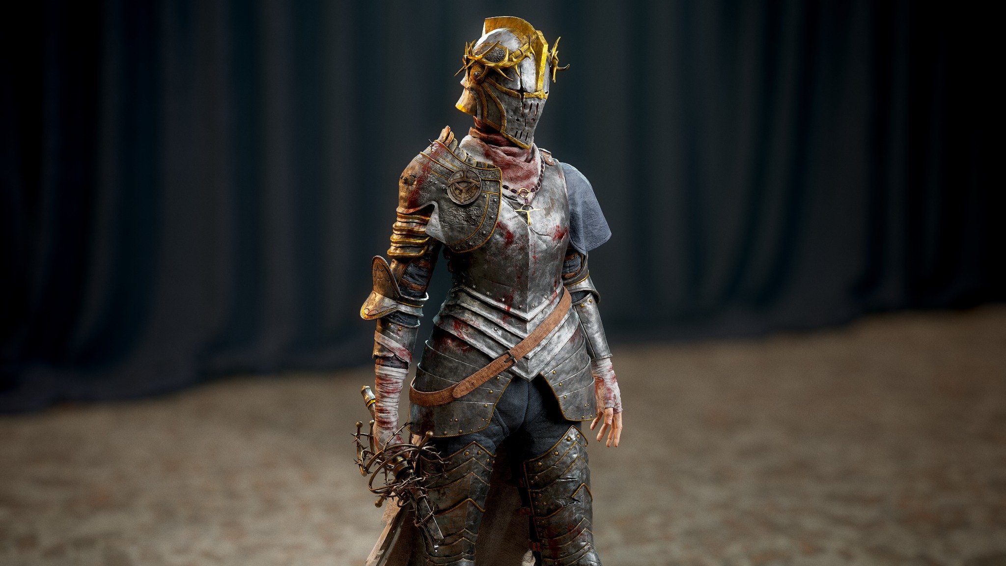
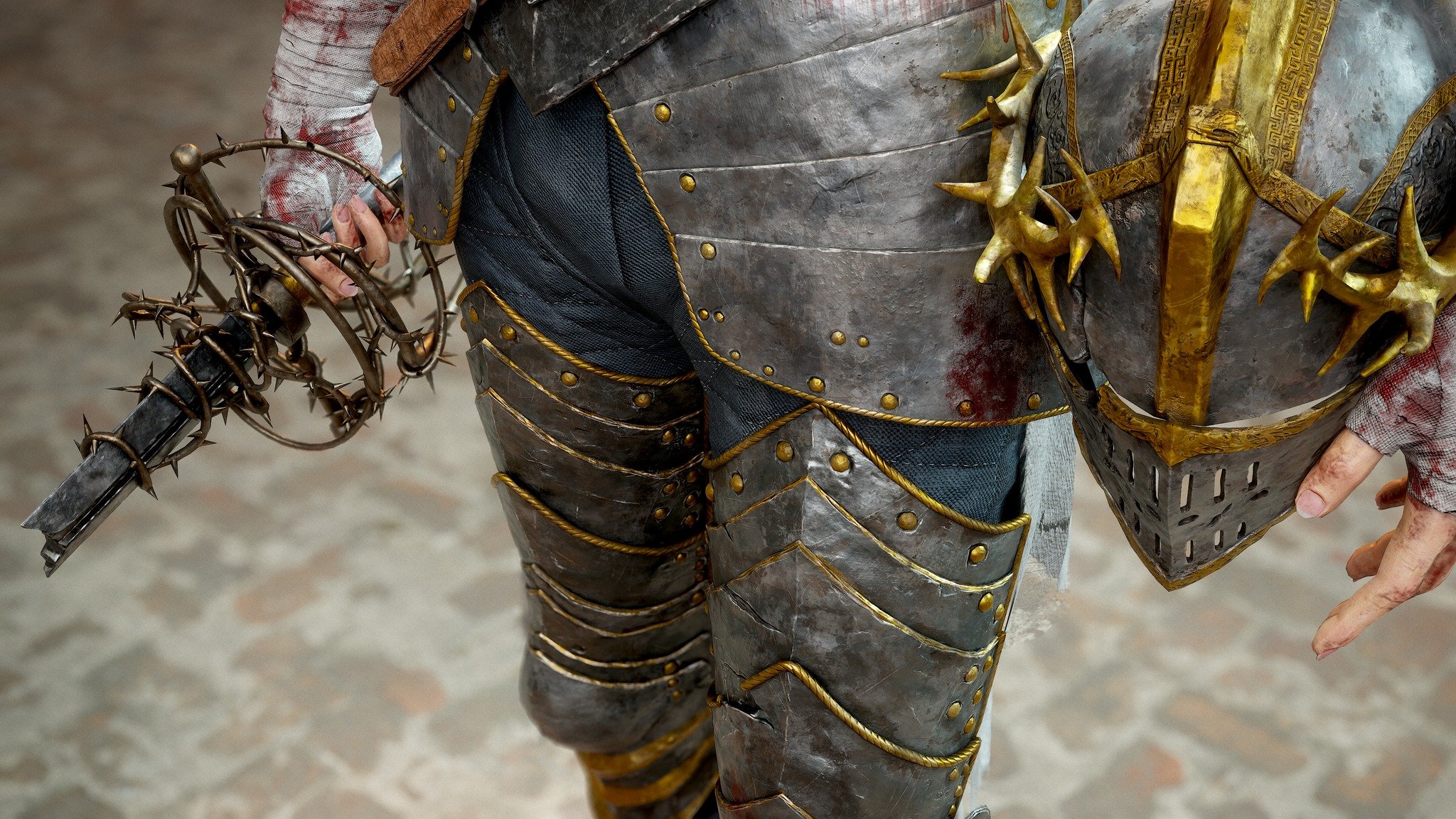
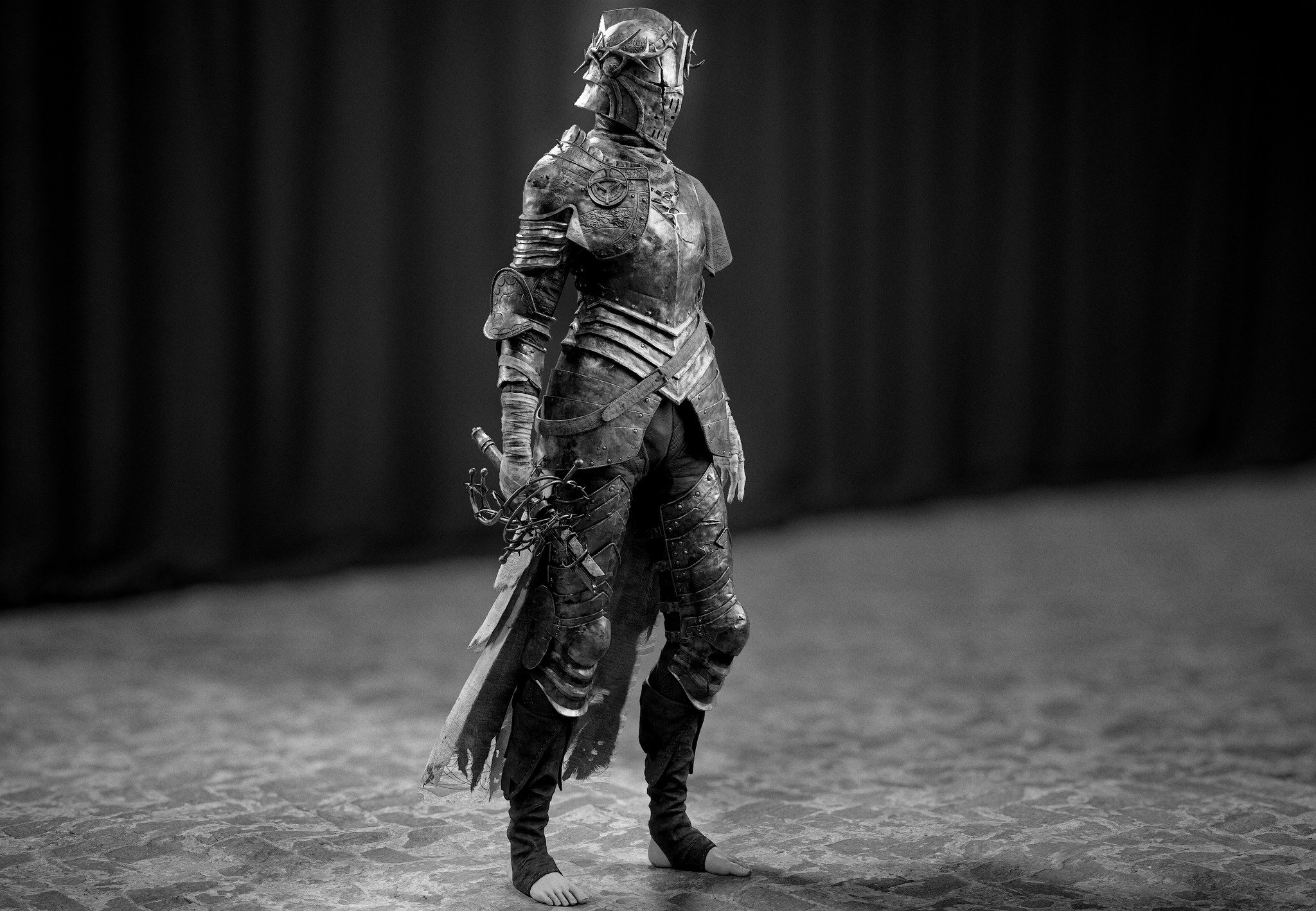
For more information:
ArtStation - Lords of the Fallen - Pieta, Realtime [Fan Art], Hoscorton


 jhonnyblade
3 ·
Re: The Bi-Monthly Environment Art Challenge | November - December (99)
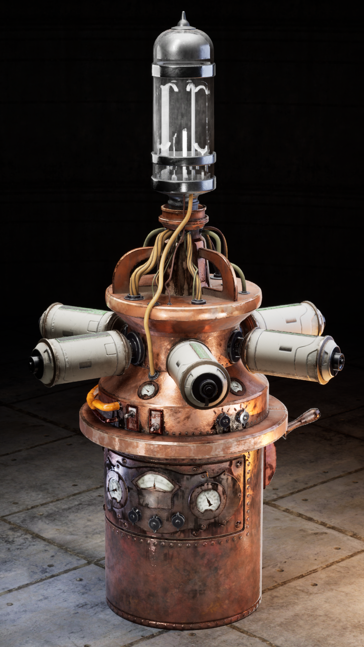 got some time last few days to model what's left, texturing, trying to get a good setup for render in unreal, i also did the shaders for it, for cans to switch from green to blue with fade and such
i made it into a high poly, the wires were kinda looking bad when its low, and baking the details didn't feel good either, so i kept the high as it is.
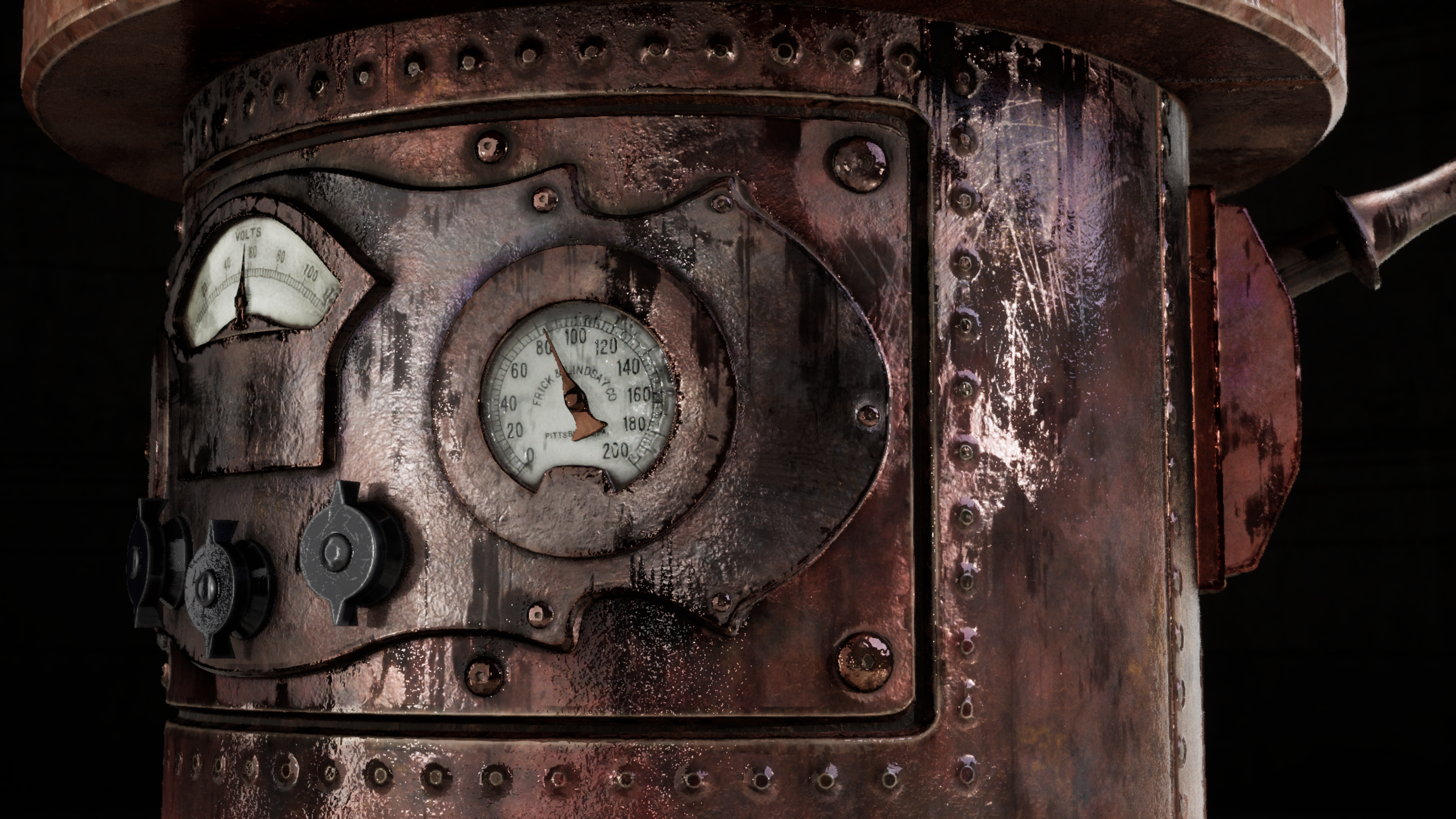
to do: guage meter to spin around with noise like it can't detect the numbers, adjust lighting for close shots, and particles for the light above like smoke > into sparts > into lit
[for some reason it fail to upload 5 scale render, this is 3 scale, glass shader on can's dosen't show well from this distance.]
the gauge above dosen't show as much but this is closer, still adjusting ligthing for close up shots.
5 ·
 https://www.youtube.com/watch?v=lI2iMNY6M4Y