Best Of

Re: The Bi-Monthly Environment Art Challenge | January - February (82)
@Fronk3D Congrats and welcome to Polycount! I probably should also learn Blender, and make the legendary Blender Donut XD.
Regarding your rough blockout, it might be a bit too wide overall. Your wooden posts can also either be too wide or just right depending on which wooden partition you look at, but at least foreground-wise the wooden partition looks closer to 2x4 than square ends. You can go for the best of both worlds which is to make the top a square cross-section and just taper it down into a 2x4 cross-section once you get to the curved section. The plus sign crank on the side of the Garment Factory Building also doesn't look like it has additional bits between the Plus-Handles and it's just solid 90-degree angles (though logic-wise your version definitely makes more sense.)
Personally, I love the idea of a sculpting pass, I think it'll really add great detail to the model that will make it look very fun.
Also from what I've seen people just add new posts to the thread as they make progress.
SIDE-BY-SIDE (ISOMETRIC VIEW)

PERSPECTIVE VIEW

It took me a while to find this thread cause it wasn't pinned, but here I am on my first official Polycount Bi-monthly Environment Art Challenge! (I did Nov-Dec 2022 kind of on time, but I didn't start until around Dec 28th so decided against posting) I'm tackling the Stylized Prop first, but since it's a relatively simple one this time around, I might also do either the Hard Surface Prop or Environment depending on how much time I have especially since I'm working on 3 other sets of props and 1 room environment right now 🤪.
Here's what I got so far after starting today! I'm not 100% sold on my proportions, but I don't think it'll change much from what it is currently...maybe. In hindsight, as I'm posting this message, I think I actually made my "loom" angled fabric angle too sharp as well as the top of the frame beams too slim. I also need to increase the size of my bucket...and yes I did make my camera into an isometric camera for the side-by-side just so I can judge the proportions correctly (Very useful for stylized props since I see them come in isometric a lot of the time). Would love to get feedback on what else looks wonky (please ignore the missing clothes they'll be there in the next pass).
Also for the stylized prop is it supposed to be low poly?
 AdePar
[WIP] Cyberpunk Character
You can fins the past wips here:https://polycount.com/discussion/167362/sketchbook-luiz-carvalho#latest


 LuizHD
Re: How The F*#% Do I Model This? - Reply for help with specific shapes - (Post attempt before asking)
this is mostly for hard-surface artist to post there issue.
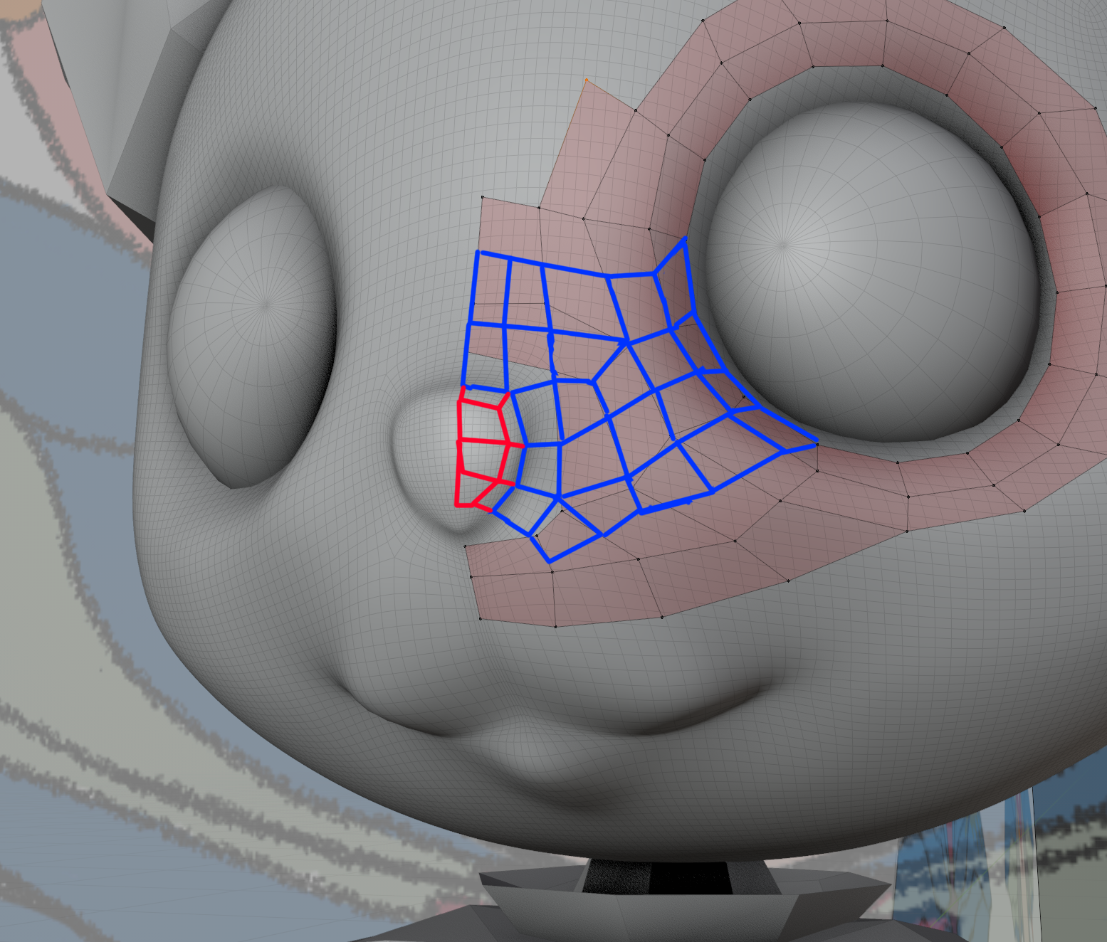
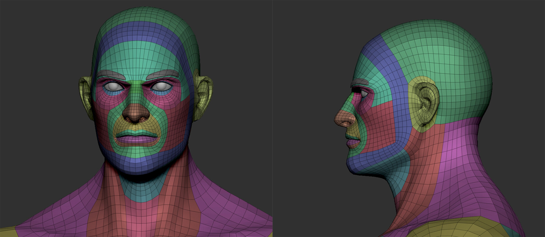
however, I think the questions here should be, will it deform? will it animate? if not, is it OK to use triangles there? also remember that you can google for character topology to see how other artist have done them.
My take away is that the topology gets narrower towards the nose.
So it could help not to have that big of a gap between face edges. Like your overpaint.
Sorry for any character artist out there if I butchered this!


 wirrexx
Re: Show your hand painted stuff, pls!
Hi, it my personal project "Dreadlord" for handpaint lvl up, I want share this art to get community's attention, feedback and get your like's :)
https://www.artstation.com/artwork/lRognk
Thanks for your watching :)

 Threegun_d
Lifeguard Tower
Hello, I'd like to show you this images. It was my old project that I finally finished, hope you will like it.

And some additional info. Substance Painter viewport:

Other side:

I tried to make it looks like it was taken on a real camera, here is some "close-ups":


The most important part of the image:

Timelapse:

Wave simulation. It took over 30 hours to calculate it:
 rocketjump4d
Re: LOW-POLY ART
 m.roanhaus
Re: Lifeguard Tower
Thank you very much guys! :D
satforce, special for you I updated the video, now it's full hd lol. And with all the warmth of my heart I made this couple of renders.
Unfortunately, the waves are barely visible from the original position. They're look much better from the top.

 rocketjump4d
Re: The Bi-Monthly Environment Art Challenge | November - December (81)
@Kruskebunken Looks good, I think that adjustment really helped make it pop and feel more connected with the chair frame. I even notice a subtle edge highlight on the seat I didn't see before,
@YairMorr I really dig the set and atmosphere you setup for the scene. I think the change of removing the fog from the foreground now gives a clearer view of that interesting surface detail you have going on, especially on the fences. One suggestion I have for the future is push the weight of the sandbags more. I can see you already have that going on, so maybe it's just needs a bit more squash especially to the stacked ones. Nice work!
@pep_mepla Good job on the modeling. That's going to be a fun texturing project if you plan to revisit it.
@Pinkfox @Fabi_G The post office is my favourite one out of all of them, and I was glad to see someone take that on, Fabi_G you did a nice job on it, although I don't see the post anymore, maybe my webpage is bugged out.
--
I wanted to push through with the texturing for the guard tower to get something to post here for feedback. I have about 90% of the sculpts done for the other parts, and hopefully the texturing will go faster now that I've figured out a lot of the process. Over the next week (depending on work) I plan to get everything textured and in engine for a simple scene, with some damage added through decals. When it's complete I'd like to post a final update here if it's allowed, otherwise I'll have it up on my portfolio page if anyone's interested.
I appreciate any feedback as I want to improve the tower and also nail the other parts of the scene. One issue I'm having is getting caught up in over-detailing so I would like to refine the process and increase my speed.
Thanks to everyone for the feedback so far, and thanks to Pinkfox for setting these challenges up.
Happy New Year everyone!


 AD_3D
AD_3D
Re: The Bi-Monthly Environment Art Challenge | November - December (81)
@AD_3D that tower is beautiful work! I love the extra details you added like the segmenting on the bottom frame and the wood detail on the windowpane (I thought that was metal lol). The cracks look great as well! I've got just one suggestion regarding the main damage on the front wall - the inner border (marked green) is a bit too round. Considering the broken shape in other areas it stands out a bit. Other than that the details are amazing.

 YairMorr