Best Of
Re: Sketchbook: Frank Polygon
Subdivision sketch: soft hard surface.
This write-up is a brief look at using basic modeling operations to create a base mesh for stiffer types of soft goods. Complex folds and detailed wrinkles can be added to the base mesh using textile specific sculpting and simulation tools but the tradeoff is these processes tend to require a fairly dense mesh.
Simple fabric details, often found on smaller, less complex parts of some hard surface models, can also be added to the base mesh by using some creative subdivision modeling techniques. The details may be a bit softer with this method but the simplified mesh tends to use a lot less geometry and the surface can still be detailed later with fabric specific tools.
Modeling fabric products with a subdivision only approach does have some significant limitations but can still be an efficient way to create simpler shapes. Certain types of stiff fabrics like foam, leather, plastic, etc. tend to be used for more utilitarian or geometric designs and often have less pronounced fold details. Below is a preview of what can be achieved by making some quick changes to the topology of a simple base mesh.
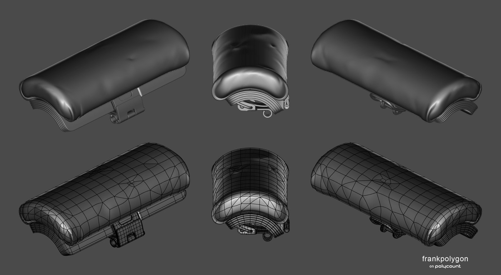
Starting with hard surface shapes, that are already well defined, will help establish a sense of scale and proportion for the fabric parts that are attached to the rest of the model. The underlying hard surface components can be created using basic modeling operations like solidify, bevel, loop cut, etc.

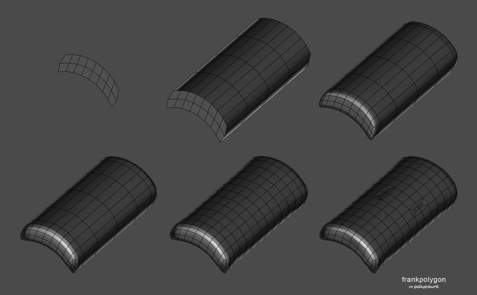
Blocking out the fabric parts is fairly straightforward. Start by establishing the basic topology flow around the shape's profile. Extrude and add loop cuts to create a relatively consistent quad grid. Enable subdivision preview and adjust individual edge segments to form the basic shapes along the surface of the mesh. Create additional geometry to support complex surface features by using inset or loop cut operations and continue adjusting the shapes to match the references.
For softer fabrics, the quad grid mesh produced during the block out can be used as a base for sculpting or simulating fine details.

For stiffer fabrics, it's possible to create minor creases and ripples by triangulating sections of the mesh then randomly selecting individual edges and moving them into or away from the the surrounding surface. Dissolving individual vertices or edges and redirecting adjacent loops will also help produce subtle folds and wrinkles. Tools that are able to make random selections and move geometry relative to the surface normals can make this a fairly quick process.

The example below shows the final base mesh and subdivision previews. A few more details have been added by triangulating other sections and moving some of the new edges away from the existing surface. While it is possible to continue adding details by sculpting in high frequency details like micro folds, pores, weaves, patterns, etc. adding those types of micro details with texture overlays tends to be a bit more flexible. For this type of heavy fabric, the unsubdivided base mesh can also be used as the low poly model. Which can help save a bit of extra time.

Recap:
Applications like Blender, Marvelous Designer, ZBrush, Etc. provide a variety of different workflow options for modeling fabric parts. Deciding which approach should be used for a project really just depends on the complexity of the components and size of the surface details. While a subdivision only approach can be a quick way to model stiffer types of fabric, blocking out the basic shapes of soft goods can still be useful when using a sculpting or simulation workflow. It can be helpful to avoid adding unnecessary complexity to both the model and modeling process but it's also important to evaluate how the model will be used and chose a workflow that can be used to efficiently create accurate shapes.

Re: Zbrush - Invisible subtools
It has to do with how Zbrush is set up as a painting program, similar to MSPaint or Photoshop. Like any other pixel-based painting program, you select a tool from the Tool Palette (such as a paintbrush, line tool, etc... ), adjust its draw settings and color values, and then paint the tool across the document/canvas to alter the RGB values of its pixels.
In Zbrush's case:
- • It's pixels also contains two extra values beyond RGB, one for Material and another for Z-Depth.
- • It lets you use 3d models as tools since it can sample all sorts of color/depth data from them
- • It gives you a chance to edit the previous stroke before actually placing it onto the document's pixels. In the case of drawing a 3d model onto the document, it lets you go beyond just tweaking the size and position by letting you edit the model data itself. When edit mode is on, the draw settings apply to the brush. When edit mode is off, the draw settings apply to the tool itself as it appears on the document.
Most people just use Zbrush for sculpting, and so they primarily just edit the tool and then save the tool, never really giving the document any thought. But the core of Zbrush is still a painting program (hence its name), and is expecting you to paint on the document at the end of the day. What it shows you at all times is essentially a preview of what the 3D Tool you've drawn onto the document would look like if it were to be applied to the document. So if you draw a 3d Tool out onto it without any depth or material information enabled in the drawing, it's not going to show you that data. If the tool had any RGB color information then you might see that still displayed (albeit flat), but otherwise you're not going to see any sort of 3d surface unless the drawing of it has enabled MRGB and Z-Depth.
So that is why the solution is to drop out of edit mode and change the Material/Depth settings before the drawing is actually applied to the document's pixels (or if you accidentally have already applied them, then you can just clear the document and redraw the tool with its new settings).
And make sure that when you do draw a 3d tool onto the document, the MRGB/Z strengths are set to 100% strength otherwise some other oddities can occur when you try to edit that drawing (for example, if the z strength isn't at 100%, the model will appear flatter and you won't be able to edit its vertices)
Re: Can't hide seams
Upload your files, otherwise people will only be able to make guess.
My own guesses : you likely put some useless hard edges at the border of all UVs even though there is no need for them ; and then somehow lost the hard edge information along the way. Or, somehow used a baker that split rays at hard edges, which would naturally produces a broken surface rendition. Or, some color depth issue. But again these are just guesses based on ... not much.
Please make the effort to describe your issue with full sentences as opposed to one-liners, and show/share as much as you can.
 pior
pior
Re: The Bi-Monthly Environment Art Challenge | July - August (79)
@Fabi_G Great work as usual, only thing I can think of adding is maybe some mist on the inside or water droplets on the glass.
Been having a go at the stylised environment. Few more assets to make but getting there. Hopefully will have time after to do the other environment challenge.


 atunnard
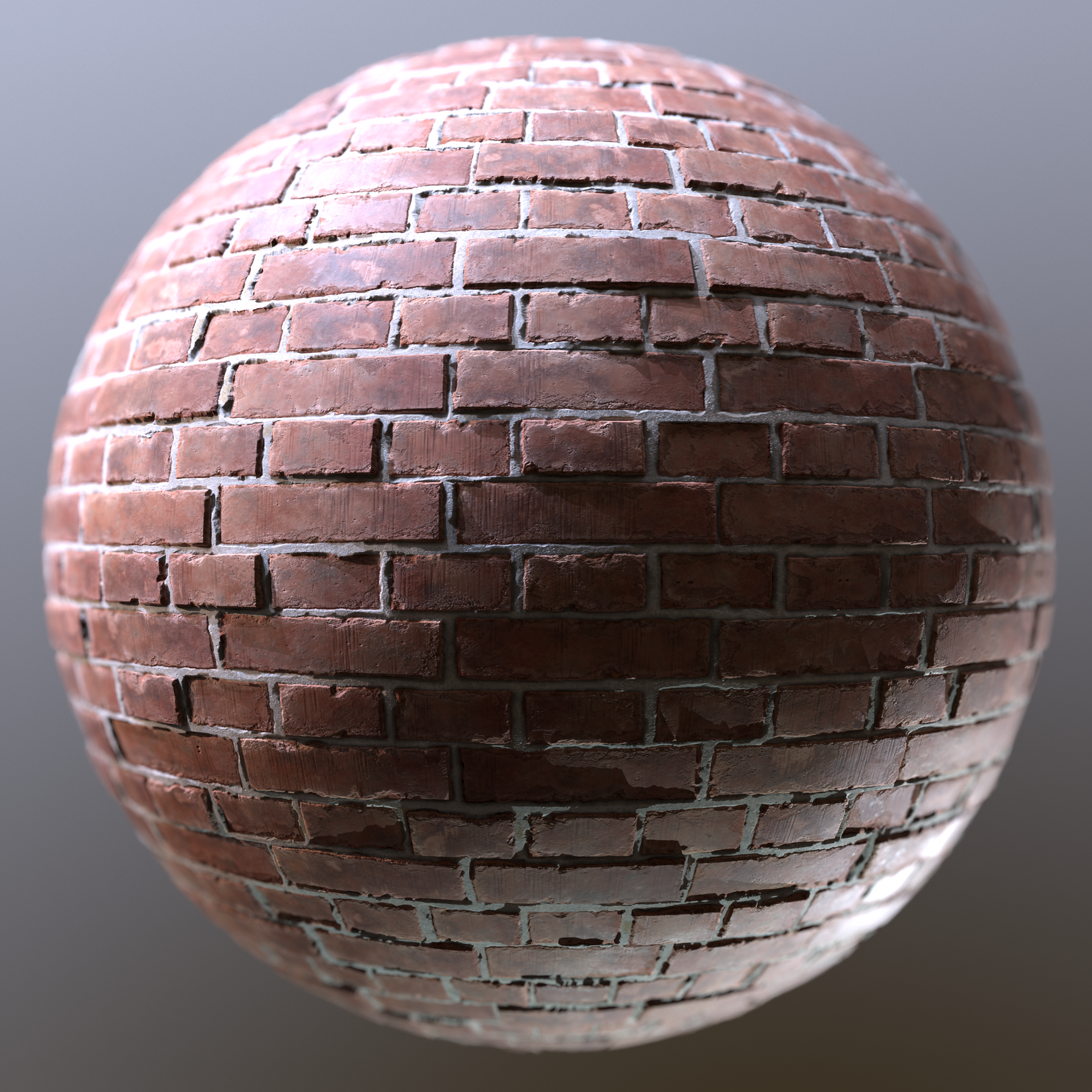
Re: Brick Material WIP (How come I never did a brick material before???)
A first render setup. I incorporated some of the feedback like contrast in the albedo, fixed the brickbond and added some height variation.
For some weird reason, marmoset4 doesnt like to render my 8k textures. I exported in 8k, but the 4k and 8k renders look 100% the same. I am sure I had this problem before...
Anyways, here is the first sphere render. Not entirely happy yet, but nearly calling it done. Been too long already... Since february. Damn :D
Will also export some variations with various brick bonds, some grout variation and color. Also maybe cranking up / lowering some of the damage values for some nice variations. I might also put it on my stores, but graph definetly needs some clean up before that. Not presentable at all haha

 Finnn
Finnn
Re: First Fusion 360/Blender Project Semi Auto Sniper
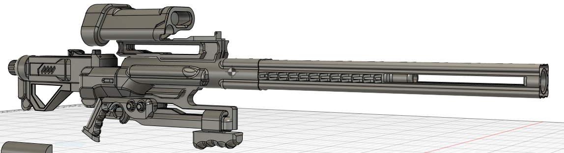

still a WIP< but close to the end.
Feel free to crit as hard as possible. Looking to improve.
 Bionicphobia
Re: Convincing 3d that looks like 2d.... Wow
 https://www.youtube.com/watch?v=uIVEQ9iSz48&list=PLv8Xik7JbQH3AtYLs3QY7jYuubckdGfnU
 https://www.youtube.com/watch?v=UUvAFpyQF3U&list=PLv8Xik7JbQH2XkhIq_8cwhgPQBL0jeKJL
 3D_director
ZBRUSH - All new updates to require Maxon subscription
So it finally happened, no more free updates. Version 2022.0.5 will be the last release for perpetual license holders.
Re: Critique required on this 1911 pistol!
Roughness Definition
I think one thing that could be improved is the overall roughness value of the metal. Most examples that I found on artstation have a higher roughness value. That way the scractches that have a significantly lower roughness value pop more. Basically a higher contrast between your roughness details should improve the overall realism. In the example you can clearly see the difference in values and I think its also supported by the albedo (brighter value where the roughness is lower) to further push the effect of the scratches.

Uniformity of Wear
imo your details look too uniform. I think you have a solid base here, but to push it further you could add details that "make sense". Take parts that are commonly used on the gun like the trigger and add wear details with direction. See these examples:


Rendering
Your rendering setup really could improve the look aswell.
Some notes:
+ Higher contrast of prop and background (most examples I found use dark backgrounds)
+ Use your hdri main light to softly illuminate your prop, everything should be clearly lit without any keylights but it shouldnt be too bright.
+ Reposition and recalibrate your keylights. Id make them "softer", meaning they should effect a bigger area of the gun. Then you can slowly add the same keylight with a stronger emphasis on certain parts. (thats the way I do it sometimes) Generally, you should experiment with it and work from examples of other artists. like these:
https://www.artstation.com/artwork/8eVgvG
https://www.artstation.com/artwork/nEbOy9
https://www.artstation.com/artwork/6aGWLn
https://www.artstation.com/artwork/2mvox
+ Light the back of the gun so the silhouette becomes more clear, like in this example:

 Finnn
Finnn