Best Of
Re: Community Incentive: Earn $STYLE Token while testing the Protocols’ Alpha Version ⚡️
woohoo, cant wait to contribute to pyramid schemes that pray on unregulated spaces to sap hard earned money from gullible people ! i love how all these tokens\whatever always have _protocol or something when the ones banking are the founders\family on their "fair launches". Regulation cant come soon enough.
 Joao Sapiro
Re: [WIP] Transport Miniverse
Finished a new locomotive and did some tweaks on the oil tank car.

Made a progress GIF again:
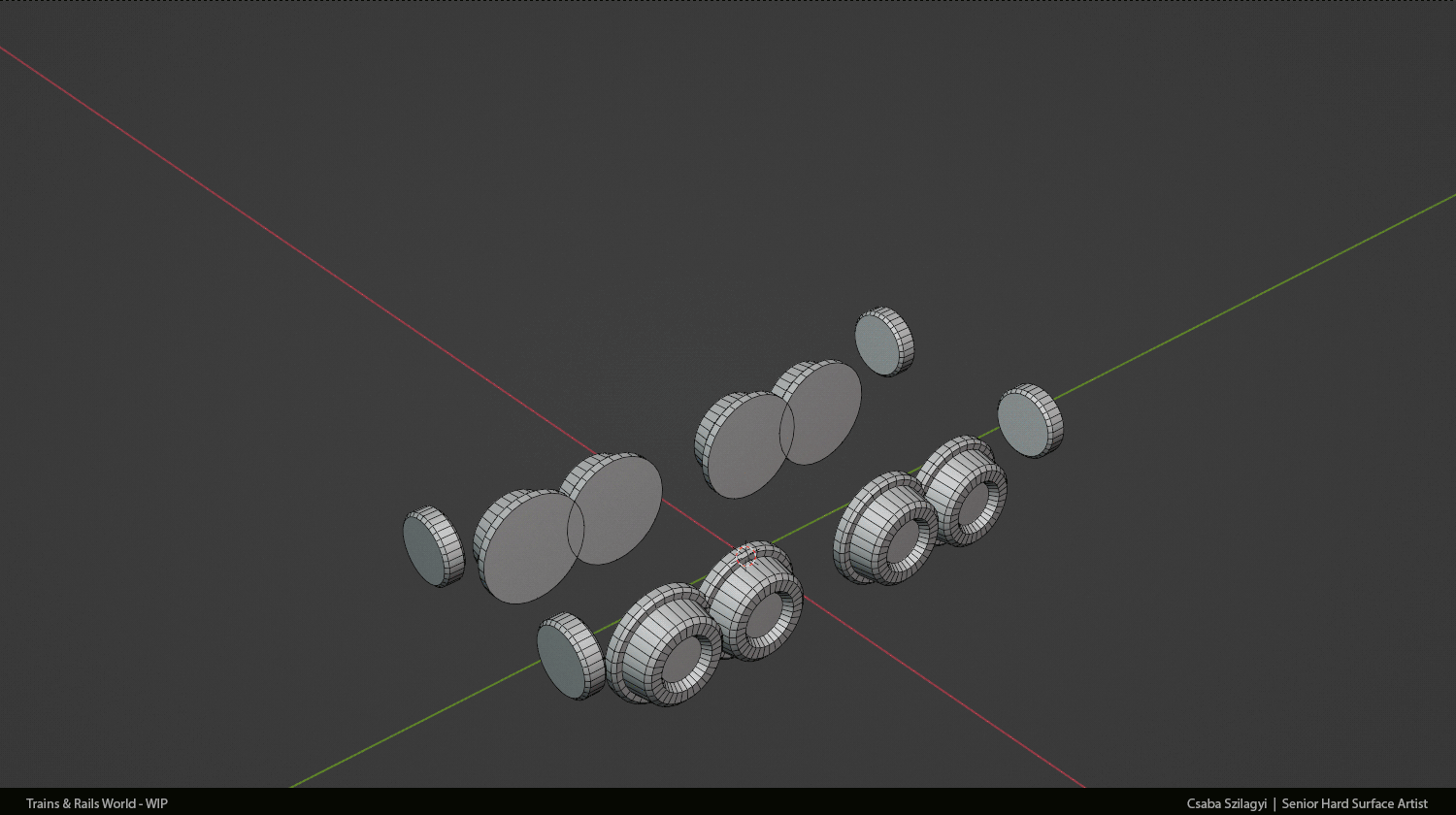
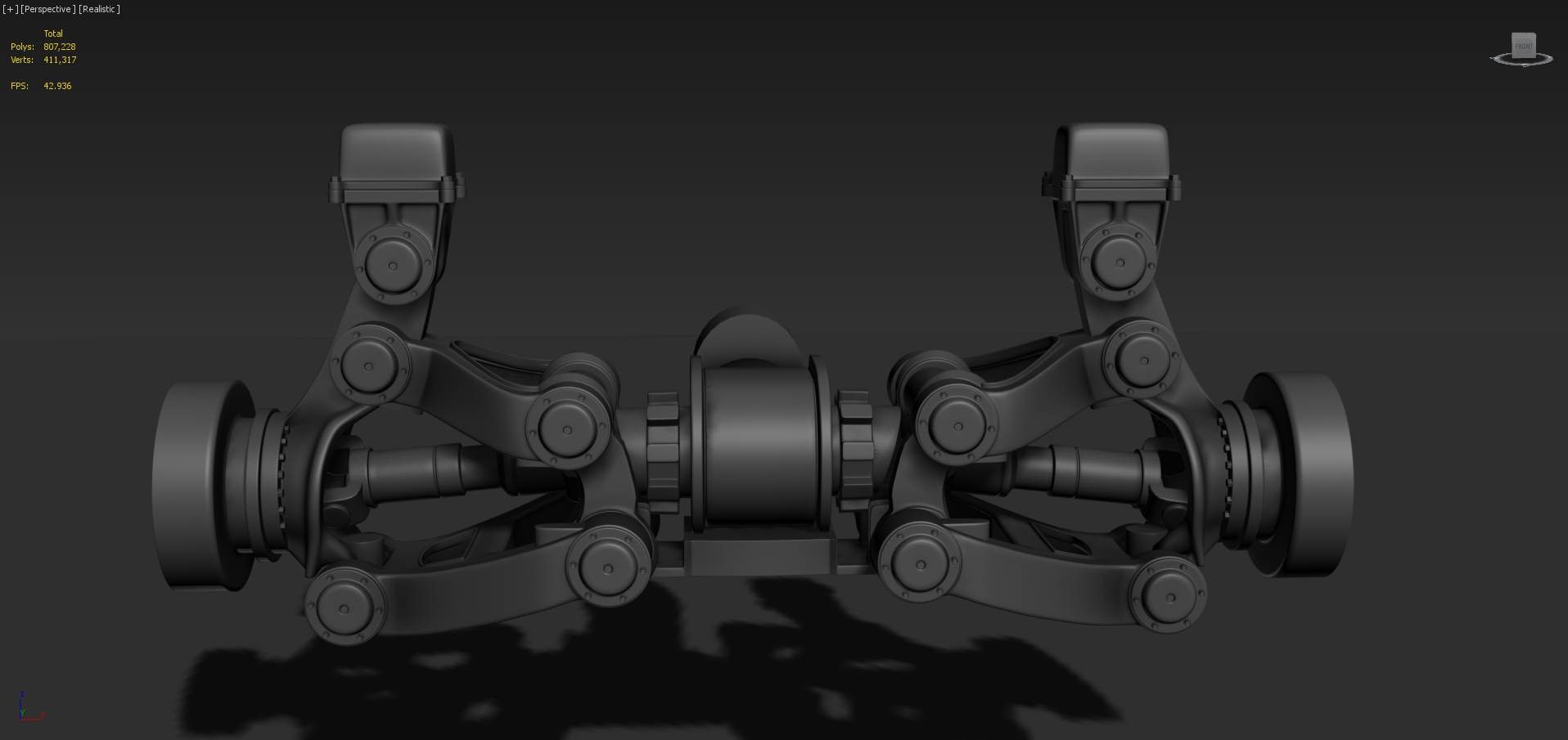
WIP - Maz 537
Hi!I put a pause on working on my game because I want to work on my portofolio,so I want to create a Maz 537.I chose this truck model because it has a lot of details and I like the look of military trucks.Also,Snowrunner had a major influence,I like the details of their models 😁 .So I first wanted to make sure I have the general proportions and where everything goes,so I've started with the chasis and suspension.Here are some images of the suspension so far.


 andreygheorghe
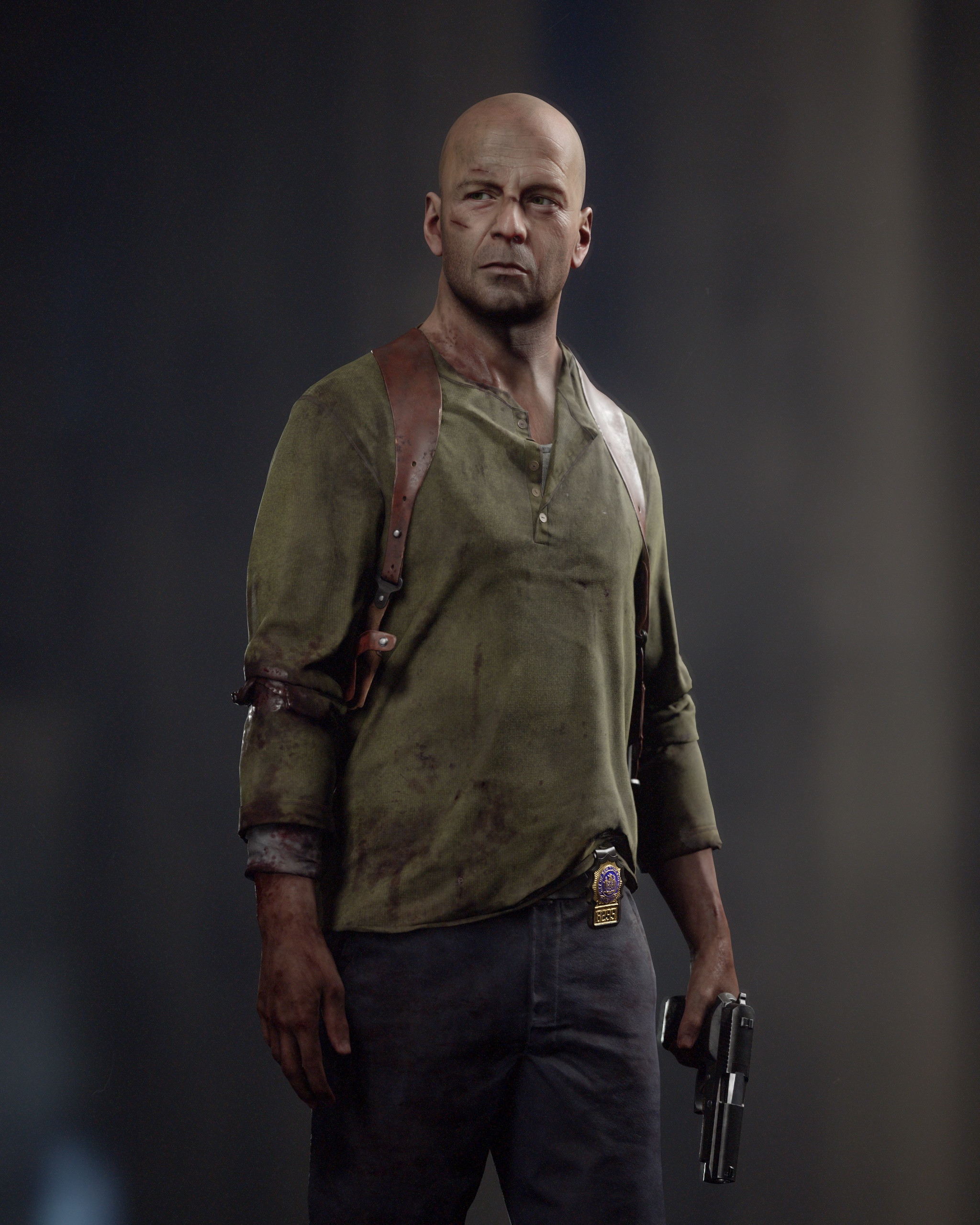
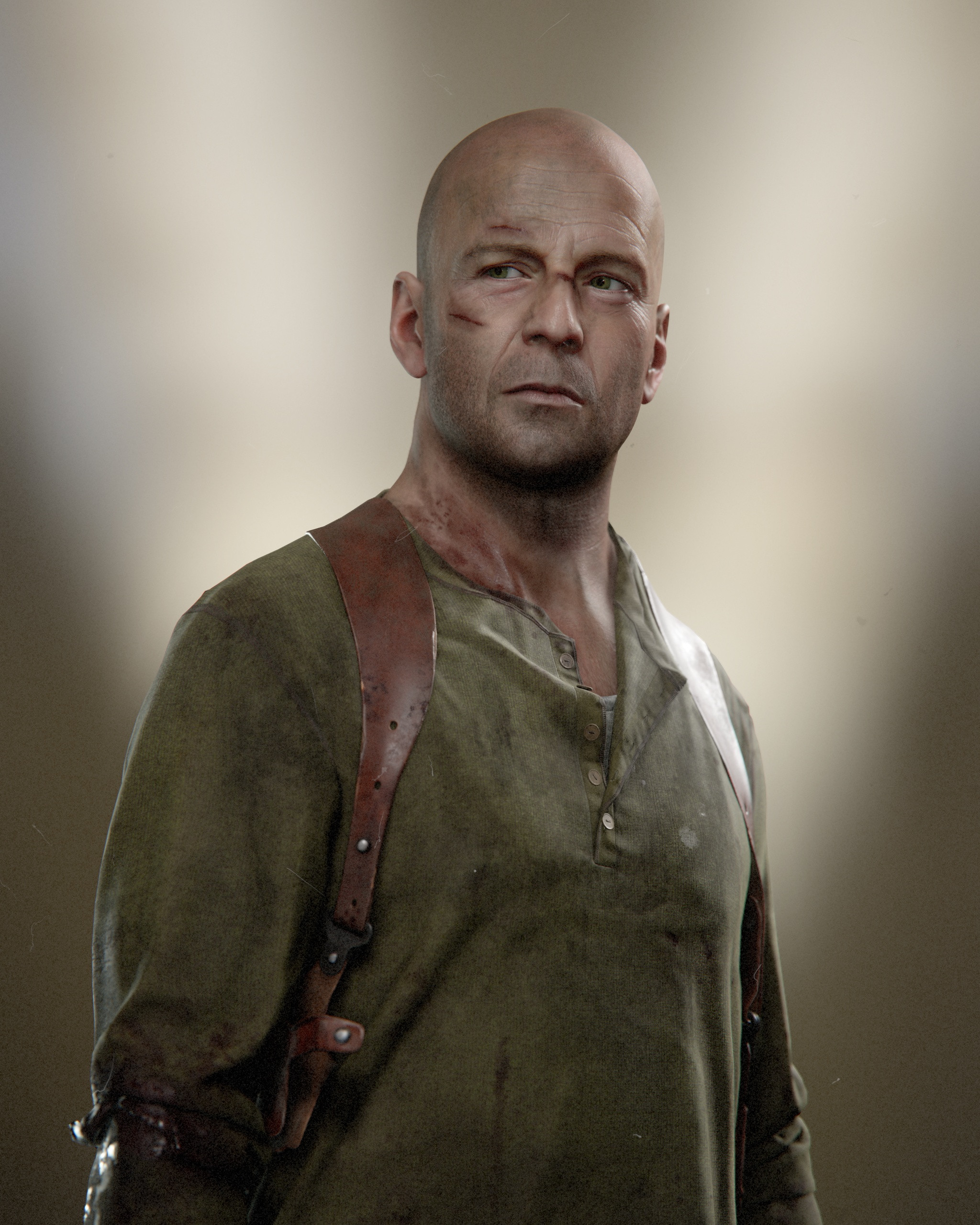
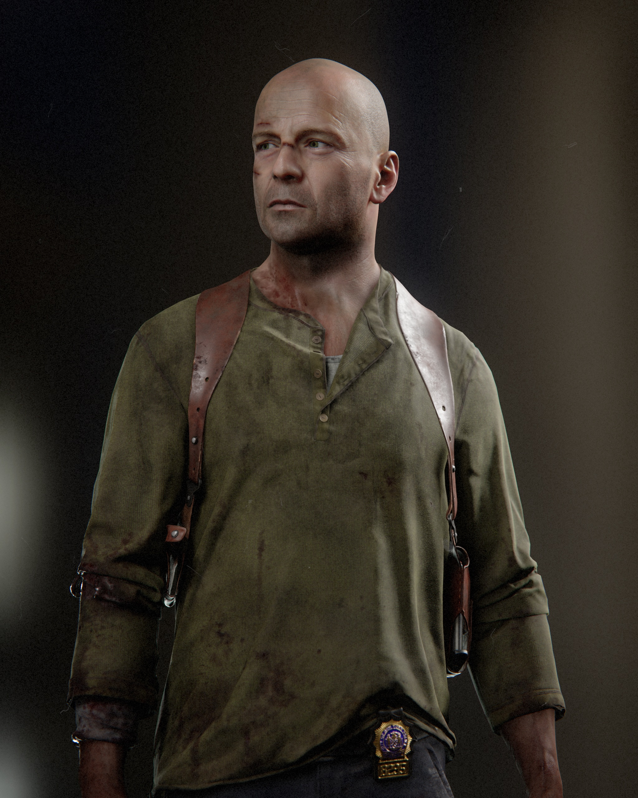
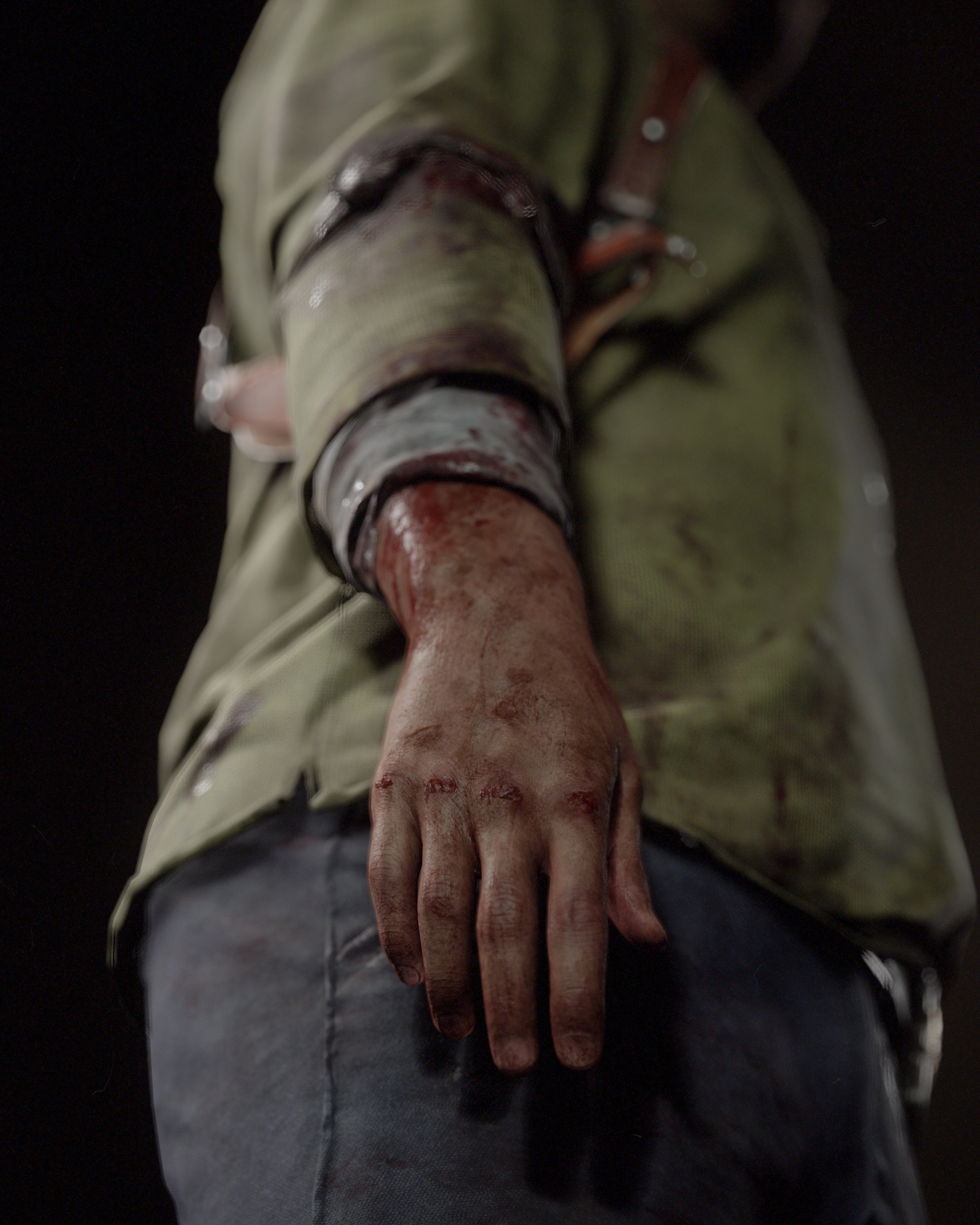
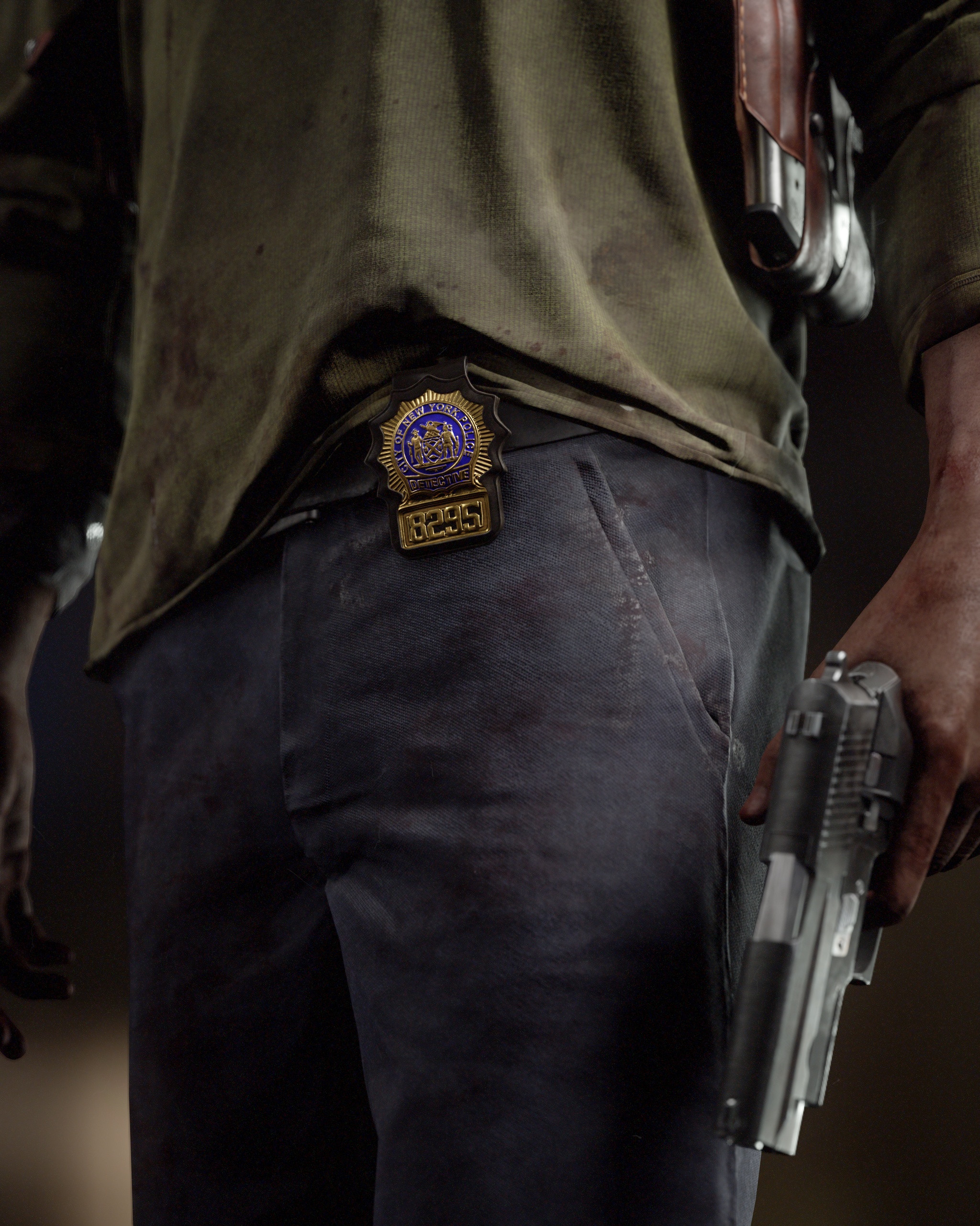
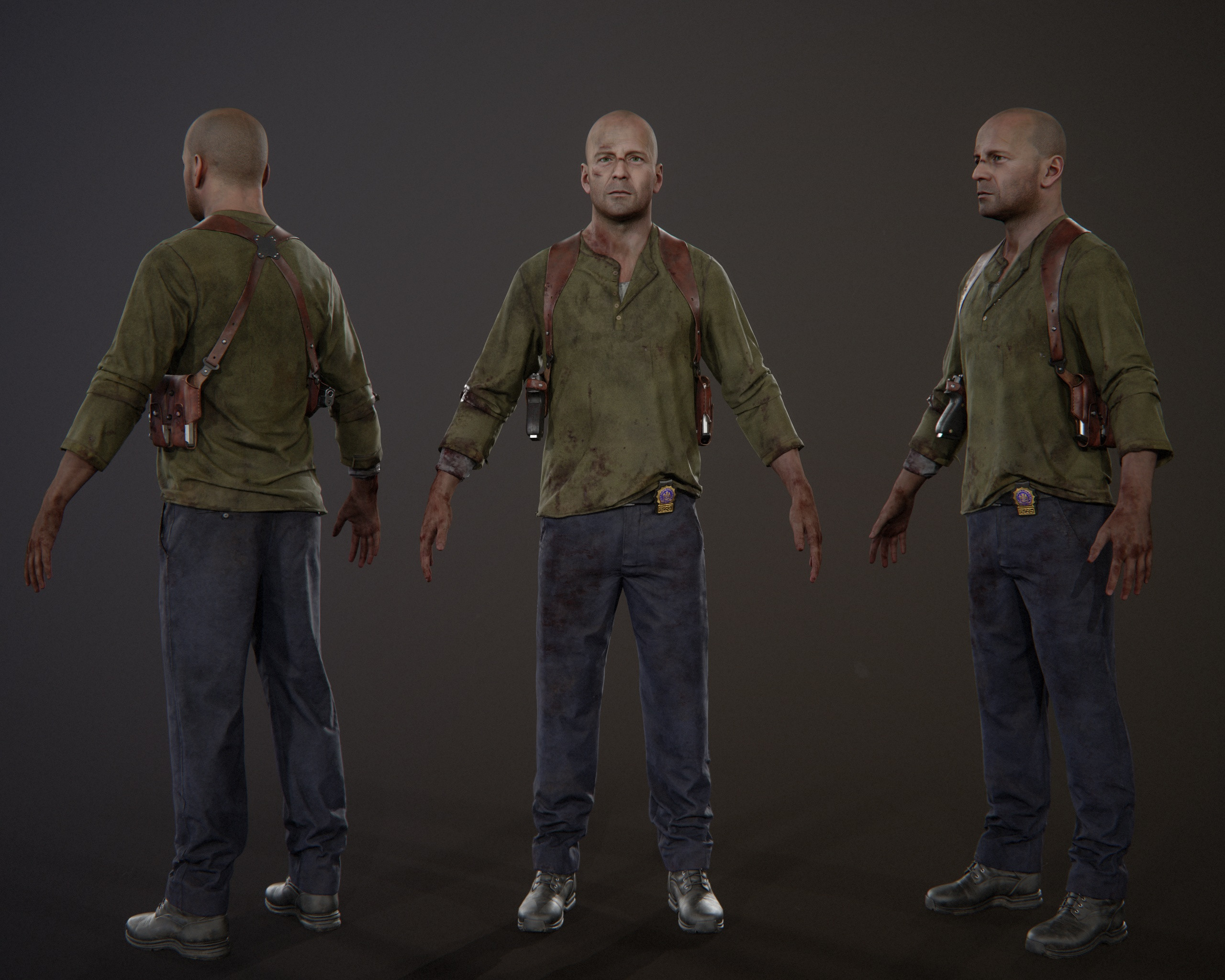
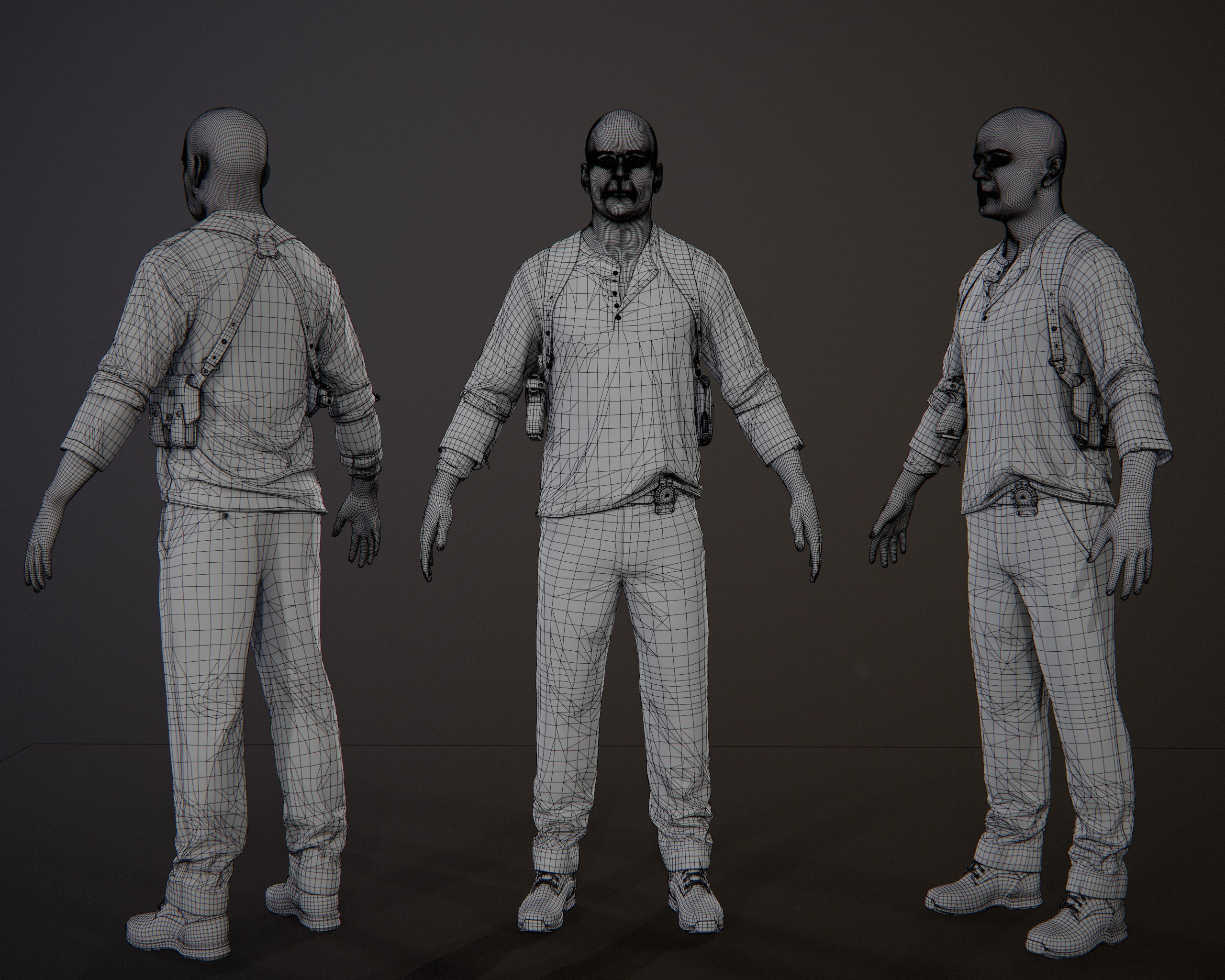
John McClane - real time character
I've been working on this character for quite some time in between jobs, mentorship and other personal projects, but now it's finally done.
Here's my take on Bruce Willis as John McClane in Die Hard 4(Live free or die hard). Thank you all who've been supportive on stream while I've worked on this and let's move on to a new one.
As usual textured and rendered in Marmoset Toolbag.
The whole process was streamed on Twitch and will be available on my Patreon
https://www.twitch.tv/nimlot26
https://www.patreon.com/nimlot
More images and videos here: https://www.artstation.com/artwork/QnvKzB
Cheers!
 nimlot26
Re: LOW-POLY ART
Spooky mummy in hybrid GB/PSX style - 452 triangles, rigged, 32x128 texture


Re: What Are You Working On? (3D) 2022
more doodling, sculpted in blender, painted in zbrush polypaint

 Ruz
Ruz
Re: What Are You Working On? (3D) 2022

 Asura
Asura
Re: What Are You Working On? (3D) 2022
Just wrapped this project for Gnomon Workshop up and it's published now as well!
more images and info: https://www.artstation.com/artwork/ArBZeq

 Dominique_