The BRAWL² Tournament Challenge has been announced!
It starts May 12, and ends Oct 17. Let's see what you got!
https://polycount.com/discussion/237047/the-brawl²-tournament
It starts May 12, and ends Oct 17. Let's see what you got!
https://polycount.com/discussion/237047/the-brawl²-tournament
Best Of
Game ready 60's office chair
I wanted a chance to practice some leather sculpting and texturing so I created an office chair! It's optimized to be game ready and was modeled/sculpted in Blender, baked in Marmoset and textured using Substance.
Let me know what you think 
Here's the ArtStation post: https://www.artstation.com/artwork/5W4qD8


1 ·
Re: The Bi-Monthly Environment Art Challenge | March - April (95)
@MRpnut
Thank you for your comment, it's very helpful and I will go do fix it.
Your work is so great bro.
Thank you for your comment, it's very helpful and I will go do fix it.
Your work is so great bro.
2 ·
Re: My glass objects on small items keep disapearing in unreal when view from a distance
I was able to resolve the issue! Just navigate to the object, then go to
detail, followed by search bound, and increase the bound scale value for any translucent objects.
1 ·
Re: Advice with secondary forms
Interesting method. I think I get the approach you're referring to. I've used it before when making hard-surface stuff. It's not likely I'll be using this for where I'm at with this particular project, but it is something I could make use of in a future project. Especially if I ever do an ecorche of the body.iam717 said:Not Tldr; Explaining what i once did, polygroup/muscle group dynamesh method:Just tossing in an idea i had to one day use cause i wanted things to look "amazing", when it comes to musculature.It might be a bit "long" process at least for me but.https://www.youtube.com/watch?v=RpT31z6LErs (video explains extracting the general idea, make bones and actually wrap the muscles to the bones accurately, will kind of save time instead of the constant redoing to get it "right", at least like this you have 100% control over the results. i just expanded the polygroup shape method to a more detailed version with some extra stuff, i made a tutorial back in the day (an image, that is now privated/removed) but the video explains it the same way in a way.
The extract mask method ( polygroup: muscle grouping method) for muscles (so actually build the entire body as we are made) works great with dynameshing and retopologizing and then possibly reprojecting the dynamesh back down, results vary, i used smooth brush a lot on a super low setting and claybuild. The idea is you are making the muscle group strands and adjusting them to the bones and you save multiple copies (backups) so if you ever want to change anything you just go back to the backups.So i split the parts like this:Arms, Legs, Upper Torso, Stomach, hands, face.Each a separated group, bones and muscles, you can use a random piece as a "skin" object to cover the "holes" in the actual muscle group, where there is more bone than muscle. I subdivide all the one group from the mentioned when i like it and feel its at a decent state, i dynamesh all parts of the one group with the highest setting 4096, make a duplicate retopologize it and reproject the dynameshed copy, and fix any issues that look strange manually, using the mask option so i do not make mistakes.https://www.youtube.com/shorts/iof0OeqwdHY (this video explains both what it should look like before dynameshing and how each group "turns inward", you'll get it just do a bunch of research about the connecting tissues. it will help, best part about this later on you can "configure" the next projects anatomy with this new "saved" final anatomy and make more portfolio pieces.)This video is what i mean by muscle group before dynameshing, APART from the coloring, if wasn't 100% clear.Hope it helps, i really should've made a video about this but i figured someone else did or would've "borrowed" the jpg and make $ and videos about it already. Perhaps it is not very time saving but the results are amazing to me, when you fix it to your liking adding your own learned spin on things.Tldr:you should try messaging the author of the work you are trying to replicate or any of his buddies and see if they will respond about what you are attempting to achieve.
Also, fear not, I've been in touch with the original artist right back when I started this project.
 DustyShinigami
1 ·
Re: Game-Ready Fire Extinguisher
Thanks for the feedback! You're right most fire extinguishers have a glossy, non-metallic red paint. I'll adjust the shading to better reflect that look next time
 Miedo
Miedo
1 ·
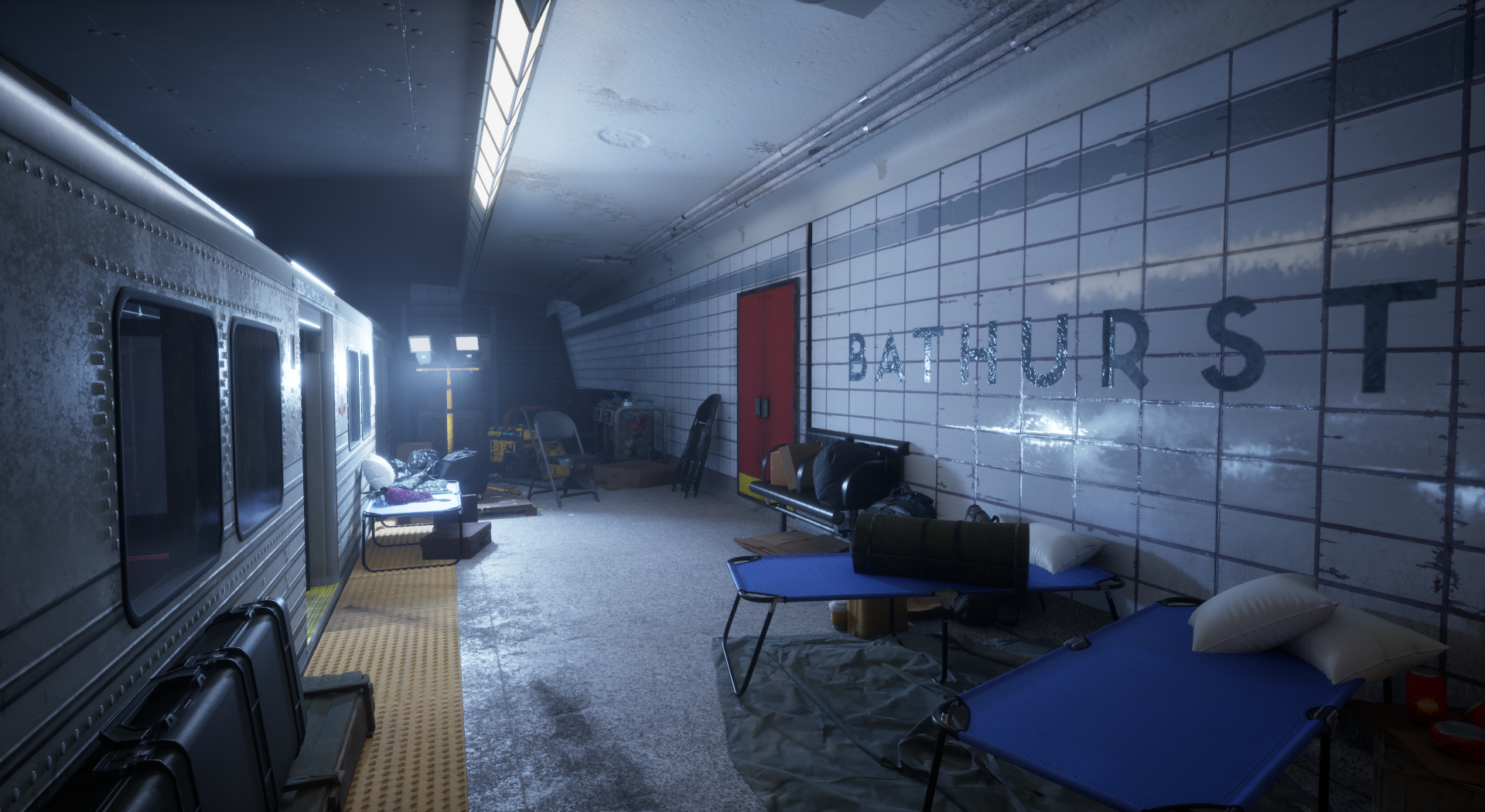
War torn subway (Feedback Wanted) UE5
Hey all,
This is a project I have been working on and off for a few months. This is before I have dove into post processing and colour grading but I wanted to ask for any feedback you guys would have. I am a 3D artist with a few years experience working in games under my belt but I am always trying to improve my scenes.
Here is a link to a video of me running around in 3rd person
https://drive.google.com/file/d/1fdZ7WUQ-VL13byZPXYHf7YUfemyvc1Dx/view?usp=drive_link
I would really appreciate any feedback.
Thanks everyone!


1 ·
Re: 3ds Max model cleanup
Retopology Tools are worth a shot.
https://help.autodesk.com/view/3DSMAX/2023/ENU/?guid=GUID-57B77A00-5300-47CB-99E1-22B9C536B060
 Eric Chadwick
1 ·
Re: Halloween scene on Unity
A quick way to do realtime animated mist & fog is to use UV distortion and a scrolling "clouds" texture. Pretty effective if you tweak it. If you advance to about 0:16 in the video, you can see the maps that go into it.
 https://www.youtube.com/watch?v=H2vLwOAu0UI&t=16s
There's a bit more about it on the first page of my sketchbook.

 https://www.youtube.com/watch?v=H2vLwOAu0UI&t=16s
There's a bit more about it on the first page of my sketchbook.

 Eric Chadwick
1 ·

