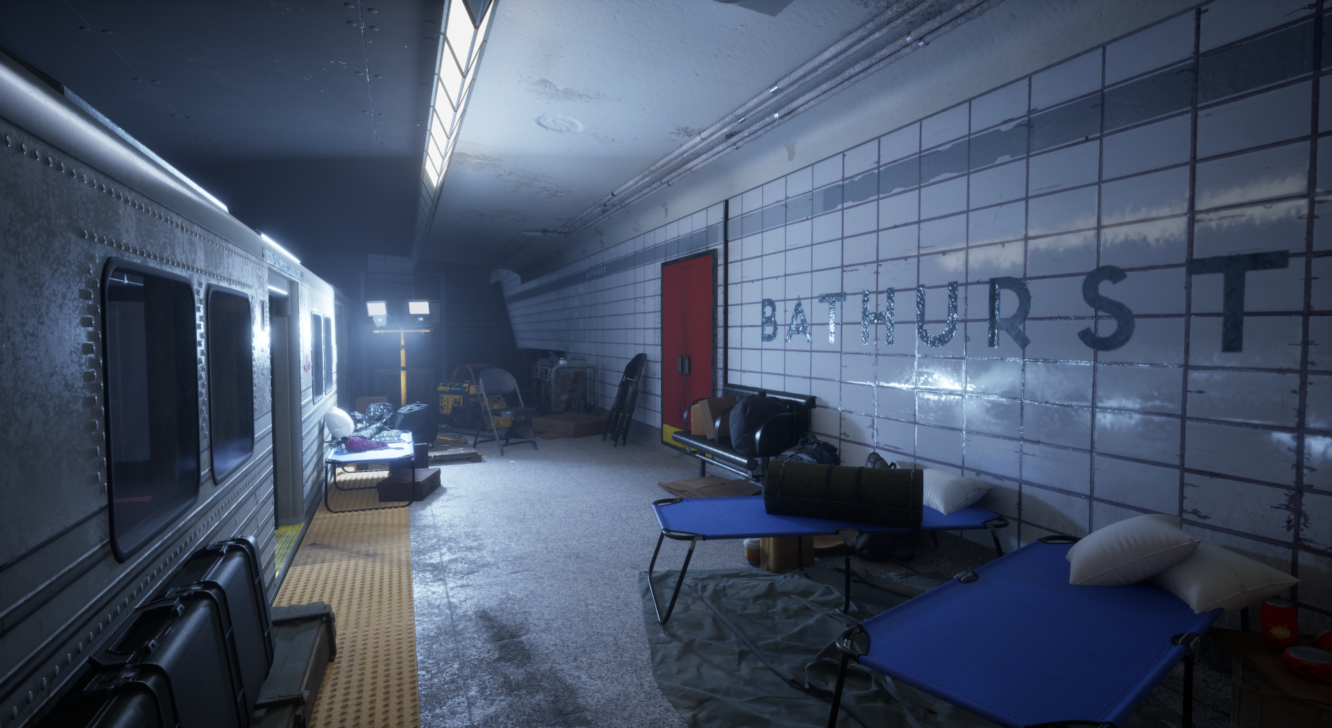
Hey all, This is a project I have been working on and off for a few months. This is before I have dove into post processing and colour grading but I wanted to ask for any feedback you guys would have. I am a 3D artist with a few years experience working in games under my belt but I am always trying to improve my scenes. Here is a link to a video of me running around in 3rd person https://drive.google.com/file/d/1fdZ7WUQ-VL13byZPXYHf7YUfemyvc1Dx/view?usp=drive_link I would really appreciate any feedback. Thanks everyone!
From a playable level perspective, there's more than enough light though slightly a bit bright imo for players negotiating waypoints plus engaging interest as well, however that said I've gamed more than my fair share of FPP dystopic/war/survival ips and most have a distinct related mood helping to immerse an audience. Whereas here I'm kind of getting a contrived vibe eg: some areas/personal items could do perhaps with wear-'n-tear that usually accompany dissolute groups of people under wartime conditions also maybe worthwhile including pup tents and clotheslines, as an aside quite handy for player cover concealment. Anyway all the same nicely done.
Looking closer, here are some points that stood out to me:
Most notably, I think the tiling of surfaces is a bit too large, other sizes/proportions might benefit from some dialing in as well. What is the dimension of a wall tile currently? I would double check against some real-life references. Would be also cool if you included reference images/ specific location info, to have an idea what you are going for.
Another aspect to improve, would be more wear/ dirt marking where people frequently go. Currently the wood planks look pretty clean, so does the ground. Perhaps puddles, mud and footprints.
Makeshift walkways are too loose/ messy and would pose a danger, in my opinion.
With some surfaces, some subtle variation/ breakup would be nice, also in the roughness to get some more variance in the reflections.
Well that's my, perhaps somewhat nitpicky, thoughts :-B
Hey thanks for the feedback I really appreciate it. Here are some screen shots of my pureref board. When it comes to the station walls I am using a material that i got off of quixel. I'll take your advice and play with the UV tiling to get a more accurate scale. I'll also go back into my subway car substance project and add some more variation to the seats as well as some more roughness on those door divider things.
The wall-tiles in this station are indeed larger than I had thought. Could extract somewhat accurate measurements by comparing against standardized building blocks like doors (perhaps you already did):
I think if the tiling on the floor was a bit more visible, it would help break up those large areas some. Tiles seem pretty smooth, reflecting the environment.
Just to clarify, my point with the dividers was that their reflection appears to be very uniform - that's why I suggested having some variance in the roughness (scratches, dirt, leakage) aiming to add detail to the reflections.
Replies
Looking closer, here are some points that stood out to me:
Well that's my, perhaps somewhat nitpicky, thoughts :-B
Keep it up!
The wall-tiles in this station are indeed larger than I had thought. Could extract somewhat accurate measurements by comparing against standardized building blocks like doors (perhaps you already did):
I think if the tiling on the floor was a bit more visible, it would help break up those large areas some. Tiles seem pretty smooth, reflecting the environment.
Just to clarify, my point with the dividers was that their reflection appears to be very uniform - that's why I suggested having some variance in the roughness (scratches, dirt, leakage) aiming to add detail to the reflections.
Good luck finishing the project!