Best Of
Sketchbook: マルコ
Was trying to make some wood, but those deep cuts are too soft and messing everything up, I need to figure out a better brush
Wood 1:

Wood 1:
 マルコ
マルコ
1 ·


Re: Unreal 5.8 Substrate Retroreflector Mat
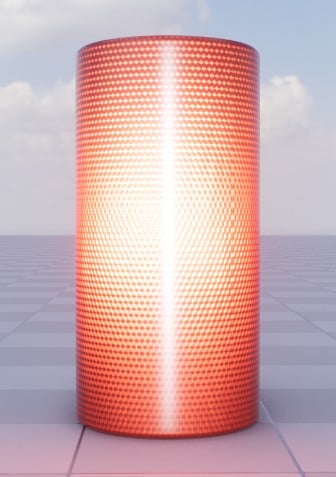
A bit of a breakthrough on the next iteration for the reference material. If you use the CameraVector node (which I was using some of my dot products), as your normal, you get "free" retroreflectivity. This much better because it actually takes into account all scene lights, rather than relying only on a single directional light. The reference shader is simpler overall and more visually responsive than the previous iteration.

 https://www.youtube.com/watch?v=oKpPW7EdTYs
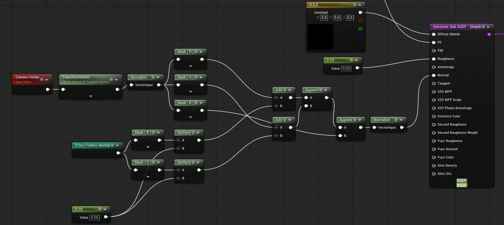
The bottom layer shown above mostly just the normal math. I take the camera vector, convert it to tangent space, where it then acts as the tangent basis. Then I blend the x and y normals from my prism pattern normal map over the new basis, disregarding the map's blue channel. The strength of the x and y normals from the map scatters the specular response more. So stronger = dimmer and more scattered retroreflector effect based on the prism pattern.
The top layer remains the same as the previous version. I also went ahead and started on the optimized version
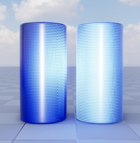
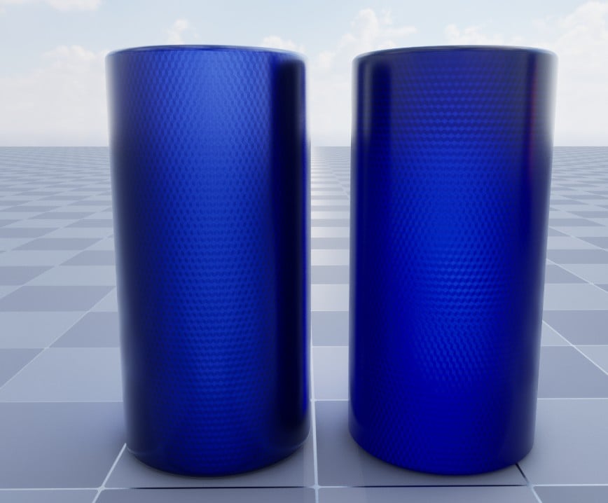
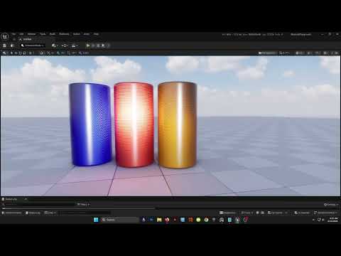
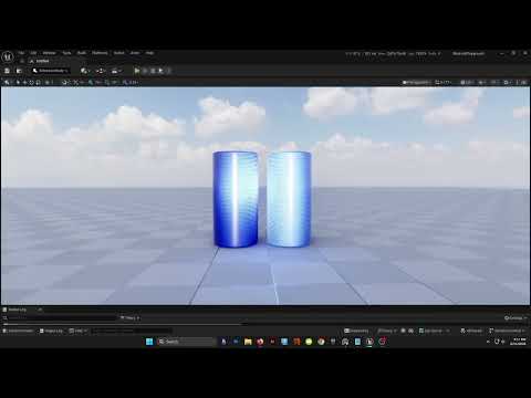
Left is the current reference version, right is the optimized version (flip that for the bottom pic).
 https://www.youtube.com/watch?v=-h7qeSII8oI
I tried using just straight up, non-substrate, clearcoat and it did not work very well. I then tried a single slab with a secondary roughness. That also didn't look great. I settled on "Substrate simple clear coat" slab. After tweaking some things I got it fairly close to the reference.


As far as numbers go I went from 2 closures and 48 bytes per pixel to 1 closure and 16 bytes per pixel.
Next is to create some different cube corner patterns like stripes and diamonds for different effects. I will probably do a simple noise/fleck version too to mimic RR coatings.
 sketchem
1 ·
Re: What Are You Working On? (3D) 2026
This year I'm working on a collection of Aliens ready for games. I wanted to make one from each universe I like; Star Wars and Star Trek already have theirs in progress, and I'm thinking of doing something from the Alien franchise in the future as well.

 Ryonvieira
1 ·
Re: Arcane Inspired 3D Character Bust
Eric Chadwick said:I love where this went.
One thing that's bugging me a little is how blurry the hair is. I wonder if a few hairs with sharp highlights might help this pop better?


Yes! That was something I hadn't gotten to yet lol, but I like the mock-up you did. Here's how the hair looks now, just gotta finish off the rest of the hair and I think I'll be ready to start taking some beauty shots this weekend
Unless you have any other bits of feedback? I appreciate what you've given me so far
 HarrisCampbell
1 ·
Re: Arm and Wrist Pain - how did you dealt with them?
I could go for some sardines, those look yummy.
 Eric Chadwick
1 ·
Re: Arm and Wrist Pain - how did you dealt with them?
be reasonable - nobody round here is going to go that far .. 
1 ·
Re: How to reduce normal map baking artifacts caused by low/high poly mismatch?
sacboi said:
Hah, I'm pretty sure that's the opposite of derailment.
I would gladly spend three months on that, and I'd love every second of it.
If a professional spent three months on that, they'd get fired ;D
[...]apologies think I'm derailing this topic a bit[...]
Hah, I'm pretty sure that's the opposite of derailment.
I would gladly spend three months on that, and I'd love every second of it.
If a professional spent three months on that, they'd get fired ;D
 Thanez
1 ·
Re: How to reduce normal map baking artifacts caused by low/high poly mismatch?
Nice writeups @Thanez, although apologies think I'm derailing this topic a bit but yeah I've dabbled with Blender's rounded edge shader which indeed does bear looking into for future reference, if the OP should wish to do so at some point. Anyway briefly vanilla workflow is imo fairly adequate in terms of most hard surface use cases however once complexity iterates beyond a certain 'plateau' then plugins such as the Zen tool suite specifically BBQ introduces streamlined functionality by:
- Setting values per edge + vertex for an entire mesh
- Custom preset groups via various measurement units
- Stores values in mesh attributes & embeds materials non destructively
- One click smart preview...and much more
For example - a current personal project that seems to output quite reasonable results minimizing edge occlusion artifacts at close viewing distances, in particular.

 sacboi
1 ·