Best Of
Silent Hill 4 - Subway recreation WIP
Hi everyone! I'm creating this environment to update my portfolio and to learn about the urban-realistic style by creating props, tiles and trim materials. My initial goal was to remake this section of the subway level of Silent Hill 4 with modern graphics standards, with the added intention of making it "playable" in first person camera, by walking around the environment.
BUT I read in another similar post that this could be an overkill, and in my case I'm planning on doing all this in 2-3 months.
The screenshots are from the project in UE5 and right now I'm at the blocking phase. So, while I'm creating the first tiling materials, I was wondering if the first approach I was planning originally is ok, or should I pick one of the camera shots I took from the project and focus on that (I'm open to suggestion on which one should I pick). Also the next thing would be feedback related to composition, or suggestions if something feels missing, such as a lack like prop variety.
Right now my first two challenges are capturing the vibe of an abandoned subway station, and figuring out how to recreate the skin wall that covers the walls, as shown in the in-game captures I took.
 b1mod
b1mod
2 ·
Re: Fan Art Striker Zero by Hyung Woo Kim - Finished
I reused the scene i have been using for render and a basic lighting set up, with a few tweaks, adding a car i got on sketchfab for better scale reference


And this is it. This project took way too long to finished but I'm glad i managed to wrap it up and pretty happy with the result. I will be uploading the final render on my main portfolio/artstation soon with a few more shots. Thank you for watching. Any questions, C&C are welcomed!
And this is it. This project took way too long to finished but I'm glad i managed to wrap it up and pretty happy with the result. I will be uploading the final render on my main portfolio/artstation soon with a few more shots. Thank you for watching. Any questions, C&C are welcomed!
 np1094
1 ·
Re: Sketchbook: Celosia
To kickstart the thread, a sketch from a while back. It's fanart from an old anime, Lodoss.

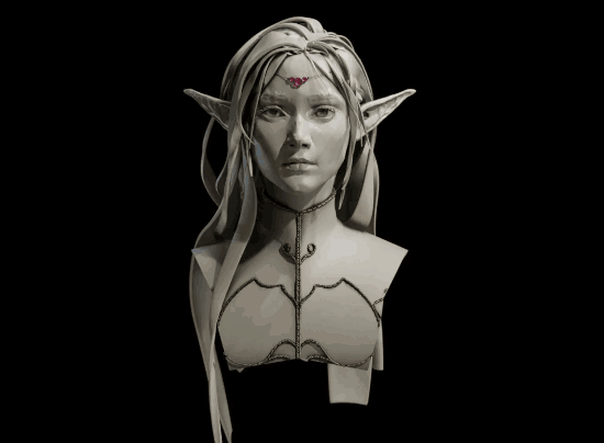
Dynotopo sculpt from scratch in Blender, I used it to figure out how to use curves for hair for this kind of clay bust, also to come up with a quick and flexible way to setup the base material so these busts look pretty.

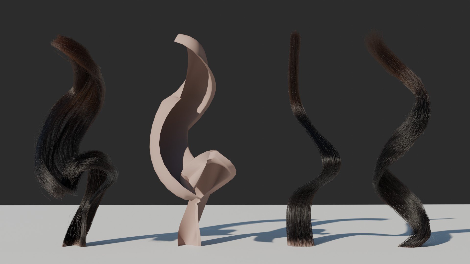
Also, a hair curves WIP. Out of the box the hair system interpolates hair in perfect circles around the hair guides. That's not organic looking at all, and the way children also clump in circles make some hairstyles impossible to setup.
I'm trying to create a few geometry nodes to interpolate them in layers that follow the curves more closely. It could also double as a base for hair cards, so there's that too. To make that possible I also wrote an add-on to change the attributes of hair splines and control points more easily.
Left to right: Output of my custom nodes, the "card" geometry creating them, Blender's default output for the same curve, Blender's output from a plain curve + curl geonodes.
What the curves look like. 3 first are the same, last is simpler. And my little addon with many junk attributes that were used to dev the custom node but aren't being used here.
The nodes still need lot of work and I have to look up ways to minimize intersections for extreme curves, but I'm quite happy already. The children follow the shape more closely, I've got per point tilt and radius going on, opening up the possibility of creating hairstyles like finger waves and curls that revert their rotation direction mid-way with full artist control. I also find it easier to place the hair layers. You can't do this at all using the default nodes.
Edit: Today's progress
I implemented a rudimentary "offset from surface" toggle. It's just a modified shrinkwrap, a bit expensive on performance, but a game changer for hair regions like eyebrows that lay very close to the surface and looks obvious when intersecting with it. I'm sick of tilting curves to fractions of degrees to avoid that. There's still room for improvement here.


I also fixed the curves resolution. Forgot to adjust that in the children spawner haha.
Next in my to-do list:
- Stagger roots for better but still layered hairlines
- Blend different profiles for roots, body and tips of hair, so you can have flatter profiles for roots but still nice wild curved shapes for the body
- Optimize children generation by pruning intersecting standing too close
And in far off future:
- Dive into my old custom hair implementation to see if my solution for self-intersecting guides/cards will work here
- Implement a new horizontal clumping that follows the "card" profile instead of going round the guides, so the hairs kinda slide onto themselves more like real hair locks
Dynotopo sculpt from scratch in Blender, I used it to figure out how to use curves for hair for this kind of clay bust, also to come up with a quick and flexible way to setup the base material so these busts look pretty.
Blender Hair
Also, a hair curves WIP. Out of the box the hair system interpolates hair in perfect circles around the hair guides. That's not organic looking at all, and the way children also clump in circles make some hairstyles impossible to setup.
I'm trying to create a few geometry nodes to interpolate them in layers that follow the curves more closely. It could also double as a base for hair cards, so there's that too. To make that possible I also wrote an add-on to change the attributes of hair splines and control points more easily.
Left to right: Output of my custom nodes, the "card" geometry creating them, Blender's default output for the same curve, Blender's output from a plain curve + curl geonodes.
What the curves look like. 3 first are the same, last is simpler. And my little addon with many junk attributes that were used to dev the custom node but aren't being used here.
The nodes still need lot of work and I have to look up ways to minimize intersections for extreme curves, but I'm quite happy already. The children follow the shape more closely, I've got per point tilt and radius going on, opening up the possibility of creating hairstyles like finger waves and curls that revert their rotation direction mid-way with full artist control. I also find it easier to place the hair layers. You can't do this at all using the default nodes.
Edit: Today's progress
I implemented a rudimentary "offset from surface" toggle. It's just a modified shrinkwrap, a bit expensive on performance, but a game changer for hair regions like eyebrows that lay very close to the surface and looks obvious when intersecting with it. I'm sick of tilting curves to fractions of degrees to avoid that. There's still room for improvement here.

I also fixed the curves resolution. Forgot to adjust that in the children spawner haha.
Next in my to-do list:
- Stagger roots for better but still layered hairlines
- Blend different profiles for roots, body and tips of hair, so you can have flatter profiles for roots but still nice wild curved shapes for the body
- Optimize children generation by pruning intersecting standing too close
And in far off future:
- Dive into my old custom hair implementation to see if my solution for self-intersecting guides/cards will work here
- Implement a new horizontal clumping that follows the "card" profile instead of going round the guides, so the hairs kinda slide onto themselves more like real hair locks
 Celosia
1 ·
Re: LOW-POLY ART
Here are a few low poly environmental assets I have currently been working on for a project. Any feedback or advice would be appreciated!


2 ·
Re: WIP- Elderly Character- Need Honest Feedback
Curious if you're a traditional artist transitioning or dabbling in digital art? was browsing this board's new entries amongst those requesting critique earlier and noticed a side profile among your images (now missing?) where a 'painterly' style/depiction applied too these studies, for me at least was quite noticeable might also add finessed by eyeballing alone so no, I don't think anatomical comprehension is an issue here. To be honest perhaps similar to what I'd encountered when initially making the jump i.e. random 'technicalities' working with digital tools as opposed to tactile ones lol. That all said plus assuming I'm correct and you're using zbrush or akin dedicated app, (...btw I'm not a user) try searching tutorials for showcasing rendered sculpted content, as an aside it's just that SSS looks off alongside lighting as well - my 2¢
Keep at it ")
 sacboi
1 ·
Re: Baked high to low normal map has seams in Arnold CPU render on all hard edges.
@gnoop I can confirm raytracing works fine in Marmoset 4.06 with UV splits on all hard edges in the normal map, I just tried it to make sure and it's seamless without the Arnold bug. I also tested all soft edges and that works fine too, so you can pretty much set the normals however you like in Marmoset and it comes out correct.
@FomoFighter Thanks for the suggestion, I used Unreal professionally for 8 years at the end of my career when I was working on Gears of War 4 and 5. I prefer something lighter weight than Unreal these days when doing prop renders so I switched to Marmoset.

@FomoFighter Thanks for the suggestion, I used Unreal professionally for 8 years at the end of my career when I was working on Gears of War 4 and 5. I prefer something lighter weight than Unreal these days when doing prop renders so I switched to Marmoset.
 malcolm
2 ·
Re: What Are You Working On? (3D) 2025
Hi everyone! I just finished these cuties and now an animator is working on some awesome animations!
More images, turnaround and power up texture here: https://www.artstation.com/artwork/1NaQKo
 Miirage
1 ·
[WIP] Verasia - 3D Environment
Hello everyone, I have been working on a small town environment for a few months now and I will be updating my progress over here in the coming days.


https://www.artstation.com/manoj_r/
https://www.artstation.com/manoj_r/
 Manoj_Ravish
1 ·
Re: The Bi-Monthly Environment Art Challenge | March - April (95)

Hey guys, first time participating in a challenge like this, but I tried my best. I got the initial idea from one of the listed concepts and chose to switch up some colors and materials to make it seem more interesting. First time doing something like this... Thanks
1 ·
Re: The Bi-Monthly Environment Art Challenge | March - April (95)
I do it slowly, here is the update for this abandoned staircase scene.

I basically continue on doing Whitebox for the scene, mainly the walls and the stairs, and also apply some materials just to get a initial feeling of the floor and the wall. For the next step will keep working on the Whitebox of the large window at second floor and debris on second floor and first floor, and other props in the scene.
I basically continue on doing Whitebox for the scene, mainly the walls and the stairs, and also apply some materials just to get a initial feeling of the floor and the wall. For the next step will keep working on the Whitebox of the large window at second floor and debris on second floor and first floor, and other props in the scene.
1 ·