Dorado - Alexander Zlatovchen The
model looks incredible, great job on the clothing and accessories. Top level.
You did an excellent job in Marvelous Designer; those small details really make
a difference.
The level of detail is amazing.
I would’ve liked to see images of the texture maps and UVs.
I also wish I had seen a bit of shadow cast from the mask onto the face, without it, the face feels a little flat. Other than that, congratulations on the result!
2st
iam717
Great
job!
I really liked the result, the character turned out really fun.
The 2D shader you used looks great and fits the character’s style perfectly.
I also liked how you handled the UV layout.
My only note would be about the retopology, there are a few areas that could be
improved.
But overall, I liked it a lot.
Congratulations!
3st
Hangli
You did an
amazing job with the 2D art and translated the idea into 3D really well.
I loved the model, especially the choice of orange, which looks excellent.
I also
liked how you made good use of the UV space.
My only
note would be regarding the gray metals. I think they could have been worked on
a bit more to enrich the final result.
But overall, I liked it a lot.
Great job!
Honorable Mentions:
• Sacboi
Wow.
I really loved the result.
I was just sad that you couldn’t finish it in time.
I hope you
complete it and publish the model in your portfolio, it’s definitely worth it.
The hard-surface work turned out amazing, truly high level.
Congratulations!
• aumramaram
Wow, this is incredible. You did an amazing job, truly
an impressive amount of pieces, both in 2D and 3D.
How did you manage to produce so much? LOL
It was really fun to see so many high-quality images.
Congratulations
on the excellent work!
• Masslove
You made a
great start on the blockout.
I hope you’re feeling better after the surgery and that you can get back to
this model to finish it and add it to your portfolio.
has a lot of potential
• Fabi-G
I really
liked this stylized piece and the low-poly mesh.
The animation, with that subtle sway, also turned out excellent.
The shader looks very interesting and complements the piece really well.
Great job!
• shark2003
I really like this style.
You made a solid start on the blockout, and the model’s potential is already clear in the proportions and silhouette.
It’s a piece with plenty of room to explore details, accessories, and interesting variations within the theme.
It would be great to see you push the design further, refine the secondary shapes, and add more personality to the character.
I’d love to see this piece fully finished.
Keep up the great work!
• Kanga You did an amazing job on the hard surface, you blended the kitbash with your own modeling in an impeccable way.
There’s a lot of work here, and it’s really impressive to see the level of dedication and attention to detail.
You also made a great start on the retopology.
My only suggestion would be to refine the face a bit more toward a realistic look, so it matches better with the robotic parts, which are excellent.
Overall, you did a great job
well done!
• Klaimtrev
I liked the
start of the face textures.
Before moving forward with the painting, I’d suggest taking a look at some
facial anatomy references and refining the shape a bit, especially the
ear.
It will make the piece even stronger.
Great work!
• ayakiryu
You did a
beautiful job on the modeling.
I would have loved to see the model finished and to see how you would develop
your own elements and visual solutions for the contest theme.
The structure you created is solid, and it would be great to see how you would
apply details, materials, and personality to the character. well
done
• sketchem This low-poly model really brought back memories of the games I used to play during the PS1 and PS2, it hit me with a wave of nostalgia. I would’ve loved to see more updates and more models in this style.”
If anyone needs more feedback, technical support, or any guidance related to 3D characters, I’ll be happy to help. I am currently seeking new opportunities, both freelance and full-time. https://www.artstation.com/victorsantos
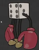
Its a hilarious mashup, love it! A lot of thought process went into it as shown by wips. I particularly loved the small details like portal animation, dice with punching gloves and 'pain' written on Kuato. It also shows nice UV layout and technical knowledge in breakdowns throughout the project. Overall from idea to execution it is an excellent work, character I am sure many will play in a game. Congratulations!
I really llike the fusion here of MadMax + Stylized, solid piece of work. It was interesting to see the iterative design process from thumbnail sketches and how true to the concept final model is. Winch at the back was a nice addition, it made the design more grounded. One thing particularly I loved about it and encourage students is to keep your reference board tight and focused as shown here. My only feedback or rather preference would be if it was textured same as 2d concept art, flat shaded. Congratulations!
Retro, PS2, GTA vibes, nostalgia + showing research, technical skills (texture density, atlas) and translating reference shot to 3d facade while aiming to make better shaders. It would be cool to have seen the entire city finished in this style. Placing it in 3rd place even though it has not been updated but matches the certain criteria of challenge. All the best!
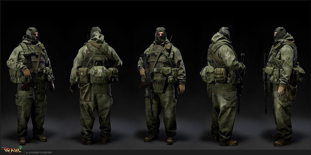
This was a tough one, artistic old school character look, presentation and ton of work from weapon to vest, shoes and so much more with 40 min video. I would have easily placed it 1st however to keep within challenge rules and fair for everyone who shared work in progress posts and breakdowns I am placing it here. My feedback would be to keep in check intersecting geo, (character arm going inside pouch on left hand side) either use deformers to minimize it as much as possible or better would be to pose in such a way that it feels natural when there is equipment on the sides of body. Amazing sculpt work no doubt about it!
Sacboi https://polycount.com/discussion/237077/brawl2-vehicle-bull-dust-sacboi-tribute#latest This was some real in depth vehicle project, super detailed modelling and lookdev. My suggestion for tyre treads texturing would be to make half or quarter section as tileable either horizontal or vertical depending on TD / Texture Size as it will save UV space that you can use to add other elements. It will be great to see the final version! Keep it up.
Kanga https://polycount.com/discussion/237091/brawl2-character-electric-monk-kanga#latest Retopology work on this is pretty clean, precise. Concept is amazing too and I am sure it will look great finished! When designing complex mechs or pretty much anything for entertainment design, I would highly recommend learning a bit about design principles and product design. For example, upper body is following 70/30 rule 70%detail 30% area of rest, it can be inverse. So for legs I see these small circular bits being repeated, if you add them in steps like big, medium and small it will give variety and clarity to overall design. Hope to see a finished version of this, good luck!
shark2003 https://polycount.com/discussion/237121/brawl2-character-aiur-survivor-shark2003#latest Personal favorite of mine, Starcraft universe and Predator whats not to like. My suggestion on projects like these is to make solid blockouts and sketches first, focusing on big and medium shapes only. This will allow to read the design as a whole and if changes need to be made, those can be done quickly / refine the design early on. Once base design / shape language is locked, it becomes easier to take a deep dive into further details and refinement. Overall pretty cool project that I am sure many would like to see completed, great job so far!
Its been an amazing experience to be part of this, seeing all the cool concepts and artwork makes me want to keep making art. Wishing everyone success and I hope you achieve your dreams and goals.
I am currently seeking remote / freelance / contract based work. my area of specialization is in VR, Mobile Games (LookDev, Environment Art, Hardsurface, Photogrammetry, CAD, Lighting, Rendering, Unity, Unreal, Optimisation) https://www.artstation.com/fahadkm Thank You
This character model is a clear standout. It demonstrates a
comprehensive and well-structured development process, fulfilling the requested
breakdown with exceptional clarity. Each individual component reflects a high
degree of intentionality, planning, and technical craftsmanship.
The final result presents a distinctly readable silhouette,
convincing mass distribution, and convincingly rendered material definition.
The work completed in Marvelous Designer is particularly noteworthy: the cloth
simulation, layering logic, and naturalistic fold behaviour immediately convey
a high level of proficiency. The combination of layered equipment, insulated
garments, and a protective mask coherently establishes a cold-weather operator
aesthetic, with materials clearly differentiated across fabric, metal, and
polymer surfaces.
To elevate the piece even further, the addition of
micro-detail and subtle chromatic variation would help mitigate regions that
currently appear somewhat uniform. Introducing slight tonal shifts for indications
of textile wear, and nuanced roughness variation—especially around areas of
mechanical stress such as knees, elbows, and strap edges—would break up flatter
surfaces and enhance material authenticity. A dedicated textile-density pass
could further reinforce realism and improve close-range readability.
Additionally, slightly stronger ambient occlusion and increased contrast
between layered gear elements could help articulate depth more effectively. The
weapon would also benefit from enhanced wear variation. Finally, incorporating
minor asymmetry and subtle texture breakup in the mask and head region could
introduce greater character specificity and reduce the impression of perfect
symmetry.
You demonstrate a strong command of stylized character
creation in this piece, with clear attention to shape language, colour
placement, and overall visual cohesion. The transition from 2D concept to 3D
construction is handled with notable skill, reflecting an understanding of both
form and interpretation—no small achievement so well done!
Your final result has confident line work and thoughtful
prop integration and breakdown throughout your thread. Each piece you
constructed reflects a solid level of technical skill and artistic polish. The
design reads well at a glance and shows a consistent creative voice—an
important asset for any portfolio.
For further portfolio development, consider refining
material separation with subtle value or line-weight shifts to enhance clarity,
and explore slight variations in texture or colour hierarchy to guide viewer
focus more intentionally. These adjustments would elevate the design’s
readability. A rigged pose to help elaborate the characters personality would
also be very nice to see, especially on this crazy dude.
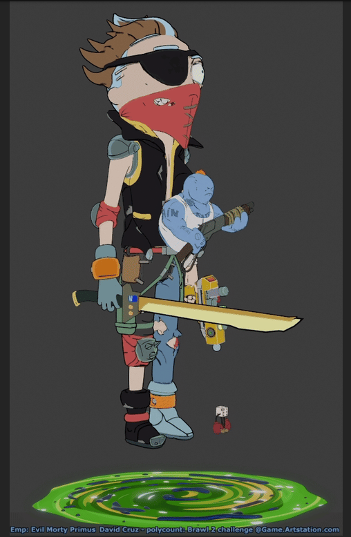
And finally, it’s exciting to see an interpretation of what this character might look like if they existed in the Mad Max–inspired universe from the Rick and Morty tribute sequence. I’d love to see a Netflix special created in your style.
This vehicle concept shows a strong sense of personality and
visual identity, combining exaggerated industrial forms with a cohesive
“scrap-built” aesthetic. The design choices—such as the aggressive front
blades, layered metal plating, and high-contrast orange bodywork—demonstrate
originality and communicate narrative function effectively. The texturing work,
particularly the weathering and surface wear, reflects solid technical skill
and contributes meaningfully to the model’s overall believability.
To strengthen this for your portfolio, consider refining some
elements like the stretched UV’s on the door, the simple shape of the rear fender
over the tracks so it’s not quite so crude in its construction, maybe add some
bevels? Stronger material separation so metals, paint, and rubber read even
more distinctly under varied lighting. You might also explore a stronger
hierarchy of detail, emphasizing key focal areas while simplifying secondary
zones for clearer visual flow. And I would like to see a thin cartoon outline
as the concept depicted but I appreciate that might just be personal preference.
These adjustments would help push both clarity and stylistic polish to an even
higher level. Over all well done, you did a great job and I love this piece.
The artwork uses bold black-and-white contrast to emphasize silhouette and mass, giving the armoured figure an imposing, almost iconic presence. The stark values reinforce the sense of brutality conveyed through the skull motifs and heavy armour forms. You might consider adding an outline to help the figure stand out from the background—perhaps using the opposite value of whatever area it borders. Alternatively, a comic-book style approach with some light fill could also give the piece additional clarity and visual punch.
The retopology work is clean and well executed, and the
underlying concept is compelling—I can already envision how striking the final
piece will be. The upper body shows a thoughtful balance between intricate
details and calmer, more open surfaces, and the precision in the constructed
components is especially impressive. The cybernetic monk theme carries a strong
Shinto-like resonance, evoking imagery of a supernatural figure or modern
reinterpretation of a Yōkai, you have made a fantastic IP right there! Amazing work.
The character model shows strong foundational work,
particularly in the facial sculpt and the asymmetrical design choices that give
the character a distinctive presence. The skin shader carries convincing
micro-detail—pores, roughness variation, and subtle coloration all contribute
to a believable surface under light. The bold hair colour and shaved-side style
also suit a cyberpunk aesthetic effectively.
Several refinements could elevate the piece further. The
specular response on the face is somewhat uniform, giving parts of the skin an
unintended glossy look; adding variation between oily and matte zones would
help. The shoulder also appears to be a noticeably different skin tone from the
face, which can distract from overall cohesion. The transition between the
shaved scalp and longer hair would benefit from softer blending, and the hair
itself could use more curvature to create a natural flow. The ear shape could
also use a bit more attention to achieve more anatomical clarity. Finally, the
clothing—especially the collar—would benefit from stronger material definition
to match the detail level of the head. Overall, the work shows strong direction
and is close to feeling fully polished.
This thread is a strong example of indie-scale ambition
driven by creative constraints. The combination of voxel art, instancing, and a
simple engine shows resourcefulness and a clear vision. Your environments have
lots of potential to be much more than a concept: it could become a highly
playable, visually unique world. Excited to see how it evolves, you are clearly
an idea power house! Amazing work!
Great character, I would love to see him with small
detective cues—like a badge, worn accessories, a utility radio, or a more
disheveled element—would instantly anchor his identity. The face could use a
bit more weariness and asymmetry to convey his personality, and introducing one
or two subtle tech accents would help tie him visually into the Valorant
universe.
Your project feels like it’s built on a strong and
interesting idea. With further refinement of silhouette, volume, and
storytelling elements, this character could become both visually distinct and
narratively rich. Looking forward to how Bratan evolves, after looking at him
again today, I would love to see this character with a Flashlight, Cigarette, Bottle,
Revolver and Police badge but what you have so far is amazing.


Replies
Dorado - Alexander Zlatovchen
The model looks incredible, great job on the clothing and accessories. Top level.
You did an excellent job in Marvelous Designer; those small details really make a difference.
The level of detail is amazing.
I would’ve liked to see images of the texture maps and UVs.
I also wish I had seen a bit of shadow cast from the mask onto the face, without it, the face feels a little flat.
Other than that, congratulations on the result!
2st
iam717
Great job!
I really liked the result, the character turned out really fun.
The 2D shader you used looks great and fits the character’s style perfectly.
I also liked how you handled the UV layout.
My only note would be about the retopology, there are a few areas that could be improved.
But overall, I liked it a lot.
Congratulations!
3st
Hangli
You did an amazing job with the 2D art and translated the idea into 3D really well.
I loved the model, especially the choice of orange, which looks excellent.
I also liked how you made good use of the UV space.
My only note would be regarding the gray metals. I think they could have been worked on a bit more to enrich the final result.
Honorable Mentions:But overall, I liked it a lot.
Great job!
• Sacboi
Wow.
I really loved the result.
I was just sad that you couldn’t finish it in time.
I hope you complete it and publish the model in your portfolio, it’s definitely worth it.
The hard-surface work turned out amazing, truly high level.
Congratulations!
• aumramaram
Wow, this is incredible.
You did an amazing job, truly an impressive amount of pieces, both in 2D and 3D.
How did you manage to produce so much? LOL
It was really fun to see so many high-quality images.
Congratulations on the excellent work!
• Masslove
You made a great start on the blockout.
I hope you’re feeling better after the surgery and that you can get back to this model to finish it and add it to your portfolio.
has a lot of potential
• Fabi-G
I really liked this stylized piece and the low-poly mesh.
The animation, with that subtle sway, also turned out excellent.
The shader looks very interesting and complements the piece really well.
Great job!
• shark2003
I really like this style.
You made a solid start on the blockout, and the model’s potential is already clear in the proportions and silhouette.
It’s a piece with plenty of room to explore details, accessories, and interesting variations within the theme.
It would be great to see you push the design further, refine the secondary shapes, and add more personality to the character.
I’d love to see this piece fully finished.
Keep up the great work!
• Kanga
You did an amazing job on the hard surface, you blended the kitbash with your own modeling in an impeccable way.
There’s a lot of work here, and it’s really impressive to see the level of dedication and attention to detail.
You also made a great start on the retopology.
My only suggestion would be to refine the face a bit more toward a realistic look, so it matches better with the robotic parts, which are excellent.
Overall, you did a great job
well done!
• KlaimtrevI liked the start of the face textures.
Before moving forward with the painting, I’d suggest taking a look at some facial anatomy references and refining the shape a bit, especially the ear.
It will make the piece even stronger.
Great work!
• ayakiryu
You did a beautiful job on the modeling.
I would have loved to see the model finished and to see how you would develop your own elements and visual solutions for the contest theme.
The structure you created is solid, and it would be great to see how you would apply details, materials, and personality to the character.
well done
• sketchem
This low-poly model really brought back memories of the games I used to play during the PS1 and PS2, it hit me with a wave of nostalgia.
I would’ve loved to see more updates and more models in this style.”
If anyone needs more feedback, technical support, or any guidance related to 3D characters, I’ll be happy to help.
I am currently seeking new opportunities, both freelance and full-time.
https://www.artstation.com/victorsantos
https://polycount.com/discussion/237071/brawl2-character-r-m-iam717#latest
Its a hilarious mashup, love it! A lot of thought process went into it as shown by wips. I particularly loved the small details like portal animation, dice with punching gloves and 'pain' written on Kuato. It also shows nice UV layout and technical knowledge in breakdowns throughout the project. Overall from idea to execution it is an excellent work, character I am sure many will play in a game. Congratulations!
2nd hangLi
https://polycount.com/discussion/237463/brawl2-vehicle-rust-rhino-hang-li#latest
I really llike the fusion here of MadMax + Stylized, solid piece of work. It was interesting to see the iterative design process from thumbnail sketches and how true to the concept final model is. Winch at the back was a nice addition, it made the design more grounded. One thing particularly I loved about it and encourage students is to keep your reference board tight and focused as shown here.
My only feedback or rather preference would be if it was textured same as 2d concept art, flat shaded.
Congratulations!
3rd sketchem
https://polycount.com/discussion/237162/brawl-2-environment-the-jungle-sketchem#latest
Retro, PS2, GTA vibes, nostalgia + showing research, technical skills (texture density, atlas) and translating reference shot to 3d facade while aiming to make better shaders. It would be cool to have seen the entire city finished in this style. Placing it in 3rd place even though it has not been updated but matches the certain criteria of challenge. All the best!
Honorable Mentions
Dorado
https://polycount.com/discussion/237670/brawl2-character-the-freelancer-alexander#latest
This was a tough one, artistic old school character look, presentation and ton of work from weapon to vest, shoes and so much more with 40 min video. I would have easily placed it 1st however to keep within challenge rules and fair for everyone who shared work in progress posts and breakdowns I am placing it here. My feedback would be to keep in check intersecting geo, (character arm going inside pouch on left hand side) either use deformers to minimize it as much as possible or better would be to pose in such a way that it feels natural when there is equipment on the sides of body. Amazing sculpt work no doubt about it!
Sacboi
https://polycount.com/discussion/237077/brawl2-vehicle-bull-dust-sacboi-tribute#latest
This was some real in depth vehicle project, super detailed modelling and lookdev. My suggestion for tyre treads texturing would be to make half or quarter section as tileable either horizontal or vertical depending on TD / Texture Size as it will save UV space that you can use to add other elements. It will be great to see the final version! Keep it up.
Kanga
https://polycount.com/discussion/237091/brawl2-character-electric-monk-kanga#latest
Retopology work on this is pretty clean, precise. Concept is amazing too and I am sure it will look great finished!
When designing complex mechs or pretty much anything for entertainment design, I would highly recommend learning a bit about design principles and product design. For example, upper body is following 70/30 rule 70%detail 30% area of rest, it can be inverse. So for legs I see these small circular bits being repeated, if you add them in steps like big, medium and small it will give variety and clarity to overall design. Hope to see a finished version of this, good luck!
pxgeek
https://polycount.com/discussion/237088/brawl2-character-tracy-pxgeek#latest
What can I say, It would have made a very strong playable character in game. Wishing you all the best.
aumramaram
https://polycount.com/discussion/237688/brawl2-environent-greentooth-aumramaram#latest
Greentooth universe brilliant idea and interesting project, loved your dedication into bringing in lots of details. What I really like about it is how there are insides of everything that player can see / interact. Amazing job!
shark2003
https://polycount.com/discussion/237121/brawl2-character-aiur-survivor-shark2003#latest
Personal favorite of mine, Starcraft universe and Predator whats not to like. My suggestion on projects like these is to make solid blockouts and sketches first, focusing on big and medium shapes only. This will allow to read the design as a whole and if changes need to be made, those can be done quickly / refine the design early on. Once base design / shape language is locked, it becomes easier to take a deep dive into further details and refinement. Overall pretty cool project that I am sure many would like to see completed, great job so far!
Its been an amazing experience to be part of this, seeing all the cool concepts and artwork makes me want to keep making art.
Wishing everyone success and I hope you achieve your dreams and goals.
I am currently seeking remote / freelance / contract based work.
my area of specialization is in VR, Mobile Games
(LookDev, Environment Art, Hardsurface, Photogrammetry, CAD, Lighting, Rendering, Unity, Unreal, Optimisation)
https://www.artstation.com/fahadkm
Thank You
Finished Entrants (eligible for 1st–3rd place):
This character model is a clear standout. It demonstrates a comprehensive and well-structured development process, fulfilling the requested breakdown with exceptional clarity. Each individual component reflects a high degree of intentionality, planning, and technical craftsmanship.
The final result presents a distinctly readable silhouette, convincing mass distribution, and convincingly rendered material definition. The work completed in Marvelous Designer is particularly noteworthy: the cloth simulation, layering logic, and naturalistic fold behaviour immediately convey a high level of proficiency. The combination of layered equipment, insulated garments, and a protective mask coherently establishes a cold-weather operator aesthetic, with materials clearly differentiated across fabric, metal, and polymer surfaces.
To elevate the piece even further, the addition of micro-detail and subtle chromatic variation would help mitigate regions that currently appear somewhat uniform. Introducing slight tonal shifts for indications of textile wear, and nuanced roughness variation—especially around areas of mechanical stress such as knees, elbows, and strap edges—would break up flatter surfaces and enhance material authenticity. A dedicated textile-density pass could further reinforce realism and improve close-range readability. Additionally, slightly stronger ambient occlusion and increased contrast between layered gear elements could help articulate depth more effectively. The weapon would also benefit from enhanced wear variation. Finally, incorporating minor asymmetry and subtle texture breakup in the mask and head region could introduce greater character specificity and reduce the impression of perfect symmetry.
You demonstrate a strong command of stylized character creation in this piece, with clear attention to shape language, colour placement, and overall visual cohesion. The transition from 2D concept to 3D construction is handled with notable skill, reflecting an understanding of both form and interpretation—no small achievement so well done!
Your final result has confident line work and thoughtful prop integration and breakdown throughout your thread. Each piece you constructed reflects a solid level of technical skill and artistic polish. The design reads well at a glance and shows a consistent creative voice—an important asset for any portfolio.
For further portfolio development, consider refining material separation with subtle value or line-weight shifts to enhance clarity, and explore slight variations in texture or colour hierarchy to guide viewer focus more intentionally. These adjustments would elevate the design’s readability. A rigged pose to help elaborate the characters personality would also be very nice to see, especially on this crazy dude.
And finally, it’s exciting to see an interpretation of what this character might look like if they existed in the Mad Max–inspired universe from the Rick and Morty tribute sequence. I’d love to see a Netflix special created in your style.
https://youtu.be/mSAXhn-wkZw?t=11
This vehicle concept shows a strong sense of personality and visual identity, combining exaggerated industrial forms with a cohesive “scrap-built” aesthetic. The design choices—such as the aggressive front blades, layered metal plating, and high-contrast orange bodywork—demonstrate originality and communicate narrative function effectively. The texturing work, particularly the weathering and surface wear, reflects solid technical skill and contributes meaningfully to the model’s overall believability.
To strengthen this for your portfolio, consider refining some elements like the stretched UV’s on the door, the simple shape of the rear fender over the tracks so it’s not quite so crude in its construction, maybe add some bevels? Stronger material separation so metals, paint, and rubber read even more distinctly under varied lighting. You might also explore a stronger hierarchy of detail, emphasizing key focal areas while simplifying secondary zones for clearer visual flow. And I would like to see a thin cartoon outline as the concept depicted but I appreciate that might just be personal preference. These adjustments would help push both clarity and stylistic polish to an even higher level. Over all well done, you did a great job and I love this piece.
Honorable Mentions (incomplete but notable work):
The artwork uses bold black-and-white contrast to emphasize silhouette and mass, giving the armoured figure an imposing, almost iconic presence. The stark values reinforce the sense of brutality conveyed through the skull motifs and heavy armour forms. You might consider adding an outline to help the figure stand out from the background—perhaps using the opposite value of whatever area it borders. Alternatively, a comic-book style approach with some light fill could also give the piece additional clarity and visual punch.
Here is an example by WinBrush - https://www.youtube.com/watch?v=U80mTG9NRd8
And a final note, I thought you might enjoy this by Kamil Hepner, different style but I thought you might like a look https://youtu.be/Dn6d2y3kL7Y?t=70
- Electric
Monk – Kanga
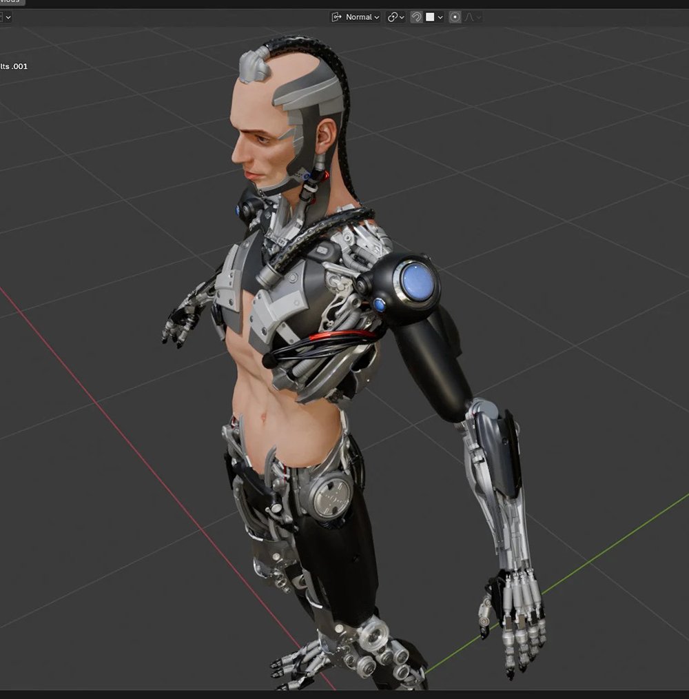
The retopology work is clean and well executed, and the underlying concept is compelling—I can already envision how striking the final piece will be. The upper body shows a thoughtful balance between intricate details and calmer, more open surfaces, and the precision in the constructed components is especially impressive. The cybernetic monk theme carries a strong Shinto-like resonance, evoking imagery of a supernatural figure or modern reinterpretation of a Yōkai, you have made a fantastic IP right there! Amazing work.Fragta – Klaimtrev
The character model shows strong foundational work, particularly in the facial sculpt and the asymmetrical design choices that give the character a distinctive presence. The skin shader carries convincing micro-detail—pores, roughness variation, and subtle coloration all contribute to a believable surface under light. The bold hair colour and shaved-side style also suit a cyberpunk aesthetic effectively.
Several refinements could elevate the piece further. The specular response on the face is somewhat uniform, giving parts of the skin an unintended glossy look; adding variation between oily and matte zones would help. The shoulder also appears to be a noticeably different skin tone from the face, which can distract from overall cohesion. The transition between the shaved scalp and longer hair would benefit from softer blending, and the hair itself could use more curvature to create a natural flow. The ear shape could also use a bit more attention to achieve more anatomical clarity. Finally, the clothing—especially the collar—would benefit from stronger material definition to match the detail level of the head. Overall, the work shows strong direction and is close to feeling fully polished.
Greentooth Environment – Aumramaram
This thread is a strong example of indie-scale ambition driven by creative constraints. The combination of voxel art, instancing, and a simple engine shows resourcefulness and a clear vision. Your environments have lots of potential to be much more than a concept: it could become a highly playable, visually unique world. Excited to see how it evolves, you are clearly an idea power house! Amazing work!
Great character, I would love to see him with small detective cues—like a badge, worn accessories, a utility radio, or a more disheveled element—would instantly anchor his identity. The face could use a bit more weariness and asymmetry to convey his personality, and introducing one or two subtle tech accents would help tie him visually into the Valorant universe.
Your project feels like it’s built on a strong and interesting idea. With further refinement of silhouette, volume, and storytelling elements, this character could become both visually distinct and narratively rich. Looking forward to how Bratan evolves, after looking at him again today, I would love to see this character with a Flashlight, Cigarette, Bottle, Revolver and Police badge but what you have so far is amazing.