FYP: Viking village
HI! this thread will be documenting my Final year project at Staffordshire university and hopefully help provide me with the opportunity to receive some feedback, outside of the university :D
For my FYP I am going to be using a concept by Nikolay Razuev from 2014 called Viking village (https://www.artstation.com/artwork/Gamyz)
Progress so far:
First pass blockout:
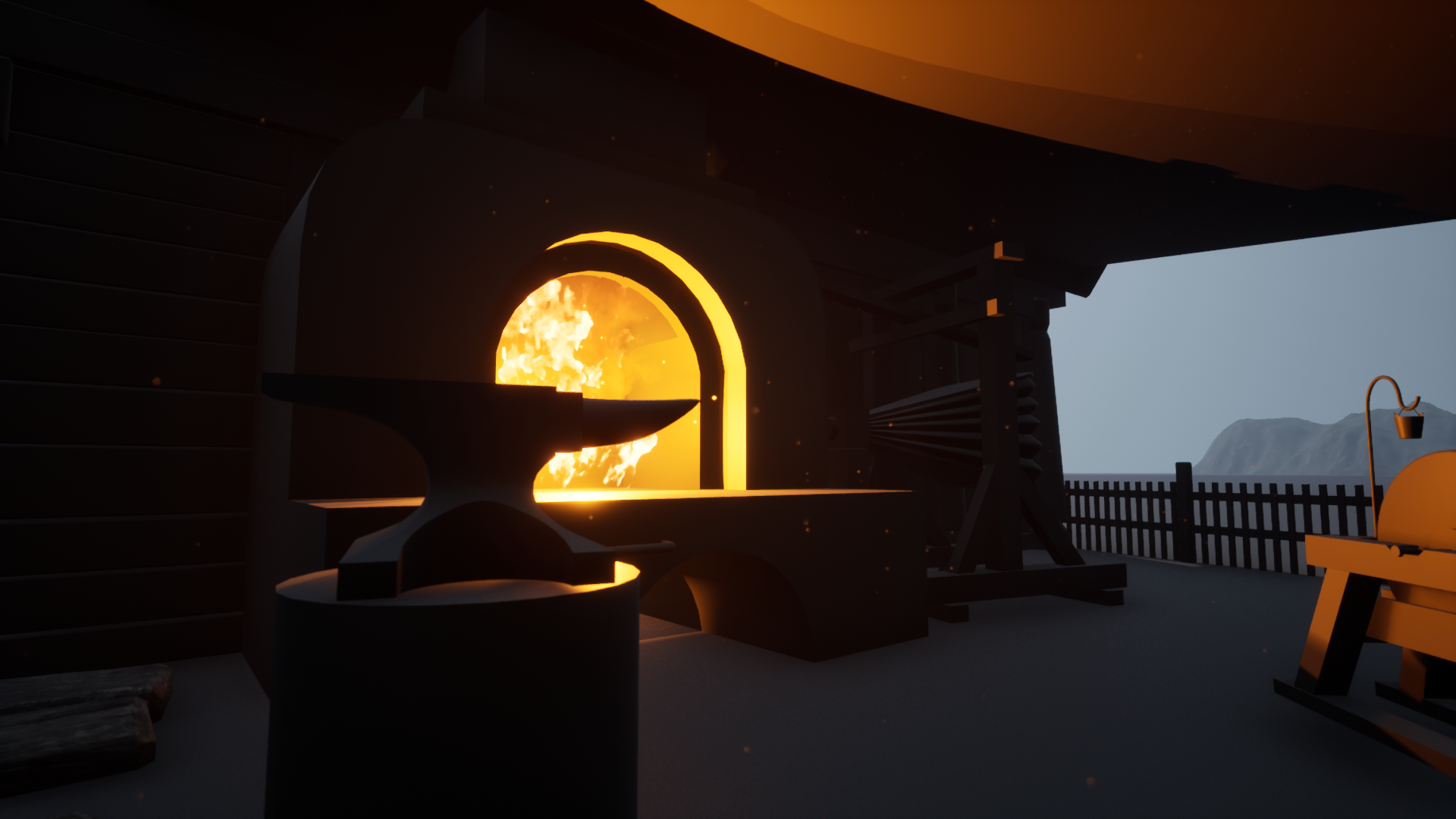
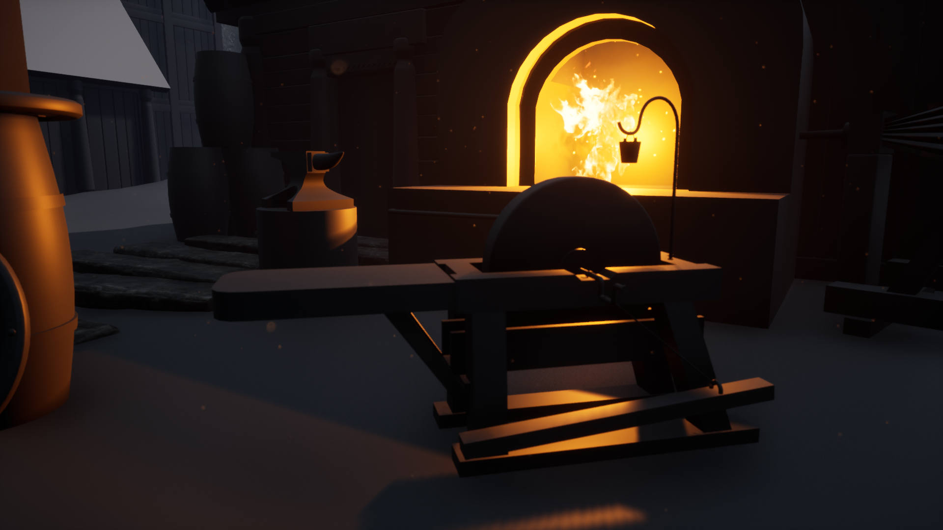
Blacksmiths area (Using assets form an unfinished project last year, hopefully ill get the opportunity to finish it this time)
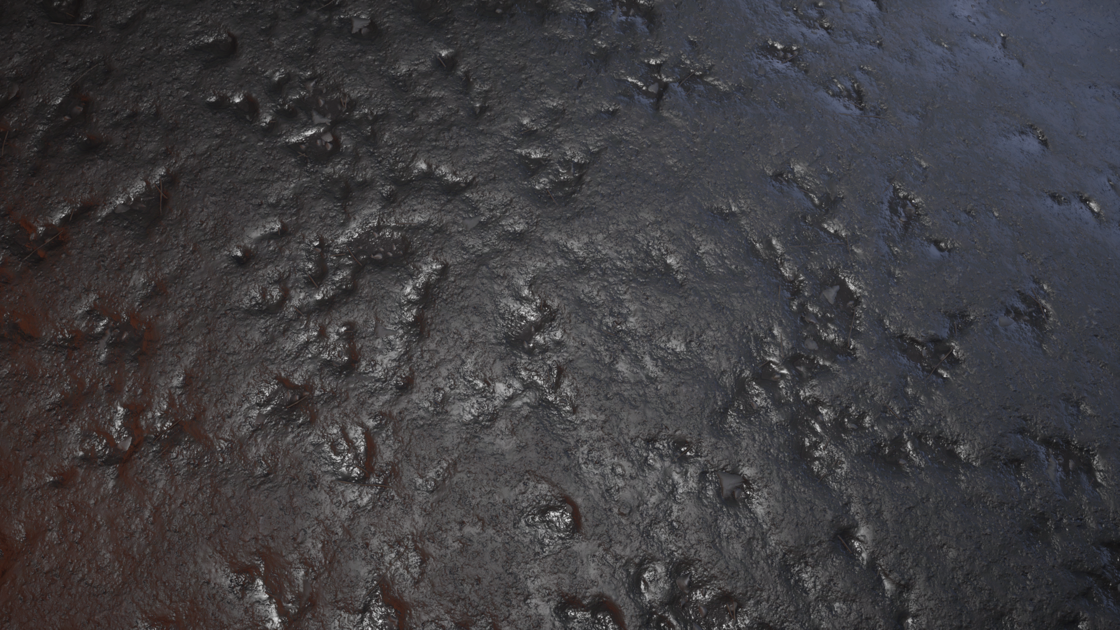
Materials created so far (Made in designer and rendered in ue4, No POM or tess in the renders)
Current master material using RGB masks and a second unwrap channel to maintain a 1024 Texel density:
Currently my RGB Mask setup uses:
Red: Edge Highlights
Blue: TBD
Green: AO
I then blend this with a simple tillable which uses my second unwrap channel to maintain a Texel density of 1024x1024p/m
I then additionally vertex lend moss onto the material which utilised POM.
Also the moss is using POM in the master material.
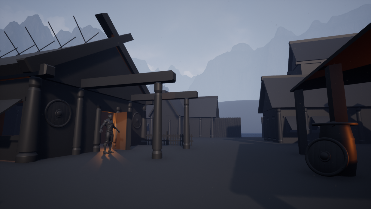
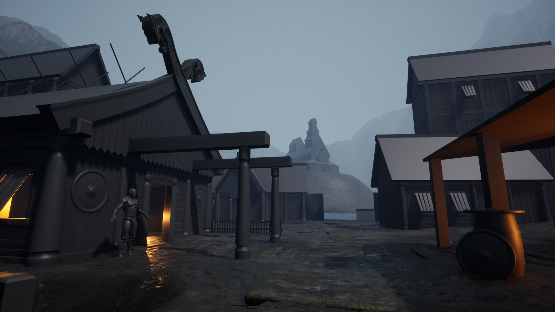
Main shot currently:
(Haven't really done a proper lighting pass yet)
Dragon head piece:
Any feedback for this project would be both welcomed and massively appreciated! :D





Replies
Did a really fast lighting pass (Still very WIP)
Progress:
Main scene:
(The right tower needs a complete rework)
Quickly blocked out a trim sheet, mainly just for the wood edges atm:
I unwrap my wooden structures to this trim sheet on my first unwrap channel, I then create a second channel with a 1024x1024 Texel density.
Second wood texture, the knots are still a WIP:
I've also implemented a simple mud gradient on the bottom of my asset:
I do want to experiment with runtime virtual textures(mainly for mud mounds and rocks) however at the moment this will do.
As always any and all feedback is massively appreciated! :)
Hey there,
Really nice progress so far, looking forward to seeing this develop :) .
I think you've matched the concept quite nicely, also it doesn't have to be 100% accurate when it comes to all details, one can always make slight changes as long as the feeling and the atmosphere of the concept is achieved.
I would rotate the shield slightly to be more at an angle so you can get more rim light and angled specularity (you know, surfaces that are more at an angle reflect more stuff..fresnel effect). Also, keep in mind that most of these surfaces have a slight wet effect, hopefully you can recreate that as well. I think it's especially important since the ground is really wet as well.
Keep it up!
Thanks for the feedback!
I'm definitely not trying to match the concept 100%, but I definitely want to preserve the mood like you suggest.
as far as the shields are concerned, the meshes themselves are just older meshes I had made a while ago that I've used as stand ins and the roughness/spec values definitely aren't correct. But I definitely want to add some spot lights around the scene to help highlight some silhouettes with rim lights and stuff.
Planning to hopefully get another post up either this weekend or some time next week! again thanks for the critique, its very appreciated!
Anvil prop:
Painter:
Small scene update (A lot of this is still WIP, notably the roofs, tower, back house and pillars)
Also switched out the skybox for one on the marketplace
Straying further away from the concept with the lighting. Any feedback or thoughts would be much appreciated!
I'm digging the lighting, cool stuff!
Further lighting progress:
Barrel prop (1k Tris)
Further scene progress (Foliage made inside of speed tree using foliage atlas's from Megascans:
keep up the greatwork ;)
very cool scene, keep a look out on the really dark renders.
Updated lighting (still need to make some adjustments but i'm quite happy with where its at ATM)
Still need to do a lot of work as well as a general color grading past as well as tweaking some values (Some areas are still a bit dark cause my monitors are a bit too bright) As always any feedback or critique is massively appreciated :D
Dang, these PNGs take forever to load. You may be missing out on feedback because people are bailing instead of waiting. Some tips on making things load more quickly: https://polycount.com/discussion/172555/waywo-usage/p1
Loving this piece so far, gorgeous lighting and atmosphere. There's nothing major that's sticking out to me, only some nitpicky stuff. I've taken a stab at illustrating a few adjustments you could make.
Not annotated in the picture, but I added some edge highlights from the moon on the roof of the centre building. It might help to add a fake light pointed at the building to help emphasise those edges and accentuate the building's form. I believe the building is still using some of the blockout mesh without any beveled edges so its probably not doable at the moment, but it might be worth considering as you finalise the building.
I also tried dropping the background mountain to the right of the central building down a little, so the silhouette of the building stands out a little more.
Beyond that, I'd probably try and work in a less dense grass mesh around the edges of the thicker patches of grass, just to ease the transition from grass to mud.
(Edited version in greyscale, without annotations)
(GIF to illustrate the differences)
Really excellent work, loving the architecture and composition too, keep plugging away at this one.
This is some really nice feedback and is massively appreciated! :D
Just want to point out that I am working from a concept so I can't really take credit for the architecture and composition.
https://www.artstation.com/artwork/Gamyz
The back house still needs loads of work and hasn't changed all that much from the blockout phase. But I do want to spend a considerable amount of time working on it aswell as breaking up the shore line with various trees and rocks.
Again I really appreciate the feedback :D I'm going to work in your composition suggestions and hopefully I'll have an update to post later on this week!
Forge prop:
Tried a little bit of a different workflow when creating the forge prop, I first started by creating a brick material in designer and then exported it over to painter.
Designer:
Painter work:
From here I exported a height map and displaced it inside of 3DS MAX.
I then drastically reduced the tri count using Pro optimizer, while retaining the UVS:
In engine:
Likely going to revisit this and just create my high poly in Zbrush, however, it was a cool little experiment :)
Been working on mainly props for the past week, here's a quick little render scene:
I've got my uni deadline for this on Friday but I plan to work on it for much longer, here are the renders I'm submitting for it (Back house still isn't done so I've had to try and hide it a little bit with fog cards.
Realise its been a while, I've had uni deadlines and other modules to attend to, but I'm finally able to throw all my time into this!
here is where the project is currently at:
Project so far:
Prop Render:
This looks awesome.
Lighting update (Some areas may still be too dark)
Finally starting to work on my background elements :D
If anybody has any feedback that be massively appreciated :D
Been a while but I'm finally planning on posting up my work to artstation soon (https://www.artstation.com/matthewwilshaw)
here are some of the shots I plan to use of the final post:
The main shot renders still require a bit of refining (Mainly fog card placement and background elements)
Real nice work bro ! Really digging the atmosphere and all :)
But is it me or did you remove the church at the back from the base concept ? That was looking quite good for depth and visual guide :p
Other than that do you plan on adding a couple of shots of wireframe assets on Artstation? I think it's always good for peeps to see how you made your stuff, topology wise etc...
Wish I was as good with texturing sir, great job again !
Thanks :D
I decided on getting rid of the church to bring more attention to the foreground and away from the background.
Id like to include some wireframe shots and texture flats on my AS post, just trying to come up with a cool format for it.
I see what you mean for the focus point :) Eager to see the final results on AS then ! Just tried to follow you, but the page is not available anymore :p
Keep us posted then mate ! 😎
Final post-
https://www.artstation.com/artwork/QnD0o3
Thanks for all the feedback guys!
Thats sick dude, good job :)