Should I straighten my UVs or not?
I recently learned that straightening our UVs is a good thing to as it reduces seams and helps in better UV space utilization. I tried the same on a model that I am working on and now I am a bit confused over is it really better to gridify my UVs or to divide them differently.
I tried both methods:
- Less seams and straightened - Had more distortions but space utilization was good
- More seams and automatic layout - No distortion but space utilization was bad
If you were presented these two layouts, which one would you say is better?
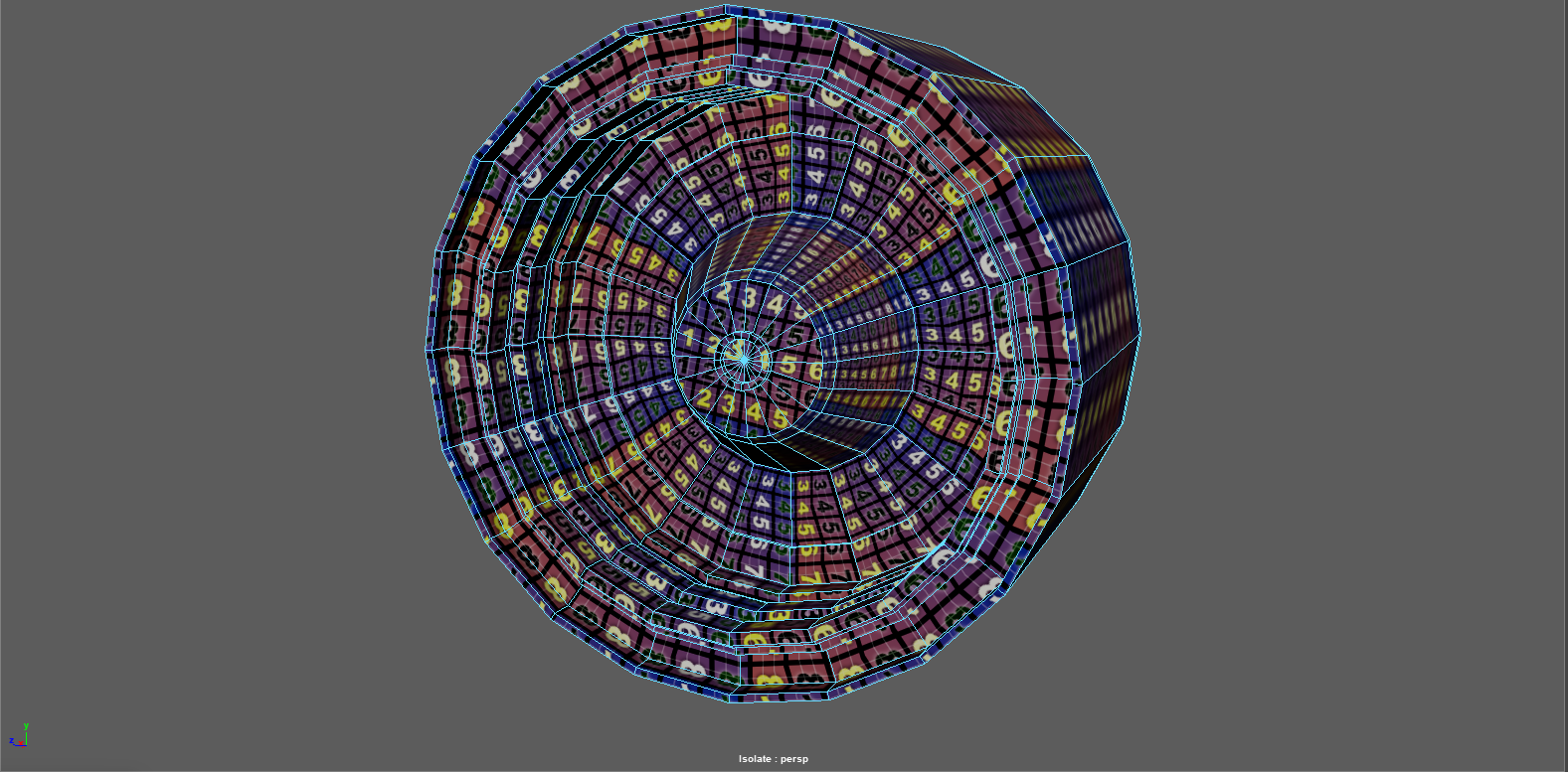
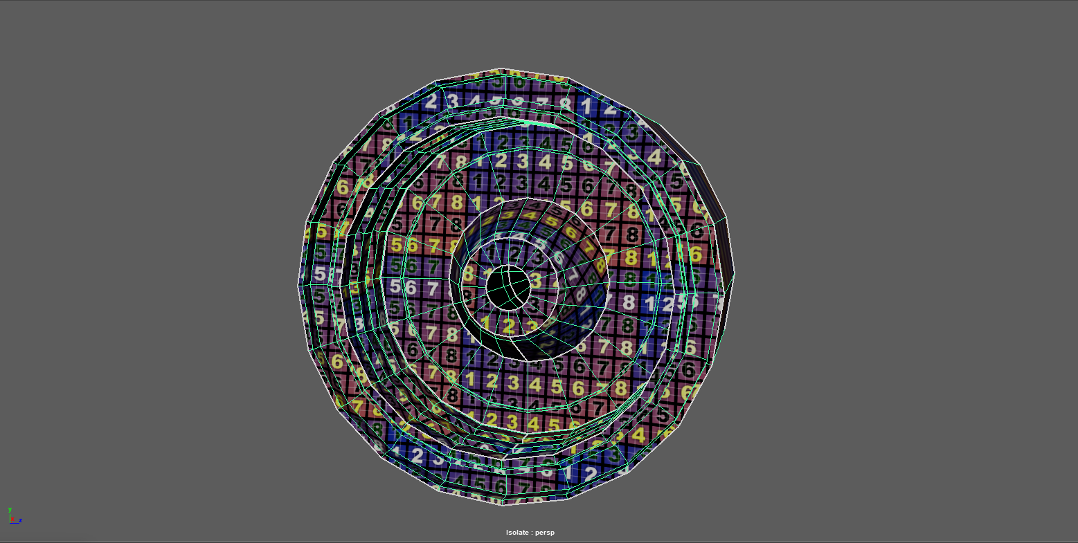
Front side (Gridified UVs)
Back side (Gridified UVs)
Straightened UVs with less seams and more distortion
Front side (more seams)
Back side (more seams)
more seams but no distortion


Replies
its very rare that being 100% dogmatic is the best approach
your uvs want to look something like this (but not crudely drawn with a mouse while eating soup)
really depends on how the asset will be used. will it be lodded? then keep in mind how and place the seams accordingly
Could you please expand on what you meant by lodded?
So I should seperate the front, back and the strip at the top resulting in three islands right?
it would be a reasonable place to start
this kind of setup minimises distortion and makes it a lot easier to reduce detail on your model (lod) without affecting the way it looks
you may need to use more separate strips, you'll find that out as you unwrap it
the fastest way to get to this layout is to apply cylindrical UVs and then rearrange the shells. its pretty much a couple of button clicks in most apps
Level of Detail LOD,
http://wiki.polycount.com/wiki/LevelOfDetail
I would unrotate this strip here (and any other strips) to be perfectly horizontal or vertical, aligned to the pixel grid. It doesn't matter if you make it horizontal or vertical as long as it's following either of these 2D axes.
If you leave it rotated like that you'll have to use padding to avoid seams at the diagonal edges, and you don't have the space for that -- notice how it's already touching the other UV islands.
wait that uv layout for the backside was for real? i assumed it was just one automatically clicked together thing to have something yeah align those and straighten what you can, you are losing a ton of texturespace and those diagonal pieces will look horrible unless you have some serious amount of texel density
Yup. It wasn't the finalised UV. I just wanted to get an idea over which method is better. Straigtening or not. I have understood what I have to do though. Thanks for all the help.
Yes, thanks for pointing that out. Have fixed it.
So you think straightening them all like a strip is better? because most have advised me to straighten things which are logically ok to do so and keep others as a circular map.
oh this really depends on the geometry, i am okay with round caps. but what you showed is all on crooked angles. is in parts opened circles which could be straightened but instead are just slightly curved. and then there is this circle on the left this prepared to be opened but wasnt because on one edge that is still connected? in simple words, that last shot is a mess and looks more like a quick test than ANY serious take on unwrapping this. round or straightened
You are right on the test part. It really was definitely a test. I just added the seams and did a UV Unfold and UV layout in Maya. All I wanted to know was is it ok if I straighten everything out as much as possible or should I just keep circular things circular? I got the answer to that.