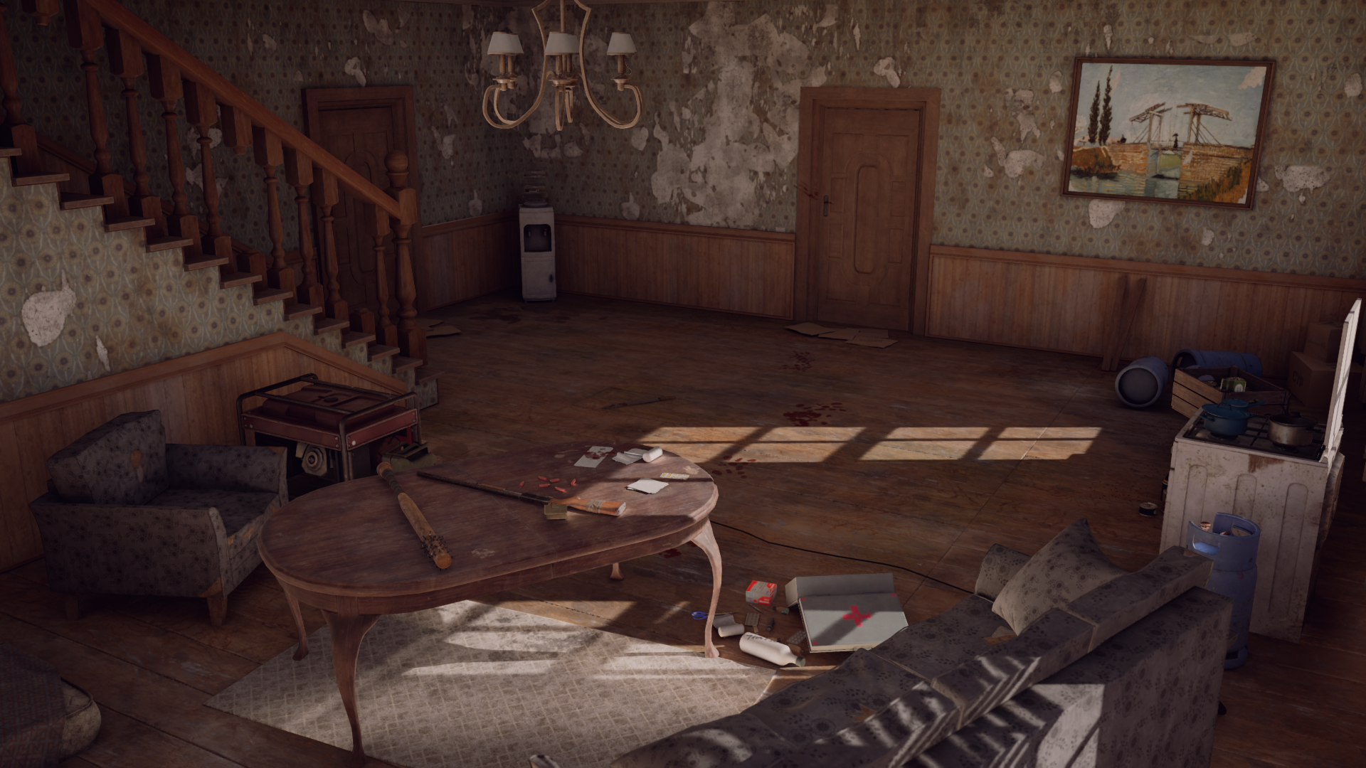
[UE4] PostApo Safe House
Hi everyone, I want to share environment I have been working on for a bit more than 2 months now. Goal for this project was to create environment that could be main piece in my environment art portfolio I'm trying to build right now. I find myself in place where tweaks I'm making aren't changing much and I don't think I can push it forward without some critique. If anyone could give me honest opinion if it's portfolio worthy or I'm not there yet, I would really appreciate it.
Environment was inspired mostly by Days Gone and The Last of Us. Modelling done in Blender/Zbrush, texturing Substance Painter/Designer. Only thing I can't take credit for is painting on the wall. It's Langlois Bridge at Arles by Vincent Van Gogh.
Thanks in advance for any critique and advice.


Replies
Hey! I think generally it looks quite good already!
Some random notes:
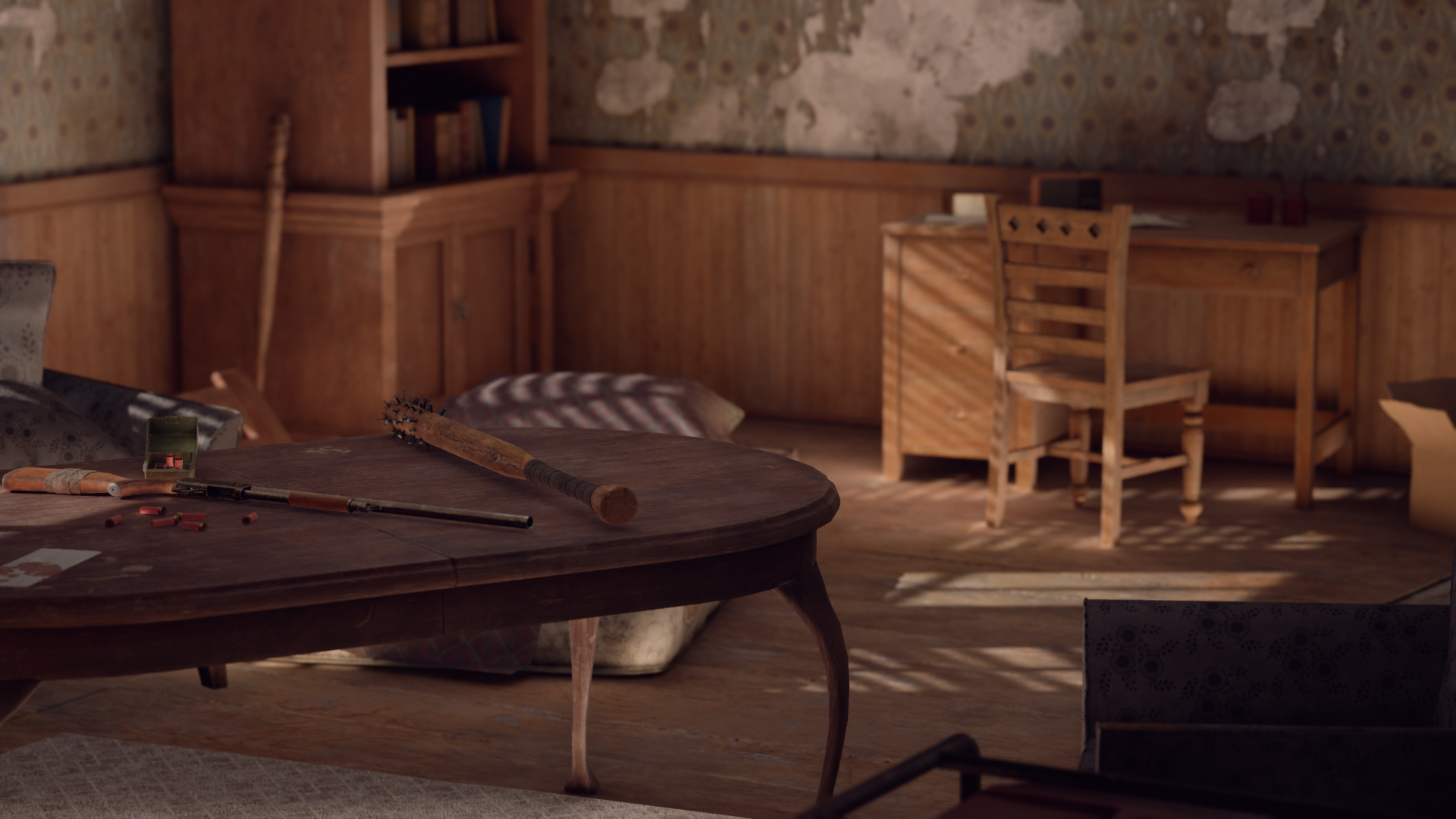
- Door handles look a bit tiny
- Maybe it would fit the theme more if doors/windows where reinforced
- Some objects look bit floating/ no contact shadow (gasoline cans, box next to scissors, couch in front of windows)
- "The end" wall writing is to overdesigned imo, like a wall sticker. Maybe more freehand writing.
- Some simple metal shelves could break up the walls more (storage of loot
- Lamp looks a bit repetitive - destroy?
- maybe slightly tone down wallpaper tear down. It almost becomes repetitive.
I can recommend making overpaints to try things out quickly.
Keep it up :)
Thanks for your input mate! I made some changes according to points you have mentioned. I added few additional props and made some changes to composition. I'm not sure about color palette on carpet. It certainly brings attention to center which I think is good, but it kinda breaks overall theme of the environment.
Hey @hublus , cool update!
I think the space could be a bit more structured and have more environmental storytelling (how the survivors live there). Also consider that in a game, the player would have to be able to navigate this room.
I would try to not having things that extremely randomly rotated and tossed over (it can look too deliberate) and try grouping assets more. For the grouping, imagine the room been broken down in various thematic sub-sections like: kitchen, sleeping space (can be social corner transformed during night time), social corner, planning/research, storage area, medical and weapons/equipment. You could make a back up of the scene and try this out with the assets you have so far, or sketch different room layouts with pen and paper.
I think you already did this with the desk, chair, images on the wall and bookshelf close to it. Instead of pictures behind the desk, there could be maps, lists and notes with markers, showing this is where survivors make plans and do research. The plans/maps can be the brightest/most contrasted spot in the room, providing a natural point of interest when entering the room.
When hanging an old painting, you could place a sticky note at the frame with it's description, like if a art-academic-survivor "rescued" it from a museum. Or someone who likes cooking hung pots with edible plants on the window boards. I feel small situations like that, will tell more about the survivors.
Also when looking at the room, I feel some elements visually disrupt/cut the direction of the room like the cable and the carpet, could try to have elements following it's shape more.
Regarding assets, I think the depth of the bookshelf left of the desk is a bit too deep - as is one could fit several books behind each other. And for the carpet, I would try to have it more flat colored, not that much contrast (so it breaks up the large floor area, but doesn't become a point of interest). And I would try to group it more with the couch, in the sub-sections spirit. Also you I would consider increasing the saturation on some colored props. Giving the curtains some color could also looks nice.
But that's just some opinions, good luck 🙂
Here is an rough overpaint, trying to illustrate some of the points (not the grouping/layout part though)
Thanks again for detailed advice! I gave a rest for myself and the project for about a week. I tried making some changes according to things you have mentioned. I decided it's last update I'm making as I don't think I can push it much further with my current skill level and I found myself procrastinating too much. Thank you for your input as it really helped me a lot. Cheers!
There is a link to final result https://www.artstation.com/artwork/lR98lY
Hey man, congratz for finishing it 🍻 Much success for your next project 🚀