Home 3D Art Showcase & Critiques

World Of Warcraft FANART: Undead Starting Zone [image heavy!]

13
polycounter lvl 6
Offline / Send Message
tomenjerry polycounter lvl 6
hey! I realised I made too much to post in "show your handpainted stuff thread". So I figured I would make a thread myself, so I can get C&C. I will post a lot of works in progress. The project itself is completely for fun, and I don't really have a planm, haha, but thats fine. Like the title says, I'm working on a redesign of the undead starting zone in WoW. Here's some of the stuff I've been working on for the last couple weeks:


@Pixelatedkiwi This is going to be my thread from now on :) Can you give your thoughts on the tree? Would be awesome!

@AntonioNeves Thanks again, I'll work on it today!

I got some advice from Antonio. Which I'll be working on next. Should be a relatively easy fix:


Replies

  • Benvox2
    Offline / Send Message
    Benvox2 polycounter lvl 10
    Awesome! I know you said you don't have a plan, but will you make a chunk of the Undead starting area as a scene? What will you use to render?
  • Wendy de Boer
    Offline / Send Message
    Wendy de Boer interpolator
    Cool stuff so far! I'll be looking forward to see what you come up with. :)
  • tomenjerry
    Offline / Send Message
    tomenjerry polycounter lvl 6
    @Benvox2 Yeah just a chunk I guess. It's not going to be a precise copy, I'm probably going to rearrange some things, and also change the deisngs a little. I'm thinking about using ue4, because it has some nice shader options, and I really like the material nodes and stuff. But not sure yet.

    @Wendy de Boer Thanks!


  • TOBSn08
    Offline / Send Message
    TOBSn08 polycounter lvl 7
    Looks good already, I like the vegetation. I'll keep an eye on this :D
  • tomenjerry
    Offline / Send Message
    tomenjerry polycounter lvl 6
    Update on the grave! Working on a candle now, texture is still WIP. I'm going to make some variations too. I Used a quick sculpt for the candle, a lot easier that way. @AntonioNeves I fixed the edges. much better now!


  • tomenjerry
  • AntonioNeves
    Offline / Send Message
    AntonioNeves polycounter
    Nice upgrades!  :) Man... I love the initial undead area, the environment , the music, everything, looking forward to see more!

    You asked me about next project, i dont know when to start yet, maybe some wow fan art like you are doing, lets see... I will let you know soon :)
  • tomenjerry
    Offline / Send Message
    tomenjerry polycounter lvl 6
    @AntonioNeves yeah man, the area looked really interesting. Maybe the tauren starting zone, that's interestng too! I persoanlly went for a vanilla zone, there'snt much "wrong" with the newer zones. I love the worgen starting zone, but it's design is so strong allready! I wanted to do some design work too, so I guess vanilla/bc zones are a good choice since they are relatively simple in design.

  • Dragonar
    Offline / Send Message
    Dragonar polycounter lvl 10
    Realllyy cool dude ! keep it up I want to see more ^^
  • Azaraen
    Offline / Send Message
    Azaraen polycounter lvl 10
    Nice start! Already getting a good feeling of what this might look like as an environment! Super excited to see your progress!  :)
  • tomenjerry
    Offline / Send Message
    tomenjerry polycounter lvl 6
  • Pixelatedkiwi
    Offline / Send Message
    Pixelatedkiwi polycounter
    Woo a thread :)  I would say for the tree, use the newer zones for reference for the fidelity of the foliage/texture maps etc. but apply it to the vibe you like from the undead area.  
    For me personally they are looking a bit realistic, you could try pushing the stylization a bit more, possibly some subtle color variations/gradients in both the trunk and foliage for more of a wow feel.  You can also add some flavor with things like cobwebs around the branches, glowing eyes in the dark spots, anything that helps push the spooky/quirky feeling of the undead. 

    These aren't undead area trees but it helps illustrate my point more clearly:

    Looking forward to seeing more.
  • tomenjerry
    Offline / Send Message
    tomenjerry polycounter lvl 6
    @Pixelatedkiwi
    thanks for the advice dude. Hmmm yeah I know what you mean. I'll try to find some more reference from WoW (I allready looked at these ones on jessica dinh's blog :) ) I think most of the stylizations has to come from the leaves, since they cover most of the trunk. in the screenshot the leaves have a slight hue shift from top to bottom. Maybe I can make a hueshift from the base of the branch to the tip? I'll have to experiment, but maybe some desaturated blue at the base, going to a little more saturated green at the tip? Have any tips on the shape of branch or the needles itself? I'm thinking of making them bigger. we'll see, thanks again.
  • gfelton
    Offline / Send Message
    gfelton polycounter lvl 6
    Your hand painted texture are awesome, can't wait to see what you have in store for us! :)
  • tomenjerry
    Offline / Send Message
    tomenjerry polycounter lvl 6
    @gfelton thanks!

    Was really busy last 2 days... but I have started working on some stuff for a graveyard. After this I'll try to work on things to define the bigger picture a little better, like trees and rocks, instead of focussing on detail so much. But this seemed  like fun to make. the new grave stone needs some edges fixed up, and I have a wooden grave in mind too what do you guys think of that? I didn't want to make it a cross, since it doesnt really fit in the warcraft universe.

    the idea for the simplest grave:

    it may look too muxh like a totem, it's really hard to think of something thats not just a cross.

    next up. like I said, I'll try to fix up the tree, with the advice from pixelatedkiwi, some rocks, and starting on some of the fences and palisades

  • Azaraen
    Offline / Send Message
    Azaraen polycounter lvl 10
    You could just leave it as a plank with carvings of inscriptions on it! 

    Also, your results from baking and texturing looks so good! I had abandoned zbrush sculpting in lieu of only painting, for time & the betterment of my painting skills, but seems like it instead saves you time to sculpt first.
  • Bolovorix
    Offline / Send Message
    Bolovorix ngon master
    Oh man this is going to be fun. I've started so many characters in that zone and I can't wait to see more life breathed into it!
  • tomenjerry
    Offline / Send Message
    tomenjerry polycounter lvl 6
    Here's a very quick update on the grave stuff. This wood texture is giving me a bit of a hard time, but whatever, after this I'll be doing the trees trust me :) I think I'll do the branch texture like antonio neves did on the wooden house project, but make the branches a little bigger.. hopefully that'll make it more stylized.


  • Cremuss
    Offline / Send Message
    Cremuss polycounter lvl 12
    hey! looks cool ! the textures are looking really nice but I'm a bit worried about the lack of values and fake lighting in them. I don't know if it's intentional or anything but everything has the same value and it may be hard to read if the scene gets too complex

    I desaturated and blurred the image to focus on the main shapes and as you can see nothing really stands out.

    keep it up!
  • tomenjerry
    Offline / Send Message
    tomenjerry polycounter lvl 6
    @Cremuss
    Hmm, yeah I could always darken or lighten things slightly. But I guess color contrst is also a thing right? 
  • KurtR
    Offline / Send Message
    KurtR polycounter lvl 7
    Loving this. Been thinking about doing something similar with something from wow myself, you got me inspired. Adding your thread to my favorites to keep checking in on your progress.
  • Cremuss
    Offline / Send Message
    Cremuss polycounter lvl 12
    tomenjerry > yeah totally agree, colour contrast is important as well. However I feel like you can't rely on it exclusively since you're not using very bright/saturated colors. A bit of changes in values here and there (maybe use the green channel from a world normal map since you're using sculpts?) would help with readability. Just my opinion anyway, it's a matter of style and art direction at that point :)
    can't wait to see more!
  • tomenjerry
    Offline / Send Message
    tomenjerry polycounter lvl 6
    @KurtR Glad to hear that! Yeah I love doing "redesigns" for personal projects, it doesnt give you the stress of coming up with something completely new, but leaves enough room for experimentation and practice. Good luck on your project!

    @Cremuss Yeah I will try to add more value changes, but to the entire object, because the shading on the objects itself reads pretty well. I also dont use sculpts for every object. I always work from a base texture that I create using the bakes, adding the lighting later using the green channel from the normal is not a really good idea in my opinion. I agree on desaturating the image to check values, but blurring seems a bit overkill to me. I'll try to makes things like trees,rocks etc, readable from a distance using more value changes.
  • tomenjerry
    Offline / Send Message
    tomenjerry polycounter lvl 6
    Been working on the tree branch texture. The previous one, like pixelatedkiwi said was not really cartoony/stylized. This one feels more like it, I think. If you guys have anny suggestions or C&C, let me know! I personally like the desaturated purple in at the start of the branch, I think it suits the undead vibe I'm trying to create. 

    Also made a simple layout template for the update screenshots, It'll look a little less random.

    I still have to make some variations on the tree. I'm thinking of making color variations for different trees too. I also made the stem a little darker. These textures are all for testing purposes, so nothing is set in stone, yet.

  • Cremuss
    Offline / Send Message
    Cremuss polycounter lvl 12
    Nice tree! I liked the first one as well but I feel like this one could fit better within an undead area :) I definitely like the purple shadow gradient. Maybe you could play with vertex color for a top down gradient or something like that?
    waiting to see more :)
  • tomenjerry
    Offline / Send Message
    tomenjerry polycounter lvl 6
    @Cremuss thanks! Yeah I was just thinking about doing the vertex coloring! I have to figure that out  first, but I was thinking about making the leaves on the top lighter, and greener (because they're fresh leaves), and the ones on the bottom a little darker and more gray/purple.

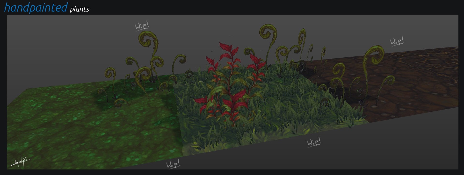
    I've made some more progress on the trees. I made one version that's a little more blue. And some trees that are (partially) dead too.

  • Faf
    Offline / Send Message
    Faf interpolator
    Hi :)
    Great work so far ! Can't wait to see it finished !
    The overall looks really good and I 'm agreed with the feedbacks you already received !
    Since I'm not a big expert in foliage, I let that for other people to critic ( looks good to me !) but I did some paint over on some of your textures.
    I think, especially for the wood, be carefull with your occlusion which seems very dark and strong. If you re using a zbrush base, don't hesitate to use several matcaps and composite them in photoshop before painting over. Usually I tried to avoid real black and white in almost all of my texturing.
    To balance my contrast, I used two layers filled with color in photoshop. One with a "darker color" blending option to turn down the brightness and add a color in my highlights; and one with a "lighter color" option, to turn up my dark areas. 
    Don't forget to also add an "unsharp mask" at the end to sharpen your textures a little bit ( used with moderation ! )
    I also added a little bit of information in the textures, but if you prefer having a more "loose" style it works too ! :)
    It's something I usually adjust by looking at the tiling if there are too many details !


    Thanks for the feedbacks on my thread btw ;)
  • wirrexx
    Offline / Send Message
    wirrexx ngon master
    Man Fanny, i'm a huge fan of yours, love your texture work and TomenJerry, wrote to you on artstation yesterday about your workflow. Both of you are just to amazing!! 
  • tomenjerry
    Offline / Send Message
    tomenjerry polycounter lvl 6
    @Faf thank you so much! Your texture work (especially ogrimmar) has inspired my work. Thanks for taking your time to do a paintover! Yeah the contrast is too strong, I'll fix that using the lighten and darken layers. I think that's also cause I was struggling with making the lighting look good. All the textures looked really washed out when I lit them, but I'll have to look into that.

    I tried using matcaps, but usually textures start to look like plastic, might be the wrong choice of matcaps, but I'll just have to watch my value range in the future, I think taht will improve things big time. Yeah I like the more defined/detailed style, I guess that's also a matter of putting in time (as wel as knowing how to add detail of course), so I will defenetely go back to those textures in the (near) future. 

    yeah, I always feel a little stupid giving critique, as I'm not at a professional level yet. But Like I said in your thread, see it as my opinion on things.

    You thanks for your feedback on my thread  ;)


    For everyone else: I'll be gone (on vacation) for the next 2 weeks, where I can't really work on this project. So don't expect updates (Although I will read the things people write :)). Because it has been a while, I wanted to share what I've been working on. It's not much, and I'm not very happy with it so far, I'll redo this some day:


  • tomenjerry
    Offline / Send Message
    tomenjerry polycounter lvl 6
    @wirrexx You mean I wrote to you wirrexx. Yeah But remember that's my workflow, which is similar, but not the same! A more detailed description of faf's worklow is in Vertex 2. But if you just start out doing handpainted textures I would just start with fully handpainted textures, rather than using sculpts. When I started doing this, about 1 or 2 years ago, using sculpts actually gave me a hard time, it was really frustrating. So then I went back to fully handpainted textures, And I learned a lot more about shapes and colors and stuff .Not that I'm a master now, but just saying.
  • lotet
    Offline / Send Message
    lotet hero character
    This is looking sooo good. I dont really have  much if any crits or anything, just wanted to pop by and say I love the look of it so far.  subbed, cant wait to see how it turns out!
  • tomenjerry
    Offline / Send Message
    tomenjerry polycounter lvl 6
    @ lotet thanks!

    A little update before I go on vacation! I painted over the old wooden plank textue I did, and took  @Faf 's tips and tried to make it work. Matching the same style was really hard, but everyone has a little bit of his own painting style, I guess. I think this is a huge improvement, even though there's still some areas I need to paint a little bit more.

  • AntonioNeves
    Offline / Send Message
    AntonioNeves polycounter
    This is great! really, I totally agreed with Faf said, but for me, everything looks a bit of the same, so what I would do is add some details in some places, like broken pieces or nail holes, something like that. Also some long planks and in some places and I reduced the space betwee the planks. That's it!

    Like I already said, its just details, your texture already looks good! :)


  • tomenjerry
    Offline / Send Message
    tomenjerry polycounter lvl 6
    @AntonioNeves thanks for the paintover! I really like the detailswhere the wood is broken off. I will add those in. And I will try to fix the spacing as well. I'm not a big fan of the nail holes though, but I have another idea for that. I will continue making other stuff first though, once I need this texture again I will work on it again. Thanks again.


    For anyone else: I just wanted to mention this project will not be finished soon. My art course starts in 4 weeks and I have some other stuff to do as well.  I will work as hard as I can, though!
  • Pixelatedkiwi
    Offline / Send Message
    Pixelatedkiwi polycounter
    +1 for the color variation and lower highlight contrast in Antonio's paintover too, when you tile that it will help to look not so noisy.
  • tomenjerry
    Offline / Send Message
    tomenjerry polycounter lvl 6
    @Pixelatedkiwi yeah true. I hadbmore color variation the old one, which was kinda rrmoved with my paintover process. I will try to improve it. Thanks for the feedback!
  • tomenjerry
    Offline / Send Message
    tomenjerry polycounter lvl 6
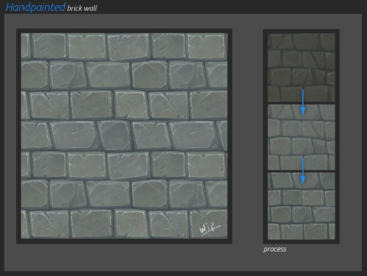
    Hey! I'm back from my vacation, ready to continue with my project. I figured I wanted to make a couple more textures I need to start making the terrain. So Here's a rock texture I'm working on. Still really early into the painting fase, but I thought I would share it anyways. I used a sculpt for this particular one, I would have liked to do this one by hand, but I wanted to have an accurate height map, which I might be able to use to do some height based texturing (just like what they introduced in WoW (MoP?)). I've been working on the wood texture, fixing some of the problems antonio adressed, but I'll share that one when it's done (cause logic).

    Here's the rock texture! C&C appreciated! (keep in mind I'm nowhere near done painting)


  • lotet
    Offline / Send Message
    lotet hero character
    a bit low contrast maybe but its looking great already!
  • tomenjerry
    Offline / Send Message
    tomenjerry polycounter lvl 6
    @lotet thanks! yeah might increase the contrast a little bit, better to start out low I guess. I'm trying to go for faf's kinda style.

    The rocks look a little too "manmade" I guess. They don't look very unatural, but for now I'll leave it like this (I would probably redo the textue at some later date). But I've done some more painting on it. I've inculded some update images here, to show some of the bakes I've used. I also included an example for the height based texturing I was talking about.

  • Jakob Gavelli
    Offline / Send Message
    Jakob Gavelli interpolator
    Looking great mate! I love the chunky look you've got! =) 
    Have you ever used matcaps for 3d object, I never got that to work that well, or for tilable textures only?
    I'd love to see how you setup your base/composite-texture btw!
  • tomenjerry
    Offline / Send Message
    tomenjerry polycounter lvl 6
    @Jakob Gavelli thanks! glad you like it. This is the first time I used matcaps in general :)! I usually just use bakes, but for this one I wanted to try it out. It defenetely helps with adding color, and the feel for the material. But I always paint so much on top, that the base texture is almost not visible anymore.

    I thought about how I could use matcaps for 3d objects. I think you can use them, for symmetrical objects, like weapons and stuff. But for other stuff, I'm not sure. For 3d objects I'll continue to use a sculpt every now and then. But since using zbrush for handpainted textures for a little while, I also like to get back into doing things by hand.

    Composite is a complete mess, I use all kinds of matcaps, bakes stuff like that, combining them until it looks the way I want. I dont use screenshots from zbrush, I rather use the normalmap, and blender to bake them that way (so I can get higher resolutions than 512).
  • Bolovorix
    Offline / Send Message
    Bolovorix ngon master
    Your textures are looking really good! Can't wait to start seeing the scene get put together.
  • tomenjerry
    Offline / Send Message
    tomenjerry polycounter lvl 6
    @Bolovorix thanks! Yeah I've looked into unreal, but so far there's a couple things that bug me, like the terrain painting, because there's no room to do things manually, which I dont like very much. So since this project is not an actual game, but just an environment, I'll composit everything in Blender (thus, the blender game engine).
  • tomenjerry
    Offline / Send Message
    tomenjerry polycounter lvl 6
    Hey guys! Been working on a bit of a test today. It's a test not a WIP .Just to get an idea for how things are going to look. This is mostly how it looks "in game" with a little bit of paintover. I will have acces to vertex painting, so I will be able to do some of the lighting you see on the grass.  I need to tweak colors and values, I guess now is the time to do so. I guess the next step would be rocks, logs, mushrooms, etc. And then moving onto some of the architecture and props. I hope the sinister vibe you get in the undead starting zone kinda shows through.

    as always C&C is welcome, but remember this image is just a test, and I'll be tweaking textures (and models).


  • Bolovorix
    Offline / Send Message
    Bolovorix ngon master
    Oh yeah! Cool seeing everything in a scene. This is making me even more excited to see this all come together.
  • lotet
    Offline / Send Message
    lotet hero character
    Looking really cool! I hope you try to make some of the actual geography and landmarks from the real starting zone, so you can actually recognize it :)
  • Cremuss
    Offline / Send Message
    Cremuss polycounter lvl 12
    yes! it's looking great! It definitely respects WoW's art guidelines. I'm little puzzled by the lighting though. I couldn't tell what time of day it is (although maybe it fits the purpose of an undead env.?) nor what is the light direction. Also the mist/distant fog could gain from being a bit noisy/swirly instead of being plain color.
    keep it up, killer work!
  • tomenjerry
    Offline / Send Message
    tomenjerry polycounter lvl 6
    @Bolovorix yeah! nice to see it come together. I need a lot more things to make the scene more interesting though (plants, rocks, etc). but this was a good test. I think I will also improve a couple textures (like the needles on the pine trees) later on, but it's fine for now.

    @lotet really good idea! It makes sense to do that, but I kinda got lost making stuff of my own.

    @Cremuss thanks. Yeah the lighting is a bit strange. But it's a bit strange in the original wow too. I think I'm aiming for a sunset kind of lighting, so long blue/purple shadows, and warm lighting. If I remember correctly the lighting in the original was also a sunset. But I'll definetely try to add some more (cast) shadows. Yeah the mist now is some standard, linear mist in blender. I wanted to keep it purple because that's the same as the original, and together with the teal/greenish sky gives anice oldschool look, I guess. Making swirly stuff would recuire volumetric stuff, not sure how to do that yet. And swirly stuf would probably mean animated textures too. I think it's a cool idea, but I would need to think about how to go about doing it.

    thank for the replies guys, appreciate it

  • Cremuss
    Offline / Send Message
    Cremuss polycounter lvl 12
    You should try UE4! You could achieve great atmospheric visual quite quickly. If you don't want to use a terrain you could simply export your ground mesh from blender and do your texture blendings with vertex color and/or masks. Blender is just a million years behind regarding real time rendering, I totally gave up rendering RT assets with it :( They're gonna redo the viewport in 2.8 though.
  • lotet
    Offline / Send Message
    lotet hero character
    Cremuss said:
    You should try UE4! You could achieve great atmospheric visual quite quickly. If you don't want to use a terrain you could simply export your ground mesh from blender and do your texture blendings with vertex color and/or masks. Blender is just a million years behind regarding real time rendering, I totally gave up rendering RT assets with it :( They're gonna redo the viewport in 2.8 though.
    +1
13
Sign In or Register to comment.