UDK - Handball Stadium
Hello all,
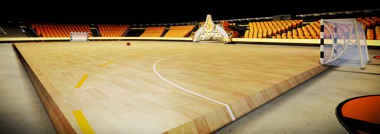
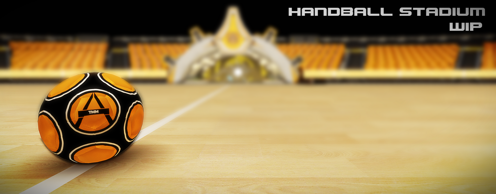
I have been working on this for a while now and decided to put my progress on here to show you. My methods from maya to udk and my planning are not the best, but i am getting somewhere.
I have recently finished a contract at Rare as a marketing artist and loved the stadiums the environment guys were doing, so i decided to create my own one. The style is suppose to be a bit cartoony but realistic if that makes sense, like those aliens from Space Jam the film, if they were playing handball.
Realsied these images are pretty broad and dont show specific assets, will try and get a few soon and explain bits at some point.
So let me know any thoughts that you may have and be harsh if something doesnt make sense tell me
Anyway some images taken from udk, guess the colour scheme!


Replies
looks nice tho
are there really handball fields where something like that is going on?
An awesome sport!
[ame="
The field looks nice, though the step to get into the field as Sharvo comments looks a little bit wierd.
cheers!
Cheer for the step on to the court never really thought about it, but have now lowered it, have also started on the second tier of seats as you can see in the images. Getting some weird shader, lighting artifacts, but i know how to resolve that. After the second tier will start working on the roof its going to be open to the sky and stars this stadium.
Have also played around with some post processing but not sure on it, let me know what you think. Got an interview this afternoon so wont be doing much updates today and helping my cousin with an iphone game, so its all busy at the moment.
Even after tweaking some uvs i am having some lightmap errors i believe, but should be able to resolve it. Next will be the roof, which i have some ideas for on paper, just need to implement it, then a bit of a polish.
The lower ceiling is very dark and will put some subtle lighting there and a nice lil shader.
I have toned down the post processing as well.
But, i have come to a bit of a struggle with this at the moment i have ideas like adding more props, spotlights and other stuff you would find in a Stadium, but i am just trying to push my materials, lighting and really want to nail down a post process chain that i am happy with.
If you have any ideas where i should take it, let me know! I just feel it looks a bit bland it needs something to spuce it up a bit, going do some research into holograms and stuff like that, i think.
Also not sure bout the sky the image was a bit low res, but let me know if you thought it would be night or day, it was always going to be an open roof thing though! Got some intersection in places but thats an easy fix
Cheers!
looks awesome. i really love the lighting.
The things that I see missing on the field is a safty net behind the goal. And maybe, just maybe some field border/posters. Also the seats is a bit big comparing the field?
Played the game? (sport) for many years and just LOVE IT! Bring out some memories then seeing this! Thx!
Have tweaked the lighting and post a bit and looking back at my old images i think i prefer the old one, not sure though.
Oniram - thanks for the input on lighting its an area i really would like to learn more about!!!
Patrick - never played the game but most sports have been dne before so thought i would try this a net is a great idea behind will try and think of a good way of implementing it maybe a hologram sort of thing? I dunno. Glad it brought back good memories.
I had a big list of things that need tweaking but left them at work! Some included lightmaps, populating pitch area, redoing sky texture, background buildings, lights, speakers etc
Anyways.... Biggish Images!!! Let me know your thoughts.
So have restarted importing everything, it does mean that i am now fine tuning everything one by one when i import it into udk. Still having problems with the skydome though it just looks so blurry so may go for a different approach to the sky.
So anything you may feel looks poor or not up to scratch would be appreciated as i said i am fine tuning bits and bobs.