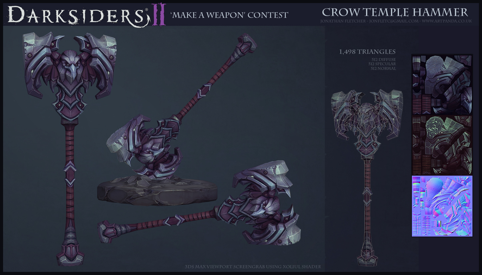
[DS2] Multi,JFletcher
Edit:
Latest pics:
.jpg)


Sup!
Super stoked about this, cannot wait to see what people make, this should turn out to be an epic challenge.
Only a couple rough sketches, still gotta make a load more and iterate a lot but just wanted to make a thread.
edit: removed junk
Still haven't decided on what weapon type I want to do, will probably end up going with mace but still have a lot of exploration to do. I'm just gonna be spamming these crappy sketches before even starting any real concepts, just to get some shapes going in my head.
Let's do theeeeeeeees!!! (╯°□°)╯︵ ┻━┻
Replies
- BoBo
^_^
pls create only one piece and let 2 other guys win in other weapon classes, ok?
Got a feeling about this rough one, may go further with it and give it a real design.
...Or just scrap it and keep going, most likely
Latest is much better than your first crop, maybe make the axe part heftier, and exagerate bits of the skull, like the teeth or something ?
Periods for emphasis. Love your work!
The very first concept you made with the crazy unique looking skull is by far my favorite thus far.
as for your sketches so far, I love the design, however I think they could handle getting even bulkier, as for now your axe feels like a one-handed weapon.
@ pulyx
Yeah, I don't think so too, I don't think they even slightly interesting, Just wanted draw some quick shapes to get my head around some things.
@ Zpanzer
yeah, I agree, I'm not really fussed about the handle at the moment as for the most part, it's not really going to be a hugely interesting part of the weapon, no matter what design I eventually go with, just throwing together quickies.
Cheers for the feedback!
I started iterating on the last one a bit, turned back into a hammer as I wasn't really too fond of how generic the axe looked. I'm thinking demonic/darksiders core:
still need to clean up the design (that spiky tongue thing just seems like it would break off if you hit anything with it) and add more twisted demonic organic like bits, although I like the skull and the idea of making one so I don't really wanna get rid of it.
..
Fuck, just got a great idea I wanna try(imo)...but it's 4am. Will have to wait til later.
Unfortunately it didn't turn out too well, just seemed good in my head.
-
Well here I am:
edit:
well, may as well show the one before as well:
Crow temple yo.
Very rough because today has been pretty much just constantly painting over things instead of committing to an idea and polishing it. This is just where the PSD ended up at 2am
But I am starting to get on board with crow temple more, I like the style and I think there are some interesting possibilities.
I even tried to make an axe from this where the blade was the wing, but it didnt work too well, may try it again. Too tempting to go with very symmetrical shapes as it helps (at least for me) maintain a cleaner design...
bleh, I dunno, I'll come back to this fresh tomorrow. Either way, I'm pretty stoked about crow temple possibilities, I just need to remain very faithful to the style...hmmm...
I wish I was as good at painting and design as the rest of you guys, just looking in other peoples threads and how easily they come up with such great ideas is a bit overwhelming.
EDIT:
AUUURGH, Another idea too late at night to bring to fruition..
Maybe you could try pushing the crow skulls' silhouettes a bit more, but not much; you're on to something really good here.
I like the possibilities of Crow temple designs and think it should end up a lot more interesting. I'm hoping to get a solid design down by the end of today and then I can start fiddling with some stuff in 3d.
Thanks for the feedback guys, hopefully the next pic will be a finished-ish concept.
Didn't really manage to get it done tonight, but it's almost there, needs a real colour pass too, but I should really get started on a model soon.
I'm also afraid that the design isn't very interesting from all the symmetry. Still thinking about a few drastic changes...
Am I just being hard on myself or should I try to push for drastic asymmetry?
-Woog
Also, a 3 sided version of this would kick so much ass though.
I think a good way to get away from the Diablo feel is to over exaggerate the shapes a bit more.
Side Question: Do you have any video tutorials of your workflow/sketching floating around the intertubes(ever done a livestream)? I love your work, keep those sexy concepts coming!
Although the issues I brought up before are killing me, So yet again I fucked around with it:
Very rough, and bland as fuck at the moment, But I really dig the idea of a false perspective, I will clean it up tomorrow, add some actual detail so its not just a black pile of shit, and see where this goes.
So much for starting a model. I guess I have the mace as a backup though.
Slightly annoyed with myself for being so slow at designs, its almost 4am...
Looking ace Fletch