Polar Science Facility - UDK
Latest Video:
[ame]
 http://www.youtube.com/watch?v=bwKaYq4agws[/ame]
This is my latest WIP tiled 'Polar Science Facility'. My goal is for the screen shots to tell the story of what took place.
I'll create video when the project is complete; because there are some dynamic objects and particles, I feel a video format would be the best way to show the environment.
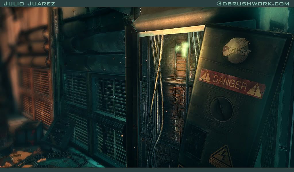
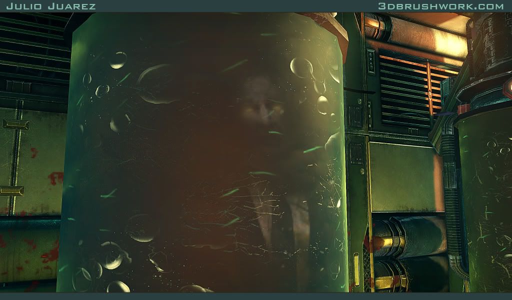
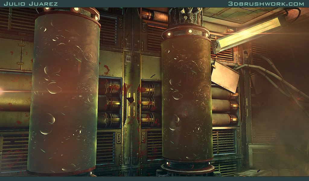
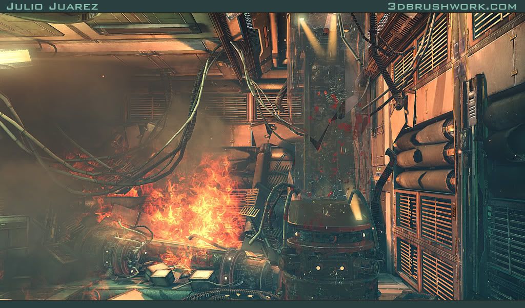
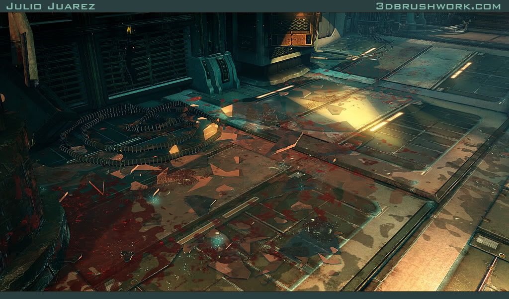
Constructive feedback is appreciated.
Replies
(I also used brackets too much in this reply, probably cause im running on 2 hrs sleep)
Limewax, the intention is to make the creatures reveal only briefly to retain the mysterious element. If what lurks inside the tubes is obvious, then I'll tweak the parameters to fix that. In regards to the broken glass tangent issues. I've been having some problems with that, I'll give it another round to fix it up!
Thanks for the feedback.
Edit: Misread one of the replies and corrected my response when I took notice.
Older Video:
[ame]
Constructive feedback appreciated
Also: Science-purpose fishies, yus!
I'd love to see simple breakdowns of any techniques you used. Are you blending material on the ground near the escape? Blending + decals?
If you have any high-res models that you've rendered out, we'd love to see those pictures too!
EDIT: Scrolled to the top after writing this and remembered something: The DOF in that first shot: Besides making things look miniature, it can also focus the scene deliberately to the point of being obnoxious. Can we see it without the DOF?
Ill post some hi poly's soon, for now I'll post the picture without DOF as you requested. Cheers!
Shawnell, thanks! Glad to know you liked my work. I was looking at you're port and I like you're pieces as well. Keep it up!
Models share the same textures, it was one of the most challenging parts of putting these scene together. It only has 4 major textures in the interior. The rest are supporting textures such as decals, fire, snow, glass, water, etc..
Please feel free to ask, if you want to see something in the scene with more detail.
Best Regards,
Julio Juarez
Other than that, top notch.
I want to make video tutorial of this in the near future. I'm currently looking for a high quality usb microphone to record my voice. Had bad luck with some Logitech models I've purchased.
Thanks for the input, I agree that area has allot of things going on. For the final portfolio images, I'll be sure to frame the center pieces and balance out excess details. Currently this is the 'chaotic' area of the environment, the other areas are much more organized and hopefully can balance this one out. I'll post more screenshot in a few minutes
Yeah
Constructive feedback appreciated
Congrats.
I really wish I had some more constructive feedback for you. The foreground of the exterior (the nature part) I think needs more loving. A few extra small plant types and a more defined ground would go a long way. To me right now it reads as...fluffy melted marshmallows?? It's just strange.
My thoughts, this is an absolutely gorgeous scene!!
nothing to say, other than...
whoa :O wonderful work.
How did you go about the lighting? Are you using color correction and stuff like that?
on how you created the little floaters wisping around and stuff inside.
The models really nice as well, so many details and things going on.
My only crit is The glass on the tubes are kinda weak, I felt like they could use a
little more reflection and use some distortion so the ones that are broken bend the light
and things that are behind it.
Lighting Process
To briefly discuss the lighting process in this scene, because its a video game environment, first thing I do is ensure the shadows will look correct under any lighting condition. This involves lots of tweaking of the uv set used for light maps, as well as the resolution for those light maps. To test those out, I generally just add a dominant light, or other temporary lights.
After this stage, its when I start adding point lights / spot lights to light sources (Dominant light is the light that enters through the windows / holes). Then experimenting with the following settings:
Indirect lighting scale: Determines the intensity of the bounced light. I generally set it to below .5 (default 1). This way the bounced light is not intense, it produces better light gradients. If you look at the screenshot, there are several point lights there, and this setting is key to ensure the scene does not overexpose.
Light Source Radius: Not to be confused with the 'radius' setting. This is relating to light mass and it's also very important, this determines the area in which the lights emit from. Considering that the larger this is, the more of an 'area' light it becomes. The larger the number on this setting, the softer and more spread out the shadows/light will be. So focused lighting with sharp shadows would in reverse, have a low light source radius. In this scene most lights have a light source radius below 10, other light sources that are more ambient, like fire and blue point light that I placed in front of the wall opening (as seen in the screenshot) have a higher setting.
That blue light was placed to imitate 'bounced' cool light. It has a higher light source radius to ensure the cool blue spreads out from the opening.
The last stage involves balancing everything out, that is in color, intensity, and contrast. Goal is to have cool and warm areas. As well as having the scene go from light to dark, then to light and dark again. These gradients of light help creating more depth. If the image has the same amount of light everywhere it can come out flat.
I do this before doing any grading/post work. The result from this is not very high contrast (you can see this in the last screenshot). Part of balancing the lighting might be introducing a sky light, considering the skylight can be used to determine the value of the darkest shadow in the environment. Generally the intensity for that light is very low. If the contrast is the same in background elements compared to the foreground, than part of the lighting process is also adding a distance fog / translucent cards.
Here is a before and after shot, the one in the bottom has the post effects filters applied.
Hope it helps!
Thanks, I agree the ground looks very soft at the moment. Considering it will be the focus of the video for a few seconds. I'll definitely consider adding more defined detail to the terrain. Thanks for the input!
Toxic_h2o, I'll definitely consider making a video tutorial out of it. I just have to optimize the material so it has a better application in the games environment.
Scott, thanks for the kind words. Feel free to send me a msg if you want to talk about the project a little more. Wish you the best man, creating a sci-fi theme was allot of fun, and learned allot from the experience
Gannon, I'll post a breakdown of the material when I get a chance so you can see how the floating bits where made. As mentioned before, this will eventually become a video tutorial. Regarding the glass, that is definitely an area that needs some improvement, right now it blends with the BG to easily. Thanks for the feedback!
scene is looking super sick! i remember the snow area back before you left. i love the new additions! great work. all your work has been badass, but i think this one takes the cake for sure.
btw ill be emailing u back the response from ur last email. sorry its taking a bit just getting my second scene done for graduation.
if you get a chance take a look at my thread or my site. my site has the most recent updates.
Thanks Jeff, I just replied to you're linked in message. I'll check out you're thread a few minutes. I understand things can get very fast paced before graduation so no worries. Best of luck with all you're projects!
Walrus, thanks for the compliments on my work
Using spot lights is almost the same as point lights, the main difference is the cone settings. So I would only use spots if I did not want the light to illuminate beyond a certain radius. They are also useful for projections via light functions as seen in this screenshot.
The placement is only to show this example, in the scene I used this animated projection in the entrance for the destroyed room, I believe that moving objects such as these invite the payer to explore a certain area.
In regards to emissive lights, I'll use them when it's necessary because I found that having multiple emissive objects turned on could increase the bake time rapidly. On the other hand, the regular lights can be limited to a certain area using light channels, while emissive lights calculate against every object (correct me if I'm wrong).
From my perspective, the goal is to create the desired look. The methods that are employed are not not the most important. What is more important to me is the time it takes to get from point a to point b, the end quality, and performance.
Hope this answers you're questions.
Other than that, really good job, it's a very nice and crisp style and the atmosphere is great. Love it!
really nice job!
Thanks guys for the compliments on my work
That sucks, you don't have some time aftewards? Maybe you can enter the sci-fi contest at nextgenhardsurface.com to get the ball rolling. I wish I could enter it but most of these pieces where modeled prior to the contest.. Damn it!!!!! :poly127:
Thanks for all the advice!
Constructive feedback welcome.
Also, u should shell the shards of glass (and the tubes) to give them depth and put a white light next to them to give them more shine.