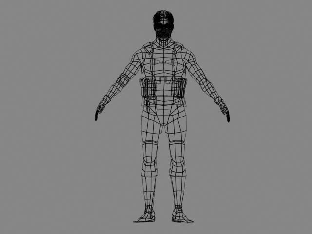
Well here it is! I'm finally making a digital sketchbook! Any feedback I can get for anything will be greatly appreciated. I got a lot of older stuff to post and have some new stuff that I hope get up on here asap.
Welp. this is what I got so far.
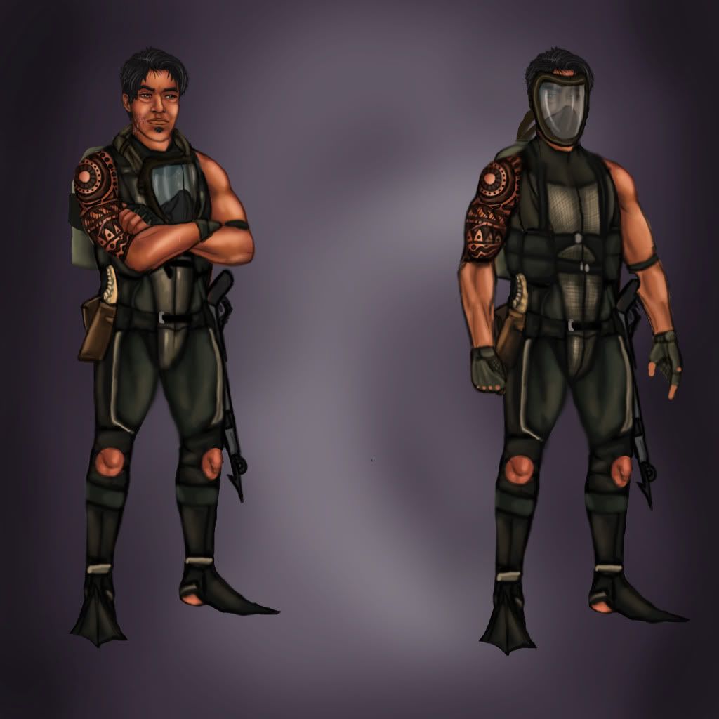
heres a concept I drew up for a character model for school n stuff.
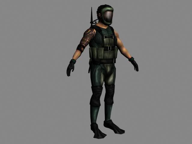
here's the final model, and a two turn arounds. With and without gear.
Hey more stuff I've been doing. I sculpted and retopologized this guy in the z brushes earlier today, hopefully it'll lead to something cool later, at the very least it was good practice.
and then heres another older painting. I definitely have to work on blending the colors and implementing a stronger light source. I wanna do some anatomical studies next but afterwards I'd like to make up concepts with environments and things going on, rather then these paintings in random poses. Help me get better at 2d and 3d, all critiques are appreciated!
Hey long time since my last post but I've been busy wit da character modeling. First, here is a first attempt at the character from an earlier post. I think the proportions are a little wonky and I think I have to plan my polyflow a little different to get the feel of the character and his armor. I wanna nail the ragged look of his armor, that might come with good normals and diffuse, etc. but yeah.
next is another character model. This guy is from the hayday pirate era, he is supposedly in service to the queen as a privateer hunter. I won't bore you all with story but yep. Check it.
As always I would love some critiques to help me get better, feel free to comment or make fun of my artwork. I'll try to keep posting more often
I decided to take two seconds to scale the monkey arms down of Ishakar up there. I think it looks a little better but again, any advice is vastly appreciated!
I still have alot to learn in terms of digital painting (and everything else really) I think its because I don't blend the colors too well so the end product looks blurry here and there. It's a rookie mistake looking at it and I hope to remedy it with future posts.
Here is a high poly in progress for my privateer hunter. I'm going to get into the alphas and stuff after I've finished up getting the forms correct. I changed the face a bit to something a little more square and rough and a little less smooth and young. As for the other model, I'm going to restart him. I don't think I took the right approach with his armor and if I keep going with the current model, its not going to look as good as it could. So I will post a new low poly for him when I'm done, more progress on my pirate hunter, and digital paintings when time permits it. Feedback more than welcome.
so I'm in my level design class, and I'm making this Aztec style statue that the player can be launched out of a la jump pad in udk. This is that statue minus details
after me and my idiot friends start joking around and being stupid this is what became of it.
I will have you know that every inch of bert's likeness was etched upon my sculpt completely from memory because all I watched from the ages of 0 to 20 was sesame street. If you need reference for a muppet then I do believe you lived a sad childhood.
looking swanky sir. Your major forms are there but areas like the muscles in the chest and arms might need a second look at. The anatomy definition seems off there really isn't any fine detail yet in the clothing. It's a good start, just keep pushing it. Also, this guy's begging for a spec map
More of the same crap but slightly updated. So yep, my privateer hunter is coming along, getting the normals, diffuse, and specs to look spiffy. As for my warrior guy I just fiddled more with the diffuse. No spec or normals for him yet. Getting towards finals time so probably not going to post a whole bunch for a week or two.
hopefully I'll get around to making some more diverse stuff, so far its been a lot of homework.
dude, that is ballzy. A common thing I notice with your work is that you do these differentiated lighting groups for different parts of the characters and environments instead of the scene as a whole. A really cool setup would be to have the main lighting source behind the bat's wings and kind of diffuse the lighting through the membrane. Always identify your light source and color first because it can make a huge difference on the mood you're presenting. Keep it up man, this is looking sweet.
I know this hasn't been the first time you told me this, haha. I really dig the lighting idea from behind the wing, overbreak I want to nail this one out and get it looking sweet, so the first thing to do will be to hammer out that lighting
All right! two weeks of break! Yep, and to start things off, I did a quick sculpt of the Thai mythical creature the Elephant tiger. Basically a mix of an elephant and a tiger. herp. So ya, kinda spliced a mammoth and a sabertooth. I think I might come back to it later
So for the past few days I have been trying to retopo some quick sculpts, but zbrush is being all kinds of stupid on my computer. So I did some paintings. God knows I need the practice.
I was actually in the process of sculpting this next one in zbrush. But like I said, the program was either being difficult or I was being stupid. Either way I feel as though I good do a better painting of her then this poop.
having some fun here and there. Will post again soon, crits always welcome
first go at a texture paint of my lizard guy. I think I really struggle with textures, so in the next couple months I really want to focus on nailing textures. Anywho this is a first attempt at texturing the lizard.
I got around to starting another character model. If you scroll up a bit you can see the poopy piece of concept art. As of right now I got the rough base mesh, so next will be refining topology and what not.
I still have a lot of models that I haven't finished yet that I am hoping to get done so I can throw the final products up here. As always any crits or advice are appreciated
been a while since posting, progress on my robot girl. Thinking about adding some shredded cloth to give a contrast in texture and material to compliment the metal robot bits and her human parts
and here's an older model of a sea dinosaur. You might recognize it from the video I linked to on the first page of the thread. I want to touch him up one of these days.
thanks shawn. I'm working on a character for my advanced level design class, so far I got some rough maps on the base mesh and I started to block out the rest of him. Crits or thoughts always welcome
first i'm not the best with anything character related XD
The robot girl seems extremly fragile to me. I feel like if she jumped or did anything she'd instantly shatter or break something. This might just be because there's no diffuse or anything on it that might change it but that's just my first thoughts when seeing the model (the actual concept does seem more stable).
I like the look of your level design character so far (HA ha now i can spy on your project!!!).
I really like the lizard monster dude but in the painted one i think the tails a little to noisy. I prefer the look of the untextured tail with the smoother bottom and armored top. I feel like the upper front legs of the lizard shouldn't have the bumps but the outer sides of the legs should have maybe more?
good stuffz just thought i'd give my 2 cents while i sit in class~.
I hear what you're saying about the robot girl. I added a lot more complicated bits to her legs, so I can see how she comes across fragile. I might go back and fix thoughs if I have time in 3d4
Yeah the tail on the lizard is a little noisy. Smoothing those out will make em look better
I'm thinking about going back eventually and giving her legs closer to the concept, which will have fewer parts but will probably read better and will solve the fragile prob mattcho brought up (I did try to thicken her bounce legs a bit but I think a redesign will work better)
also I think I strayed a little far with this one. In the concept I gave the character some meat to her bones but in the model I gave her more of a volleyball players build along with trying to imitate the overstrike artstyle. I may go back and fix her up a bit, just like the other 800 models I'm going to fix up when I get to it.
Hey, dude I like your character designs, and your zBrush stuff is pretty solid. One comment I would have is that you need to work on lighting in your 2d stuff, it'll help define materials and give more feeling of depth. Keep up the good work!
thanks Hammed Al Tamimi, one of these days I wanna get back and work on my 2d stuff its been awhile.
Speaking of which, I haven't posted in forever cause of school work. Speaking of which yet again (for the last time)
here's progress on my tribal guy. A got a good start on the maps, I'm going to get some war paint on him along with some more details here in there and then get him in udk
and here's a sturmtiger tank I'm doing for a class. This is the untextured lowpoly. Its based off the sturm tiger tank, but I just appreciate the fact that the tank has a ton of personality.
Both these guys should be done soon and I should be posting more frequently.
your 3d stuff looks pretty good, especially the lizard guy. robot girl looks like she could fit well in some stylized, non serious indie game.
you might want to focus on human anatomy a little bit more as your characters often have weird looking muscles.
posting again. I've been fighting to climb out of an art funk recently, Nonetheless I'm not using that as an excuse to not post. Here is the finished tribal warrior, ready to run around in Unreal.
and a life drawing, which I need more of. I took about 30 to 35 min on it. I'll be posting more when I can. Thanks for all the help guys
Replies
one of the characters I've been working on for a while. Hoping to get him modeled soon.
and heres a more recent character model. A little plain and stuff but its good practice
and then heres another older painting. I definitely have to work on blending the colors and implementing a stronger light source. I wanna do some anatomical studies next but afterwards I'd like to make up concepts with environments and things going on, rather then these paintings in random poses. Help me get better at 2d and 3d, all critiques are appreciated!
And along with it are two paintings. Yarp.
Crits always welcome for everything
next is another character model. This guy is from the hayday pirate era, he is supposedly in service to the queen as a privateer hunter. I won't bore you all with story but yep. Check it.
As always I would love some critiques to help me get better, feel free to comment or make fun of my artwork. I'll try to keep posting more often
more stuff
after me and my idiot friends start joking around and being stupid this is what became of it.
I will have you know that every inch of bert's likeness was etched upon my sculpt completely from memory because all I watched from the ages of 0 to 20 was sesame street. If you need reference for a muppet then I do believe you lived a sad childhood.
I apologize for the stupidity of this post
hopefully I'll get around to making some more diverse stuff, so far its been a lot of homework.
Classes are almost out for me so I should have some cool stuff to post soon. As always crits welcome
I was actually in the process of sculpting this next one in zbrush. But like I said, the program was either being difficult or I was being stupid. Either way I feel as though I good do a better painting of her then this poop.
having some fun here and there. Will post again soon, crits always welcome
lizard person quick sculpt. yarp
critz appreciated!
and here's an older model of a sea dinosaur. You might recognize it from the video I linked to on the first page of the thread. I want to touch him up one of these days.
as always crits are very much appreciated
progress on my bionic girl
The robot girl seems extremly fragile to me. I feel like if she jumped or did anything she'd instantly shatter or break something. This might just be because there's no diffuse or anything on it that might change it but that's just my first thoughts when seeing the model (the actual concept does seem more stable).
I like the look of your level design character so far (HA ha now i can spy on your project!!!).
I really like the lizard monster dude but in the painted one i think the tails a little to noisy. I prefer the look of the untextured tail with the smoother bottom and armored top. I feel like the upper front legs of the lizard shouldn't have the bumps but the outer sides of the legs should have maybe more?
good stuffz just thought i'd give my 2 cents while i sit in class~.
I hear what you're saying about the robot girl. I added a lot more complicated bits to her legs, so I can see how she comes across fragile. I might go back and fix thoughs if I have time in 3d4
Yeah the tail on the lizard is a little noisy. Smoothing those out will make em look better
thanks a ton Mattcho, I love the crits
photobucket is being stupid right now but I'll try to get the video turn around in soon.
as always crits are welcome
also I think I strayed a little far with this one. In the concept I gave the character some meat to her bones but in the model I gave her more of a volleyball players build along with trying to imitate the overstrike artstyle. I may go back and fix her up a bit, just like the other 800 models I'm going to fix up when I get to it.
http://s1113.photobucket.com/albums/k508/gillmeister74/?action=view¤t=Sequence01.mp4
Speaking of which, I haven't posted in forever cause of school work. Speaking of which yet again (for the last time)
here's progress on my tribal guy. A got a good start on the maps, I'm going to get some war paint on him along with some more details here in there and then get him in udk
and here's a sturmtiger tank I'm doing for a class. This is the untextured lowpoly. Its based off the sturm tiger tank, but I just appreciate the fact that the tank has a ton of personality.
Both these guys should be done soon and I should be posting more frequently.
you might want to focus on human anatomy a little bit more as your characters often have weird looking muscles.
2D pics look rather flat and cartoony but i guess you know that already. anatomy sticks out here as well.
i like this one though:
http://i1113.photobucket.com/albums/k508/gillmeister74/monster.jpg
and a life drawing, which I need more of. I took about 30 to 35 min on it. I'll be posting more when I can. Thanks for all the help guys