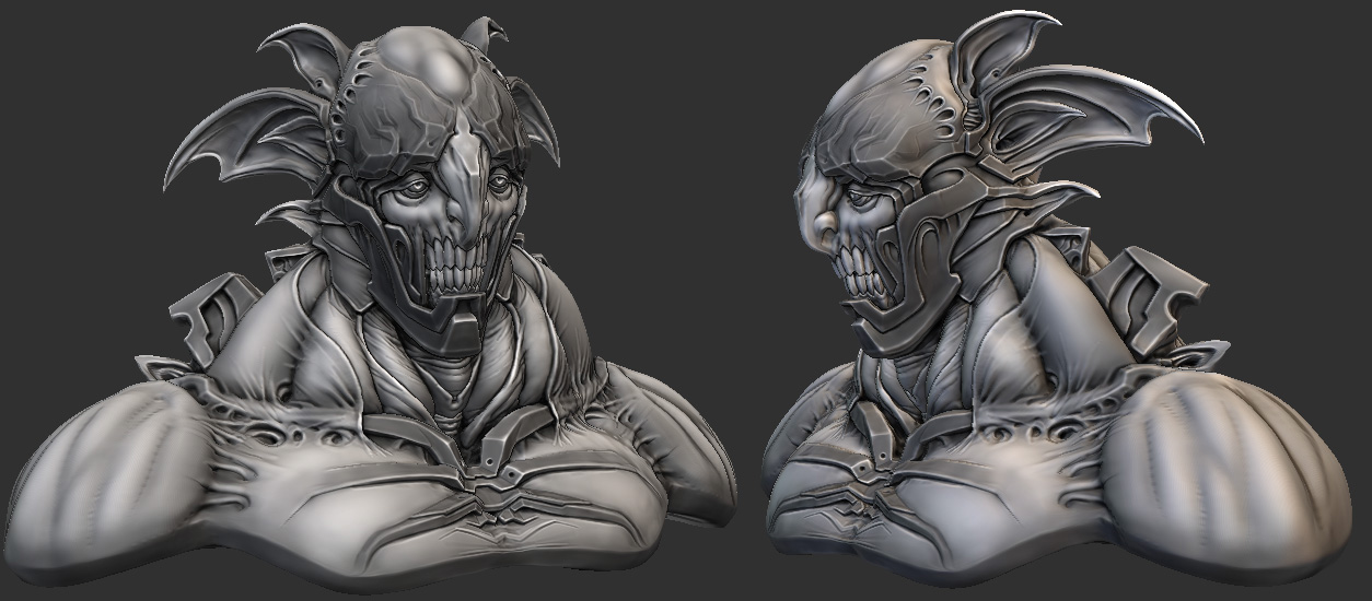
el fergo zbrusho
Finally tryin to get my act together and do a full character, sculpted, lowpolied and textured. I'll also post my sketches and various zbrush abortions in here to keep from clogging up the WAYWO... and get more crits hopefully.
Feel like I've gotten pretty stuck with my style and am probably doing the same things over and over with every character. Some of that's intentional and it's just a matter of style... and some of it is habits that need to be broken so I can grow as an artist. Any crits are muchly appreciated
Here's today's bust... started out as a warm-up and ended up taking all the time I'd allotted to start a full character. Owell.
(based off / inspired by / ripped off from Allen Williams' incredibly badass sketch)

More soon!
Feel like I've gotten pretty stuck with my style and am probably doing the same things over and over with every character. Some of that's intentional and it's just a matter of style... and some of it is habits that need to be broken so I can grow as an artist. Any crits are muchly appreciated
Here's today's bust... started out as a warm-up and ended up taking all the time I'd allotted to start a full character. Owell.
(based off / inspired by / ripped off from Allen Williams' incredibly badass sketch)

More soon!

Replies
- BoBo
bobo - thanks, great crit, I agree and did some work on the shoulders. I'm callin it done, hopefully this is an improvement, I've spent entirely too much time on it now heh.
cheers
cant wait to see what you cook up for your full character, until then ill be watching this thread
The only part that bugs me is the middle metal bone part on the chest, it just kind of fades into the skin while the one above it has this really cool insertion point under a flap of skin.
CRAY ZEE
Maybe you could polypaint him a bit. Just a couple of base colors layed down properly and a good shader could bump up presentation even more.
or you could even do smth like this if you'll gave a bit more time:
http://www.zbrushcentral.com/showthread.php?p=597908
anyway keep rocking - I wanna see more=)
timewiese - thanks, yeah I hear ya but I wanted to keep the pecs as bigger, smoother shapes, whereas the collar bone was supposed to be defined all the way.
Swizzle - Crazy? I was crazy once...
Vig - thanks!
Makkon - Gracias duder! I haven't made any recent recordings, but I have a few on my vimeo account: http://vimeo.com/8788809 . I can't really recommend them though, my workflow for those is pretty simple and sloppy, not really something I'd want anyone try and study heh. Sketch mode and production mode are pretty different for me.
Bal - thanks man!
D1ver - Thanks! He's actually polypainted quite a bit in grayscale to pop the shapes and break up the materials a bit. I thought about doing a color paint but it would just take so long and I really need to get started on another character.
...which leads me to the fact that I still haven't done that. The other day I remembered that I used to paint, and so I started one and blew most of my free time the past few days on it. It was fun but now I really need to hop back on the 3d train. I also decided that I'm not allowed to do any more faces with crazy 3d shapes until I do a lot more art that isn't that.
anywho here's the painting, it's about four feet tall and all acrylic. Photo kills about half the color range but whadyagonnado. More 3d after this, promise.
cheers!
killer painting... but i'm afraid you have too much talent (welcome to donate some my way
nizza - thankzza... Tell ya what, I'll trade you five units of whatever it is I've got for five units of whatever it is you've got. Deal?
Either the climate here is too dry or the medium I used was too old, but it started beading up and turning white instantly, and my attempts to remove it just fucked it up worse. Looks like someone jizzed all over it then hired a drunk guy to scrape it clean with a rusty butter knife. FML.
I would like a picture of that.
On a serious note, awesome sculpt and painting. Can't wait to see some more of your work.
always love seeings the canvases
AND NOW IT IS ART!!!!
awesome painting anyway, totally glad you grabbed a snap of it thanks for sharing.
Zipfinator - Hah, thanks, and be careful what you wish for there buddy...
konstruct - heh thanks man, and speak for yourself, mr graffiti man indeed
mat - wellll I have some good news for you Mr Mat! I repainted the whole goddamn thing in a fit of righteous indignation, so you can still purchase it for the thousands of dollars you were originally planning to offer me! god bless america!
Mike - Sort of, I assume it would take a lot of work and cost a lot though... if I got more interest I'd check it out, but I'd probably need to sell twenty or thirty to break even, based on my past experiences with printing. We shall seeee...
Jesse - haha, so that's the secret eh?
nfrrtycmplx - heh yeah, I almost did have myself a bitch cry... but then I flew into an art rage and repainted the whole thing, which was a lot more satisfying than crying
sltrOlsson - thanks man, I do indeed have more canvas work, but my portfolio for them is down right now... I have a couple on the last page of my cghub though. I'll toss the traditional gallery back up once I get my portfolio back up, should happen within a month ish
Hal - Thanks
So yeah, for those of you who didn't read my individual replies there, I repainted that acrylic piece all over again. Couldn't let the universe (and my own stupidity) just steal it from me like that. So that story has a happy ending after all.
On a sadder note, I probably wont be jamming as hard on that full character as I promised. I got more paid work so I won't have that much free time for a week or two... But I'll keep the busts flowin for now. Thanks for the words everyone!
warm up sketch from yesterday... robo ceasar is not feeling confident about his role in history
and pfft, paid work is overrated man. Should just chill out here making characters
(that last head freaks me out btw, gj
Did a "splody" sculpt redux, cleaned up and re-rendered for the ultimate high-rez viewing experience... check the original here. Any crits on the presentation here would be super helpful, compositing/rendering isn't really my strongest area
You can officially call that last head for HD™ now!
Ferg, can you try to be a little less awesome you're soakin up all the tallent. O_O
That crazy primary color head thingy is breathtaking. I can't think of a single thing to change, other than to get your name on that proud piece of sexy.
sltrOlsson - thanks!
natetheartist - thanks dude
today's warmup sculpt... it's a study... sort of. A thousand cookies to whoever can guess who it is, since it looks nothing like him. Mainly trying to shake up my old facial anatomy habits.
Workin on a new portfolio here. Each image will lighten a little as a rollover effect... I'll add more images further down, but this should give an idea of the layout.
cheers
For the header. Red and white work nicely, though it is a bit unclear because of the background img being so damn white too. I'd try and darken that quite a bit, ditch the drop shadow or make it really soft. Maybe try a white pixel outline for the red text to make it read better. Maybe place the 3d artist behind your name to balance out the img, or lift it up a bit, because it is almost crawling into the text below.
The text inbetween, is that, pro for the left row and personal on the right ?
The thumbs, can use a bit more height, maybe 50 pixels but it will help display the work way better then having to cut it short. I would also consider using one example in it that is yelling click me, then having multiple, cause it gets REALLY busy, becomes distracting, and most do not add much.
The background grey of the thumbs, blends in to the background. Now that can be a plus, but right now it feels like they have no border and one thumb goes into the next. I would go for a darker tint background to have the work pop out more. I dont feel the need to have a harder outline since you get that lighting effect.
Last thing i would like to add is spacing. spaaaacinggg. there.
Your thumbs should be cleaner by now, but if i try and look at one, the other thumb is right there screaming for attention and my eyes just bounch from image to image.
By adding a good bunch of spacing it becomes a lot calmer, and i think you can concentrate on the work better. It becomes a rainbow once you add a ton of other images to it
Maybe that helps a bit, maybe i wasted your time, what i do know, is that my coffee is now cold, but thats oke cause your zbrush work keeps me warm. GIMME SOM MO!
Oh and my thoughts on that sculpt is Jean Reno too :P
how many subtools ?
planaria - thanks! It's just two subtools, one for the head and one for the hair.
ack master - cheers
almost didn't post this doodle... I'm really starting to notice the way I recycle the same anatomy for most of my sketches. I might work on this a bit more but it's gonna be my last head sketch until I get some studies done. Need to shake up the ol' mental library.
also I've been stealing color schemes for my 2d warmup sketches from people on cghub
You're crazy,
and so is this guy
Fucking love this dood!
really like this one