The BRAWL² Tournament Challenge has been announced!
It starts May 12, and ends Oct 17. Let's see what you got!
https://polycount.com/discussion/237047/the-brawl²-tournament
It starts May 12, and ends Oct 17. Let's see what you got!
https://polycount.com/discussion/237047/the-brawl²-tournament
[WIP] Hurricane mech with pilot
Hello everyone
I decided on following another artist's design for this project. I'm making a mech from a comic called Devolution. Here is the concept for the mech by the Puppeteer Lee; http://cghub.com/images/view/74043/
I'm also making a pilot and I decided to do a female character this time. The mech type is called Hurricane and the pilot is known as Khanda. There were no images o the female pilot suit so I decided on making a female version of the male suit that's shown in the comic. I mailed puppeteer about more images but unfortunately he only had a painting of the suit from the front so I had to improvise the back myself. Please tell me what you think.
I used some other images other than the concept image for the mech and the one I've built is a modified version with wings. I just thought it was cooler like that.
It's still a work in progress so any constructive criticism would be helpful at this stage. I'd like to know if you think my 3d mech's design is cool enough too and if you have any helpful suggestions to improve it.

The comic is free and can be found here if anyone's interested(it's just called Storm lion there):
https://comics.comixology.com/#/issue/1993/Storm-Lion-0-FCBD-2010-Edition
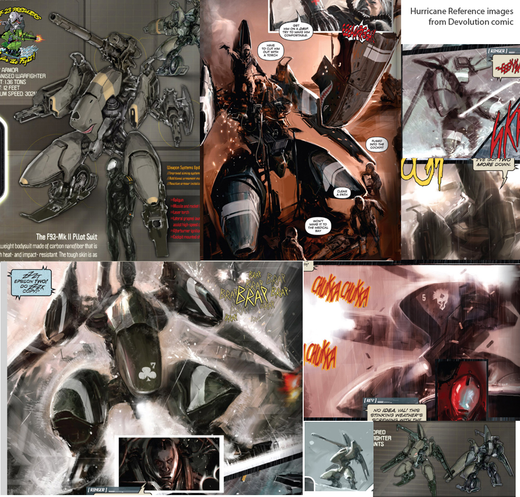
Some of my refs;


Thanks!
I decided on following another artist's design for this project. I'm making a mech from a comic called Devolution. Here is the concept for the mech by the Puppeteer Lee; http://cghub.com/images/view/74043/
I'm also making a pilot and I decided to do a female character this time. The mech type is called Hurricane and the pilot is known as Khanda. There were no images o the female pilot suit so I decided on making a female version of the male suit that's shown in the comic. I mailed puppeteer about more images but unfortunately he only had a painting of the suit from the front so I had to improvise the back myself. Please tell me what you think.
I used some other images other than the concept image for the mech and the one I've built is a modified version with wings. I just thought it was cooler like that.
It's still a work in progress so any constructive criticism would be helpful at this stage. I'd like to know if you think my 3d mech's design is cool enough too and if you have any helpful suggestions to improve it.

The comic is free and can be found here if anyone's interested(it's just called Storm lion there):
https://comics.comixology.com/#/issue/1993/Storm-Lion-0-FCBD-2010-Edition
Some of my refs;


Thanks!
Replies
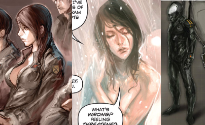
Here is another update. I remade her face and hair so it looks like a concept image I got from puppeteer better. Tell me what you think;
Edit: I followed a concept image I haven't posted here. I'm not sure I can so I'll have to ask Puppeteer for permission first.
Well ya beat me to it sir. I was going to start blocking this guy out after I wrapped up my gun i'm working on.
Ahh well plenty more concepts to pick from... Have fun
@Jesse: Haha. What were you gonna start block out though? The mech or the pilot?
The mech of course my good sir! But there are plenty of mech concepts in my inspiration folder of fun
No worries...
The concept image is done by Puppeteer Lee.
I need critique on this. What are your thoughts about the face? Does it look good? Is the nose too long? I also wonder what your thoughts are about the hair. I was going to go for a more stylized hand-painted look but since the clothes are done more realistic maybe I should go for that? What do you think?
What do you think about the decals btw?
I recommend paying more attention to the eyes (eyebrows look a little close together) and giving her a makeup pass. Try watching one of those how-to makeup vids some girls post on youtube- they're actually really informative! You get a better idea what features to emphasize/de-emphasize.
I can see why you are doing some things based on the concept, but I would also refer to some real reference photos as well. A few minor tweaks here and there and it can look really good.
I think the hair could use some more layers and variation for personality. Perhaps some anisotropic highlights would be nice too.
Your rendition of the character is a little conservative compared to the sexy vibe I get from the concepts. I think exaggerating her curves for a nicer silhouette and trying to infuse a little bit more attitude into the expression/pose would help too.
The mech is looking great so far. Her suit design is cool, but it's a little plain compared to the mech (looks like she rides a motorcycle instead of a bad ass mech). Maybe even if it just had a bright stripe running down the body or something to make it more interesting?
I'm a little confused about what you mean by a bright stipe running down the body though. Do you mean on the front or the back? On the chest area and down to the crotch?
Also you're probably right, chrisradsby. A friend mentioned the hips being too manly at the moment.
Thanks for the feedback, guys. I was worried I wouldn't get any feedback and this helps a lot.
about the mecha - i dont like the concept very much but i like your approach to it
Oh, I didn't mean anything specific. I just meant some kind of bold design to break up all that monotone darkness. I guess it depends on what kind of character you had in mind. Is she stealthy or kind of dark in personality? That's what I normally associate with a design that relies mostly on dark and subtlety, but I didn't really get that impression from the concepts.
I think another thing that bugs me about the eyes is the overall eye shape. They're a little too oval and lacking in definition. And I'm personally not a fan of using alpha to coverage for eye lashes unless you're really careful about it. It can be a distraction in an area as important as the eyes.
The suit she's wearing is actually a generic suit worn by all of this mech-kind's pilots so I doubt she's supposed to be a stealthy dark type character. There weren't any female type suits in the comic(there is only one issue out) so I had to improvise there. There weren't any shots of the suit from behind either so I improvised the shapes there as well. Because of the lack of details I added all the decals you can see around her suit.
Here are some reference images of the suit I've put together;
What are your thoughts about my version as opposed to these? I went with rounder forms around the suit so I think that differs. I followed most of the rest of the shapes but as you can see the colors look a bit monotonous so I tried breaking that up...
I'll add some more bold shapes to break up the dark colors, I'll post some updates when it's ready. Thanks!
* EDIT * Sorry, I just noticed you had already mentioned that!
The sketchy quality of the art definitely isn't making it easy on you.
I've been working on the face of the pilot and I need fresh eyes on it. It's still WIP but I'd like to know what you think regarding the parts we talked about before like the eyes and the masculinity. Does she appear masculine here(the jaws etc). Are the eyes looking more attractive and feminine?
This is the first time I'm doing a stylised female character and the biggest mistake I did was not to look at real photo references for the facial parts. After looking at other similar characters I know I was wrong.
http://philippefaraut.com/store/reference-casts/female-planes-head.html
The plane changes on the face can be very helpful to give your face the impression of a solid structure. Your sculpt has some, but in some areas it still feels kind of amorphous.
Also check out the areas of contrast in these images and compare it with yours. Obviously lighting differences will play a factor, but in general you can see that the areas of contrast suggest more depth. Especially around the eyes, corners of the mouth, and basically around every facial feature there is some nuance that might be worth replicating.
The shape of the eyes do look better now, although getting some more structure around it will help a lot too.
The model is still feeling a bit masculine, and Google can probably answer what makes a face more feminine better than I can. The more knowledge you have, and the more you notice while going through this, the better your next try will be.
However I'm posting a new update of the face along with hair. I made some major changes compared to the previous update and I followed the facial structures of some famous actress'.
Those are some great tips, haikai. I will look into that.(I honestly never even thought of googling masculinity etc. :O )
Edit: don't mind the ears. I will replace them later.
Sorry about my bad handwriting! Here are some things you might want to consider:
- I think the eyebrows can be lower to avoid the surprised look.
- The forehead is too wide in front. The forehead is less wide than the back of the head. Whenever you see diagrams of how the head is five eye lengths wide, remember that the widest point is usually at or slightly BEHIND the ears.
- The distance between the top of the lips and the bottom of the nose is a little far apart. The distance between the eyes and the nose also makes the nose feel a bit long. All this adds up to her having a somewhat long face which isn't necessarily bad or unrealistic, but probably not "ideal" if that's what you're going after.
- Notice how the eyelids conform to the eyeball and have thickness. A common problem I see in 3d models is not giving enough thickness to the eyelids.
- Be careful with the cheeks. The structure that creates the silhouette of the cheek at different angles is more complex than most people think and it can be confusing if you're not careful. Your cheeks feel too gaunt right now from 3/4 view. I would try moving out the back/side of the jaw/cheek to correct this.
- Be careful with the definition between the lips and the chin.
- There are some lumps on the model that you can probably get rid of by stepping down to a lower subdivision level. The surface of the model doesn't have to be super smooth, but you want to be careful of imperfections that can make the normal map bake look sloppy. I recommend working more at lower subdivision levels until you're happy with the forms.
- Needs more indication of mastoid process going form behind the ears down to the clavicle. Doesn't need to be clearly defined, but it should get rid of that indentation that is there now.
- Jaw line could be more defined. Or more specifically, the plane changes there could be more obvious.
- The base of her neck looks a bit like she's flexing or tensed.
- The corners of the mouth are a great area to add interest to the lips. It's probably more complex than you think with how the top lip kind of curls down inward and the bottom lip corner is "contained" by the top. Also notice that the lower lip fades into the face more on the sides (don't be fooled by lipstick!). This will help soften the face. Soft, gentle, delicate, round = feminine.
- The area between the eye and the nose bridge has very abrupt plane changes. Important for adding definition to a face.
Once you're more aware of these kinds of things, you can choose to emphasize or omit details to create an effective stylized look.
I went through all the critique you did and I made some changes after that. As for the long face I moved the lower part of her head(from nose and below) up in order to make the face rounder. I'm not sure but I think she might look a little child-like now, what do you think?
Here is the update;
As you can see I put screenshots of her without the hair so you can see better. The face is pretty much symetric at the moment so I only took screenshots of her from one side.
Edit: Updated the picture. The eyes were all messed up so I remade them. Also thanks, jungsik
Reference this time is Ashley Judd. Notice how the mastoid muscle is more smooth. Define the jawline and avoid the lumps.
The forehead shape is a little more complex than simply round. It's probably not necessary to indicate all the plane changes here, but I'd try to put them in and ease it back rather than leaving them out completely.
Making the eyes not so wide open can help her look more mature. Also try to find angles to the brows that work as a default according to the character's personality.
I'd add more substance to her cheeks and give more structure to the nose. Also be careful with the space above her upper lips because indentations here can shade in ways you don't intend. You don't want anyone to subconsciously interpret the shading to be a mustache!
I also gave more shape to the lips and avoided having a straight line from one end to the other. One of my favorite metaphors I've heard for lips is that they look like a bird with outstretched wings (upper lip) over a nest (bottom lip).
In general, I'd say squint your eyes and look at the model as a whole and look at where the contrast is. This can help you identify where your model is getting excessively lumpy or where it is lacking definition. You can see from the greyscale photo how smooth and soft everything is overall even with the contrast pumped up.
Don't mind the ears. I'll replace them later.
Edit: chrisradsby: I've never thought of that. That actually makes a lot of sense. Man, I'm learning a lot
I'm looking forward to seeing the final models.
EDIT: Ohyea, and about the triangles, there are a few ways you can smooth them out. This is from Pixologic:
They're not too noticeable from this distance anyway, but some options exist to deal with them. You can GoZ it and fix those areas in Maya/Max/etc., manually retopo and reproject, or Remesh all, etc.
@gauss: Thanks, man. I didn't post any of my stuff here before but when I did I realized that I got a lot of helpful feedback which helped improve my work a lot. Not using that feedback would be a real waste in my opinion. The only disadvantage I can think of is if you have people giving you different opinions...
I'm gonna continue uv mapping the mech now.
The materials on the mech aren't really finnished either. I'm gonna use marmoset engine for the final pictures and set the materials more correctly there.
What do you guys think?
The mech is looking cool although the metal texture could use some more scuffs on the corners and things like that. I also think the shark mouth graphic could be a lot larger for more impact. The central cockpit (?) area looks really slim too, but maybe that's just the original design.
Thanks, haikai. I added some more details to the mech texture such as dirt and scuffs. I'm not satisfied yet so I will be working some more on it. The pilot's face's texture is also WIP at the moment but I'd like to know what you think about the overall look. What do you think about the face. Is the head too small, big? Please tell me what you think.
The size of her head doesn't bother me. It depends on how tall you wanted her to be. She feels tall right now, which might be what you were looking for.
Her forehead looks a bit big because of the tall hairline. You might want to experiment with lowering the hairline and perhaps adding a little more bulk/body to the hair on top.
@haikai: I did some changes on her face after the bake. The changes were probably too many(which explain the non-clean normal map result and the return of the long face.).
I'm reworking the normal map
These screenshots were taken from the viewport in max with Xoliul's shader so some of the errors visible in the screenshots here may not be visible in marmoset toolbag or max renders.
(Also, I'm aware of the artifacts and stuff near the ear and lower neck but I figured that you won't be able to see those areas with the hair, clothes and all anyway.)
One thing that may improve your normal map result is to be wary of quads that are being twisted too far from a planar shape. These areas can confuse the normal map bake and cause some wiggly results due to the differences between the applications used for modeling, rendering, and viewing.
Considering how much geometry you have on the face, I think it wouldn't hurt to add some to the neck as well. Once you get a more polished diffuse map on there it might be easier to see where how the face shape and proportions are holding up.
Using photos for textures can be tricky. You're going to have to find nice and clear photos that don't have strong directional lighting. Ideally it should be pretty neutral and allow for the shaders and lighting to work their magic. You're probably going to have to end up doing some hand painting anyway, so it wouldn't hurt to do that as a base and then try to get realistic skin textures through overlays and stuff like that.
I personally think the hair could use some more variation. It looks like you're basically using perfectly straight lines for the hair strands. Just like anything else, you probably want to avoid having the same hue and value throughout the entire thing. This can be tough depending on how you laid out your UVs. It's not a big deal though... I know a lot of games make hair that way, but I'm not a fan of reusing strips of hair unless you can make it as good as Final Fantasy.
Oh yeah, I changed to color of the mech to gray/black. The mechs seem to have different colors depending on what type it is(the one with the wings was more greenish). Also this color matches the pilot's suit better.