The BRAWL² Tournament Challenge has been announced!
It starts May 12, and ends Oct 17. Let's see what you got!
https://polycount.com/discussion/237047/the-brawl²-tournament
It starts May 12, and ends Oct 17. Let's see what you got!
https://polycount.com/discussion/237047/the-brawl²-tournament

Replies
EDIT: updated with revised antennae
Awesome high poly work, I'll definitely be watching this.
Great shapes!
ps: the robot antenna look too plain, how about some metal like this? link
I was thinking the antennas needed something to jushe them up. Thanks for the suggestion.
It's a hipoly pillar!
full size here
The pillar looks great. Very nice style, simple with some nice shapes. Only thing I will say is that you should consider how you will bake these pieces out into a low poly. Right now it looks like it will be fine without going too high poly but its a mistake I've made too many times too feel like I've learned anything from it - building something that looks good high but uses to many poly's to justify being low.
Anyways, what you have right now should be perfectly fine and I do really like the style. Good luck with the rest.
full size here
Looks like a simple point and click interface to me
Just make sure they settle in nicely with whole grand scheme of the original concept (big blurry brushes before going in with smaller hard-edged brushes is what i always say :P)
What I mean is that nobody in the real world would ever do a weapon like that (well, maybe the brits).
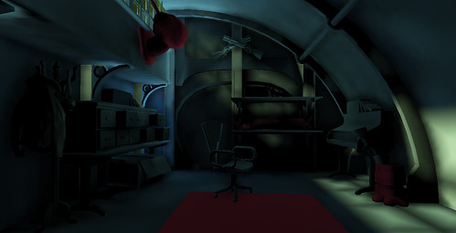
Once I adjusted the brightness/contrast I could see what the scene looked like, I like what I see.
well it looks kind of like a compact chain gun / minigun, and since there is never a sight on an unmounted gun of that type, i think it works.
high rez image
I may give it a cushion later...
All the renders I've posted in this thread so far have been using the 'shiny dark' mental ray shader from this thread:
http://www.polycount.com/forum/showthread.php?t=69829
The only thing that bothers me about the scene in general is that, to me, it doesn't look anything like how I picture a hunting lodge to look. I don't mean the props like the mounted robot head and crossed rifles (also cool), but the overall feel. Right now, it looks more like a bedroom than a hunting lodge.
Maybe it'll be a different story when you're a little closer to finishing it and we've got some proper lighting and different views of the room. Either way, looking forward to seeing where you go with it.
higher resolution version
I have to agree with danshewan that it's giving off a bedroom vibe rather than a hunter lodge so far, but since you've just started I might be speaking to soon
The models you've posted look promising
I know what you both mean. It's supposed to be a sort of hunting cabin where the hunter goes after a hard day hunting robots. I guess it's not really a lodge at the moment. Or if it is it's a bedroom or study in the lodge and not the main room where the fire and couches are.
I think the assets I'm making should be flexible enough that if I wanted to it would be possible to make a room like that later
hirez image here
brief explanation: this is a severed robot foot which the robot hunter has hollowed out and is using as a place to store a shotgun.
Lol the brits indeed
http://en.wikipedia.org/wiki/Bren_light_machine_gun
Yeah, it really shouldnt be that dark. Cannot see anything~~ Brighten it up like above mate. high poly stuff looks good. Clean stuff!
http://www.privateletters.net/equipment_machineguns.html
Anywho... back on subject.
The high poly modeling is looking great, I love the hallowed out leg idea, total big game hunter stuff. Keep up the great work!
hi resolution image here
RH_robotArm_render291110 by sprunghunt, on Flickr
Another one of the robot hunters trophies or keepsakes. A severed robot arm.
it's very handy to have around...
also, love the pun!
"it's very handy to have around...