Home 3D Art Showcase & Critiques

katerina yonce

13
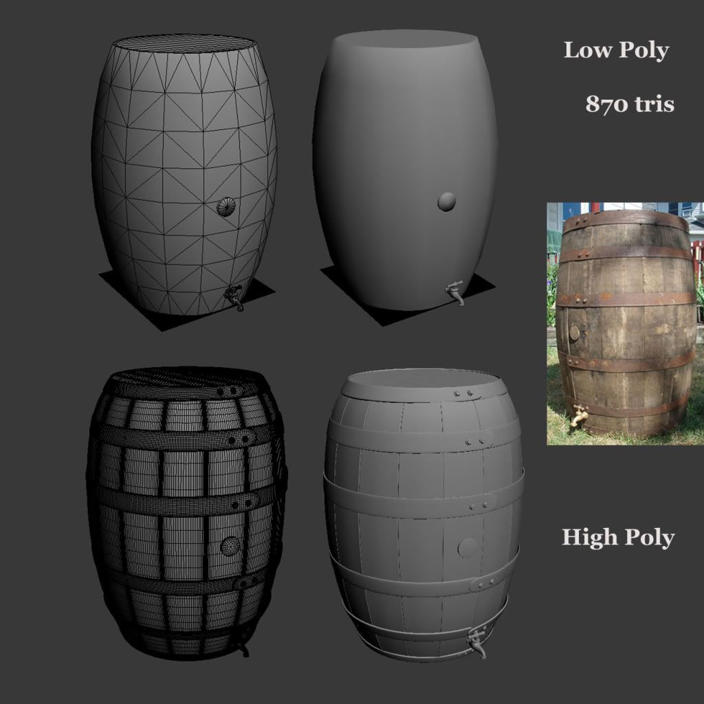
Hey guys, my name is Kat. I'm currently a student in the Dallas area and i just started doing 3d modeling. This barrel is my 1st prop and i'm looking forward to doing more 3d! First time doing a low poly, high poly, textures and even posting screenshots. I would like to thank Raul and Phillip for helping out! You guys rule! smile.gif

hp_lp.jpg

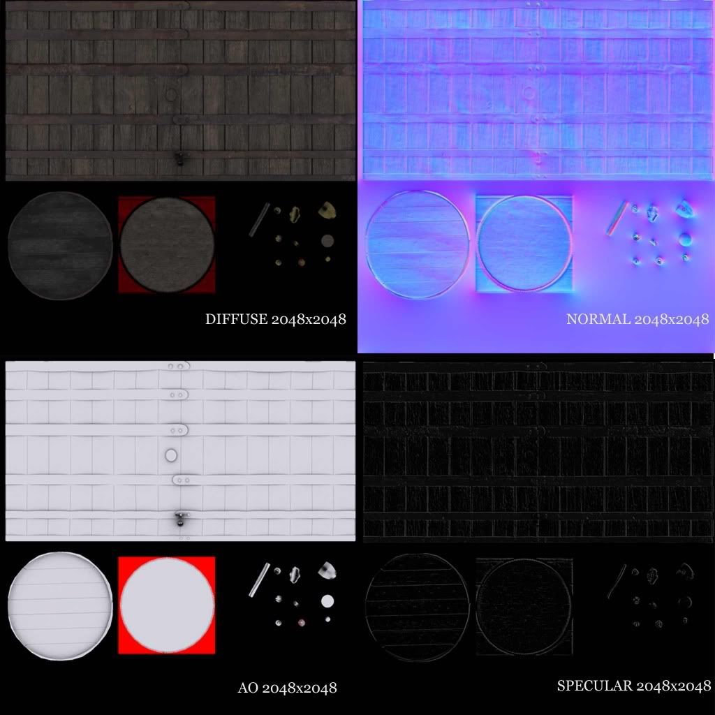
Maps-for-polycount.jpg

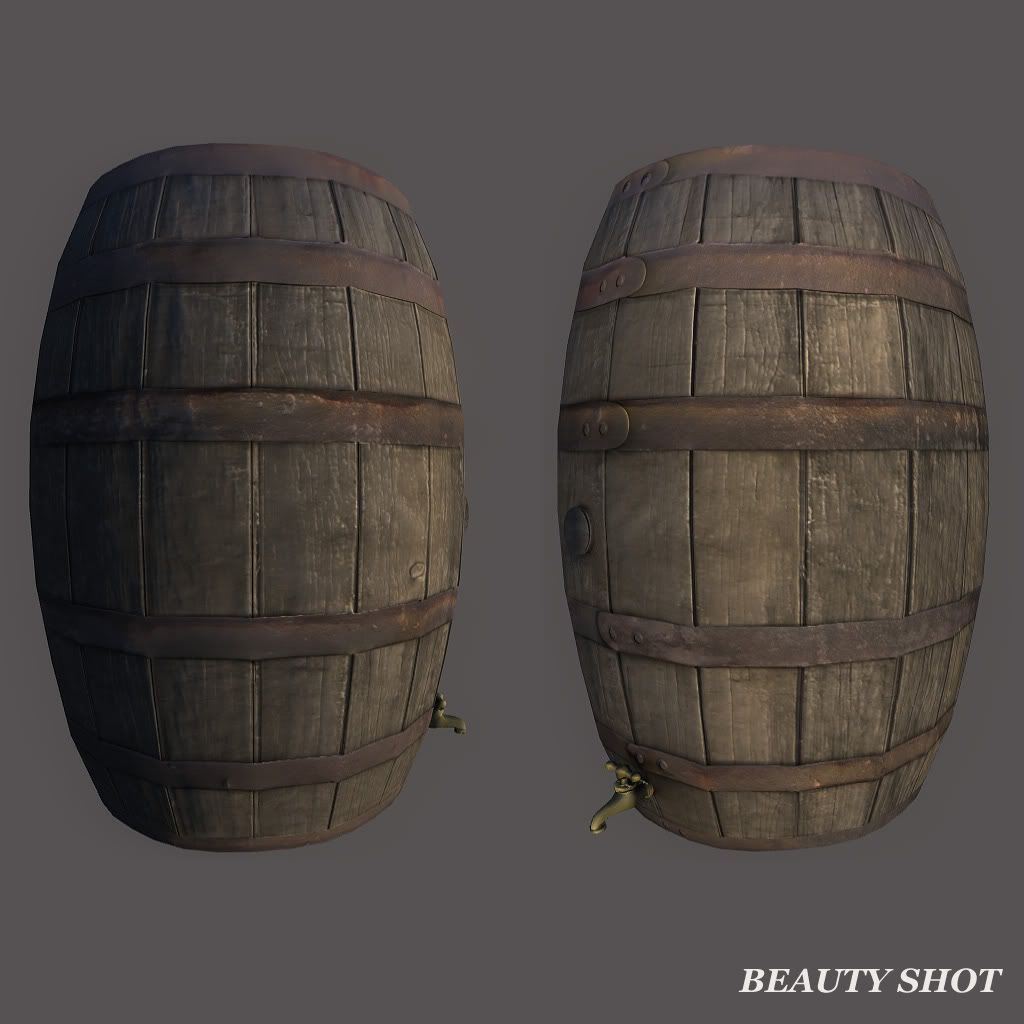
barrel_beauty_shot.jpg

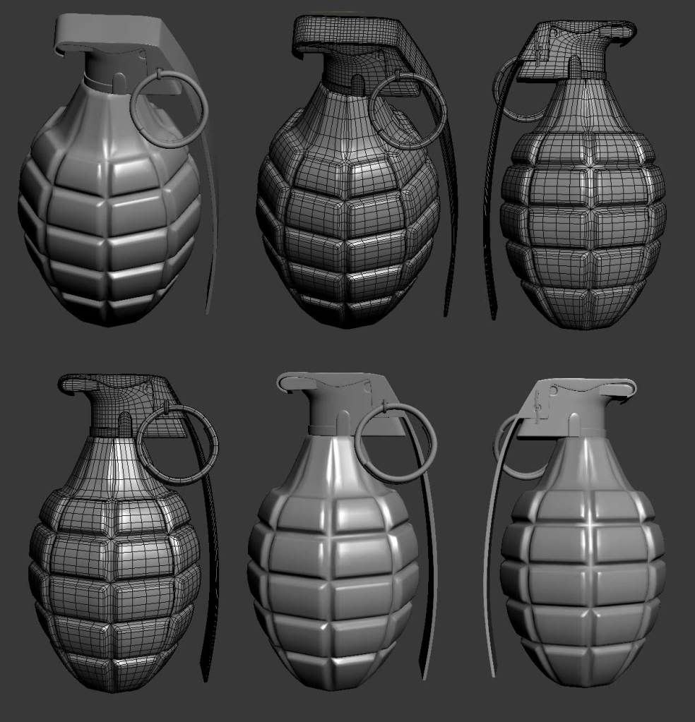
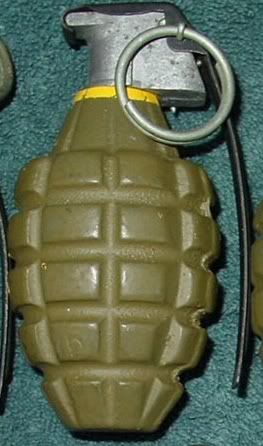
Pineapple grenade

grenade_hp.jpg

here's the ref i used

grenade_reference.jpg

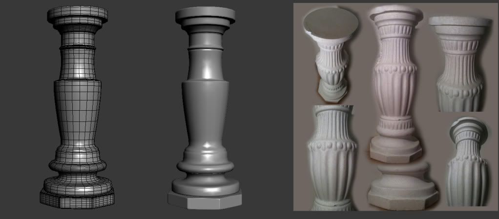
I just started working on this column
column_hp_base.jpg

Replies

  • Ben Apuna
    Welcome to Polycount Kat, you're off to a good start.

    Here's a few crits:

    1. I think the specular on the barrel needs some more work to help differentiate the wood from the metal. You might want to brighten up the specular for the metal parts to get them to have some shine.

    2. Take out the red from your AO map it will show up as a red outline around the faces it surrounds when mip mapped in game. In fact it might also be a good idea to change the black dead space to white on the AO as well otherwise it will appear as black outlines when heavily mip mapped.

    3. 2048 for a barrel seems a bit high res for a real time asset of this size, unless maybe you're going for "next gen" or it's for a pre rendered cut scene.

    4. I would suggest mirroring and/or stacking UVs as a good method for increasing pixel density rather than using larger texture sheets. In many engines you can also use non-square textures to save texture memory and have less wasted UV space. Your barrel for example could have been placed on a 2048 x 1024 map by mirroring most of the wood panels.

    Anyway you're first low poly work is way better than what I first made. Keep it up :)
  • pestibug
    Offline / Send Message
    pestibug polycounter lvl 18
    Ben made valid points, I just want to add that this specularmap looks like it has been made with crazybump or something? The way it is now it doesn't do what a spec map is supposed to do.

    Metal bits need to be lightened so they have more gleam. Not too much since its rusty and all, but just to show its another material than the wood.

    Don't make the spec texture all black, but make it a really dark grey. Then use black in the seams.
    Cracks and seams usually gather dirt, dust and all that, so there's not much place for shiny spec there.

    The rest of the models look good. A bit of pinching on the top of the grenade body, needs cleaning up.
  • Anuxinamoon
    Offline / Send Message
    Anuxinamoon polycounter lvl 14
    You know what I thought and that impressed me the most when I saw your barrel? That it was simple, it was easy to read and the texture wasn't noisy!

    Massive props on that! :D

    Spec is used, as stated above, do help differentiate different material types. An easy way for you to start a spec map is to grab the layers that have your basic wood and metal materials on them. (so remove all the shadows and highlights that you might have added to just gain the raw texture of the materials.
    Use masks to separate your different materials (in this case the metal from the wood) then either paint, dodge and burn or use levels to get the desired base specular.
    In this case the wood would be mostly black and metal would be tweaked till most of it was a med-light grey.
    Then make another layer and add on different specular bits, like white scratches on the metal and some dark patches where there is rust or dirt.

    Keep going! Post more and its great to see more girl power on these forums :)
  • e-freak
    maybe the only thing is that you can bring the polycount on that barrel way down. there can be done more with 900 polys at hand on the shape/sillouette
  • Harry
    Offline / Send Message
    Harry polycounter lvl 13
    something strange is going on with the normalmap for the barrel, is it a flipped green channel or something?
  • HAL
    Offline / Send Message
    HAL polycounter lvl 13
    What harry said, looks like your norm's greenchannel is flipped.
  • katerina yonce
    Hey guys here's my maps to the grenade

    maps.jpg

    screenshots.jpg
  • Shogun3d
    Offline / Send Message
    Shogun3d polycounter lvl 12
    Hey Katerina, double check the normal map on the barrel as Harry stated earlier. The green channel appears to be flipped.

    Welcome to polycount, some solid work here as others have mentioned. You're definitely on the right track as a new modeler. Keep up the good work!
  • raul
    Offline / Send Message
    raul polycounter lvl 11
    Nice work, kat! There are a few things i would change on the textures. But i think u should just keep moving on to other props and revisit these once you get a better idea of what's up.

    Keep it up!!
  • katerina yonce
    I added a normal map that i did on crazybump on top of my normal map that i made in Max for the barrel so that's why it looks like it needs to be flipped but the green channel is actually on the right side. I did the same thing for the grenade but i need to work on it some more. Any suggestions on how to mix the 2 normal maps without making them look like they need to be flipped?
  • katerina yonce
    here's a quick update on the column

    WIP1.jpg
  • katerina yonce
  • raul
    Offline / Send Message
    raul polycounter lvl 11
    fucking danm it kat! my jaw just hit the floor!! Very nice!! see all those hours of cussing at me and max finally paid off!! :)

    I know you are still not done, so make sure your silthoutte value is dead on with your reference. I see some curves need more work. Also make sure that you delete the traingles from the top side of the cylinders..

    The little circles with with stripes going on at the end of the decor. They dont match your reference. Check the right pattern.

    -raul
  • Ruz
    Offline / Send Message
    Ruz polycount lvl 666
    re the grenade it looks odd because in the real one the 'grouting' is much wider
    On yours the little panels are too big
    it needs a few more hard edges too, looks a little soft overall. silhouette is very smooth also
    if you can spare the polys, just leave the bigger bevels in.
  • katerina yonce
    Raul what circles with lines are you talking about??...
  • almighty_gir
    Offline / Send Message
    almighty_gir ngon master
    the specular on the barrel needs work, remember that metal generally has higher spec values than wood, where your current spec seems to be mostly the same "material".

    with the grenade, remember that scratches and scrapes on the diffuse will also need to be present in the specular.
  • DeusExMatteo
    Offline / Send Message
    DeusExMatteo polycounter lvl 10
    you should get a sketchbook :) the edges on the grenade looks a little to smooth/shallow to me, how did you make them? The column looks cool!
  • Anuxinamoon
    Offline / Send Message
    Anuxinamoon polycounter lvl 14
    I added a normal map that i did on crazybump on top of my normal map that i made in Max for the barrel so that's why it looks like it needs to be flipped but the green channel is actually on the right side. I did the same thing for the grenade but i need to work on it some more. Any suggestions on how to mix the 2 normal maps without making them look like they need to be flipped?

    This tutorial by Ben Mathis can help you merge your detail normal with your highpoly source normal.

    http://www.poopinmymouth.com/tutorial/normal_workflow_3.htm
  • katerina yonce
    Here's the hi-poly on the column

    column_hp.jpg
  • Spark
    Offline / Send Message
    Spark polycounter lvl 18
    Kat, the colum is looking good, as for the barrel and such I agree that it isn't looking quite correct, having it within a game engine will really help in figuring out any problems. As for the grenade, you arent pusing out the little pinapple parts as they feel quite shallow. The textures all need to be pushed but texturing takes time so continue on learning the process more with different items and at some point down the road come back and look at what you ddi wrong. Your hipoly colum/wires are showing alot of tris, where we talked about good topology flow and there is not need for alot of the tris. Not saying you cannot use tris if neccesary but your treating it like its a lowpoly reduction in some parts. I speak of the picture above, where the colum top is facing more towards the camera.. you can see the lip above the small circles as tris, I would correct this.

    Spark
  • katerina yonce
    column_preview.jpg

    Here's my lo-poly on the column...These are not my final maps...I'm still working on them
  • almighty_gir
    Offline / Send Message
    almighty_gir ngon master
    i must say, it's mildly disappointing to see you pushing out so many medeocre works when you could be pushing out fewer more amazing ones just by taking a step back and looking at the criticism you're recieving here..
  • arrangemonk
    Offline / Send Message
    arrangemonk polycounter lvl 17
    let him do how he pleases, when hes stuck, he will ask questions and then there is the time to give advice,

    you guys wast your time awesomely criting people who dont listen
  • Celes
    you got some nice texturing skillz!
    That high poly barrel is reeeaally high poly though. i don't think that many polys are needed for either low nor low.
  • katerina yonce
    Hey guys, I really appreciate everyone's comments. I just started doing 3D 2 months ago so I'm really new to this and I know I have a LOT to learn.

    Almightyl_gir: Both the barrel and the grenade specular maps were done in crazybump. I'm still in the process on learning how to make them look right.

    DeusExMatteo: I took the polygons around the grenade and used inset and then used the push modifier to push them out. Then i chamfered the edges and connected each "pinapple" once vertically and horizontally to keep the square shape.

    Anuxinamoon: The link to the tutorial you sent me is very helpful. Thank you

    I will be going back on the barrel and the grenade to pay more attention on making the specular maps and textures after I finish my class projects.

    Katerina
  • Goat Justice
    Offline / Send Message
    Goat Justice polycounter lvl 10
    I'm not sure what process in Crazybump is producing those specular maps, but I'd recommend doing them in Photoshop instead. There's a lot more to a good spec map than just tracing the edges of the normal map. In fact highlighting these edges may not even be a good idea sometimes.
  • katerina yonce
  • katerina yonce
    i'm in the process of learning how to make specular maps. Thank you for the advice :)
  • Adam L. Gray
    Well, it might not be that good anymore.. but to get the basic understanding of creating specular maps you could have a go at this one: cleekme
  • HAL
    Offline / Send Message
    HAL polycounter lvl 13
    Regarding that specular map you ahve atm --- it looks like you just inverted the AO map?
    Try to think of which parts reflect the light more than others and paint those brighter.
  • phillip.bailey
    Offline / Send Message
    phillip.bailey polycounter lvl 9
    Hey Kat!
    You are really starting to spit these out. That's good that you are getting the process down. Now that you seem to be grasping the process you should try more complicated props. Ones that are not just a cylinder (barrel, grenade, column).

    In regards to the specular:
    Specularity can be a difficult concept to understand. Anuxinamoon, had some very valid points. Take another look at her comments. Also, you should find yourself spending close to the same amount of time and love as you do with your diffuse map. You can utilize some of the information you already have from your normal map to get a good start on your specular but there is no one button, click and then your done. I've also seen people start the specular with their diffuse and even the ambient occlusion. Here is a link that I found for you that shows a technical way to think about it. CLICK

    Another way to get a good start is to take the normal map into Crazybump, go to Diffuse and set the 3D Highlights to like 15 or so. Save that file, take it in to photoshop and try a layer blend mode (such as Hardlight). Then maybe underneath that layer you could use a desaturated version of the diffuse. Even this way, you still shouldn't call it done with a better understanding of specularity. (polished metal = shiny = light, worn metal = less shiny = darker than light, wood and rust = dull = dark)
    MAPS1SP.jpg

    As a spankin new learner, it can be difficult to intake the amount of information fed to you. So open your pie hole and take it.lol Keep going your doing fine.
    -Phil
  • pestibug
    Offline / Send Message
    pestibug polycounter lvl 18
    kat_spec.jpg

    quick dirty specmap, but shows the principl

    Bare metal usually get more white assigned to it because it will be shinier then most other materials on the model.

    Highlight edges to make them pop, but don't overdo it.

    black goes to parts that catch less light, are dirty or muted. Use it on cracks and such to bring out depth.
  • raul
    Offline / Send Message
    raul polycounter lvl 11
    i agree with phil. its time you do a crazy prop. Something that will really kick your ass!!!
  • katerina yonce
    I started working on this fire hydrant. Here's the high poly in progress. I still have a few details to add but here's a preview

    Reference:
    reference.jpg

    hp1.jpg
  • raul
    Offline / Send Message
    raul polycounter lvl 11
    Nice progression and very close attention to detail. I say u almost got it. Just tigthen ur chamfer a little bit more to give those bevels a little more sharpness. keep it up kat!
  • marq4porsche
    Offline / Send Message
    marq4porsche polycounter lvl 9
    Looking good the main pipe itself needs to be a little wider overall, it feels too skinny compared to your reference.
  • Giacomo X
    Offline / Send Message
    Giacomo X polycounter lvl 6
    FYI: if you have the opportunity, shoot axonometric views of the object you're modeling and use them as backdrops. Trying to eyeball something you could have a blueprint for is a waste of time.
  • raul
    Offline / Send Message
    raul polycounter lvl 11
    Giacomo X, pardon my noobness, but what is a axonometric view shot and how do we take them?
  • katerina yonce
    Giacomo X i was wondering if you give me some more information on the axonometric view?
  • Cap Hotkill
    Offline / Send Message
    Cap Hotkill polycounter lvl 13
    Hey guys here's my maps to the grenade

    maps.jpg

    Are you using Any Texture Normal map Filters such as Crazybump?

    With a High poly like that it should look alot better.

    btw, that fire hydrant is looking very good :thumbup:
    Giacomo X i was wondering if you give me some more information on the axonometric view?

    He talks about Left Side, Front, Upper side Pictures of the Object you want to model, you take the images and you put them as a Backdrop.

    Something like this:
    backdropexample.png
  • katerina yonce
    Cap Hotkill I did use Crazybump to make the specular. I need to go back and finish the textures on it though. Thank you for your comments and your explanation on axonometric view.
  • katerina yonce
    Here's an update on the fire hydrant. I re-sized it to look more like the reference. I also added a few more little details

    preview2.jpg
  • Cap Hotkill
    Offline / Send Message
    Cap Hotkill polycounter lvl 13
    Cap Hotkill I did use Crazybump to make the specular. I need to go back and finish the textures on it though. Thank you for your comments and your explanation on axonometric view.

    Avoid using Crazybump as much as you can. specially on your High poly baked Normal maps, Crazybump has an odd tendency to Mess with the normals and they end up looking always wrong, you should give a try to Xnormal, It has lots of usefull tools and even a Height to Normal map Filter Plug-in for PS that is usefull when you want to add a layer of small detail to your normal map.
  • Harry
    Offline / Send Message
    Harry polycounter lvl 13
    i'd say crazybump is pretty okay for most things except models with split smoothing groups
  • Cap Hotkill
    Offline / Send Message
    Cap Hotkill polycounter lvl 13
    The problem with Crazybump is that it adds quite a lot of colour gradient distortion to your baked normal maps. it makes the model look wrong, just look at the Barrel she made and at the grenade, the high poly models were good, so the normal maps baked should look good, but by using crazybump they get all messed up.

    Try to avoid Crazybump 3D shape Recognition and always keep your normal maps clean.
  • katerina yonce
    Hey guys..I had to put the fire hydrant on the side for tonight so i could do another prop for school tomorrow. So i had to do a vase and here it is with the reference.

    tallshaped.jpg

    vase_preview1.jpg
  • katerina yonce
    so i unwrapped the fire hydrant and here's my normal map. It has a lot of waves so i'm trying to fix that

    normal_map.jpg
  • katerina yonce
    I had to do another prop for class so i started on this rose...I'm still working on it but here's what i got so far

    rose_1.jpg

    Here's the reference
    image002.jpg
  • raul
    Offline / Send Message
    raul polycounter lvl 11
    The rose is looking cool, are you going to be modeling the little sharp edges on the leaves?

    on the normals of your hydrant, i see a lot of waves! Makes me wanna go surfing! :) You migth wanna post a screengrab and wire of your low poly to get a better idea of what's causing the problem.
  • roosterMAP
    Offline / Send Message
    roosterMAP polycounter lvl 14
    i think the little sharp edges should be on the texture on an opacity map. dont even bother modeling them in to bake it. it'll take too long.
13
Sign In or Register to comment.