WIP- Low Poly Spy
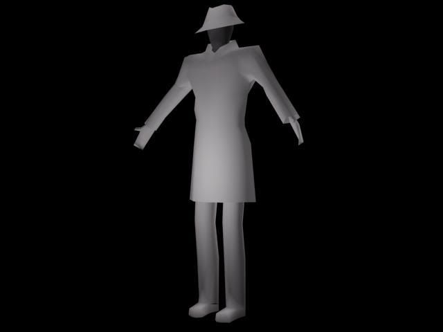
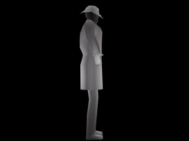
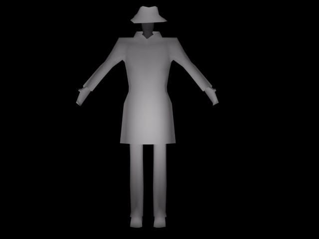
Here is a model I am currently working on.
It is supposed to be a spy character for a iPhone game. The model is wearing a trench coat, which I hope to add details with a skin.
The model currently has 666 tris, and I think it is done.... Unless you guys have somethings to change :poly122:
The game will have a top down/isometric view (think Metal Gear Solid 1), so I figured I didn't have to model to many details (especially being an iPhone game)
I originally had the model at 2000 polys, but had to cut down A LOT as I haven't modeled in years and just starting to get the feel of things.
Any ways let me know what you think!:thumbup:


Replies
Post the concept as well.
What kind of style are you going for?
Here is a wireframe shot.. I know it is very messy but I used multires on a 2000poly mesh (Which I tried so hard to keep in quads
[img][/img]
The legs I agree with.. I cant figure out what to do with them. I was thinking really thin with tight pants at first. But then I figured some "normal" pants would fit better.
The arms I had longer, but it didn't look right. I will try and make them a little longer.
I think I fixed the shoulder?
Made the arms a bit longer
Changed the legs
Cleaned up a few parts of the mesh
deleted polygons. (Currently at 645 tris)
Your geometry is a bit peculiar in places, most notably around the elbow. For it to function you'll need at least a couple of edge loops running right the way round the arm. I'd suggest doing the same with the knees as they'll collapse when animated the way you have them now.
Yes I know I need some edge loops, I will definitely try to fix it the mesh more.. At this point I really regret not paying attention the poly count from the beginning so I didn't have to use multires.
You're right. It is my mistake (and lazyness) which got me here. I will be fixing that as much as I can. I have been looking into the lowpoly threads and have been getting some ideas. But every time I try to fix it too many polygons are added. I guess I will just have to play around with it some more.
Removed the arms (which were probably the worst) and started over on them. Still not done, need to add some more shape and longer (Can some one give a suggestion of where I should bring them down to? Every thin I try looks too long to too short)
Any ways thanks for all the feedback and keep it coming!
Try and keep your polygons at 4 sides, 3 if you have to, but try to never do more than 4 on characters. Try and keep everything in nice lines that follow the flow of the model, having points jerk up will break the look of everything.
If this is going to be top view, you don't need as much polys in the hat as you have, most of everything can be detailed with nice shadows and highlights in the texture.
Your new polyflow is TONS better and will be a lot easier to work with to get the shapes you want.
Hope this helps, keep us posted.
EDIT: Just noticed some typos in the example I gave, haha I was in a rush what can I say!
Here is another update. removed a lot of unneeded polys, currently at 531 tris.
Try taking a look at this helpful link for your elbows and knees.
http://wiki.polycount.net/Limb_Topology
*Also, see how in your side view his chest is completely flat? You can't waste those polys like that, especially working so low. Try pulling those outside edges back just a tad, and allow the center loop to give more shape.
Now I think you can focus on the proportions as mentioned above :poly124:
Made some more changes.
-Head is wider
-Legs are thicker
-Torso is thinner
-Shoulders are less broad (and removed a row of polygons)
-Arms are longer
-I think I added some proper deformation to the knees.
-Made the chest less flat
-Removed a lot of polygons where they weren't needed.
Shortened the torso and legs a bit..
Better or worse?
Edit: bored and just thought I'd try and make a nicer render.
I am pretty happy with it, but let me know what you guys think before I move on and try to UV map it :poly127:
I am pretty happy with it so far... I know it is not as great as some of the other stuff on polycount, but for a non artistic person I think I did quite well
I know the jacket "flaps" are pretty blurry.. But I couldn't fix that.. I think it will be fine for the game though (isometric game on an iphone)
The jacket is done with some image samples from google. So cant take all the credit there.
Here, check out an older thread of mine where I had the same issue, might help you: http://boards.polycount.net/showthread.php?t=68572
Does any one know of some good easy to follow game animation tutorials for 3DSmax using Bipeds?
[ame]
This detective walk is old old old old school, you might want to re-do your detective walk..
Nice model though. Thanks for sharing. <.<
Though, that is the same style of movement I will be going for
http://www.youtube.com/watch?v=mDphvhbrRz0