The BRAWL² Tournament Challenge has been announced!
It starts May 12, and ends Oct 17. Let's see what you got!
https://polycount.com/discussion/237047/the-brawl²-tournament
It starts May 12, and ends Oct 17. Let's see what you got!
https://polycount.com/discussion/237047/the-brawl²-tournament
kicking it out of the system - Fantastique Electron
Alright guys! Finally decided to fisnish that one.
I've been messing with that design for too long, so I thought time to create a thread, finish her, bake her, pose her and hopefully print her in 3d!
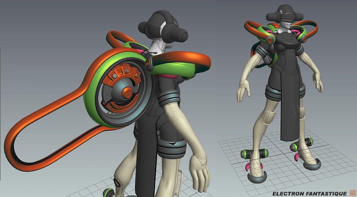
Squeezing in tons of pop influences too ... it's alot of fun and not very serious. The gear is just brainfart improv - I want to focus mostly on the very simple tight body version, and then do a pimped up/armored up variant as a teammate. I also really want to do 2 or 3 swappable heads.
Suit design :
http://img.photobucket.com/albums/v242/pior_ubb/pior_fighter_wip005.jpg
gear wip :
(the loincloth makes her look short tho. Or maybe that's because of the shoulder gear? Need to investigate...)

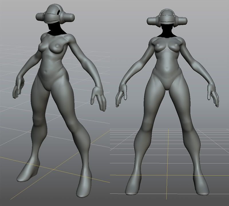
Early body sculpt - I dont think I need to take it further, since I want to add layers of tight rubber, seam lines and so on.

Crit away!
P
I've been messing with that design for too long, so I thought time to create a thread, finish her, bake her, pose her and hopefully print her in 3d!
Squeezing in tons of pop influences too ... it's alot of fun and not very serious. The gear is just brainfart improv - I want to focus mostly on the very simple tight body version, and then do a pimped up/armored up variant as a teammate. I also really want to do 2 or 3 swappable heads.
Suit design :
http://img.photobucket.com/albums/v242/pior_ubb/pior_fighter_wip005.jpg
gear wip :
(the loincloth makes her look short tho. Or maybe that's because of the shoulder gear? Need to investigate...)

Early body sculpt - I dont think I need to take it further, since I want to add layers of tight rubber, seam lines and so on.

Crit away!
P

Replies
Only thing I'm not so keen on at the moment is the thick cuffs of her sleeves and pants. Seems rather blunt compared to the other sleek elements all over her.
I look forward to the updates.
Cheers, Nick.
Is there some counterweight to the backpack? Feels like she'll fall over but that's maybe just my impression from these screenshots
Body is great, gear is funky. Doesn't look back-heavy to me, I imagine the thing producing some kind of gravity-field. Looking forward to snazzy suit designs. Keep it simple!
Looking great. I'll follow this for sure.
The design makes me think of a street luge as the ankles seem to have wheels along with the big one on the back- dunno how functional it would be but she could end up turning herself in to some funky tron esque bike hehe
shall be looking out for updates for sure!
yeah its probably not my style, but i think the shapes of the arms and legs dont have the quality as the rest of the design. (just my op maybe)
i would probably leave the orange shoulder piece aswell,
besides that it has the pior look, funky fresh, gw dude
http://bodylights.com/pdshop/shop/item.asp?itemid=1553
I agree that she looks a bit short with the loincloth. But, I think if you very carefully color her so her legs distinctly contrast her stomach region, it'll read better. I think that design element works well if you keep those legs so long!
I also think her hands might want to be more elegant, but the chunky look could be cool too.
:thumbup:
Overall, Very cool work, Pior.
I love the proportions you have going on this girl. The machinery on her looks great too. Looking forward to seeing more.
Started to address most of the crits. Also I'm pretty much done with the backpiece and the helmet (except a sculpt pass to make it more robotic still).
Also, about the contact piece between the torso and the tech gear (just a fat pink rubber band at the moment from shoulder to shoulder across the boobs), I decided to make it more of a designed element, like a main armor piece that fits tight around the torso holding the shoulder pads and the spinning wheel. So back to the drawing board for that one!!
Added more details ...
love the proportions and the designs over all, although I feel like the orange 'handles' on her shoulder pieces should be rotated or skewed at the handle so it's not entirely parallel. I also love the crazy disc brake/engine backpack thing haha. This may go against your wanting to make her the 'sleek' version, but i think the cylinders coming off it seem a little too downplayed considering the huge exaggeration of everything else.
I agree that the gloves being slimmer and more classical in approach would be cool, especially with the 'sleeker' version, but it would also be consistent with more exaggerated feminine gloves.
I'm a sucker for that whole Speedball, Jet Set Radio, 2000ad pop culture stuff though, I suppose transmetropolitan is the most recent 'cool' successor to that stuff.
Not much progress, was away for the weekend but managed to do a bit of head sculpting on the plane and sitting on the ground like a bum hunting for free AC outlets!
Also edited the hands how I wanted them originally (thin but in gloves)
African first, now want to do asian and caucasian/latino too... some kind of cliche squadron of hot chicks.
BTW dropbox is the most fantastic way to handle little projects like that. So handy to have access to the full folder of files everywhere!
This character has personality in her facial structure. Personally, I might pull it back a tad. Here's what I'd change:
The red area indicates the selection that I used. Before the mid-focal point of her face seemed a little lower than her eyes!
LOL, sorry, I had a little time to kill - so there you go!
EDIT: I might have widened her chin a tad. And, don't worry about the eyebrows, I was just figuring out the facial thirds.
The face sculpt looks great, especially the eyes, but she doesn't look very african. Here's another paintover to show what I mean.
I can't really offer to much crits, but I do have to say, I love those nipples Pior, ha ha
Keep it up!
So I'm Back with some more helmet obsession.
I joined the UT3 mod DM_Spectrum because it looks and sounds very very cool - with the idea of creating one or more character for it.
http://www.moddb.com/games/unreal-tournament-3/news/dm-spectrum
The idea is that the character is only to be visible in flashes, for instance when being fragged or when at low health. The game mechanics still have to be properly thought out, but you get the idea. (the map itself gives other visual clues to locate players too : flashing disco trails, colored cubes indicated what area of the map is being walked on, and so on.)
It was a very interesting texture to make. Also the model is a bit peculiar because most of the joints are segmented, ball and socket style. But it does the trick once in game. The portrait shots are subdivided, but it looks okay enough with the raw low res mesh in the game too I think. UT goes so fast anyways, the lowpoly edges are barely noticeable.
Some shots! This was a real blast to work on.
The shader is supposed to be self illum for the black surfaces and white lines, and regular diffuse for the metal mask on the face. Don't really know why she looks so yellow on some shots ...
http://img.photobucket.com/albums/v242/pior_ubb/pior_spectrumchar_001.jpg
i really like it though
Cool project !
I saw that map a while back.. makes perfect sense your lending your character for it