Sketchbook: bounchfx
hey guys, I keep meaning to do more art and now I'm going to. yay. any feedback, comments or crits are of course welcome.
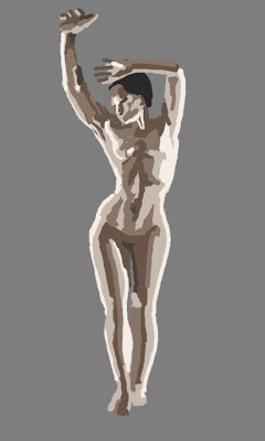
for now, most of the stuff I put in here is either going to be color studies, env studies, or life drawing studies. if anyone has any suggestions of things to do that's great also, but I want to at least try to have some focus.
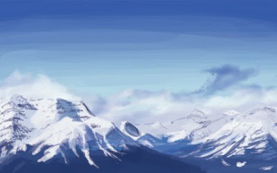
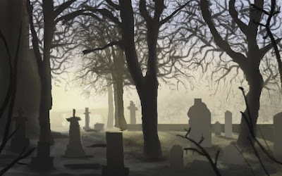
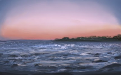
here's some stuff from the past couple months, with more to come. the mountains are the most recent. I usually spend around an hour or so per piece.
jackwhat was a big motivation for me starting to do these as well. thanks jack.
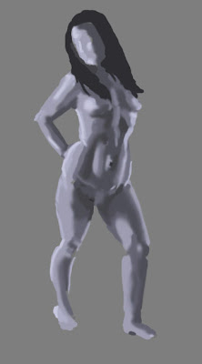
thanks again to everyone who took time to check this out.
for now, most of the stuff I put in here is either going to be color studies, env studies, or life drawing studies. if anyone has any suggestions of things to do that's great also, but I want to at least try to have some focus.
here's some stuff from the past couple months, with more to come. the mountains are the most recent. I usually spend around an hour or so per piece.
jackwhat was a big motivation for me starting to do these as well. thanks jack.


thanks again to everyone who took time to check this out.

Replies
do you guys recommend painting in layers when blocking stuff out like this? I'm feelin it out colorwise and in general ways to put it down. this particular ref image had weird lighting that I tried to stick to. ah well. thanks for looking.
also, my strokes seem to be very wobbly. any advice for this at all or is it just a case of more practice?
next I'm gonna start it the same but paint with like 20-30% opacity and see how that goes. Thanks again!
As for critiques i would say, be more conscientious of where you're lighting is coming from, and If you aren't doing it already, it could help to use a larger size brush when you start out to get forms and lighting blocked in, and then use smaller brushes to fill in the finer details later. Of course, the more you practice the more you will improve, wobbly strokes and all.
If your strokes get wobbly, they might be too long for the type of movement you make. You might need to move your hand more instead of making the lines fromout the wrist.
I mostly use layers to stack progress, blocking things out is just one layer for me. (might be a bad habit..)
The last img is a bit weird, you can try to make some changes by using the liquify tool and push things around a bit, really helps to find the forms your looking for. (use a duplicated layer for this)
Good practice pieces, more!
Also the women in green, first thing I noticed was the proportions were really good. It has a nice flow to the drawing as well.
Over all, sweet work man
This is a self portrait of me using a picture as reference.
Thanks again guys!
look. I'm sorry. at least I still did art tonight like I promised myself. no, I don't know what it is.
kinda think it looked better before i whacked out the color of the clouds and bone spider leg things. ah well!
once again, thanks for your time!
another quick envo study for tonight
thanks again guys.
Nice bounch, i like that you put up a new piece every day or so, keep it up!
beh. used photo as reference, and for color picking. gonna do another now and try to keep brush bigger, and use my own colors
yes I would appreciate tips on realistic/mental ray rendering
had some life drawing with coworkers, lots of fun!
this one was an hour, camera picture of the newsprint haha
quick blocky in one while I watched groundhog day.
I really need to find a way to do this faster and get an actual pipeline down.
however, this one I didn't spend nearly as much time blocking out with line for proportions, it was just three quick lines (spine, legs, etc) and I put the color on, i'm fairly happy with the proportions for doing it so haphazardly
female midsection, value and form study, and definitely practice with traditional rendering. gotta fudge with it more.
thanks again.
i would take a step back and maybe do some hogarth studies. he has a lot of emphasis on exadurating the form of the muscles. in my experience exaduration has been the best way to learn something. take it over the top, then you can always knock it back for more realism
fun stuff man, keep on rockin
richkid: I appreciate the advice. I've heard a lot about hogarth but never actually went and studied his stuff. I'm going to be running through the Stucture of Man DVD's and see what I can learn from that. there's a crapload but it should help. I'm also planning on reading Figure drawing for all it's worth by loomis. thanks again for the crits!
whipswitch: Ah crap! thanks for letting me know. Guess I gotta find a new host for that, ugh. I'll use my dropbox. Should be fixed now. Thank you!!
quick apple color study. about time I tried this exercise.
still trying to decide whether i want to use zbrush or mudbox as my main. I dig em both, but dom war is coming soon!
any tips sculpting wise on brushes and whatnot is appreciated. on anatomy too, but I did use a ref image for this and I think it came out pretty darn close
thanks again guys. I think three in one day should be sufficient.
another apple during lunch. it's the same one, upside down. this time the lights in the room were on.
edit:
only thing that annoys me about this that I just noticed is the colors reflected onto the apple don't match the bg color I choose. it's my desk color though. oh well!
AK
Anyways, keep it up! I think I'll have to do a head study too sometime soon.
another, that took an unfortunately long time.
I seem to be procrastinating doing my DW fairly productively lately:
man this is hard. i need a real workflow, the one i have doesn't feel right.
I don't know what your workflow is but I would imagine it's similar to most artists.
1. sketch
2. block in colors
3. blend and add details.
Here's a couple links that might be helpful to you:
http://conceptart.org/forums/showthread.php?t=107217
and that figure drawing dvd at the massive black site would be helpful too I'm sure:
http://media.massiveblack.com/
Anyways, I don't claim to know much, but I know those links are helpful to me
Edit: are thes last 4 portraits all the same person?
yeah, that's pretty much my workflow, but I always get lost at the block in colors phase. I never know how many to block in, is it only the big shapes, some colors are so hard to see etc. so I'm trying to try new things but blah I always give up and start blending too soon I think. I'm getting better at the sketching and proportion part at least I think. I know that boosting the contrast and levels in the images I use for ref would probably help me see shapes better but for some reason my mind tells me that's cheating, that I need to be able to see it naturally.. so for better or worse I've been doing them without color picking or contrast tweaking.
and yes! the last FIVE actually were all the same person! though you can probably only tell a resemblance in the last three, or perhaps the two before the latest one - the cheek does come across as droopy! so hopefully you see in the latest ones at least better proportion in regards to a likeness.
also thanks for the links. I've read through the bumskee one actually, but I definitely need to read it again and analyze what he does more.
also, I've been really wanting to watch the digital figure drawing massive black video.. I'll probably pick it up because it'll most likely benefit me.
you're doing pretty awesome stuff consistently in your sketchbook too, so it's nice to have these back and forths
thanks for the reply!
here's the ones leading up, followed by the final. props to anyone who can tell me who it is.
thanks!
soft round brush, as suggested by jackwhat. I like this one. about 2-3 hours again haha
quick one, I've decided I'm going to just work on being able to draw a likeness in a shorter amount of time (or at all!) then once I can do that, get back to painting. ok, well, still some painting, but it's definitely something I want to focus on, so I don't have to worry about stuff other than painting while painting haha.
anyone wanna guess who?
...gotta do something during the 7 month downtime.
Thanks again for looking!
and a portrait of a co worker for a little event we're having... heheh..
thanks again guys, thanks for looking. I appreciate your support.
Thanks!