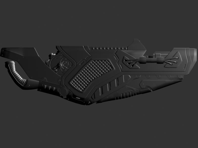
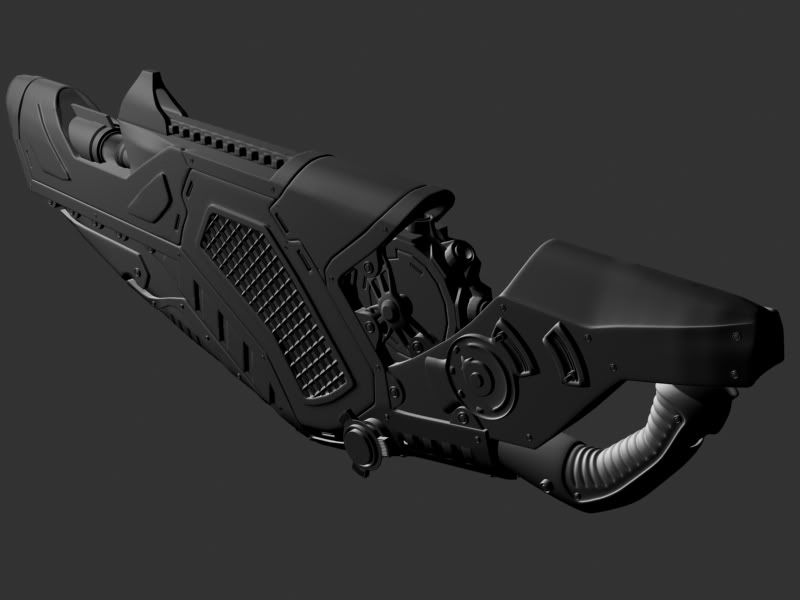
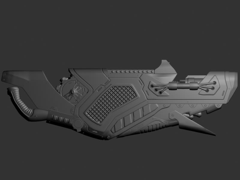
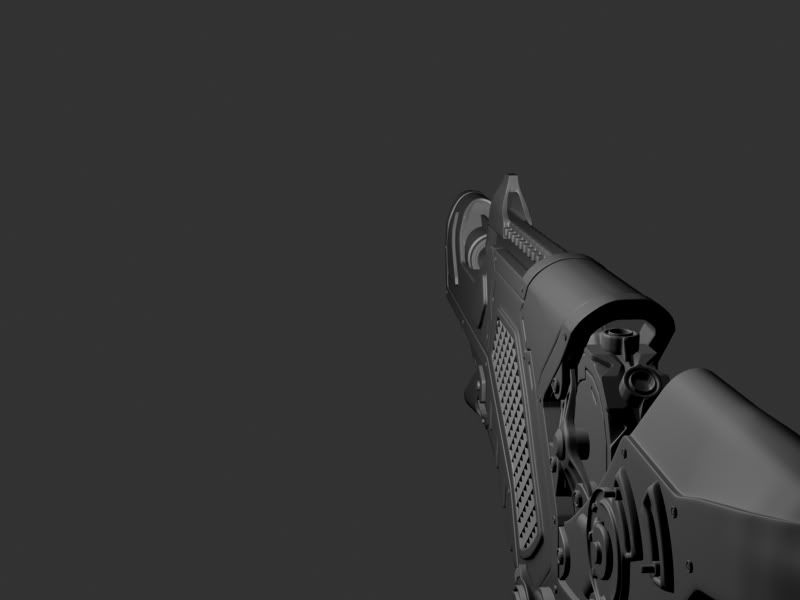
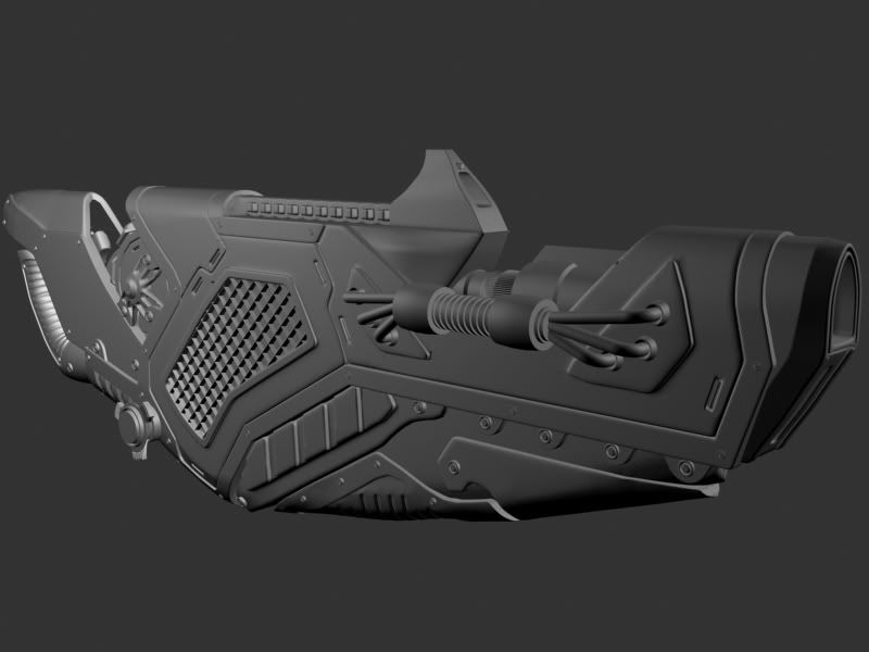
Would like to get people crits on my work in progress for Make Something Unreal. This is the high poly for the gun. It is made from a concept I drew out.
It fires sort of like the Shock Rifle in UT3. Except the primary beam fired starts off large giving you a good shot at hitting someone close but the further it travels the smaller it gets until it just disappears (this mode can be shot in a rapid fire, tho its not an incredibly fast one). The secondary fire takes time to charge but when charged it fires one large slow moving blast. This blast also dissipates over time except it takes a lot longer time for it to.
It has a few moving parts, the cylinder near the back spins when firing sucking in a blue energy. The gear in the front opening spins as well. also when doing the secondary blast the front opens up exposing two extra barrels. The side grating is a heat release exhaust that gives off a little steam when rapid fire mode and gives off a big cloud of smoke when doing the secondary fire.
This is my idea for the colors of the gun. It's a quick job I did in photoshop.
Nice work on the detailing, but frankly I cannot fathom holding or using that thing. Really, does that look comfortable or practical to hold? The problem is the shape of the grip handle and then no clear place to support it with the other hand.
hmm looking at it, to me it never seemed that hard to understand how to hold it. I mean you have the handle in the back and the grip near the front for your other hand. The fake textured one shows the grips better, the two brown areas. I can understand how the back handle would be uncomfortable though since the way it is shaped, but it was more of a aesthetic choice, i can try curving in a more form fitting way tho.
imagine holding that gun with your wrist cocked back like that, to hold it at chest height or thereabouts... it's pretty much impossible, or just extremely uncomfortable. There's a reason all gun handles tilt forward.
Decent design overall, could use a couple tweaks like fixing the grips though, mainly the back one. For some reason I keep wanting to see it open up, like the ZF-1. edit: just re-read your post, you already planned on having it open up... good call.
You might want to think about putting something else on the side besides that mesh grate thing, it looks like filler. Maybe some interesting overlapping metal plates and joints, maybe a moving part, something more interesting than just a metal screen.
You might want to think about putting something else on the side besides that mesh grate thing, it looks like filler. Maybe though some interested overlapping metal plates and joints, maybe a moving part, something more interesting than just a metal screen.
I like this idea as I have been thinking of a way i could add more to the beef of the sides of the gun. since the gun at the moment is fairly thin and i'm not really completely pleased with it.
if it's a firstperson weapon i would add some more interesting volume too it, that thing feels like it could fit into a lowpoly box right now, maybe take away the part in bottom front and add something else, really don't like the smoothness in the mesh there,, also add moving parts,, go into UT3 and look at the weapons and see what makes them feel alive.
i would really see this getting cool if you remove the front bottom and add something to the detail at the sides.
thanks everyone, I quickly changed up some stuff I am thinking about doing in photoshop. I think its starting to look a lot better already. just gotta change out that side vent to something more interesting.
Looks pretty. I'm not sure about the shape, where does the players other hand go? For the grip I would find a gun or power tool that has a similar shape to the grip you want, as use the as a base.
Why would the particles go into the players face?
I didn't see your latest update. Look better but I'm still wondering about the particles.
It looks very interesting, but like others said, the grip is really odd and the particles spraying you in the face isn't a great idea. I'm still unsure how you fire it, I don't see a trigger?
The gun shape looks cooler now, I also think it should have more volume and not be so completely slim. Not sure about your colour placement, the blue bits look rather arbitrary like they are just that shape because the gun is that shape, I think more uniformed military looking markings would help even if they dont fit the shape of the gun at all.
Well it is sucking energy to the players would really be unaffected although they do come close to their face (even with that said I have the same concern). I think what I will try is to flip the direction of the opening so the particles come out forward.
ah you changed the front, already looking better, still hope you will work more on the side shape
Oh yeah I am definitely going to add more volume to the sides and take out those vents.
It looks very interesting, but like others said, the grip is really odd and the particles spraying you in the face isn't a great idea. I'm still unsure how you fire it, I don't see a trigger?
Yeah I need to add a trigger, It is going to be a final detail once I get all the big shapes worked out better. With the changes I made do you still feel the handle is odd?
The gun shape looks cooler now, I also think it should have more volume and not be so completely slim. Not sure about your colour placement, the blue bits look rather arbitrary like they are just that shape because the gun is that shape, I think more uniformed military looking markings would help even if they dont fit the shape of the gun at all.
Yeah I completely agree with adding volume I am actually working on concepting something out at the moment. Thanks for the tips about the blue bits I will look up other guns and try to get a better idea of the direction I should go with the painted areas.
Thanks everyone, I'm really glad I posted this before I got too far all this advice is helping tremendously.
EDIT: Made some changes to the photochopping I did. this time to account for the particles in the face comment. Tho I still need to change the side profile and the paint markings. but those will be done in time.
Nice work on the detailing, but frankly I cannot fathom holding or using that thing. Really, does that look comfortable or practical to hold? The problem is the shape of the grip handle and then no clear place to support it with the other hand.
Dude, havent you ever played Unreal before? More than half of the characters are jacked up-rampant steroid abusers that put mark coleman to shame. A mere 200-300 lb weapon or impractical handle/grip for them is no problem!
Tim, the gun's looking a lot more usable now (and cooler). One big complaint I still have is that it looks like the foregrip is way out there and hard to reach.
And Ferg gets some major kudos points for even mentioning the ZF-1.
Dude, havent you ever played Unreal before? More than half of the characters are jacked up-rampant steroid abusers that put mark coleman to shame. A mere 200-300 lb weapon or impractical handle/grip for them is no problem!
Like Katamari, I've learned that trying to bring logic into the Unreal universe generates an unfathomable mindscrew. That being said, I look at those guns and can immediately see where I put both my hands.
Dude, havent you ever played Unreal before? More than half of the characters are jacked up-rampant steroid abusers that put mark coleman to shame. A mere 200-300 lb weapon or impractical handle/grip for them is no problem!
Haha nice. I should hang some dumbbells from the underside of the gun, just to add some weight, we don't want all those muscles going to waste carrying a light gun. haha
Tim, the gun's looking a lot more usable now (and cooler). One big complaint I still have is that it looks like the foregrip is way out there and hard to reach.
And Ferg gets some major kudos points for even mentioning the ZF-1.
Yeah for the foregrip I think once i get it set up in 3d closer to the shape I have in photoshop I will put it in the hands of a character model just to see if he looks uncomfortable holding it.
yeah the funny thing is that I showed it to my brother and his first response was "is that the gun from The Fifth Element?"
Very interesting design, i like it.
I agree that you should make more stuff that sticks out of the sides, so it looks not that simple flat. You could make the side grating more interessting with making it stick out in someway, maybe making some big cooling generator or let the plasma energy get out there, you could also incorporate tubes for that. The things you painted blue in your color concept pop out a lot to much for making not much sense, Some big closures/locks or some smaller vents would fit there.
I made stuff that sticks out of the sides, still needs a ton of tweaking but its really just a rough out of how i am thinking about going about it.
It now has a huge look from the front and back. I think I need to angle the parts that stick out more so the lines aren't so straight from the front view. I will probably make them angle in more toward the bottom since theres not as much to cover there and out more at the top.
Something I learned about the guy who created the guns for UT3, was that he modeled two different versions of the same gun. One for the gun that the player is holding, and the other for the guns that he sees others holding.
The shape and size is different for both of them as well as the perspective. Thats why you see the majority of the gun barrel for the different weapons in UT3, when realistic thats not even possible.
Looking at yours from the quarter back angle, it looks right, but it just needs to stand out more. Let us see more of the gun and not let it be covered up by the back part.
Something to consider when you finished the gun. it's improving too, so it should turn out all right when your done.
I think I am close to getting of the shapes and big details I want in there. Now I just need to add more little details such as rivets and things. and some areas still aren't welded or closed off.
This time I adjusted the FOV in the first person view render to get a little more of an accurate depiction of how i want it.
I will have to look into the UT3 weapons, I knew that theres two different models one low poly one higher in first person view, but I was unaware that they had different size and shape. Thanks for that tip.
Reminds me of the upgraded dispersion pistol from unreal 1
I'm glad it reminds you of a unreal weapon so that means I must be getting close to the style.
Are you using max for your modeling program? If so, are you using turbo smoothing or not? I'm still kind of experimenting with high poly modeling and trying to figure out when or when not to use it.
Looking better but the flaps would hang the other way so to protect the wielder and hoses behind. Also try adding a screen that lets you know your ammo/charge amount.
I will try out making the flaps the other way. I like the ammo indicator screen also, I will work that in somewhere.
Are you using max for your modeling program? If so, are you using turbo smoothing or not? I'm still kind of experimenting with high poly modeling and trying to figure out when or when not to use it.
Yeah I am using max. I use the meshsmooth modifier on a lot of the objects that are more rounded. The biggest thing to remember when working in high poly and using meshsmooth or turbo smooth, is to have enough edges at each corner to keep the shape you want.
I changed the way the flaps are angled so it makes more sense, and I added a screen to the back that displays the current charge level. The screen is a holographic display that is projected by the three tubes pointing towards it. the screen is the red part.
Now I just need to weld all the parts, and add some more minor details.
Ya, I figured out how to chamfer edges or corners to retain shape during turbosmoothing or meshsmoothing. I was just wondering if it's a good method to use for high poly non organic objects. I was watching this AT-AT video on 3dbuzz.com and they are doing the high poly but not smoothing anything like that. But I used turbo smoothing on an object I'm doing now and it looks much better and produces a better normal map than without.
Replies
Decent design overall, could use a couple tweaks like fixing the grips though, mainly the back one. For some reason I keep wanting to see it open up, like the ZF-1. edit: just re-read your post, you already planned on having it open up... good call.
You might want to think about putting something else on the side besides that mesh grate thing, it looks like filler. Maybe some interesting overlapping metal plates and joints, maybe a moving part, something more interesting than just a metal screen.
i would really see this getting cool if you remove the front bottom and add something to the detail at the sides.
Why would the particles go into the players face?
I didn't see your latest update. Look better but I'm still wondering about the particles.
Oh yeah I am definitely going to add more volume to the sides and take out those vents.
Yeah I need to add a trigger, It is going to be a final detail once I get all the big shapes worked out better. With the changes I made do you still feel the handle is odd?
Yeah I completely agree with adding volume I am actually working on concepting something out at the moment. Thanks for the tips about the blue bits I will look up other guns and try to get a better idea of the direction I should go with the painted areas.
Thanks everyone, I'm really glad I posted this before I got too far all this advice is helping tremendously.
EDIT: Made some changes to the photochopping I did. this time to account for the particles in the face comment. Tho I still need to change the side profile and the paint markings. but those will be done in time.
Dude, havent you ever played Unreal before? More than half of the characters are jacked up-rampant steroid abusers that put mark coleman to shame. A mere 200-300 lb weapon or impractical handle/grip for them is no problem!
And Ferg gets some major kudos points for even mentioning the ZF-1.
Like Katamari, I've learned that trying to bring logic into the Unreal universe generates an unfathomable mindscrew. That being said, I look at those guns and can immediately see where I put both my hands.
Haha nice. I should hang some dumbbells from the underside of the gun, just to add some weight, we don't want all those muscles going to waste carrying a light gun. haha
Yeah for the foregrip I think once i get it set up in 3d closer to the shape I have in photoshop I will put it in the hands of a character model just to see if he looks uncomfortable holding it.
yeah the funny thing is that I showed it to my brother and his first response was "is that the gun from The Fifth Element?"
I agree that you should make more stuff that sticks out of the sides, so it looks not that simple flat. You could make the side grating more interessting with making it stick out in someway, maybe making some big cooling generator or let the plasma energy get out there, you could also incorporate tubes for that. The things you painted blue in your color concept pop out a lot to much for making not much sense, Some big closures/locks or some smaller vents would fit there.
It now has a huge look from the front and back. I think I need to angle the parts that stick out more so the lines aren't so straight from the front view. I will probably make them angle in more toward the bottom since theres not as much to cover there and out more at the top.
I have plenty more work to do now.
The shape and size is different for both of them as well as the perspective. Thats why you see the majority of the gun barrel for the different weapons in UT3, when realistic thats not even possible.
Looking at yours from the quarter back angle, it looks right, but it just needs to stand out more. Let us see more of the gun and not let it be covered up by the back part.
Something to consider when you finished the gun. it's improving too, so it should turn out all right when your done.
Size: Definately
Perspective in the model?: no.
Just open up unreal ed 3 andlook at the first and third person models for each of the models.
The third person are much lower poly, but keep the major shapes.
Reminds me of the upgraded dispersion pistol from unreal 1
This time I adjusted the FOV in the first person view render to get a little more of an accurate depiction of how i want it.
I will have to look into the UT3 weapons, I knew that theres two different models one low poly one higher in first person view, but I was unaware that they had different size and shape. Thanks for that tip.
I'm glad it reminds you of a unreal weapon so that means I must be getting close to the style.
Yeah I am using max. I use the meshsmooth modifier on a lot of the objects that are more rounded. The biggest thing to remember when working in high poly and using meshsmooth or turbo smooth, is to have enough edges at each corner to keep the shape you want.
I changed the way the flaps are angled so it makes more sense, and I added a screen to the back that displays the current charge level. The screen is a holographic display that is projected by the three tubes pointing towards it. the screen is the red part.
Now I just need to weld all the parts, and add some more minor details.
I feel like the first version looks suspiciously like the gears of war weapon minus a chain saw.
Looks stupid from the side view but great ingame!
Very nice progress on your weapon tim. Maybe make the stick out plates more interesting with making them curved/bended.