Sketchbook: Abhishek Chaudhry
polycounter lvl 18
Thread revived after a year-long hiatus
latest art:
--- --- --- --- --- --- --- --- --- --- --- ---
okay so i'd resolved that this year, id work harder on my art.... heres a step in that direction... since school has become crazy busy [ISUs, summatives etc]... and work is anal... i've realized that i might not be able to produce 3d art at a good, fast pace...
so i've decided that i should at least keep my 2d art going?
SO!
i've made this little thread, where ill post 2d art... wether digital, or traditional... now i know, some of you will tell me right away to stay away from digital... but for me its sometimes easier to just get the wacom out and draw on photoshop than to do it on my sketchbook.. plus.. my scanner is being a pain for now.. so many things i wanna scan and upload.. and ill do them in this thread.... when the biatch stops acting up
i would really appreciate it if you guys would provide me with some tips, or general hints in the right direction. if there is something good about a piece, then tell me what it is... something wrong? must know!
thank you guys very much for all your support in the past year. it has helped me develop as an artist greatly, and i hope that this year will be another giant leap forward in my skill level...
Thank you all once again
- abhishek chaudhry
Replies
The Beauty of it All
Actually a result of some music videos i saw... mainly 'what i've done' by linkin park and 'la rage' by keny arkana [french rap ftw]
no im not emo or anything... but 'polluted earth' struck me and i felt like doin something or the other....
30 minutes worth of work.
any and all crits and comments are welcome
I like that painting, Indi, atmospheric, i am thinking just the same about factories and such.
looking for new works.
my crits(tips?) are not directly to your painting, i guess you make your experiences there anyway (if you keep at it
yea i thought so... does its exoticness catch eyes? or deter them? [lol]
no i just wanted it to be my real name rather than my alias... more professional? i dunno....
thanks for posting guys...
new works comin'!!
okay, this was another quickie... though now i realize i shoudlnt be doing quickies..... so thatll change soon. thanks for that tip xysdf
now to make that time appear lol
j/k... ill make it
ANYWAYS
Duncairn Park
thats where my gf and i go, every lunch... its a park... like.. 10 minutes away from school..... all from memory... and my memory is generally VERY shitty... so im sure im missing stuff..
anyways, once again, open for crits, tips and general comments! about colour, mood, and anything else artistic or otherwise [no, that doesnt refer to relationship tips]
thanks once again guys
some1s house for a lunch party and then a job interview [3d shit w00t] so i only had time for a quickie... in case ur wondering, i want to pump out at least SOMETHING each day
Industrial Wonders
this one is more like the first one i posted.... er... its like 3 factories, and off in the distance is a monument which is clearly too close to this stuff.... i suppose i was trying to do the Taj Mahal at first [cuz they say it IS yellowing cuz of air pollution]... but then im like, no ill just keep 4 minarets and the curvy roof... this can be quite a few monuments around the world [practically wherever the muslims have been]... now keep in mind NO im not going against islam... im not going against ANY religion... its just that the first tall structure that can be 'monumental' in nature is a minaret, in my head.. so bang... minaret it was... that soon became what it is now...
i dont offend religions cuz i have none lol..
but yea... sorry, ill stop the whole 'quick' stuff... anyways, time to depart
thanks in advance!
it'll probably seem harder, but I think it'll push you to new areas
Is your eyesight this blurry?
They're good but my god, blurry blurrrrry
haha 2 in one day w00t... as for going back to old pieces, if i want to make em something big, then i will... i still appreciate the crits and suggestions... cuz i can go back to an old piece whenever and look into these words and apply them.
so yea:
Devil's Child
Yeaa...... i hate rubix cubes... they're annoying lol...
but yea, this piece shows the truth behind them... they're MURDERERS!
lol i kid... i was just in the mood for some 'humour'.... if its funny?
yea all crits welcome!
thanks so far guys!
looking forward to more...
enjoying the start to my artistic year
also, I your palette in the last one isn't nearly as nice as the last few pieces. you've got a whole load of black, load of white and 3 basic colours. it doesn't 'gel' very well imo
the theme: not wild on it
BUT.. something really annoying.. whenever i use alt-click to eyedrop pick a colour from the canvas, the bg colour changes, not the fg colour.. its getting to me lol... anybody know a fix please?
i'll post up the new piece when its finished... got 30minutes of work on it today [got home at seven -dead-]
thanks for the help thus far.
srry for the big image...
but yea... its just a tower... friend added the sun AFTER i put the shadow, and the crescent was put there cuz i drew wat ended up looking like an antenna, as opposed to a spire... er... yea...
PS: had to take a pic using the camera... god damned country with its 120V power supply... i need a power convertor for my scanner, and im lazy.. there... i said it
srry for quality
err crits and comments?
feel free to say what u wish... im sure it could all help lol!
thanks again!
No Effort Made
Err... the idea here is similar to the first few... basically, k, theres the play on the whole 'bulbs' of flowers, and i put the idea in that humans arent really tryin hard enough to fix up the world. howd i show that? well, we have enough electricity to power that huge-ass lamp post, yet we dont get any electricity to the flower bulbs... err... might add some more metaphors here and there... definately gonna make this look nicer [when i get the time].
Idea and the comp so far are open for crit!
rip me a new one!
thanks for all the help so far!
ok as for crit-all good advice so far- i would pay a little more attention to your perspective
try to add a little more contrast some dark colors and some light colors
spend a little time doing some light studys it helps alot, it seems like your stuff is lacking a little depth, sometimes a little specular highlite can really make a peice, carefull its easy to over DO!
i hope this helps
nice improvements with the painting, its nice to see ya explore more with atmosphere and space as opposed to plopping objects in some non-descript area.
gogogo! keep crankin!
keep up the "big brush" idea, dont let yourself get obsessed with details yet
edit: btw you fixed the perspective on the guard bit below the light, but the top 'hat' part still is off
Relatedly (but not the same), having a few reference images around when you're drawing stuff can help loads too. If you've got 3 or 4 examples of real-life smog and cloudy skies around when you go to paint one, you'll be able to observe more of the visual properties of smog and skies that make them what they are, which you might have otherwise not thought to include in your work.
thanks for the support man
@rooster: err..i thik ur commenting on the paintover? either way, ur crit let me know whats not to do in the next step.. thanks for it!
@fly_soup: hmm... good idea... ive never actually sat down and tried that except twice.. ill scan those pics if i can.. one's a GBA and the other is the seat i was at on the plane ride to canada... eheh... yea tru, good idea... i shoudl try that sometime...
thanks
okay, so i had a fairly stressing last night, and i wanted to do something quick just to relieve myself a bit... and i came up with this... 'pixel art' id suppose?
its using the pencil in photoshop....
er.... ye... tell me what u guys think!
will be back on the original project soon... just needed something short and quick and all
like,...? your work isn't bad... you could use some diversity [boobs]... try more, things that aren't... tall (high) brown buildings...like, turtles [lol]... don't just [i'm hungry!] throw a color, around.... observation good, and refs? haha...
SO!sketch rough lines,... pencil, refine shapes... okay and use an nice... color to show light [my eyes!], shadows, and er, ambiance..yea
stop with the ellipses. don't be afraid to take a simple statement and put a period on it. full stop. a lot of your ellipses serve no purpose other than to obscure the meaning of the post, or make the whole thing come off like a nervous text message. we know you're young, but while you're improving your artwork, improving your online etiquette is a good idea too. it's made me avoid reading most of your posts lately because it's irritating to wade through so many dot-dot-dots.
also please stop asking for people to tear or rip you a "new one," it makes the whole business sound sexual. just say "i'd like some honest crits here, so please don't hold back on the harsh criticism."
posting criticisms aside, you look like you're developing your painting pretty well for where you're at. probably handling color quite a bit better than i was at your age. work with big brushes as long as possible before getting down to detail brush use.
custom brushes can be good but overrated. at this point, just keep experimenting with different compositions and colors--and like elysium says, draw from reference. if you're pulling ref into photoshop, contrary to advice i've given before, do NOT color-sample from the original. learn to eyeball what's going with the colors and recreate them yourself through color-picking, blending on the canvas, etc. keep posting, i'll be back here later.
@Sup: haha, thanks man. I'll look more into pixel art. It was fun and quick, so i might do it more often.
@ElysiumGX: okay. i think i get the point. More so cuz of Gauss' post than anything lol.
@Gauss: Right, online etiquette. Possibly another good thing to learn at these boards lol. So imma try and fix up the bad grammar and the ellipses. And i'll be less sexual on the desire for being critted. i always thought of it more as 'be aggressive please'
Alright then, thanks for the compliment
Till then, see this:
Not much more done. Fixed up the perspective, added spec on the bulbs, added glowyness to the lamp, added some bulidings at the back. Lost alot of work, though, cuz of some stupid randomness. Just got a hang of the opacity jitter, and i'm LOVING it.
If there are still some issues, or things you feel i could do to spruce things up a little, let me know! just keep in mind, i didnt redo the 'fine details' yet, so that perspective is still screwed.
thanks for the help so far!
not much of an improvement on that image. perspective is still off, and you ignored the other areas of the paintover. the bulbs look more like clouds without a solid outline and appropriate specular highlight.
an easy way to sell perspective and depth would be to repeat that indent at the bottom again in the middle and once more up at the top.
btw: yea i get it. but considering i understood what u said this time around, i guess u dont need a translator? w00t! lol
@Sectaurs: good idea! thanks man, will implement, though i think i pretty much already did in the following update?
UPDATE:
yea here we go again!
did some more work on the perspective, fixed up the bulbs, did some stuff on the lamp. and a bit of work on the buildings, not too much.
right now, im thinking up 2d quickies that could also help me with dom war III in terms of painting textures. im thinking something with skin, steel, some elemental stuff. any more things i should learn to texture asap for the task at hand? would like to maybe just make some surface "studies" if u so will. i thought of takin those wallpapers of some of last years entries, and trying to replicate them usin brushes and my eye [ie no eyedropper tool] in photoshop. to get a feel for it.
would any of the artists on the polycount boards mind?
i guess i could contact u guys individually. along with guys on the other boards.
EDIT: forgot to ask, dyou guys think thats a good idea? or?
thanks for the help so far guys!
helps me stay foccused
its actually kinda fun to do! i dunno how this particular one looks, but i had fun trying to do it!
will definately do more!
tell me what you guys think!
that is, about the piece, about my above idea, and about the ongoing 'wip piece'.
thanks!
thanks for the wake up call guys
Agree, stick to game art stuff.
no blur! bad indian boy!
even with quickies they should me closer to 'game art'. tru. sorry about that. oh, and sorry for forgettin the lens flare, wats WRONG with me.
ANYWAYS:
[tell me if this is 'illegal' to do without askin permission. i figured its fine cuz im not takin any credit for the thing, just doin it to practice? or does it depend on the artist?]
right so, this was "rv_el"'s dw2 entry. thought id try it out. no 'eyedropper' used. not a single colour was sampled, and i know it doesnt look like it yet, but im just posting it up for a few crits, and perhaps some tips.
thanks for the help so far.
i want to be able to do skin well before dw3 starts. my texturing skills are ass [and no, not the good type of ass]. so i want to fix that up.
I think it should be ok if you give credit. for learning, should be fine but if you put it in your portfolio i'd contact him
anyways, did some more. its pretty fun trying to get it right without sampling.
tell me wat you guys think:
The detailing too early is a big one.
Focus on the major forms first, then refine.
The other thing that will complicate this piece for you is the multiple light sources in addition to color changes in the skin itself.
I honestly think this is one piece you might want to work up to rather than start right into.
Do some single light source human anatomy studies, then find a few multiple light studies, then do some creature work. The single light things will help a lot with learning how to illustrate the actual form and volume of things. The dual light subjects will show the same forms but show the second light's influence on them. Once you can mentally get the effects of multiple lights on a form then more abstract things like this will be much more successful for you.
part 1: http://www.conceptart.org/forums/showthread.php?t=47859
part 2: http://www.conceptart.org/forums/showthread.php?t=107217
@aesir: suggestions taken! start in blocks. thanks for the tip. and i did the 'pallette' thing for the update at the bottom. also, thanks for the links: i liked the pear idea lol. the links are awesome help.
@Vailias: alrighty, thanks for the pointers. start simple. block first. and even better, start w/ single light sources etc, slowly addin to complexity... got it. thanks for the suggestion!
here we go:
tried a pear of my own.
30 minutes
outlined, blocked colours, used opacity jitter to blend. oh and, i know theres no spec, but i need to study for exams. and i really wasnt able to do it quickly, so im like, just post it as is.
tell me what u think!
thanks for the help so far!
its been great!
thanks for them tips
alright then! been a bit longer than id hoped. but hey, exams. grades are important too!
and i will find something good to paint, and some good practice. and i will finish off that project [lamp one]
but just to get the feel for my tablet and PS again, i did a quickie:
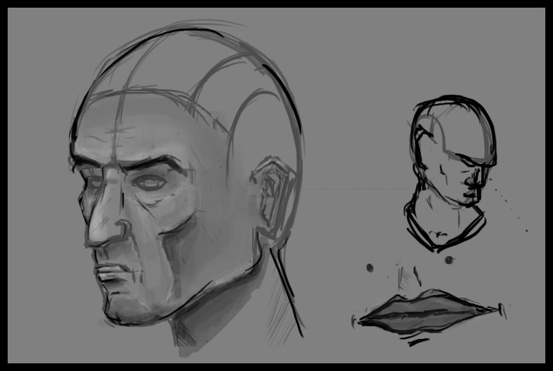
just a face. tried out facial hair for the first time. good? bad?
the only thing i focussed on really. he doesnt even have pupils!
lol
tell me wat u think
sorry, couldn't resist
but in all seriousness, some tips that might help;
1. your brushes could use a little less fuzzy. turn up the hardness a bit--because sometimes, no matter how many strokes you put in, those soft brushes will kill detail. i'll get into making gradients in another tip.
2. hard light mode. this isn't something you want to use absolutely ALL the time, but it really helps to build up tones, hues and add chromatic variation. switch the brush mode to hard light, turn down the opacity a bit and layer on detail like that. goof around a bit and see how it works; colors become more saturated the more you slather it on.. if the brush color is above 50% grey, the tones build up to white with layering and if it's below, they push down to black. this way you can do all sorts of shading easily and realistically. looks pretty and saves you a ton of trips to the color picker.
3. the smudge tool is your friend. some people might be raising an eyebrow at me right about now, but this is my opinion at least. grab the smudge tool, but don't use it as it is; go to brushes-brush tip shape and uncheck spacing. this makes it so that the smudge tool doesn't shove around your shapes; it just blends pixels. as i hinted above, this is good for gradating colors and tones and smoothing out hard brush edges you don't want. also, it works best with a hard edge brush. unchecking spacing also makes it a lot less strenuous on your CPU.
4. diversify your palette. reality is a lot weirder than we make it out to be. if you look at your face really closely in your mirror, you'll find all sorts of blues, reds, greens and purples in there with the usual expected tans and pinks. the brain is very good at simplifying information presented to it, though--it usually normalizes all that into an easily recognizable solid hue that we can process and get an outline from. of course this doesn't mean we can leave it out when we paint. so this is where studying and observing and reference comes in--keep an eye out for those weird hidden colors in your day-to-day life and be sure to practice integrating them into your paintings with an appropriate degree of subtlety.
5. contrast. it's a good rule of thumb to try to include the entire spectrum of tones in your images--from pitch black to pure white. it should be noted that these extremes shouldn't completely dominate your scene. that's why they're extremes. they're used sparingly to add focus to important parts. the rest of the image should have a varied range of tones from in between. this is one of a few very crucial things when it comes to creating that all-important illusion of depth. with mr. pear for instance, there should be at least some part of the shadow where i can find pure black (i think i fucked that one up myself.. whoops.) and at least some part of the highlight where you can find pure white, and a gradation of darkness to lightness sculpting the rest into a convincing shape. this just requires practice and observation of light.
i'm no expert painter, digital or analog, but i hope this helps somewhat.
@systmh: woah! thanks for the pointers! like, copied, pasted in notepad, and saved for going back to! oh, nice paintover btw.. lol, dont mind one bit
yea soo. art classes started, not much free time on my hand, but i popped this out in what little i had:
Duncairn Park 02
Now i know i said id go back to the old project, and work on sketching out a single object w. lighting and watnot.
But when i get the feeling to make a piece, i find it very hard to do any other piece.
Anyways, I got this piece done within, 3 hours of work id say [personal deadline?] Its a remake of the "duncairn park" i made a long time ago. had forgotten alot of stuff, and that one was very messy [to understate entirely], and too gloomy for a place of its significance [for myself at least]. I feel this one is better, though id like to do more to it, i wanna stay loyal to my deadline.
tell me what you guys think!