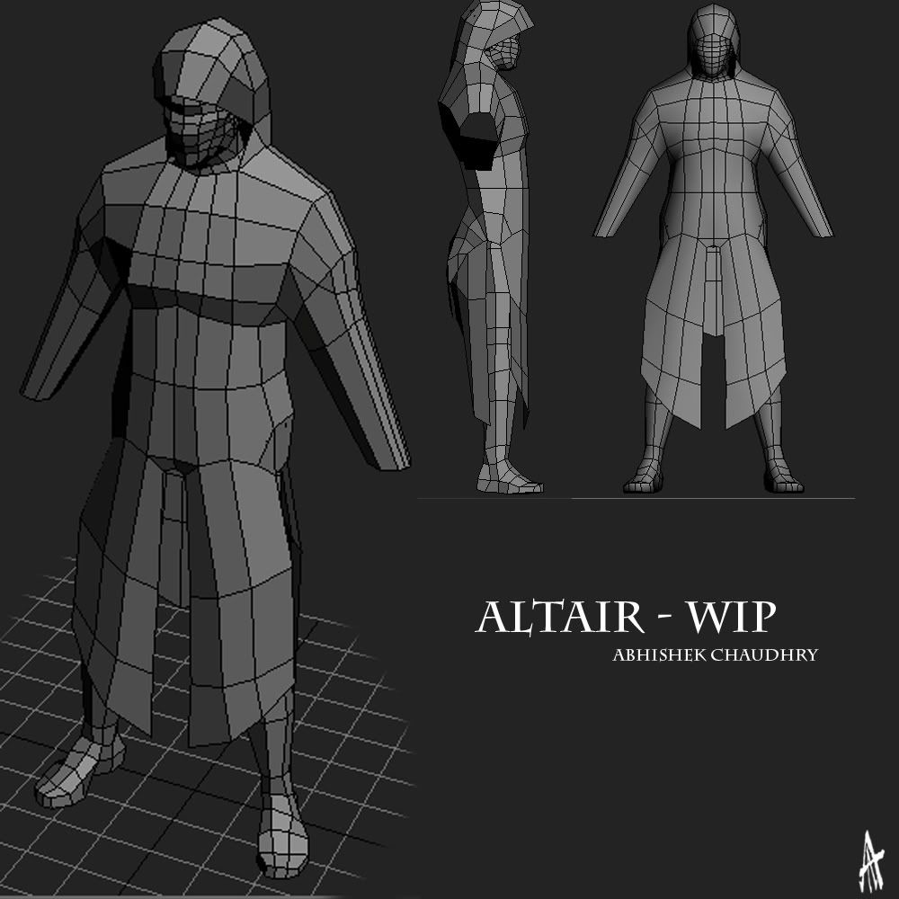
Altair WIP
hey there guys.
i know i know.... i'm already working on one thing, why am i diverting myself. Well, there is this competition that i wanna take part in, for which i need to hand in some fan art for the game Assassin's Creed. First prize is a copy of the game. I wanted to try out this model because i felt it was a crazy challenge for myself. The more i thought about it, the more obsessed i got, until i finally realized that there was no way i could get back to "Watashi Kaizoku" while knowing that i coulda done this to win the game.
Forgive me, but help me nonetheless... please.
Well, let's see, if u don't know about assassin's creed already, its a game by Ubisoft, and its protagonist is a character called Altair. Google it for further information, its too big to be explained here. For my piece of fan art, i thought i would try to duplicate Altair using 3ds Max. Now, i believe that working off concept art is something that pros in companies do alot [ie. without orthos?]. well, i guess that's what i'm doing now, cuz ppl rarely give out orthos of their characters right?
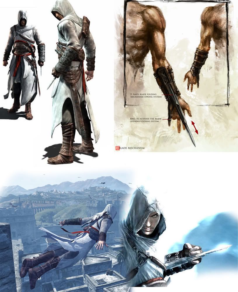
Going through the net, i picked a few images as my references:

[will add more to my search later]
Did some work on it [the model] today, and felt it was time to get the crits for my usual problems: proportions and mesh flow.

I'm looking forward to all suggestions, tips, and ideas that you want to put forth. Let's see if my skills are good enough to finally win me something !
!
thanks guys!
i know i know.... i'm already working on one thing, why am i diverting myself. Well, there is this competition that i wanna take part in, for which i need to hand in some fan art for the game Assassin's Creed. First prize is a copy of the game. I wanted to try out this model because i felt it was a crazy challenge for myself. The more i thought about it, the more obsessed i got, until i finally realized that there was no way i could get back to "Watashi Kaizoku" while knowing that i coulda done this to win the game.
Forgive me, but help me nonetheless... please.
Well, let's see, if u don't know about assassin's creed already, its a game by Ubisoft, and its protagonist is a character called Altair. Google it for further information, its too big to be explained here. For my piece of fan art, i thought i would try to duplicate Altair using 3ds Max. Now, i believe that working off concept art is something that pros in companies do alot [ie. without orthos?]. well, i guess that's what i'm doing now, cuz ppl rarely give out orthos of their characters right?
Going through the net, i picked a few images as my references:

[will add more to my search later]
Did some work on it [the model] today, and felt it was time to get the crits for my usual problems: proportions and mesh flow.

I'm looking forward to all suggestions, tips, and ideas that you want to put forth. Let's see if my skills are good enough to finally win me something
 !
!thanks guys!
Replies
is this the complete basemesh? not until i know about the poly flow and anatomy it isn't.
Also, i was wondering if the leather straps on the character should be modelled as seperate objects? so far this is all one object @ 1700 tris.
all crits and suggestions are welcome, and [more specifically] advice and comments on the mesh flow or anatomy.
thanks
does this look more accurate:
looking forward to more advice!
I would say rotate the legs further back, it should make the pose look more natural, humans tend to have their feet set quite far back. Also I would probably model the cloak separate if your going to have a highpoly and a lowpoly, I would actually model almost everything disconnected (topology goes crazy if you want everything together). The silhouette is pretty good
PS. are the legs from arsh's base mesh? I've got an eye for these type of things lol, look pretty similar. though its entirely possible you just copied the topology, I've done stuff like that before :P
also in the concepts his right hand is missing a finger remember to remove it :P
[/ QUOTE ]
LEFT hand. The blade fits through the resulting gap in his fist...
@Armanguy + Gmanx: haha. no chance i'd forget that. I just had the symmetry modifier on till now. Yeah, its the ring finger on the left hand. awesome character.
@Marshal Banana: thanks for that. are the new sleeves looking better? and does it seemed crumpled where the glove begins? that would obviously rely more on the normal maps....
UPDATE:
here we are. finally got rid of the symmetry. Any advice is welcome, yet again. Thanks for the tips so far, and thanks in advance!
The reason I said I would have everything disconnected is because I usually make a rough lowpoly, made up of different parts, then start sculpting, and then build a new lowpoly when Im done. I'm not saying its the best method, its just my workflow. If your intending for this mesh to be the final lowpoly (perhaps with UV's before sculpting?), then I would make one connected mesh, and then prehaps break it up before I start subdividing into separate parts. Its entirely up to you though, whatever gives you best results
@Asmuel: oh i see. i think i know what u mean, but the problem is that if i split up the mesh, export to mudbox and subdivide, the seam becomes all squiggly and doesn't fit when i try to join the meshes together, so i go for the mask-and-work method. thanks for the tips though.
update may come later in the day. as of now, i was wondering: what texture sizes should i aim for? it seems to me that the character would be 2048*2048 with another 1024*1024 for accessories. that might be it, cuz of the 360 specs... so i was just looking for some insight on tex limits.
thanks for all the support thus far!
type less work more
work more ==>
lol. okay wait, so 512* for head, and 1024*512 for body. How would i go about makng a UV template for a "not-square" map? never done it before
apart from that, how's the mesh looking? im actually kinda proud of it... should i not be?
(see concept)
You may want to mess with rigging those arms up and seeing how badly the shoulder/armpit areas deform. Those parts could use the most work.
I'm not sure the strap hanging down in front of his crotch needs the bisecting vertical loop.
Reference for good shoulder topology, thought I would post it seeing as someone mentioned shoulder deformation. Thanks Pior, The second example is great for animation, clean loops are your friend...
http://boards.polycount.net/showflat.php...true#Post172375
@Johny: a) lol; b)thanks... still striving to get better.
@kp: lol.
@Xenobond: thanks for the tips. i've deleted half of the head [as you'll see in the next shot], and tried messing around the rigging. so im gonna say "uh oh" before you guys see the next shot.
@Sectaurs: i can't believe i didn't realize that! well wait, frogs = straps; scabbard = sheath right? in that case: "i can't believe i didn't realize that!" [thanks for the vocab lesson too!] i got rid of the vertical loop on the front and back strips.
update:
im gonna have to figure out how to do the shoulders nicely. any tips?
thanks guys. i'm loving the support im getting!
EDIT:asmuel, if i'd waited 5 minutes longer, lol. thanks for the link. i'll be sure to go through it! and possibly bookmark it?
ill mirror the arms over when i get the anatomy down to pat.
right i'll fix that up. thanks for the help!
as for the "modelling for rigging". how does this look:
i think we all see that i'll be an animator :P!
thanks for all the help!
EDIT: i mean: i'll NOT be an animator :P!
i sent the arms out a bit [yes, edit poly again] so that they're at a 45 degree angle as opposed to 20 or so that they were earlier. Tested a rig, and it seems to be working a-okay! i even set up some bones for the bags hanging from his back, and the sheath etc. etc. and its all working seemingly fine!
UPDATE:
in this update, i just want to show you guys Altair in his new default pose. Just worried that i might have messed up the shapes while bringing him to a new position:
what do you think? am i gonna move on to UV mapping now? 3,108tris so far, just need to check if i'm missing certain assets etc.
oh yeah: symmetry modifier is on again, for the time being.
any tips on mudboxing cloth would be of the greatest help atm, but other advise is _always_ greatly appreciated!
As for the thumb and wasted polies, i'll look into that. thank you very much for the advice.
as of now, i've worked on some of the mid-res and high-res details, still in 3ds Max. this renderering is with 1 skylight, 1 spot and light tracer on:
just wondering what you guys thought! [note, only one boot is present]
thanks for the advice and images. I was earlier thinking that the problem was the size of the thumb? but i guess it looks like the positioning aswell. whatever it was, the collection of crits on the hands alone warrants one of these:
hand close-up!
looking better? i'm not that great with hands [whether 2d or 3d], so your advice is really gonna help.
thanks for the advice guys. its coming at a great pace to keep me working
[im testing myself with a 2 week deadline lol]
Check out the Low Poly Hands thread for some ideas: http://72.232.179.131:8003/showflat.php?...;gonew=1#UNREAD
i added a loop or two to each joint in the finger... does this look more correct:
thanks, once again.
oh, and i'm thinking, does the mesh look good atm? apart from the hand, is anything else standing out as needing changes?
And that hand mesh althou is better still is terrible , look at your own hand and draw loops on it i promisse you it helps
Here you go:
but yeah, lets see:
i know i can't judge by myself, but i think im getting a hang of it? except for the thumb....
it definately needs some more work, not sure where though, lol
"And as the man brought down the knife to cut Altair's finger, he missed his mark, and cut off both hands."
thanks for all the tips. taking them into account, i deleted the hands completely, and started from scratch. There are definately some problems here [there _have_ to be], so any help is more than welcome!
the hands are agitating me quite a bit... can't believe i've spent so much time focussing on them! lol! what else did i have to do again? apart from shave some polies?
peace!
wll, i know they look really sharp in this view, but when i render them, the fingers smooth out. i'm guessing game engines smooth out the polies w/ smoothing groups right?
but yeah, are they looking better now? and does it look like a complete hand?
once again, thanks for all the help till now!
cheers!
is that my basemesh?
looks like a good base to me, but always try it out a bit before calling it ready
-caseyjones
:falls off his chair:
wow. thanks for the compliments guys. they are MORE than average confidence boosters, trust me. :goes off into a dream about being an industry=pro: glad that you see such an improvement.
and don't worry about it rooster. lol. i won't/wouldn't hate u. luckily enough though, when i subdivided and tried some sculpting, the hand didn't seem to mess up. thanks for the tip!
uhh. about not having an update. came hope late these last two days, so didn't get a chance to do anything substantial. currently, im working on a 'mid-res' mesh of Altair. it'll go into mudbox soon.... any tips on mudboxing cloth?
thanks for all the support!