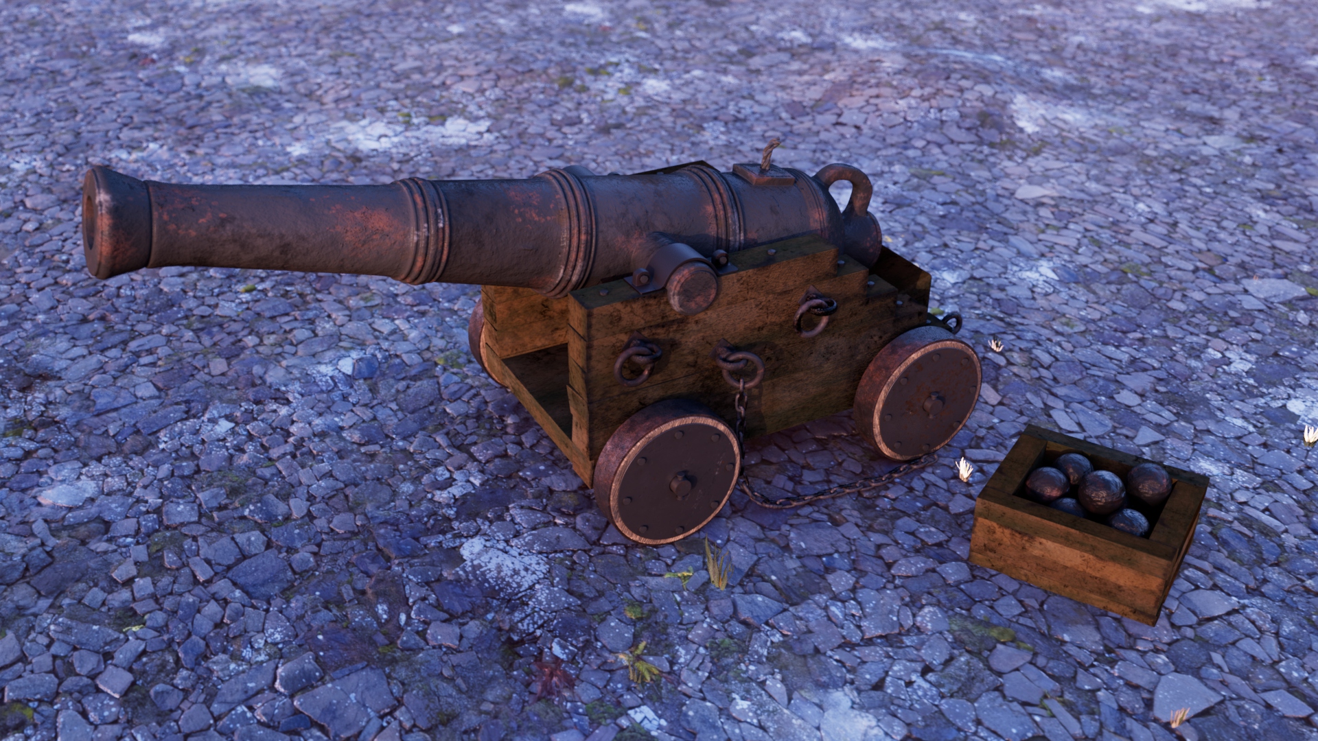
Medieval Canon (learning texturing and lighting). Any and all feedback is very welcome!
Hi, this is my first post here. This is an asset from a pirate ship scene I created a little while ago. The original asset looked like this (separated from the ship scene) :
and this is my current iteration:
Any critiques on how to make this better and what direction I should aim in my learning process would be highly appreciated. Thanks.


Replies
A new render with updated textures on the canon. After learning a bunch in substance I decided to redo all of the textures again starting with the main canon. Any feedback on the materials would be greatly appreciated.
This is (probably) my final version. Any criticisms/critiques are most welcome!
Hey good job! My only bit of feedback is for the wooden parts - see if you can make the planks stand out more next time. It looks fine on the shorter ends of the carriage + crate, but its harder to distinguish the seams from the texture on the longer sides. Making some of the planks slightly crooked and/or adding some dirt along the seams should do :)
Thanks a lot for the advice. I'll make sure to remember that. I did try to do that at the front end of the wood but never thought about it on the sides! Also, I should have made it more obvious at the front. Thanks a again :)
Hello my friend. This is really high quality and cool work. Made very high quality. And I try to create works in 3dMax, this program is the most convenient for me. I take ideas for https://create.vista.com/colors/color-names/, and then I bring them to life. So far it's not super cool, but not bad, I'll show you my masterpieces soon :)