Home 3D Art Showcase & Critiques

The Bi-Monthly ENVIRONMENT ART Challenge | May - June (72)

interpolator
Offline / Send Message
alytlebird interpolator

Welcome, all! Time to get started on the second Monthly Environment & Prop Challenge for 2021!

I'm very sorry it took so long to get this thread officially going, I was away on a trip and realized too late that I would be unable to modify the thread with the needed updates. :(

Remember if you don't finish in the time allotted, just keep plugging away and post when your work is finished. There's always some good progress that falls off the radar - we want to see your work! So keep going and finish those pieces!

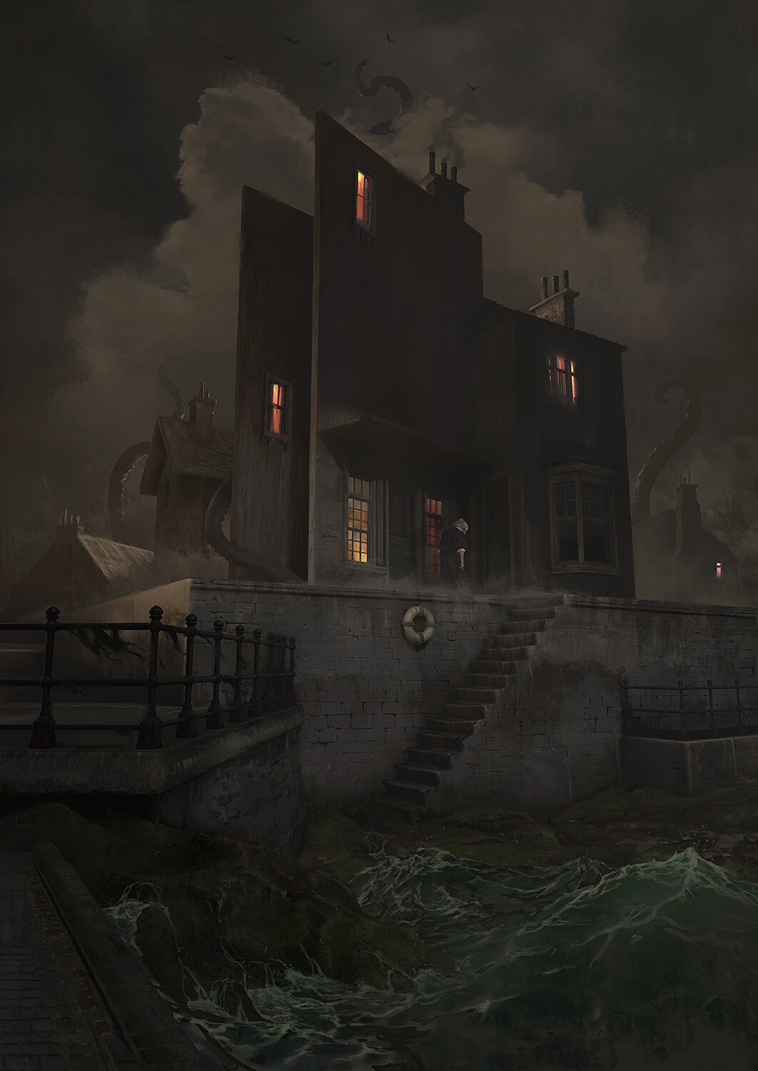
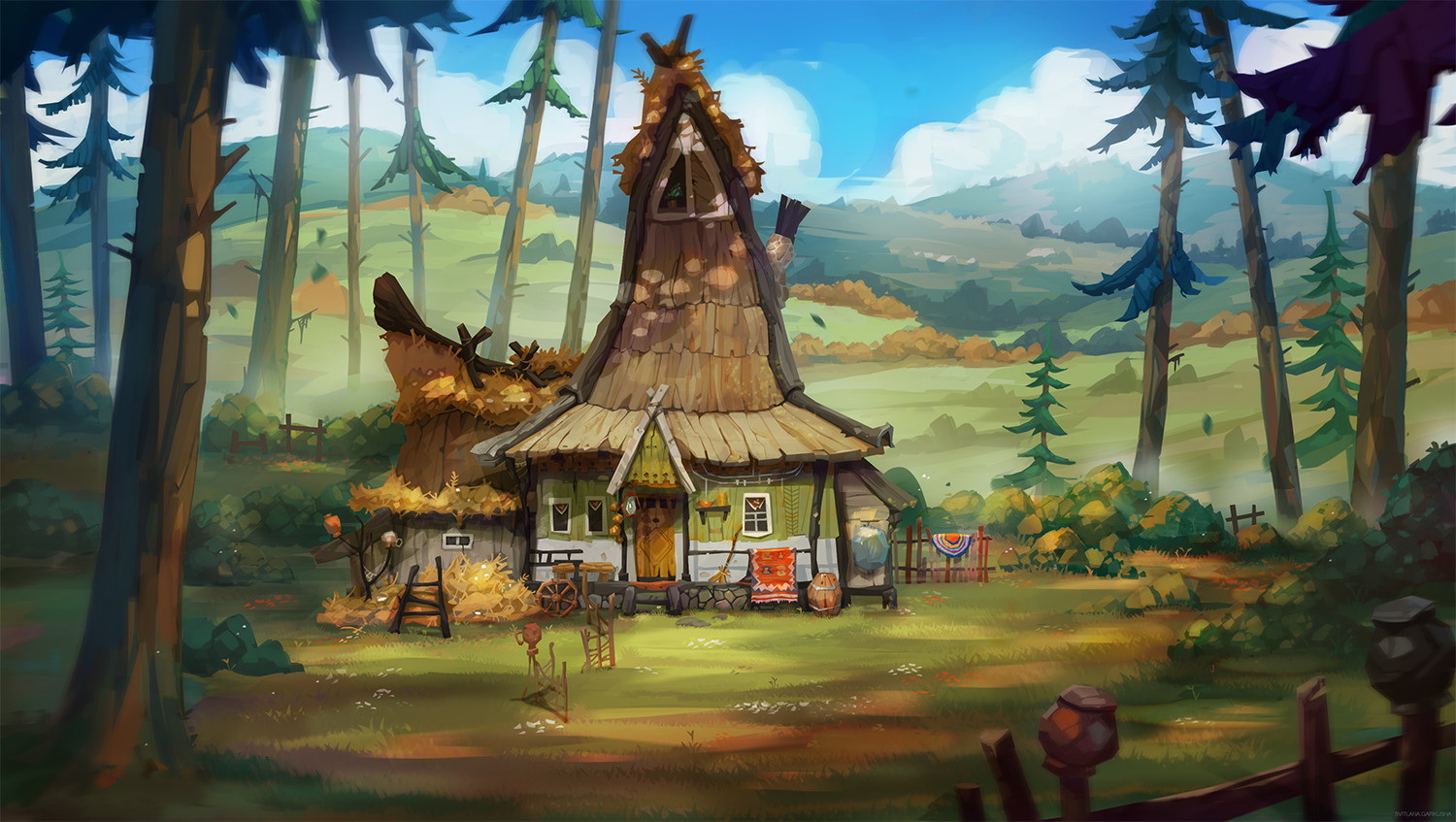
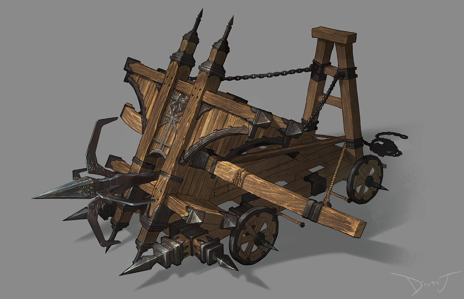
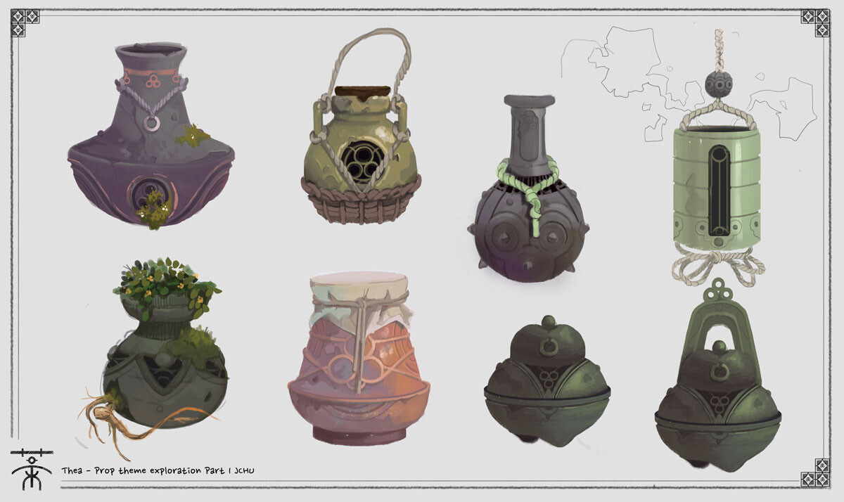
Without further ado, here are our official options for Challenge 72:

Please read all the rules before starting:

-Try to post one critique for every post that you make. This will make for a better learning environment and help us all grow as artists.

-Try your best and finish as much as you can in the time frame provided.

-Post what you are working on in this thread so that way it's a more centralized place for advice and critique. We don't need to have 1000 disjointed threads littering the forums. 

-It is recommended to use a game engine to present your work. Unreal Engine and CryEngine are very common engines that can be used but feel free to use any alternatives that you want. (Marmoset Toolbag is allowed as well)

-If you want to change up your chosen concept a bit, then feel free! Interpret these concepts to your liking, especially if your aim is to add storytelling elements.

-NEW!! If you finish your project and decide to post it to Artstation, make sure you give credit to the concept artist in the form of a link to their profile. Additionally, it is best practice to ask a concept artist for their permission to post a 3D piece based on their work, and I would recommend doing so.


And here are some recommendations:

-When you are just starting out making a scene, it can seem complicated or imposing, so take the time to break it down. 

-Think about how you can re-use assets, re-use textures, break it down as simple as possible and plan it out. A lot of people will break it down in their own way when they start out their challenge. Gather some reference images as well for different parts of the scene, maybe gather some refs and make it your own.

-Take your time planning and blocking out, it will set you up for success later on.

-We strongly encourage you to go and look at other games and see how they make their assets as well as get concept art to give it your own feel.


All that matters is that you learn while being able to effectively critique others, as well as accept critiques on your own work. Remember to have fun!

Good luck! 

Replies

  • Pinkfox
    Offline / Send Message
    Pinkfox ngon master
    Oh man, that hard surface environment looks enticing! I've been wanting to work on something with an appealing sky, not something I've done much of, so I'm totally on board with it!
  • MikeyView
    Offline / Send Message
    MikeyView polycounter lvl 3
    For stylized or wildcard enviro I'm thinking about that Honya no Poncho by Klaus Pillon

    Link: https://www.artstation.com/artwork/6aaz6V
  • MikeyView
    Offline / Send Message
    MikeyView polycounter lvl 3
    Ok, one more:
    Concept House by Svitlana Harkusha

    Link: https://www.artstation.com/artwork/4mqEY
  • Pinkfox
    Offline / Send Message
    Pinkfox ngon master
    Saw that Janice Chu posted these on Twitter and I think they'd be great for the stylized prop since it would give people a variety to choose from.


  • CrimsonIndustry
    Offline / Send Message
    CrimsonIndustry polycounter lvl 8
    Pinkfox said:
    Saw that Janice Chu posted these on Twitter and I think they'd be great for the stylized prop since it would give people a variety to choose from.


    Have to agree here; clicked through to look at them some more and found the original ArtStation page, plus an additional page of artwork- 

    https://www.artstation.com/artwork/q9zGoD


    I think these would be really neat to do.
  • alytlebird
    Offline / Send Message
    alytlebird interpolator
    Hey everyone! I'm so very sorry this update is late, as I mentioned on the updated OP, I was on a trip and realized too late that I couldn't update things to start the challenge on time. However, late is better than never, so we're starting the challenge now. :)

    I've updated the OP with a couple new concepts, as well as a new entry to rules section that I would recommend everyone check out. (As a side note, I don't see these as hard and fast "rules", more as guidelines.)

    Best of luck!
  • Pinkfox
    Offline / Send Message
    Pinkfox ngon master
    Got the blockout done for the Hard Surface Environment. Still thinking on what to do for the close building since it's got such a strange shape and seemingly floating walls. Definitely adds to the surreal nature of the whole piece it just creates an interesting challenge of how to handle it in 3D.

  • Pinkfox
    Offline / Send Message
    Pinkfox ngon master
    Put a bit more work into getting the general tone going in the piece. I still need to play with the lighting pretty heavily and continue to tweak the clouds so they fit into the scene more, but I'll come back to that later once I've got the buildings fleshed out a bit more otherwise I feel I'll have to redo a lot of it anyway.

  • ellis_3d
    Offline / Send Message
    ellis_3d polycounter lvl 2

    here's most my block out for this one. I'm happy with it so far. Got to push the back mountains a bit more. 


    @Pinkfox I Really like it so far. I can't wait to see how you are going to set up the water.  The atmosphere is looking really good. Did you just edit the sky sphere to get that effect? 
  • Pinkfox
    Offline / Send Message
    Pinkfox ngon master
    @ellis_3d Love the blockout you've got so far! I don't know if the hills need to be pushed back too significantly, maybe more just increase their overall footprint, but I would recommend giving them gradual peeks and valleys as they look to be rolling hills in the concept. Though if you're thinking of going for more a more dramatic mountain behind the house then disregard that suggestion. :P

    For the atmosphere I edited an HDR from HDRI Haven in Photoshop to give it a more desaturated, slightly brown tint. Then on top of that for the clouds I'm using cloud cards I made following Tyler Smith's cloud tutorial (https://www.artstation.com/marketplace/p/xkDm/ue4-cloud-creation-tutorial). I have modified it in a couple places but it's really his technique for creating those overall.

    As for the water, I'm really not sure just yet but I'm not ready to cross that bridge just yet.
  • tomsanders1993
    Offline / Send Message
    tomsanders1993 polycounter lvl 5

    Sup guys! I'm a bit late to the party but last week I also started working on the first concept. I've mostly been busy with planning, doing some block-outs, and some basic lighting. The rocks are from a previous project, If I have time left I'll update those if I think it's needed. 
    The main two goals are getting this to a point where it matches the concept as close as possible + adding a bunch of dynamic elements to make the whole piece come to life. Looking forward to everyone's progress. Good luck all.
  • Nick_M
    Offline / Send Message
    Nick_M polycounter lvl 3
    Hey Everyone!

    I'm deciding to do the hard surface prop for this challenge. Lots of interesting shapes going on and so much room to add storytelling elements. I am a bit concerned though on how the ballista is keeping its spear secured like the way it is in the concept - I think I'll be adding my own modifications to the prop itself. 

    Overall here is my midpoly blockout so far - I am really excited to do the details for this prop! 

    Sup guys! I'm a bit late to the party but last week I also started working on the first concept. I've mostly been busy with planning, doing some block-outs, and some basic lighting. The rocks are from a previous project, If I have time left I'll update those if I think it's needed. 
    The main two goals are getting this to a point where it matches the concept as close as possible + adding a bunch of dynamic elements to make the whole piece come to life. Looking forward to everyone's progress. Good luck all.
    Oh man the tentacles in the background and the rags hanging off the railing in the foreground would look fantastic if they were dynamic - that would add so much life to the scene!  
    Your blockout is looking nice so far, I'm excited to see how you'll do the windows with lights shining from them. 
  • PhantomString
    Offline / Send Message
    PhantomString polycounter lvl 3


    Hey guys, I guess I am pretty late to start this env. Hopefully, I can power through. I think I am done with my blockout. I decided to change the main building because the building in the concept just didn't make any sense. 
  • Jean_Pierre_Varg
    Offline / Send Message
    Jean_Pierre_Varg polycounter lvl 3
    Hi guys!

    I hope you don´t mind me participating in this challenge. I'm working on a haunted  - abandoned asylum in UE4, hopefully I will make it before the end of June! I'll keep sharing my advances here ^^ I'm still blocking out and figuring out the mood and history of the environment.


  • alytlebird
    Offline / Send Message
    alytlebird interpolator
    Hi guys!

    I hope you don´t mind me participating in this challenge. I'm working on a haunted  - abandoned asylum in UE4, hopefully I will make it before the end of June! I'll keep sharing my advances here ^^ I'm still blocking out and figuring out the mood and history of the environment.
    Hi there! I think your post will probably be better suited to its own thread in the 3D Art Showcase & Critiques subforum. This Challenge thread is mainly for people who are working on projects based on the four concepts listed on our OP. :) Our format doesn't really include people bringing their own concepts to the table. If you want feedback on your project, I'd recommend starting a new thread and posting updates there!
  • Sunyan
    Offline / Send Message
    Sunyan polycounter lvl 2
    Hi everyone!
    I started working on the Ballista Prop , Its still WIP , But if there is something wrong with it , Point it out,
    I will keep Updating until i finish it! 

  • Pinkfox
    Offline / Send Message
    Pinkfox ngon master
    @Sunyan Looking good already! Can't wait to see your progress on it. Only thing I noticed that seems a bit out of place from the concept is that your cart body (blue part) seems significantly wider. I don't think that's a major issue I just worry that it might throw the proportions off a bit. Like with the wider body the wheels feel somewhat small.
  • Pinkfox
    Offline / Send Message
    Pinkfox ngon master
    I've been trucking away at the hard surface environment. I opted to use Megascans for the rocks and decals so I could stay focused on the bigger forms. I've got the materials for the houses ready to go so hopefully they should be fairly quick. Still have a ways to go but I'm happy with how it's been progressing so far. Definitely open to any critique anyone might have. :D


  • tomsanders1993
    Offline / Send Message
    tomsanders1993 polycounter lvl 5
    Pinkfox said:
    I've been trucking away at the hard surface environment. I opted to use Megascans for the rocks and decals so I could stay focused on the bigger forms. I've got the materials for the houses ready to go so hopefully they should be fairly quick. Still have a ways to go but I'm happy with how it's been progressing so far. Definitely open to any critique anyone might have. :D


    I think that the textures are really nice for the docks, they are not too detailed but still read as bricks. It might be nice to introduce some AO as there is currently a really hard cut between the different meshes. The Megascans you used for the rocks are a bit too noisy. It might be nice to stylize the textures for the rocks a bit more so they fit a bit better.
    Besides that, I do really like where this is going. Good luck! :)
  • hasgan
    Offline / Send Message
    hasgan polycounter lvl 7
    Pinkfox said:
    I've been trucking away at the hard surface environment. I opted to use Megascans for the rocks and decals so I could stay focused on the bigger forms. I've got the materials for the houses ready to go so hopefully they should be fairly quick. Still have a ways to go but I'm happy with how it's been progressing so far. Definitely open to any critique anyone might have. :D


    looking good Geoffrey! I feel like I need to follow the tutorial on how to make the cloud cards because yours is da bomb :) it look like a painting !
    also love the textures of the bricks are nice too, any chance we can see close-ups?
    like tom said, the transition between rocks and bricks is a bit hard, you can use AO or maybe painting moss over it (like in concept)

    for the water you guys could also use unreal water plugin. I haven't use it much but it could give you instant sea water and waves (hopefully)
    https://www.youtube.com/watch?v=d5Ft7UaYayM

  • Pinkfox
    Offline / Send Message
    Pinkfox ngon master
    @tomsanders1993 You're right about the mesh intersections being a bit too harsh in places. I'm thinking I might try creating some extruded stones that can stick out and break up the straight edges of where the pier joints are. As for the Megascans rocks right now are just thrown in as-is but my goal to do what @hasgan mentioned and add some moss to them along with a bit of grime which hopefully should alleviate the harsh edges from the rocks as well.

    Mostly avoiding the rocky water area though until tackling the water itself doesn't feel so daunting. Hopefully that will change after I watch the video @hasgan linked! :D

    Here is a close-up of the pier wall though. It's honestly pretty dull looking at it on it's own but hopefully that avoids it being too heavy in the main composition.

  • hasgan
    Offline / Send Message
    hasgan polycounter lvl 7
    a bit late to the party, but I also want to take on the props challenge since the props seems a fit to my next environment. here's my updates sofar:


    - the ropes/strands will be made with tiling textures
    - the plants/moss will use different materials
    - I plan on finishing these 4 props first and moving on the the other when I have time

    critiques and comments are appreciated!

    --

    @Pinkfox checkout minute 23:00 -25:00 from the video link, I think that's the effects you want. the water plugins is super easy to use I think its just drag and drop. the water material is also provided within the plugins
  • Pinkfox
    Offline / Send Message
    Pinkfox ngon master
    @hasgan Beautiful sculpting work on those! You captured all the intricate details wonderfully and I can't wait to see how they'll look once textured. For the jar with handles though I believe the topper for that is probably meant to be something like a natural cork as opposed to a stone or clay substance given it's color and function. Maybe something like this just with the proper shape:


    Also, thank you for that timestamp. That actually looks like it will make things phenomenally easier! Guess I shouldn't have put off working with the water feature for so long. :P
  • hasgan
    Offline / Send Message
    hasgan polycounter lvl 7
    @Pinkfox Oooohhh nice, I didn't know what the top supposed to be, what kind of material it is. thanks for the input!
  • tomsanders1993
    Offline / Send Message
    tomsanders1993 polycounter lvl 5

    I'm currently focusing on texturing every object in the scene. I started with modeling, UVing, some simple sculpting, and now Texturing. However, it bored me after a while so I decided to throw in some clouds and play around with the lighting.

    After texturing I want to add the tentacles and give a unique twist to the piece. I'm thinking about creating some Lovecraftian props. Adding some tentacles around the fence or an octopus-like door knocker. I'm still planning to add a lot of dynamic stuff. So far I only have some dust particles and water. I still have a lot to do but I should manage :). C&C is always welcome!
  • Pinkfox
    Offline / Send Message
    Pinkfox ngon master
    @tomsanders1993 Oh man, your scene is looking fantastic! Love the texture work you've done so far and the way the light dances over the left side of the pier behind the railing and onto the side of the house is simply sublime!

    Only critique I can really see with it is the area where the stairs join with the pier wall there is a very obvious seam there. I'm wondering if you could do something similar to what I was thinking of doing to hide the seams between my pier meshes of adding some extruded bricks that can cover most of the seam so it's not so obvious.
  • tomsanders1993
    Offline / Send Message
    tomsanders1993 polycounter lvl 5
    Pinkfox said:
    @tomsanders1993 Oh man, your scene is looking fantastic! Love the texture work you've done so far and the way the light dances over the left side of the pier behind the railing and onto the side of the house is simply sublime!

    Only critique I can really see with it is the area where the stairs join with the pier wall there is a very obvious seam there. I'm wondering if you could do something similar to what I was thinking of doing to hide the seams between my pier meshes of adding some extruded bricks that can cover most of the seam so it's not so obvious.
    Thank you! I tried to copy the lighting from the concept as close as possible.

    And yea I was hoping no one would notice that seam haha. But that should be an easy fix, I'll probably start blending the textures there. Adding some extruded bricks can also be an option. Though I think I go with just doing better texture blending, extra geometry isn't really visible anyways from this POV.
  • alytlebird
    Offline / Send Message
    alytlebird interpolator
    Hey everyone! Once again, there's some really great work in here, keep at it and finish this cycle strong!

    There is some housekeeping I'd like to do. I've been running this Challenge since January of 2020, and it's been a real privilege to continue such a long-standing tradition here at Polycount. (Fun fact: October 2021 will mark the 9 year anniversary of what used to be known as the "Monthly Noob Environment Challenge", and has since become this Challenge.)

    However, starting with Challenge #73, I will be handing off the Challenge-hosting responsibilities to @Pinkfox. We've been talking for a while now about ideas for the future of the Challenge, and I think he's a great fit for the role. :)

    Thank you to everyone who has participated over the last year and a half, it's been a pleasure to host, and it's truly inspiring to see everyone levelling up their skillsets and cranking out quality projects. Keep up the fantastic work!
  • Pinkfox
    Offline / Send Message
    Pinkfox ngon master
    Seriously a huge thank you to @alytlebird for hosting the challenge for so long. I've loved tackling all the ones I've been fortunate to be a part of so I'm excited to take the torch and keep the tradition going!

    Nothing should be changing in the next challenge, aside from the concepts of course, to keep the transition smooth. So as normal keep an eye out for the concept voting thread this coming Thursday or Friday. I'll be sure to post here when it's up.

    Until then though I hope to see everyone, myself included, keep pushing to the end of this challenge and finalizing your pieces!
  • Pinkfox
    Offline / Send Message
    Pinkfox ngon master
    Hey everyone! The concept voting thread for the next challenge is up! Feel free to hop on over and put in any suggestions you might have or vote for your favorite concept.


  • hasgan
    Offline / Send Message
    hasgan polycounter lvl 7

    I'm currently focusing on texturing every object in the scene. I started with modeling, UVing, some simple sculpting, and now Texturing. However, it bored me after a while so I decided to throw in some clouds and play around with the lighting.

    After texturing I want to add the tentacles and give a unique twist to the piece. I'm thinking about creating some Lovecraftian props. Adding some tentacles around the fence or an octopus-like door knocker. I'm still planning to add a lot of dynamic stuff. So far I only have some dust particles and water. I still have a lot to do but I should manage :). C&C is always welcome!

    this looks great! love the lighting! I didnt realize it before but I love the contrast between the dark side and lit windows. if you can bring a hint of blue tint on the dark side maybe it will look better
    another input is that the fog/dust on the floor looks too solid for me, maybe make it more transparent?

    ---

    As for me, I almost finished with first props. I will move on to second props and finsihed as many as I can before the deadline.
    any C & C are welcome :)


  • Pinkfox
    Offline / Send Message
    Pinkfox ngon master
    Nearly there! Animating the tentacles gave me some headaches mainly due to not knowing that Blender and Unreal don't play well with Armatures unless you set the unit scale just right, so that slowed me down on those quite heavily. Got through it though and now just have a few more things on the list to tackle (especially the water) and it should be good to go.

    One thing I wanted to ask @tomsanders1993 is how you got the old man in there! Is it just a 2D plane with him cutout from the concept art?


    @hasgan Love how well you captured the feel of it and you've done a wonderful job of adding intricate details to the texturing without letting it get too noisy!

    I do think your background doesn't do it justice though. The model looks fantastic and has great lighting on it showing interesting depth but then the background is consistently flat and fights against it. Maybe try taking it out or at least letting the model contrast against the background more than it currently does.
  • tomsanders1993
    Offline / Send Message
    tomsanders1993 polycounter lvl 5
    Pinkfox said:
    Nearly there! Animating the tentacles gave me some headaches mainly due to not knowing that Blender and Unreal don't play well with Armatures unless you set the unit scale just right, so that slowed me down on those quite heavily. Got through it though and now just have a few more things on the list to tackle (especially the water) and it should be good to go.

    One thing I wanted to ask @tomsanders1993 is how you got the old man in there! Is it just a 2D plane with him cutout from the concept art?


    @hasgan Love how well you captured the feel of it and you've done a wonderful job of adding intricate details to the texturing without letting it get too noisy!

    I do think your background doesn't do it justice though. The model looks fantastic and has great lighting on it showing interesting depth but then the background is consistently flat and fights against it. Maybe try taking it out or at least letting the model contrast against the background more than it currently does.
    Yep. I cut out the old person from the concept piece and placed him/her on a plane. Mainly focusing on the environment here so I doubt that I'll ever update it with a 3d model of my own.

    Nice tentacles! However, it might be nicer to make the one in the front a bit smaller. It currently seems a bit too big compared to the corner where it's coming from.
  • tomsanders1993
    Offline / Send Message
    tomsanders1993 polycounter lvl 5

    Hey all. Officially the last day of the challenge. So here is my ''final'' result. However, I still want to do some stuff here and there. Which are obviously the tentacles. I also want to add some tentacles to the fence, just some extra ornamentation. Besides that, some post-process effects (color grading) and fixing the chimney smoke. However, I'm happy with this piece already. Looking forward to seeing all your results!
    Cheers!

    Oh, and yes, the final - final gif will loop + have better quality. :) 
  • Pinkfox
    Offline / Send Message
    Pinkfox ngon master
    Excellent work from everyone who participated this cycle! Was really great to see the progress and hopefully even those that fell off earlier on will come back and finish up their pieces because we'd love to see it!

    With that said, a new batch of concepts have been finalized for the July through August iteration which starts today! So hop on over and give one of the concepts a try if you're interested in any of them. Also, feel free to post critique even if you're not participating this time around!

    https://polycount.com/discussion/227132/the-bi-monthly-environment-art-challenge-july-august-73
  • tomsanders1993
    Offline / Send Message
    tomsanders1993 polycounter lvl 5
    Last post! I finished my piece. Check it out on Artstation :) 
    https://www.artstation.com/artwork/NxOyrb
  • Pinkfox
    Offline / Send Message
    Pinkfox ngon master
    Oh man, superb work, @tomsanders1993! Love the atmosphere you were able to capture in the whole piece, and I've enjoyed seeing your updates, they've been great inspiration.

    I'm still probably about a day off myself but I'm pushing to get finished up.
  • Pinkfox
    Offline / Send Message
    Pinkfox ngon master
    Finally calling it complete myself! Such a great environment to work on, really enjoyed it. :D
    https://www.artstation.com/artwork/Vgn9OX


  • RustedFaith3d
    Offline / Send Message
    RustedFaith3d triangle
    Love this! Excellent work!
Sign In or Register to comment.