The Bi-Monthly ENVIRONMENT ART Challenge | July - August (67)
Welcome, all! Time to kick off the fourth Monthly Environment & Prop Challenge for 2020!
Remember if you don't finish in the time allotted, just keep plugging away and post when your work is finished. There's always some good progress that falls off the radar - we want to see your work! So keep going and finish those pieces!
Without further ado, here are our official options for Challenge 67:
- ENVIRONMENTS -
HARD SURFACE: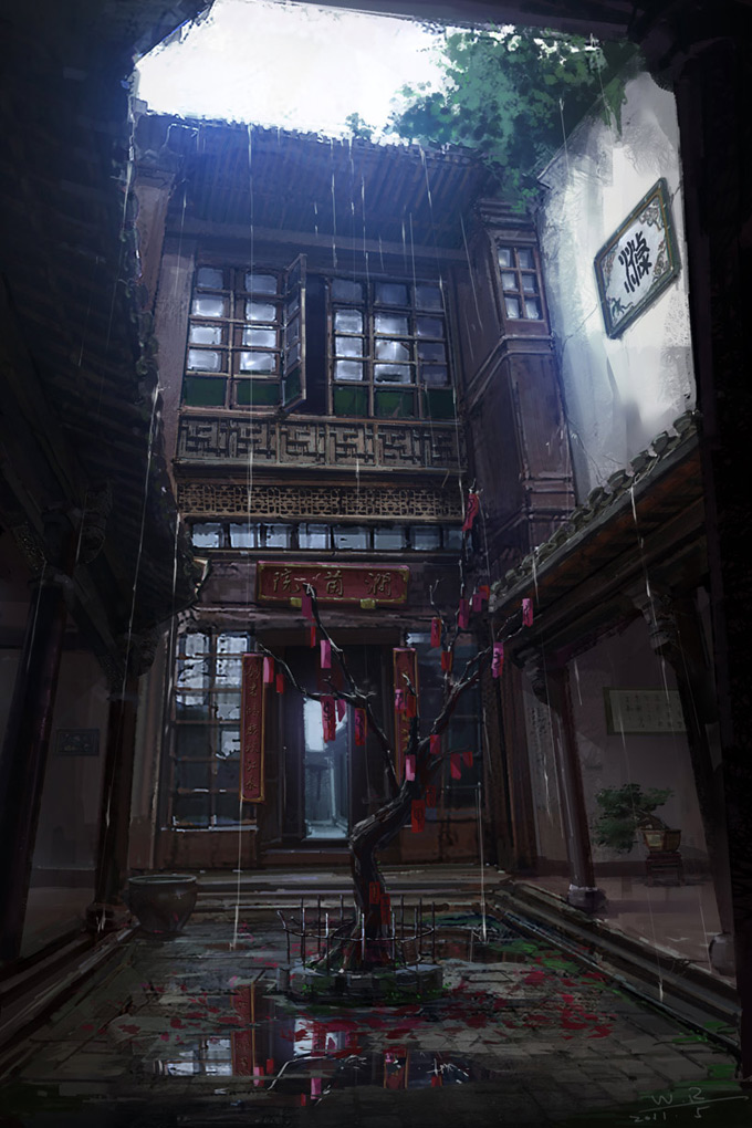
Artwork link: http://conceptartworld.com/artists/wang-rui/
STYLIZED:
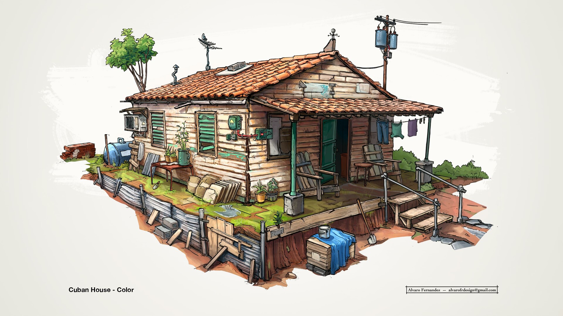
Artwork link: https://www.artstation.com/artwork/qAd59n
- PROPS -
HARD SURFACE PROP: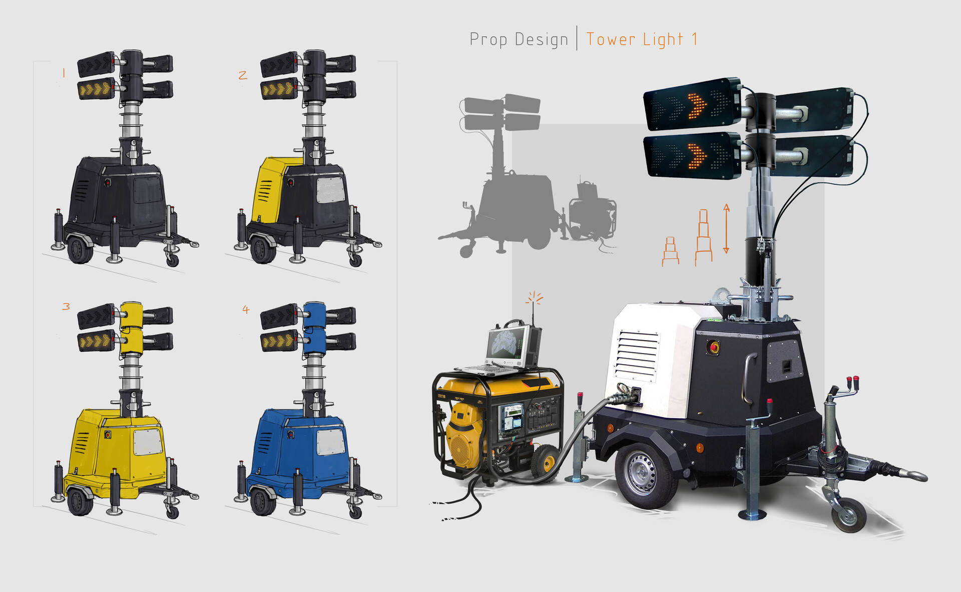
Artwork Link: https://www.artstation.com/artwork/xzG5wY
STYLIZED PROP:

Artwork link: https://www.artstation.com/artwork/lVx6va
- WILDCARD -
HARD SURFACE INTERIOR: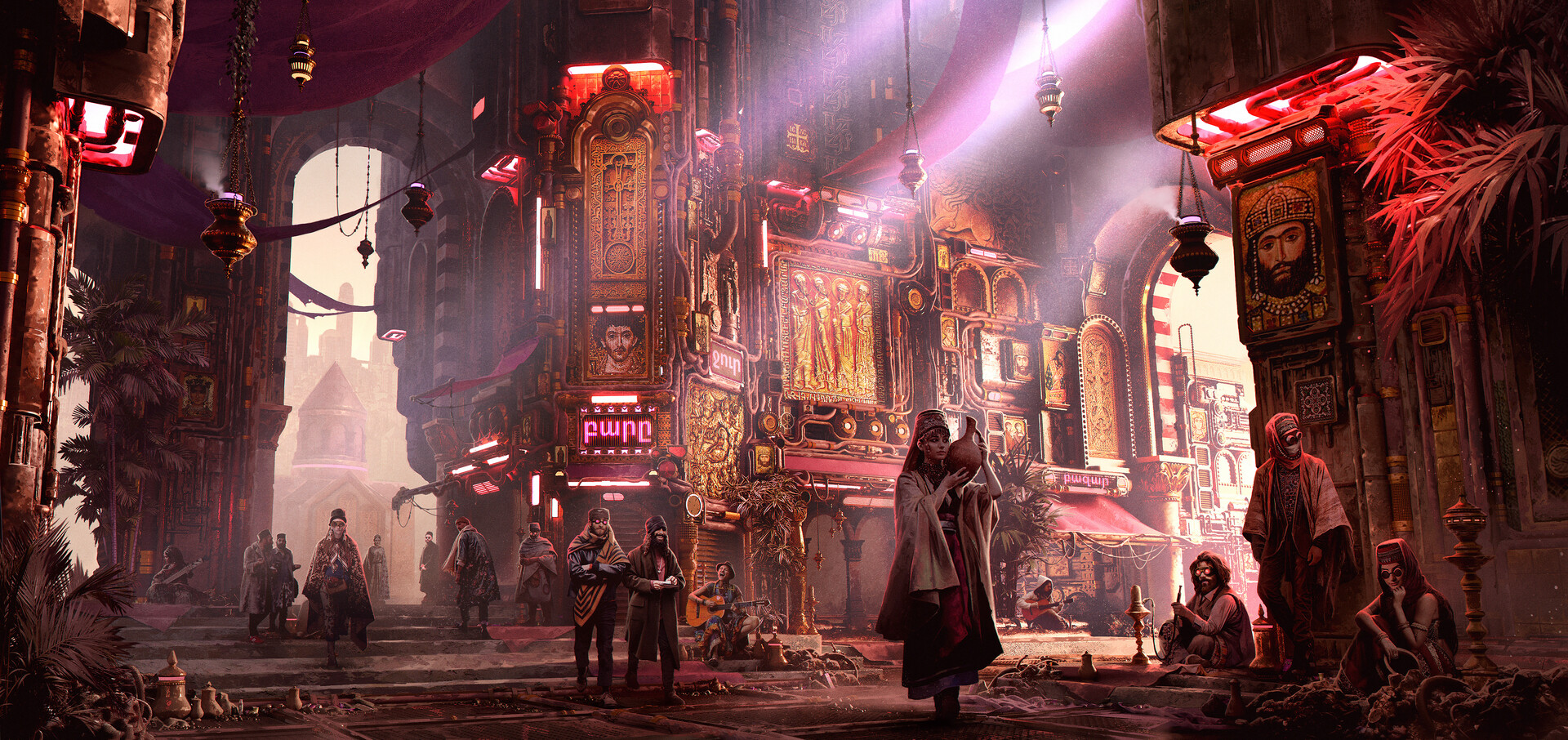
Artwork link: https://www.artstation.com/artwork/BmAeJ4
I decided to relegate the original hard surface concept to the Wildcard category, since it is so complex and the other hard surface concept got quite a few more votes. Hopefully someone will at least take a stab at this one!
Please read all the rules before starting:
-Try to post one critique for every post that you make. This will make for a better learning environment and help us all grow as artists.
-Try your best and finish as much as you can in the time frame provided.
-Post what you are working on in this thread so that way it's a more centralized place for advice and critique. We don't need to have 1000 disjointed threads littering the forums.
-It is recommended to use a game engine to present your work. Unreal Engine and CryEngine are very common engines that can be used but feel free to use any alternatives that you want. (Marmoset Toolbag is allowed as well)
-If you want to change up your chosen concept a bit, then feel free! Interpret these concepts to your liking, especially if your aim is to add storytelling elements.
And here are some recommendations:
-When you are just starting out making a scene, it can seem complicated or imposing, so take the time to break it down.
-Think about how you can re-use assets, re-use textures, break it down as simple as possible and plan it out. A lot of people will break it down in their own way when they start out their challenge. Gather some reference images as well for different parts of the scene, maybe gather some refs and make it your own.
-Take your time planning and blocking out, it will set you up for success later on.
-We strongly encourage you to go and look at other games and see how they make their assets as well as get concept art to give it your own feel.
All that matters is that you learn while being able to effectively critique others, as well as accept critiques on your own work. Remember to have fun!
Enjoy!

Replies
I started working on the courtyard, used fspy for camera matching and modeled simple shapes in blender,
I want to make enviro that would be suitable for game with tpp view so after running around in engine I decided to make the whole square slightly wider and moved awnings higher so they don't collide with camera also lowered the wall on the left to let more sun light in.
Started playing with floor material but it's just temporary, I will revisit materials after finishing modelling:
I find it really difficult to find the right size of the scene, I might should upscale the whole scene by 10%.
As for the roof, on youtube you can find various tutorials that show how to create the roof very similar to your reference using trim sheets so I would follow this method.
@Łukasz
Speaking of pipes, I have a question. I'm currently using a combination of mesh and splines which I think is a fairly wrong method because it requires a lot of draw calls and time. Initially to not have these problems I wanted to use only splines but they allow me to create only soft corners and not more precise angles such as 90 degrees. I have found only similar methods by searching on google. So, does anyone know a better method?
This is what happens:
This is the progress of the project:
Thank you. It is a very useful addon. Moreover, I changed the scene size as suggested by you and @Łukasz.
Let me know if it has improved.
You might try raising the focal length on the camera you're using though. The concept seems a bit flatter and you should be able to achieve that look by increasing the focal length and pulling the camera back a bit. Might make it easier to compare against the concept.
I have decided to kick off the July challenge with
CC is always welcome.
This being the first challenge I'm taking part in I started with the potion bottle concept. I've blocked out a base in Maya which will then be taken into ZbrushCore for sculpting.
Criticism is highly encouraged and welcome.
Thank you for your suggestion. I changed the focal length (now it is 35) but I also had to increase the sensor width and sensor height (80mm and 40mm respectively) because it did not fit into the frame even by moving the camera backwards.
Thank you. I changed the texture by reducing the rust of all the pipes except some central ones to give a little variety. I also slightly reduced the roughness. As for the trim sheets, I honestly followed some tutorials on how to make them but I didn't understand how to apply them in a project (especially in this one) so I continued to use only Substance Painter even though I understood that it is not the most efficient way.
https://polycount.com/discussion/133117/monthly-community-noob-challenge-april-2014-18
CC is always welcome.
Thanks for pointing that out!
Decided to do the potion prop, created a couple of assets in Houdini to make the Potion bottle and draw so tubes on to it to get a rough basemesh for Zbrush. may attempt to keep this somewhat procedural
Since I am going for a stylized look, my main focus was painting highlights exaggeration and Values. Next, I will work on the hue and balance the colors.
sculpted a couple of snake heads for the bottle, need to get my brain in gear and work out a way to blend them in to a procedural body for snaking around the bottle
worked on getting the heads to attach to the body, and will work on some more controllable scale and orientation next.
In my opinion, you should slightly modify the black and white texture of the large central part of the model. To my eyes they seem a little blurry and not rough enough. Maybe you can try increasing the roughness. However it seems to me really good.
MARMOSET RENDER -
I had a lot of fun going back to some stylized game assets, and thanks for the critiques. Feel free to drop some CC. I may revisit my asset later. However, I hope this render can inspire some people and i will be glad to see different approaches on the thread.
Armenian District
For my 2nd challenge, I have decided to work on Max Bedulenko's concept. Below is the first layer of my blocking and my texel density will be 512 px / m.Armenian District
Blocking Stage
So far, I'm happy with the scale and the scene prototype. Next, I will start making materials in Substance and Zbrush.
This is my first challenge here on Polycount, I was looking for a space with some prompts and was glad to find this. Because I have plenty of time on my hands at the moment (unemployment is killing me) I went for the crazy one to see how I fared. @Łukasz had a good idea using fSpy, so I did the same for laying out my block out in Blender and positioning my camera (focal length of 26.971649). Once I was happy with the general greybox, I brought it into UE4 and made a very quick floor grate material in Substance Designer. I will start strategizing my material and asset creation tomorrow.
fSpy to get camera position and focal length.
Imported fSpy camera into Blender, did my block out, and then transferred everything over to UE4.
worked on getting the heads to attach to the body, and will work on some more controllable scale and orientation next.
Onto my progress:
I'm working with the concept from Wang Rui. (I think the wildcard looks super interesting but I think would not make it in time.)After some trouble with the perspective I'm quite happy with the result. The blockout is kinda eyeballed and it might not be 100% accurate but I don't want to make a carbon copy. (I'm use references more as a guideline.) In a later stage I do need to work more on the lighting.
One of my goals is to create the majority of the scene procedurally. I had a thought how to approach the workflow for the building and settled on using my blockout shapes to define the building parts. (Kodoos to Simon Verstraete).
After the concepting I started with a tool to generate the the various roof elements based on a spline. It simply does what it need to do, nothing more at the moment. I struggled a little bit with the procedural UV layout (I had to write a custom script in order to layout the UVs into a Trim Sheet Layout. After some hacking I got a quite useful but messy combination of nodes that work for now).
Thanks so much for the tip. It was actually sphere reflection capture. I had one that was probably too big so I made it smaller and added more and got the correct reflections.
Lately I was mostly gathering more references, just started modelling my modular awnings:
@Donato If you are interested in learning more about trim sheets I recommend the Polygon Academy tutorial series! I just started getting the hang of trim sheets and found those videos to be really helpful.
At this point in my project I have finished one trim sheet with three variations. Unfortunately I forgot to add the column base to the model of the arch gateway.
Thanks for the suggestion and also for the translations. In my eyes, your trim sheet looks really high quality. I would like to take advantage to ask you one thing: did you get the paint stripping effect in the center of the stone blocks with zbrush and if not with what?
I'm reusing tileable textures except for the rooftiles that were textured in SP
Armenian District
Floor_Mat_01
I have made a grid material in designer and imported some cards in Unreal Engine to make the first part of the floor. Later I will make the 2nd part of the floor then, add some elements to the floor to break the repetition.
@b_beauchamp I am really enjoying your textures so far! I think more dirt at ground level too would match the feel of the concept art
I'm still blocking in the low-poly but here is what I've made out so far. I also identified the lighting tower the artist used as a reference for this piece as the V20 lighting tower by Vinco, and am using it as a reference for the fuzzy bits I can't really make out.
Thanks for the tips. The texture you suggested I think is perfect for this concept. I inserted it in a second trim sheet with which I created objects that are not completely metal (arches, walls and columns). It is far from the quality of yours but it should do its job.