Low poly Chinese garden scene [DONE!]
Ooooooooooooookay! It's time to call this project done at last! 
Here is some of the final presentation shots but full presentation can be seen here - https://www.artstation.com/artwork/L2ZYzr
Full animation:
 https://www.youtube.com/watch?v=w3L-Blw8tJo
Animations by Kristoffer Björnör https://www.artstation.com/voffe Thanks for making the scene come alive man!
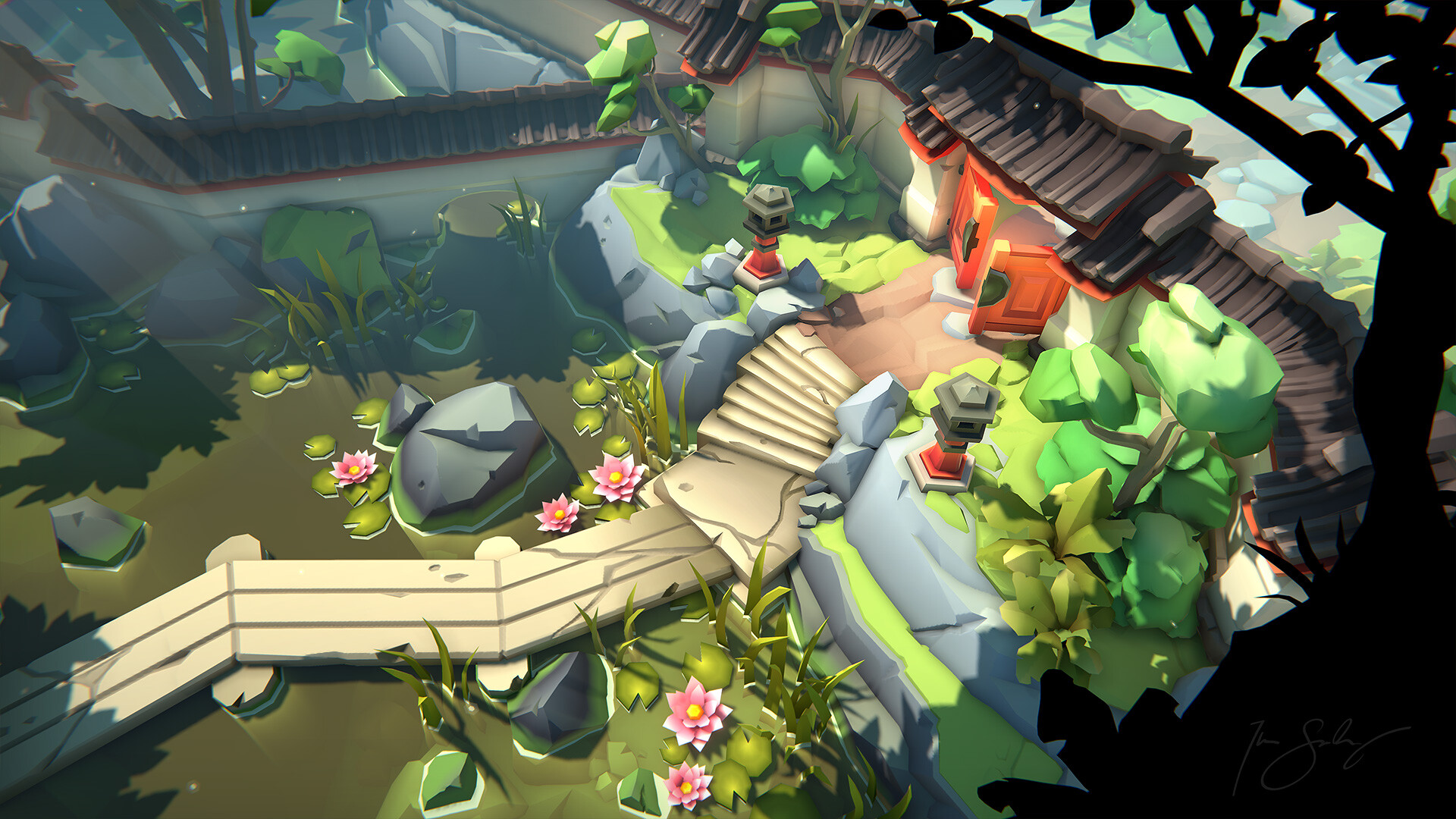
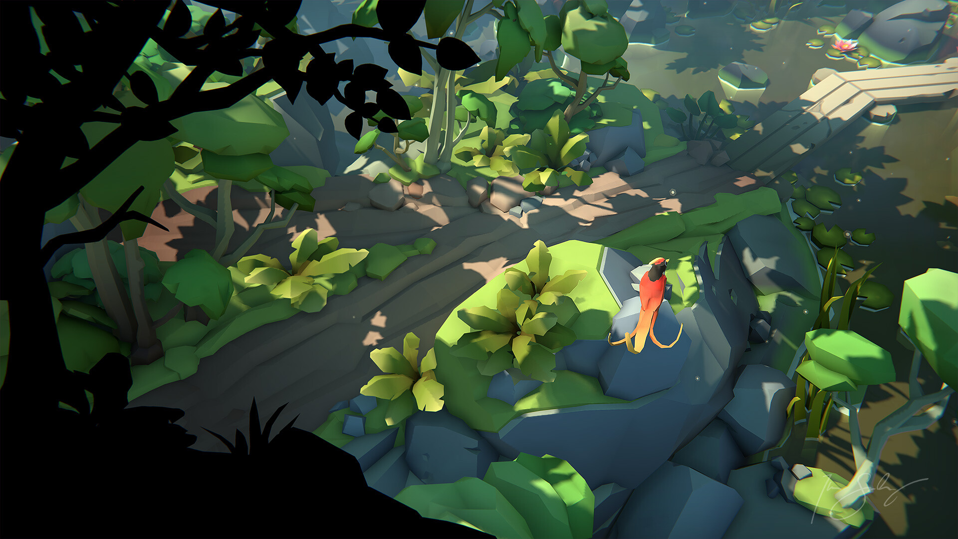
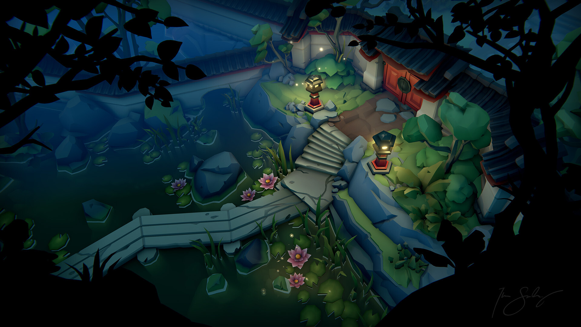
A big thank you to everyone who gave me feedback on the road!
-------------------------------------------------------------------------------------------------------------------------------------------------------------------------------------------------------
Hello forum!
Here is some of the final presentation shots but full presentation can be seen here - https://www.artstation.com/artwork/L2ZYzr
Full animation:
 https://www.youtube.com/watch?v=w3L-Blw8tJo
Animations by Kristoffer Björnör https://www.artstation.com/voffe Thanks for making the scene come alive man!


A big thank you to everyone who gave me feedback on the road!
-------------------------------------------------------------------------------------------------------------------------------------------------------------------------------------------------------
Hello forum!
This is a scene I am working on atm just for fun. It's inspired by Lara Croft GO and a Chinese garden I visited a few years back. The idea is to make it like a mock up of a game complete with main character. I do intend to use more polys adn details then Lara Croft GO however, since I'm not restricted by the limitation of a smartphone screen size.
I actually started this scene a few years back but it had to be put on hold when Super Sportmatchen came in production. But now I kinda started over. I kept the old concept as a starting point tho. Unity is what I'm using btw.
Here's the concept:
I actually started this scene a few years back but it had to be put on hold when Super Sportmatchen came in production. But now I kinda started over. I kept the old concept as a starting point tho. Unity is what I'm using btw.
Here's the concept:

And here is the a first blockout in Unity:
 The white "tofu block" represents the character here.
 The white "tofu block" represents the character here.
At this point I didn't really know what character I wanted to have, so I paused the environment to focus on the character and came up with this:

The idea behind the character is a traveling artist. Complete with a backpack full of art supplies such as paintbrushes and paint tubes. The artist character could represent myself and his travels could represent my own journey into this low-poly style :P Heh, cheesy AF I'm aware.
At this point I'm pretty happy with the first iteration of the character and the blockout of the environment so I want to make a first pass on all the props. But for now, here's snapshot of the artist gazing into the eyes of some carps.

Feedback and thoughts are more then welcome! Thanks for stopping by!

Replies
Regarding the texturing, I'm planning to use simple gradients as textures to 1-up the Lara Croft GO style. As for the lighting department, here I will have to really have to try and get the best out of Unity.
And here's the main camera angle. Lot's to do still. But it's shaping up!
Need to figure out how I'm gonna solve the corners where they meet up. (Since I want to keep modular pieces and not make one large wall mesh. Hope to get more time for this project soon!
Aaaand:
I need to watch out so it doesn't become too noisy now tho. ^^ Might have to clean up the scene a bit.
Either way....keep going, dude. It's looking good!
I did this paintover to help me on the way, but I don't think I like it. I think I need something that looks less out of place during daytime. Even tho multiple time of days is kinda a stretch goal for me. Would be awesome ^^
Currently no textures on the rocks tho. But I intend to make use of pretty simple gradient textures that I will map to my props.
Here's a general update shot!
I have started to go through the props and give them more final geo and some gradients that collected in an atlas.
Here is a shot in albedo only to show what the gradients actually look like.
I like this project more and more the further in I get! Nice
Here's an update of the main views:
At the moment I've been struggeling a bit to find a good look for the canopies and bushes in this low-poly style. Ferns and blades of grass is not a problem, but the canopies are. I look at meny references here but I don't seem to find anything that I think is spot on. Worth mentions here is that Lara Croft GO (that was my main inspiration when I started this) avoids canopies all together. They just show trunks reaching up beyond the screen and then more fern like plants.
Here's what I got at the moment and I think they are ok-ish but not great. =/
If you who is reading this got any pointers and/or opinions on the matter, please shere ^^
These are the meshes:
And here is what it looks like when I set them to "cast shadows only":
I love these kind of compositional tools XD
Here's camera at most left position:
And here at the right:
Works even better in motion with the paralax. Now it's time to wrap up the character and lighting!
And albedo only:
This is the only thing in the scene that got proper UV maps and texturing.
Really nice work and progress, keep it up!
I have teamed up with an animator that will do some animations for the character, the fish and the bird (!) Yes, I have to make a bird first! I'll try to show something in the weekend! Cheers!
I like the shadows but its also casting a shadow on the tops of all the tree's
What programs are you using?
The engine is Unity and models are made in Maya.
The night version with the fireflies is also a nice touch, but the colors seem a tad too 'faded' perhaps ?
You think? Maybe it helps if I crank up those lanterns a bit... I will try it out, thanks! I hope to post a work in progress of the animation here soon as well!
The colors are great but with the shadowed areas looking so close to the lighted areas it appears like there is little depth to the composition. How to change things I am unsure as the more contrast washes away the amazing colors, probably changes to the lighting is in order
Also the black silhouettes in front, amazing idea although I feel its quite a bit off probably due to the angle, have you tried adding actual geometry in front of the camera. You could add a black material to give it that silhouette look