Polycount has been updated!


We’re very proud to bring you the latest update to Polycount. This update brings us away from the archaic infrastructure of vBulletin and into a platform that will allow us to easily add features and improvements. Using Vanilla Forums as our backend, Polycount now offers you features that will make browsing content fun and creating content simple.
At its core, we are still a forum. In fact, a lot of it should look pretty familiar to you. There’s the menu and showcase banner across the top of the site and a list of forums and threads for you to browse through. Under the surface are tools that the Polycount Team has to ensure content is being brought out from the depths of the forum and placed front and center. In addition to new things the team can do, you - the Polycounter - can easily get to content you like to see, discuss, show off, or enlighten others with.
So, what’s new?
First and foremost, the front page. “Adam this looks a lot like what we’re use to.”, is probably what you’re thinking to yourself. (Well, actually, its a little bare right now.) And you’re not wrong! However, where that content is coming from and who wrote it is completely different. No longer will front page content be coming from just the Polycount Team. Instead, this content will be coming directly from you. The team here will be able to easily - literally at a click of a button - feed content found in the forum directly to the front page. That means, any time we see something interesting or noteworthy that the rest of the community should know about, we can share it. We’ll still write News from time to time, but ultimately this content will be coming from you.
In the future, we’d like to see users customizing this front page with content they want to see. Whether it’s from artists they love or topics they’re heavily interested in, the goal with the front page is that over time it will become yours.
Then there’s the forums themselves.
On the surface this should look and feel familiar. Sure, we’ve spaced things out a bit - which you’re welcome to comment on and let us know how you feel - to allow for the content to get less cluttered. But hopefully it doesn’t feel vastly different. What is different, though, is what you can now do with the forums.
Thread previewing is now possible. That little magnifying glass in the thread row, when hovered, will now display the first image posted in the OP’s thread. GIve it a try - we think you’ll love it.

All images in a thread page can be viewed in a lightbox. This just made browsing the WAYWO thread a whole lot easier. Check it out yourself and click on an image to pop it out to a lightbox viewer. Use the arrow keys to navigate to the next image. In the future, we’d love to see it where clicking on an image will take you to its spot in the thread. But, for now, enjoy the ease of image browsing in a large thread. Check it out now on this years WAYWO thread.
Showcased threads got a whole lot easier - for us and for you! Clicking on a showcased banner will now take you directly to the thread it was posted on. Clicking on the author’s name will take you to their profile. For now, there is now Showcased artwork so that we can draw attention to this page. In the coming days, the moderators will begin Showcasing threads in the rotation.
As the author or original poster (OP) of a thread, all you need to do is ensure that the FIRST image in your original post is uploaded to the thread as an attachment. Right now, third-party hosting isn’t supported. So if you upload your images to your thread, and the team wants to show case your thread at the top of the site, we can now do it with a click of a button. That means the showcase banner should be on a continuous rotation of new, fresh content. And don’t worry - if we see a thread we want to showcase but the image isn’t uploaded, we’ll work with you to get it uploaded so we can make sure its possible to show it off.

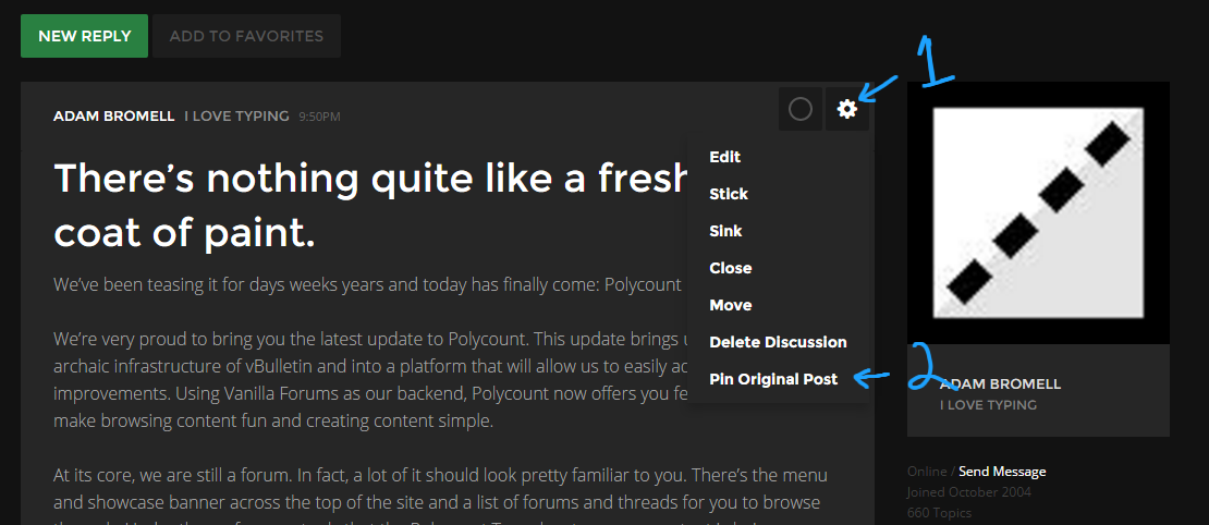
You can now Pin your original post to the top of your thread. This is perfect for anyone who is working on a project and wants to maintain their thread in one central location. As your project grows, simply update your original post with the new content. As your thread grows into multiple pages, the original post will remain at the top of the page for all to see. This way the discussion can continue while your content has one central location that is easy to view and manage. I’ll Pin this thread so we can see it work.
We have fully functioning SEARCH. It works and its fucking great. I am not going to say anything more on that.
Navigation, Favourites, Communication, and Search is vastly improved. You’ll notice now that the menu at the top of the site stays with you wherever you are on the page. Besides the ability to jump between the News and the Forum, you’ll notice that there is a new notification center for your own content on Polycount, a nice clean new chat interface for you and other users, a spot to keep tabs on your favourite threads, and easy access to your own profile.

What state is the new site in?
We probably should have called this a ‘Beta’ launch of the site as you’re bound to run into issues throughout it. There will be a thread for you to report BUGS & SUGGESTIONS but here are some known issues:
The site will not work properly on mobile. Once you’ve picked up your table and all the stuff you just flipped on the floor, please know that this is a top priority for us and the folks at Vanilla. We considered sitting on the site launch even longer to ensure it worked, but we opted to push this live and deal with this in the future.
The front page will render oddly when you resize your browser window. To fix it, just refresh the page. However, if you scale your browser window to a very small width, even refreshing it won’t fix the responsive issues. We’ll work on that post launch, promise.
There will be some formatting issues throughout the site. I won’t list them here, but rest assured we’ve probalby seen them all. If you do come across some, please report them in our BUGS & SUGGESTIONS thread.
Video sites are supported, but implemented inconsistently. What I mean here is Youtube videos will be about 320px wide when posted (just post the URL!) while Vimeo videos will actually be WIDER than the width of the post (again, just post the URL!). We’ll get this fixed.
3D viewers are supported/going to be supported. Sketchfab projects can now be shared via the Sketchfab button in the editor. Marmoset Viewer support will be coming in the future. Both will eventually be formatted to be the full width of a post.
The WYSIWYG editor doesn’t scale well. If you’re like me and like to talk a lot, you’ll notice that the WYSIWYG editor panel will remain at the top of the text editor. This will make editing long form posts cumbersome and more time consuming than necessary. We’ll look at solutions in the future.
----
So there you have it - welcome back to Polycount! It's been a long time coming but we're glad that it is finally here. Over time, Polycount will become yours - the front page will feed you content you want to see and working on projects and sharing it with the world should be better than ever.
This is its first launch so it will be rough around the edges - but that's OK! We'll improve it together: If you notice bugs or have suggestions, please post them here. Keep in mind that if there are new features or design choices you're not fond of, offering suggestions will be incredibly helpful. The good news is with our new work environment it should be relatively easy for us to turn around new features or bug fixes relatively quickly.
On behalf of the entire Polycount Team - thanks for being patient as we flipped the switch on the new site and we can't wait to hear what you think!
Replies
Also you can't post https links without it adding a http:// to the front of it, which then stops the link functioning.
I dig it. Cursor height is rather large in the text box, fucks with the line height... but am sure yall know that, and agree overall with the size of the font but I've already started getting used to it and like not having to squint! /old Seeing a lot of subpixels on the right, may be the color... dunno. Hurts legibility some.
Definitely appreciate the new look and hard work that has gone into this! Can only keep getting better and better!
Thanks dudes.
The profile management was was kinda hard to find and cluttered.
Header had useless links like "about" instead of it's modern version... the "shop".
Take a look at this: http://snag.gy/uqSKS.jpg - I can only see three short one line posts on nearly full-screen. The forum itself suffers from the same issues with lots of lost vertical space. If a post were particularly long, because the text boxes only take up about 50% of my screen width, I'd be staring at 50% black and 50% content, and doing a lot more scrolling than I need to.
I am also not a fan of this layout: http://snag.gy/4ltoi.jpg
You can pull the page menu etc to the right underneath the actual posts, and shift the offline / join date / post count stuff back on to the left hand side underneath the avatars, giving you way more space for post content.
Also, when in the forums themselves, I cannot easily see which threads are new or have read and unread content - the 'new' and 'X new' icons are not adequate and look very similar. Bold and unbold threads is visually much clearer for unopened threads, and having an icon (that isn't grey) for unread content distinguishes those threads that have new content.
Edit: I assumed that the arrow on the page counter would take me to the last page (handy for long threads). It doesn't, it takes me to the next one, which is redundant, as I have a page counter with the numbers of the pages on...
Also, every time I revisit this thread, the reply box seems to have a saved draft of this post in, despite the fact that I have posted it.
The problem with this type of design, it prioritizes stylishness over anything else.
It's good to remember that minimalism is not always something that improves readability and clarity.
For example. What is the rational reason for user name + post date being on the same gray rectangle space as the contents of post, with no line or shade difference
to separate these 2 elements?
Or top bar having a shade so similar to background that it blends with other elements.
Or making user info float in space on background like some separate entity?
Same goes for floating formatting options above reply window.
Stuff like that only makes things less clear, just for the sake of style.
Also, when pressing the buttons to a new page, it should open the next page, but move down to the first comment instead of displaying the Ops post, especially with long posts, as you spend a lot of time scrolling, which is not a good thing.
Also, personally I prefer to have numeric dates, it's easier to see how old posts are.
One quick critic, with the complaints about spacing/size. It seems to me like there was a focus on mobile devices, and making things easier for mobile navigation. While I definitely understand this direction, it tends to make things too large on desktops. You may want to utilize some @media css, to adjust padding, between devices.
I have a few other critiques, and bugs/issues. Is there a 'preferred' way to provide feedback? I don't want to fill Adam's messages here, or on Facebook, with everyone's issues. I don't want to flood this page, with critiques that may feel negative, or piling on.
Aside from that, nice work guys. I'm sure things will get tweaked/improved, with time. Lots of cool new features to discover
-edit: nm about the feedback location. I saw the thread, after posting this
CONGRATULATIONS ON THE UPDATE!
There's some wrinkles to iron out, but the new structure and features look great! I can't wait until this new battle station is 100% operational.
My primary concern is that you seem to have forgotten the link to the Quote Game on the forum front page.
Ok, wow. I just started typing a response for this. Didnt finish, surfed to a different page on the forum, came back to this thread and my reply was still waiting for me to send (it wasnt on the other page). So. Much. Yes.
1: When browsing a section and looking at all the threads, I have little to no information. Can't see how many replies, how many pages, who last replied and when, etc.
2: The dark theme is a bit hard to use on mobile, and I hope the upcoming white theme wont be too bright. The dark gray fonts and UI are just barely visible, and that was a shock once I realized my phone was at max brightness.
3: Typing this message is pleasant in the quick reply box, no lag and easy to select the text on the phone.
4: I wish I could use the request desktop style button on my phone to get the full site. I'm not sure how such a request from a phone works with a responsive design that just looks at the width of the window to automatically change the style.
Overall, I'm looking forward to the site being refined. Modern sleek designs like this take some getting use to, especially the initial shock, especially on a mobile phone. The large UI and spacing l gives the feeling of tunnel vision, making it hard to get a good overview of sense of the site.
hmm, now where is the post button on this quick reply area? Found it, had to rotate my phone horizontal to see it.
- But it works just fine, why we should fix it?
- Because...
Maybe just a touch lighter , especially the thread titles. The core text font is also very thin, making it a bit lighter would bring it more
to old level in terms of readability , im not sure If i just have to adapt but it feels harder to read
Also Im having issues with the formatting, can we please have the same formatting and text size in the writing box than in the final output ?
I feel this is very important. Everything I write is not as planned. Also the text box font is even smaller, Id understand if the text box text were bigger and would be shrinked afterwards somehow, but having more space in the box than the actual post is exactly the opposite as expected. It should really be exactly the same either way.
(Plus In the writing box there is a lot of empty space in between lines , as if exactly one line was skipped , which looks strange and takes a lot of space)
towards seeing if a new person replied to the thread. Usually I just check If my name is standing there, and if it dosnt, someone replied.
Keeping track of the small post count is very hard.
All old polycount-thread-links aren't working anymore - is that correct or I'm I doing somthing wrong? So e.g. the Links to a Polycount-Thread in the Polycount-Wiki aren't working anymore?