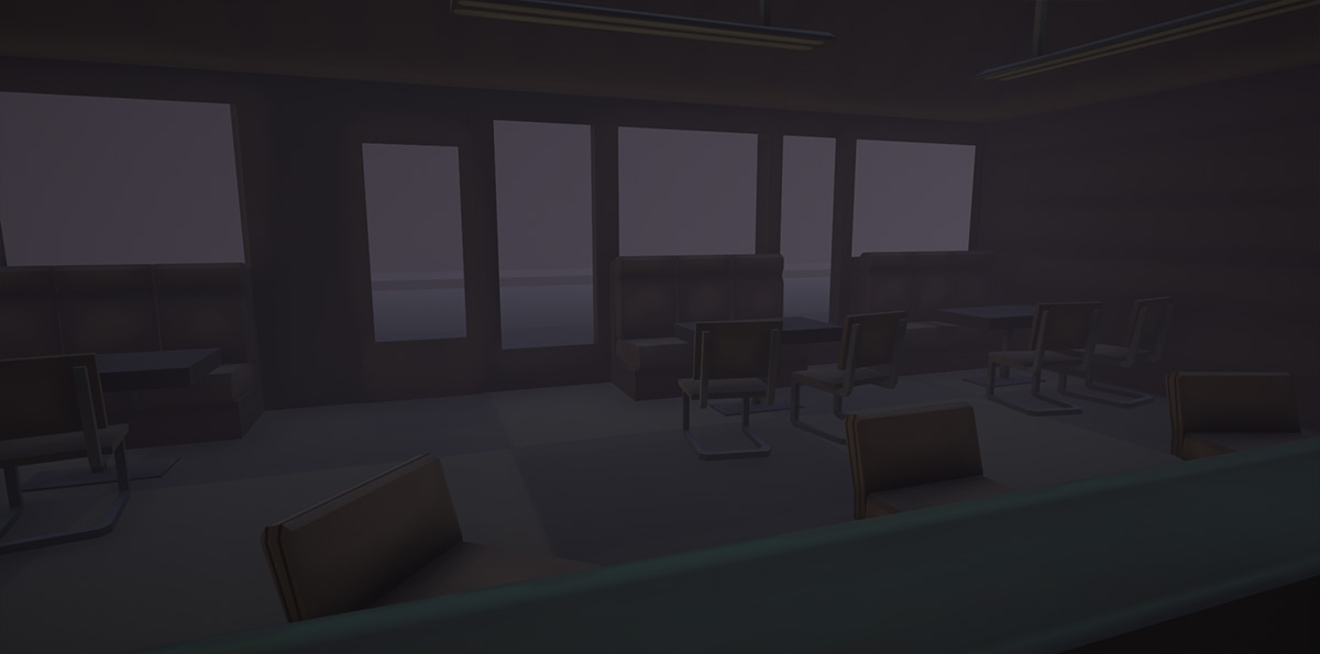
Cafe 5to2
Hello!
This is the cafe from the first Silent Hill game
I know it's not exactly a brilliant and fresh idea but I couldn't come up with anything better... and it's about time I do something else at home than playing Counter Strike and I feel kind of bad with my portfolio especially when I see what you guys post here everyday
So I started with prototypes painted in Modo XD (it's funny I tried to paint them almost the same like the original ones are painted) placed everything in UE4
I wasnt able to achieve better results with ue4 lighting and fog but i will try later.
something like this would be awesome:
http://cdn4.dualshockers.com/wp-content/uploads/2014/02/TheOrder_004_1080.jpg
We'll see.
I will try to make some elements similar to the original cafe but I think it will need some serious redesign
updated picture:

Some pictures:


This is the cafe from the first Silent Hill game
I know it's not exactly a brilliant and fresh idea but I couldn't come up with anything better... and it's about time I do something else at home than playing Counter Strike and I feel kind of bad with my portfolio especially when I see what you guys post here everyday
So I started with prototypes painted in Modo XD (it's funny I tried to paint them almost the same like the original ones are painted) placed everything in UE4
I wasnt able to achieve better results with ue4 lighting and fog but i will try later.
something like this would be awesome:
http://cdn4.dualshockers.com/wp-content/uploads/2014/02/TheOrder_004_1080.jpg
We'll see.
I will try to make some elements similar to the original cafe but I think it will need some serious redesign
updated picture:

Some pictures:


Replies
I am testing some textures on wall and floor, colors etc.
I dont want to make it completly different that the original cafe from game but its really hard when I see all that shiny stuff in references
I think I will remove that red leather. won't work with the mood that hopefully i will make.
Also switched to more default lighting but only for now
I need some help from you guys.
I am trying to make an ambient lighting with ambient nondirectional shadows
( like here for example :
)
is it even possible in UE4?
all i found is some kind of postprocess ambient shadowing from skylight but it doesnt look very good:
and directional lighting even with distance ray traced shadows doesnt make that cloudy day effect:
EDIT:
OK i got it. I just had to use some nice hdr texture in skylight and increased indirect lighting
This is what i got so far:
The blockout looks pretty solid, but clean, too clean. I'm assuming you'll do this anyway, but grunge and high contrast makes the Silent Hill style stand out for me. The floor needs debris and the whole place needs a sense of disorder.
I like the venetian blinds you have going in the other screenshot, consider bringing those, back but ragged and broken, could be a good spot for nice volumetrics and cool shadows.
shadacer - I saw your SH environemt, nicely done!
I wanted to make clean scene with fine lighting and atmosphere first, then move to more proper textures
Now I am not very happy with the result, I kind of lost motivation ;/
As for the assets themselves, add some smaller props and damaged, misplaced items on the floors and tables. It's not just textures that make Silent Hill, it's the little bits of geometry they scatter about everywhere, like the drinks cans and tiles in my scene. Good work so far
i made a little paint over, i think its just time to make more props and it should be ok
Removed almost all textures (just flat colors and roughness)
I am not sure if i didn't go too crazy with fog and grain ;/
I try to think of it as a part of the game, not just pictures so there is kind of a story
The main idea is that Harry didn't make it, you start in the same place as in first game but instead of Cybil you just have to take the gun from a puddle of blood (Harry's blood)
Here is a gif, showing how it could look like in actual game
Does it feel like it can be Silent Hill game to you?
What do you guys think?
I always try to make dirt at the very end, it can cover some major issues and then you dont know what sucks
Magihat, you are right man, I prefer the original look too. I tried to fix it.
omg it was 6 months ago, time goes so fast
anyway i have some new pictures