The BRAWL² Tournament Challenge has been announced!
It starts May 12, and ends Oct 17. Let's see what you got!
https://polycount.com/discussion/237047/the-brawl²-tournament
It starts May 12, and ends Oct 17. Let's see what you got!
https://polycount.com/discussion/237047/the-brawl²-tournament
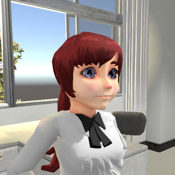
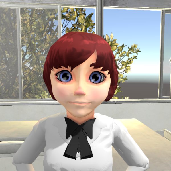
Looking for feedback on character models
Hi everyone! I'm a fairly inexperienced 3D artist working on an immersive language learning game. The team is very small, and we thought using a low-poly style would be more efficient for generating content. However, since the focus of the game is communication, we want the models to have enough detail to show facial expressions.
I feel like they could still use some work, but I'm having a hard time figuring out what to focus on. I'd love to see any feedback you have on the style or execution of the models.
Thanks!
[SKETCHFAB]31d955e3a8be42a08ae071f5654eee6e[/SKETCHFAB]


I feel like they could still use some work, but I'm having a hard time figuring out what to focus on. I'd love to see any feedback you have on the style or execution of the models.
Thanks!
[SKETCHFAB]31d955e3a8be42a08ae071f5654eee6e[/SKETCHFAB]


Replies
The skin texture needs to have more values in it to make it appear livelier. Areas like the nose for example have a much redder tone compared to the rest of the face. The cheeks also usually have a subtle blush on them. Try to use a subtle blue/red when shading as opposed to creating black shadow areas to achieve this effect. (Take a look at any picture of Elsa from the movie).
Form-wise, looking at the girl's model her face is very flat when viewed from the side. Approaching her facial structure in three dimensions will really help push the piece further!
Overall I think the style direction of the models needs to be established further. It looks like you are going for an anime toon style character, but at the same time you are adding facial features reminiscent to that of Pixar/Disney's characters. Of course, you can get something in the middle thought it requires care so that it doesn't turn out too doll-like.
That said I like some of the expressions presented here, especially that smug look. Girl's got a personality going on. Keep it up and hope this helps! All the best to the team working on the game.
Boy looks as if he doesn't eat enough, like a street urchin. Maybe its just that he doesn't seem to have much cheek, just a very pointy chin and makes him look very thin.
As far as the style goes, I'm still experimenting to see what I can actually do before committing to anything specific. I found I enjoy doing the Disney/Pixar style facial expressions, and I like how expressive they are, so maybe I'll move more in that direction.
What's the best way to do skin textures? So far I've been baking ambient occlusion, putting that on top of a skin color and then doing some smudging where I thought it was needed. Should I just do that and then paint some highlights in red or pink like you mentioned?
I've been having a hard time getting the face structure right. Are there any resources you recommend for learning this?
I'll make sure to make them look healthy and well fed going forward.
I'll take another pass at the face structure and textures and let you know how it goes.
The majority of your problems seem to stem from topology that won't animate well, and is causing these problems.
I just completely redid the topology and made the face structure less flat. Will this work better?
I think you really need to pay more attention to stylization like Helen Chen, and go back to the drawing board on the face style.
http://jigokuen.tumblr.com/
I think your topology is ok, but it certainly needs improvement, there is a lot of density in places that doesn't need it, and not enough in others, so really you need to try and even it all out.
Keep it up
Thanks for the feedback and encouragement.
When you say "made too much", you mean there's too much detail in the geometry or they're too big?
I really like Helen Chen's style, but I have a couple of questions about implementing something like this in a game. If I do something like this would I need to bake all of the lighting into the textures? It seems like I would need to do some hand tweaking of the shading to get that effect. Is there a game I could reference?
If you have a look at my current thread (super chunky character pack) im actually doing something really similar right now.
I am making a high poly sub-d model just so it is super clean, and baking it down to normal maps to make sure that it remains that clean.
But you will notice just how simple i am keeping the shapes.
Thanks for the advice! I took a look at your thread and your models look great, but the style is a bit too clay-like for what I'm going for. We're planning fairly realistic environments, so I think if it's too stylized, the models will clash a bit.
Here is the textured version of the new face. I think she looks much less sickly.
The main reason why i pointed you in the direction of my thread, is that because of the huge eyes i thought that would be more of the direction you wanted to push it. If that isn't what you want i would suggest making the eyes smaller so that they match the rest of the style better.
I would also recommend removing the painted lighting on the hair, as it looks out of place when everything else is dynamically shaded.
I tried tweaking the face to make it look more stylized, but I just didn't like how the changes turned out, so I'm going to leave it as is for now and come back to it after a while. Looking at the complete figure, do you think the big eyes look strange? I think it's ok, but I've spent way too much time looking at it.
I'm working on improving the shape of the body now. I tried a few different styles, but I think the anime style works best for this. Any thoughts?
[SKETCHFAB]31d955e3a8be42a08ae071f5654eee6e[/SKETCHFAB]
The whole point of anime eyes is so they can display emotions easier so if the games about communication then they match the game well.