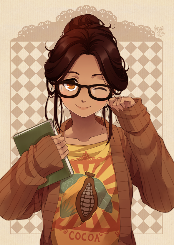
The Monthly CHARACTER Challenge | January 2015 | Cocoa Girl

IT'S ONE YEAR ANNIVERSARY !!!
Polycount Main Google Hangout Link
Great way to stay motivated while you work. It's like a virtual office
1. Try to leave at least one critique per post. It makes you a better artist if you have the ability to give constructive critiques. Just because you're working on a different concept piece, doesn't mean you can't give feedback to others.
2. Challenge yourself.
3. Your final presentation should be posed and rendered in real-time. (Marmoset, or game-engine like UE4 or Unity)
4. Try your best to finish on time.
5. Post your work-in-progress in this thread.
6. Specify your own triangle count and texture size. Be reasonable and stick to your budget. Some suggestions are as follows:
Mobile: 2k Triangles, 512 Maps
Low Res: 8k Triangle, 1024 Maps
Mid Res: 16k Triangles, 2048 Maps
High Res: 32k Triangles, 4096 Maps
7. Similar to #6, you may pick an art-style yourself. You are, after all, an artist too. (Realistic, Stylized, Cartoony, etc)
8. Learn as much as you can. Share what you've learned.
For this month, we have just one concept art for you.
Cocoa, original character of meago(magda) | http://meago.deviantart.com/art/Cocoa-393654716

Here's her at full body shot.

GOOD LUCK. AND HAVE FUN.
Cocoa, original character of meago(magda) | http://meago.deviantart.com/art/Cocoa-393654716

Here's her at full body shot.

GOOD LUCK. AND HAVE FUN.

Replies
I finally got used to texturing in mudbox, this time my challenge is modelling completely in maya lt.
Good luck everyone!
My challenge is to create a rig and do a bunch of library poses and potentially create a small scene where she
1. Gets the book
2. Looks at the book
3. Sits on the ground reading the book.
That's my sort of idea in mind.
My own sort of all-over-the-place thinking and planning.
I think i will go for something more realistic, and tweak some details.
Might try saving them out as png and hosting at imgur, gets me good enough results and there's no need for an account I don't think.
Here's my update.
I'm gonna hide and see how others tackle the anime faces
@Pyzern: Foreamrs look a little too long, the curve of the legs are very nice tho.
@Pav3d Beautiful. You just made me hesitate to post mine for a minute.
I'm aiming for low/mid-res with diffuse only materials. Unfortunately this month is filled with Uni deadlines, so we'll see how that works out.
@DerRazputin Looking a bit pinched around the nose area, smooth it out a little. Hair looks cool
@Pav3d Looks great!
I'm still iffy about the face though.
I think ther hairstyle is a 'messy loose bun' , it's the closest I could find which somehow represented her hairstyle. I think.
@Pyr Her chin looks a little too long. However I'm not an expert on anatomy so maybe it's the angle of the camera... :P
You're right, gonna fix her chin next
Here're sideway and back view.
Thanks for the hair references!
I worked on this T-Shirt today, first time using Marvelous Designer 4 - I then retopo'd in Topogun 2 and sculpted in Mudbox.
I need to work on the boob area, think I put a bad 5 connector quad in a bad area around them which is hurting my ability to work on the creases between them. I've never made any fabric in 3d before as this is my second character I've ever made. First one being entirely mechanical.
@Francois: Id suggest making the iris more covered by the top lid. Nice start on the hair painting.
Here is my sculpt, next is the hair but Ill do some more fold (which are drive me nuts) tweaks before that
@Pav3d Her jacket looks nice :P Looks very jacket-y. Sleeves' folds seem too clean, though...
And here's my update. Still haven't worked on her hair properly yet...
I love it ! You nail it, she is cute, but i agree with Pyrzen tho.
Guys you dig it, i'm super late ):
For her hair you should look at the references posted
Keep up the good work!
[ame]
I hope this makes sense
The t-shirt could also be a little longer but that's an extremely minor thing imo.
This is what I have so far , started to make a little scene for her as well to feel at home in.
I'm tempted to leave out the alpha cards for her hair because I tried out and it didn't look that good and the hair doesn't read that well yet either , it's very dark still.
Yeah, haven't touched her hair for real yet either.
@Francois_K Thanks man! I'mma work on that tomorrow first thing I wake up
Fixed the pinched face and finished the body sculpt with quick retopo.
Started with the Clothing. I played a bit with cloth simulation before sculpting the folds.
You should make the knees less pronounced and make her neck less veiny. She looks like an old lady right now
I've actually gone and finished mine way ahead of schedule ( But I have too much free time )
@Francois_K Well done on the piece
I remade her jacket and her hair. Will see if I like them or not :P Too many wrinkles on her sleeves, dang it !
The clothing wrinkles, especially on the arm, could use more care as to their origin of anchor and how they wrap aroun the arm as gravity pulls them down.
@PyZern: I made the hands a bit smaller. Also smoothed them some, but now that I look at it, they could use a bit more.
I like the progress on your piece. The jacket needs some more bigger folds though. See, for example, the underlying tube-shape of the sleeves still stands out too much and the silhouette isn't affected as much. Folds on the pants look good though in my eyes.
I call the high-poly finished as I plan on wrapping the textures up next week. Moving on to retopo + UVs tomorrow!
I really want to get it in the style of the concept (Anime-ish?) rather than to changing it because I want the challenge
That is what I have so far, Although I'm struggling really badly with the hands/face/hair.
I'm considering working on the alphas for the hair.
I UV'd mine today and used it as an excuse for some baking/shading tests and very basic color block-in. Will most likely use the AO as a base for texture painting.
http://www.zbrushcentral.com/showthread.php?178524-Wreck-it-ralph!!!
Yeah, hands are next on the list of things to do @DerRazputin.
Gonna have to fight the face/hair some more :<
I'm not an art jedi like some of the scary people here so I use model sheets to help me get a good base mesh. I've been told this is *so* yesterday, but oh well, it's what lets me be not completely crap
Here's what I've got so far after about 3 hours last night and today at lunch:
@JadeEyePanda Thank for the link man. BTW, I miss your panda avatar.
hmmm, I think you're right... ta
I've set up a second version of her with no shading at all (diffuse only) to help me with previewing my textures. I've been wondering: Is there an easy way of getting alphas to work inside of Maya with flat shading without exporting a separate alpha texture everytime I change the diffuse (that is, simply using the alpha of the diffuse texture, as in every game engine, etc.)?
EDIT: Problem Solved! Was using PNGs, switched to TGA, all fine now. God, how embarrassing.
Here's my update. I worked more on her face, and exaggerate her eyes some more. Also reworked on her jackets. Dem wrinkles are hard.
I'll call the textures mostly done for now. Will fix some things and upload a higher res-version when there's time. The material is done using Maya's DirectX11 Shader.
I've just about finished with my model sheet, front hair is in, will do side at lunch and back tonight. Will probably be about nine (scattered) hours of work all up for it, but for me it's worth it, without this level of fussy analysis I just wander around lost when I sculpt.