[CE3] Mountain Lodge
Hey People,
I have been working on this rustic mountain lodge back and forth for a while so I thought I should share it with you.
Ive been using a lot of different references for both the interior and exterior when it comes to layout, design and lighting.
Here are some of the references for interior and exterior
My main goals:
-Create an PBR environment, with both interior and exterior.
-Create two different light setup to see how the PBR works in different conditions.
-Try different techniques and workflows to expand my knowledge in different tools and programs.
You can find more images on my website: http://www.joakimstigsson.se/
I will probably do a breakdown when I get time and I'm also thinking about releasing the level with all the content for you to download and try out.
Please let me know what you think and Merry Christmas to you all!
DAYTIME:
[ame="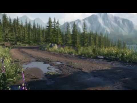 https://www.youtube.com/watch?v=1Xd3cEsFQxI"]https://www.youtube.com/watch?v=1Xd3cEsFQxI[/ame]
NIGHTIME:
[ame="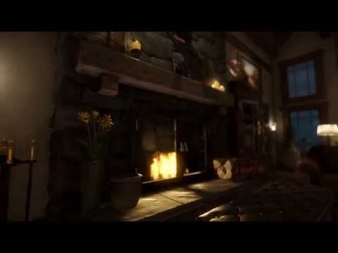 https://www.youtube.com/watch?v=PSj3cATL4SY"]https://www.youtube.com/watch?v=PSj3cATL4SY[/ame]
NIGHTIME FLYTHOUGH (60FPS)
[ame="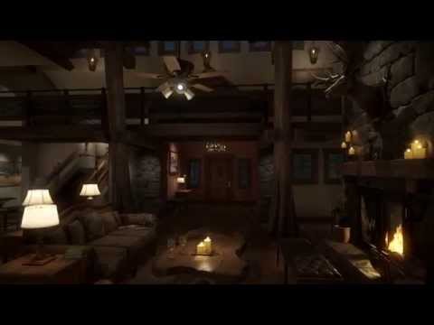 https://www.youtube.com/watch?v=RvRtlTyU_dQ"]https://www.youtube.com/watch?v=RvRtlTyU_dQ[/ame]


I have been working on this rustic mountain lodge back and forth for a while so I thought I should share it with you.
Ive been using a lot of different references for both the interior and exterior when it comes to layout, design and lighting.
Here are some of the references for interior and exterior
My main goals:
-Create an PBR environment, with both interior and exterior.
-Create two different light setup to see how the PBR works in different conditions.
-Try different techniques and workflows to expand my knowledge in different tools and programs.
You can find more images on my website: http://www.joakimstigsson.se/
I will probably do a breakdown when I get time and I'm also thinking about releasing the level with all the content for you to download and try out.
Please let me know what you think and Merry Christmas to you all!
DAYTIME:
[ame="
 https://www.youtube.com/watch?v=1Xd3cEsFQxI"]https://www.youtube.com/watch?v=1Xd3cEsFQxI[/ame]
NIGHTIME:
[ame="
 https://www.youtube.com/watch?v=PSj3cATL4SY"]https://www.youtube.com/watch?v=PSj3cATL4SY[/ame]
NIGHTIME FLYTHOUGH (60FPS)
[ame="
 https://www.youtube.com/watch?v=RvRtlTyU_dQ"]https://www.youtube.com/watch?v=RvRtlTyU_dQ[/ame]


Replies
Are they two separate environments, interior/exterior? Also what sort of time frame was this completed in?
Vertex 3 please.
First thread of the day while I'm drinking my cuppa and it's given me both inspiration and food for thought
I only got 1 suggestion: the distant mountains lack detail. So either increase the detail terrain view distance or replace them with objects.
cheers
ps: kinda reminds me of the lodge of Alan Wake
...Ok, I think it's back in place now.
Stunning work, congrats. Really hard pressed to find any crit that isn't real nit picking.
I second what maxmead said. Get this the hell in Vertex 3 if it's not planned already!
The only thing that throws it for me is the outside water puddles don't seem as reflective as they should be...... i could be wrong though :P
How long did it take to complete this?
Breakdowns would be the best Christmas present ever.
Only crit from me would be your forest looks a little too perfect. Needs some trees that are dead/falling down etc.
What's for dinner?
Some asset breakdowns would be sweet. Bra jobbat!
This is so good! Amazing work man honestly top notch.
The only thing that jumped out at me was the use of a normal map ( or the diffuse/albedo being used for shinniness / roughness ) on the dark worktop surface. I would expect this surface to be smooth.
Overall .... WOW !!!!
Im really happy you guys seems to like.
maxmead: Its all made in one scene. I think I'm going to upload a camera flythough without any cuts to show the scene as a hole. Ive been working on this on and off though the year at evenings, but its really the last months Ive been pushing it to its finish state. Steam tells me that Ive been using CryENGINE 400h = 16 days
gametime: Thanks, I agree that the background mountains could have had a little bit more detail. I changed the view and lod distance for the renders. The first plan was just to have the mountains as a background from the interior, not to actually create an exterior. The hightmap I generated from world machine is a 4096x4096 but I could probably gone bigger. Might do a test to see how much difference it makes
steve0: Im not using Light Propagation Volumes since its been removed in the 3.6 version. Im using one big global environment probe for the exterior and then I have smaller ones for the interior. For the Global one I set the sort priority to 0 and the smaller ones to 1 which means they will be rendered on top of the global one.
Ervin: That was actually one of the intensions, I wanted it to look a little bit like a promotional commercial for the lodge
nathdevlin: I think I actually have some of that albedo information in my smoothness map, I remember it almost looked to smooth and perfect without nothing in the texture. I have also seen some marble floors that are a little bit more rough. But im gonna try to decrease the noise or remove it completely to see if I can archive a different look. Thanks for the input!
Thanks for all the comments!
I will defiantly do a breakdown of the lodge in someway, but first I'm going to celebrate christmas with some swedish meatballs!
Stay Tuned!
Cheers
What was your workflow for the grass and plants?
Did you use Speed tree or xfrog type software?
For one of the bushes I used fibermesh i zbrush to generate leaves to some smaller branches. I didnt use speedtree or xfrog.
I will try to cover this as much as possible in the breakdown
I added a new video on YouTube with one camera fly-trough to better show the layout of the scene.
[ame="
You can download the raw-video here (60fps):
https://www.dropbox.com/s/ktkp4liqqnh2fck/mountain_lodge_nighttime_flythough.rar?dl=0
Cheers!
[ame="
Im still thinking of releasing the hole scene for you to download.
Cheers
The gold under the helk head is crazy bright at night.
My favorite scenes are the close up night time shots. Great work.