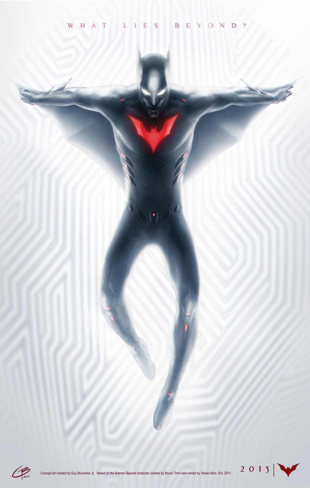
Batman Beyond (from concept)
Hello, my name is Marco. I haven't posted much work in the past though I would like to make it a habit for feedback and perspective in moving forward with future projects.
As the title says, I'm working on a Batman Beyond character model based off a concept a friend of mine, Guy Bourraine(http://tiguybou.blogspot.com/), drew up which I've included below.
I have already put in a good amount of time, and as such, I'm posting what progress I've made throughout the process up to this point. It's never too late for critique and I can't wait for you guys' comments and feedback.


Replies
More to come soon!
The suit detail seams and panels I modeled separately and I will upload some screens of those soon. I'll probably generate a normal map for the seams since they aren't much of an extrusion to begin with.
Nice to see an artist doing it justice!
I will be rigging it for a pose to render in maya, but I was wondering how to best capture the detail from the padding on the suit. I tried a normal map with looks pretty good, but also tried creating a displacement map in Maya's transfer maps feature.
I want this to look like promotional art basically.
Any suggestions?
I would suggest to not rely completely on cutlines everywhere to help define the costume. It looks like everything is just segmented up by cutlines. I would say that adding some form and mass to some of the shapes would help to not make the suit look so flat. Right now especially int eh chest area it's reading as if it is occupying the exact same space as the skin, like there is no space between the skin and the suit.
Quick paintover to help. The red and yellow help indicate the big forms, and then within those forms folllowing through with cutlines so that the design doestn get lost in the "spagetti string" effect. It would look REALLY cool to inflate someof those forms on his back as well. You have some really great shapes.
I don't know if I'll pull them out exactly as you drew, because of the bat symbol being flat, but I think the general idea is a good step forward. it helps emphasize the "mantle" of the upper body.
As of now, I was thinking of baking the details into a normal map, but I really wanted to try getting a displacement map out to render in hi quality and see all the nooks and crannies in detail. I just couldn't find a good way to bake one out without getting artifact issues.
Anyway, if that doesn't work, I'll just model out some of the edges in the lowpoly to res up the silhouette. I'll post an update soon!
These are some stills I took using Marmoset (I really do like it so). There are some tweaks here and there that I'll be making: I think the hands might be a bit big, but could just be me. Also going to try and spruce up the wings. They look a bit boring next to the body.
As always, I hope to hear back and get some cool feedback moving forward. I'm close to wrapping this up, and I started other personal projects since this one's close to being finished.
BradMyers82. - Thanks buddy. This is my first presentation since having started using Marmoset and it has a lot of fun settings to play with, but it's also easy to get carried away with certin things. 8). I personally kinda like it, but I'll probably end up toying with the settings some more. Thanks again!
St4lls - Yeah, props to my friend Guy for his concept. I more or less looked at the cartoon, and the concept he drew up to try and whip up a look for the wings which always felt like more of a visual element since the design in the cartoon was so simple. As far as gliding goes, they're more akin to the armpit webbings in Spidey's suit than actual wings a bird would use to flap. I'll probably look at it in another month, and find something that bugs me about it (as with everything I do 8D) Thanks for the feedback!
not sure if I like the really stylized renders though. would love to see a more straight forward one with a 3 point lighting.
Looking forward to your next piece.