The BRAWL² Tournament Challenge has been announced!
It starts May 12, and ends Oct 17. Let's see what you got!
https://polycount.com/discussion/237047/the-brawl²-tournament
It starts May 12, and ends Oct 17. Let's see what you got!
https://polycount.com/discussion/237047/the-brawl²-tournament
Handpainted luv by Cordero
hey polycount!
I made a new thread everytime I made a new work.. well I think thats not really effective for anyone, so I decided to make one thread and spread my stuff all over it
some are game related, some not... wips, and final works aswell!
feel free to ask anything, and critics are welcome, and encouraged at each thing I post!
hope you all like what you see below and will leave your thoughts!!


Replies
First of all, ace stuff. It's great you are expanding into 2D as well.
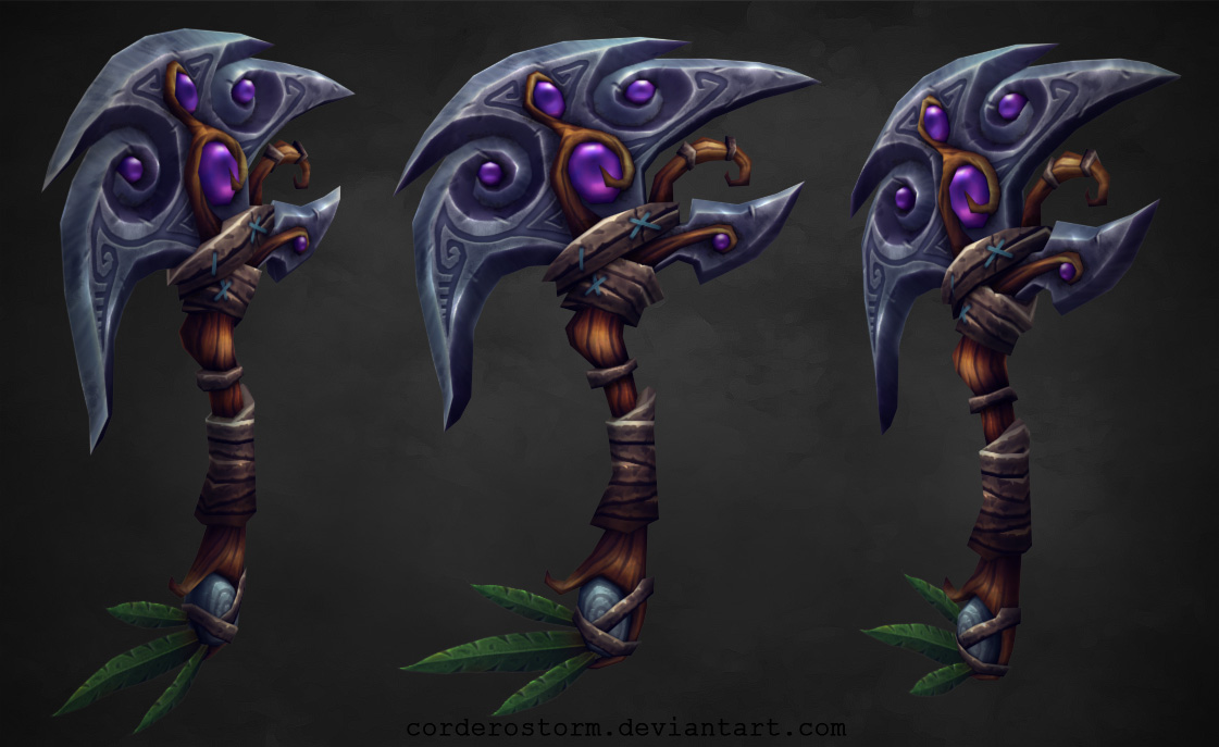
I feel the axe is your strongest piece here. I can't find anything to crit. Dead cat inn is great as well, but I would recommend presenting this piece with flat textures as well, so everyone can see how efficient you are with tiling and texture space usage.
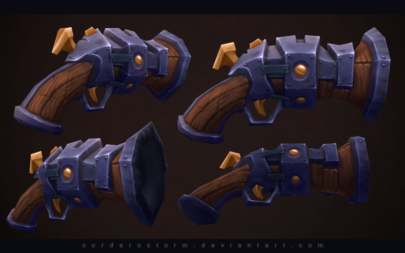
The flintlock is really nice, but now looking at it, it could use some more color variation, maybe stronger rust here and there. Otherwise, great gun.
The restof the pieces are looking very well too, though I wouldn't show them in your portfolio if you are trying to get a job in gaming industry as they are not low-poly.
Continue, give us moooaaar!
Nice stuff you've got here.
Visually, I think the axe is your strongest piece. The inn would be amazing, but when I look at the brick textures.. I feel they are a bit flat. They need more variation in terms of color value (a bit more dark around the bottom, brighter at the top maybe + it could pick up some global illumination, in this case some browns from the wood etc.) . If you defo want to present this in your portfolio, I`d improve the brick textures a bit.
The gun is cool as well, although it looks like one that was created for older games. It depends what type of job you are after, but that polycount I feel is too low for today's games.
Hope to see more stuff!
Elod.H: Thanks! I agree with the GI on the inn, but some parts sadly are tiled, and I can't paint gi in there, unless I have a second uvw chanel or something
here is what I'm working on at the moment.. the blades are blacked out because I haven't started them yet.. I feel like the direction could be good, but some parts are blurry, not defined enough.. and I also struggle with the right color combinations, and variations..
What do you think?
I didn't mention in the previous post that the axe is originally not my concept, it was made by http://kindredconcepts.com/
I need to do some detailing, but its almost finished..
so let me know what you think!
I call this axe done for now, and I'm moving on to another weapon.
feedback would be highly appreciated!
Quick example:
Either way, keep it up, they're looking great
/edit - maybe not quite as light as I made it, but I hope you see what I mean...
Benton: Yep, I am that guy
I'll post an update at the end of each stage
I noticed that because of the dark viewport background color, my previous weapon ended up really dark, so I changed the bg color closer to mid grey, so I wont have a black patch as an end result
I'll now detail, and finalize the greyscale values..
What do you think so far?
hair and little assets left to go
but still in need of feedback!
gonna do one more I think, and then move on to chracters probably
Your axe is awesome too, but tbh I liked it better before the blood spatters. The blood looks like a generic photoshop alpha and it's inconsistent with the rest of the texture.
I do agree with pixelb, my eyes are having trouble looking at the details, where the simpler texture my eyes can rest and enjoy the contrast.
Lavitz: thanks! Yeah too much details kills that weapon
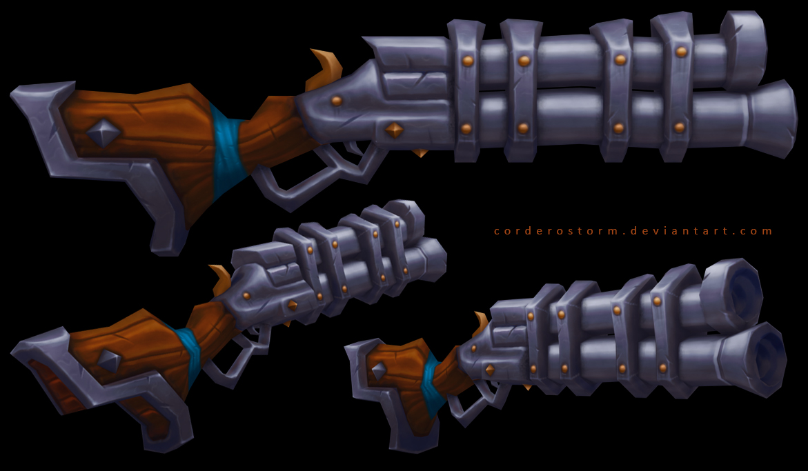
next up! another weapon, this time NOT based on my own concept, its from torchlight again, just like the previous pistol I made! I also timed this one, and it took me about 5 hours to model,uvw and take this far in texturing.. which is less then half the time my first hand painted pistol took
It's a wip, and some feedback would be awesome before I start finishing it up!
How do you achieve such lovely painterly results with your textures? I'd love to see your process dude.
I'd love to see the textures on these guys and your texture-tutorials on youtube, couldn't find them. I'd love to tap in to those skills of yours:)
Looking foreward to seein more stuff!
Added a wireframe of this pistol just for you
PelleK: I'm glad you like these! Yeah the blood will be removed, thanks!
So here it is, almost finished.. I tried to open up in to a new direction, not follow WoW or other fantasy stuff I've seen before.. do you think I succeeded?
wire! 534 triangles
On your latest pistol, that ribbon wrapped around the barrel is looking a little flat. It appears to have a shadow on the barrel showing some thickness but maybe you could make the highlights pop a bot more on it.
A little fun with the presentation of the latest weapon.. I hope you find it funny too
And also a start on a character, based on a torchlight 2 concept I found on the game's website. Almost done with the model, just have to add some curves, and fix some silhouette issues..
and the concept NOT MINE
Haha. Nice work man. Your tutorial videos are entertaining. =]
Nice start on the character, will definitely keep an eye on this thread.
Your video has some good stuff, I too would enjoy seeing your process for the character if you have to time to make another one.
Blaisoid: Thanks, it's great to hear I'm making progress!
Memory: Well, texturing this character will be a challenge for me aswell, and I would rather not make tutorial about something I'm also just discovering.. that would be a bad tutorial
Lavitz: Thanks! I'll see what I can do about that tutorial
KennyTies: no problem
I've been trying to make the shading part of the flat diffuse map a bit faster, so I've been messing around with some baking and stuff like that.. and this is the "end" result with some basic values to establish interesting regions.. there are some errors sadly, mostly with the spikes, I need to make some of them on it's own uvw isle
I'm veeery excited how this ones gonna turn out!
4250 triangles
and the uvw map
constant struggle with hand painting.. a full character might have been a bad idea
here is garrosh based on jedi master gimaldinov's concept!
It's just a greyscale now, will add more detail on the skin, and stuff, but I think painting is almost done! Will be in color at the end.. I already see some issues, but I could really use your help with this one polycount!
CONCEPT HERE:
(http://gimaldinov.deviantart.com/art/Garrosh-305040117?q=gallery%3Agimaldinov%2F13909465&qo=53)
Need to fix teeth, and mouth region, it's not detailed yet!
also have to find a good balance between skin details, and disctracting noise
buuut it's almost over, what do you guys think?
a friend of mine suggested to frame Garrosh with something, because it's a bit weird that he ends in bare polygons.. so here is the frame, his shoulderpads, and necklace!
Colors were a bit disctracting, so I had to turn them off for a while.. but I'll start flashing it out soon
will put this on hold for a day or two, so I can come back to it with a fresh eye, and finish the details that needs attention.. Overall I'm really glad I started with this, and learned 3Dcoat, and paiting on polygons
Can anyone tell me how I can change the name of this thread?
The most recent piece is great especially where the spikes are breaking through. I'd possibly consider pushing the colour a bit more with the wood and the metal as it's looking a little saturated to me right now, as well as darkening the cracks in the wood. Other than that great work
praetus: thanks for the feedback! I changed some things you mentioned
chris1988green: fixed some of the things you said, thanks for the feedback! I'm glad you like the thread
Here is the next piece I'm working on.. guess who?
He is 3191 triangles right now.. just letting you know I'm alive
<br>
slmost done with this one, thought I would post it here.. I'll make a scene with this to exercise presentation a bit, because it still is my weakest point <img alt="D" height="20"><br>
<br>
sadly it's a bit too low poly, especially the hair.. but I wont make the same mistake again in the future!<br>
<br>
1561 triangles and a diffuse map<br>
<br>
it's based on <a rel="nofollow" target="_blank" href="http://anako-art.deviantart.com/art/Hairigator-352631512?q=gallery:anako-art/27075&qo=23" title="Link: http://anako-art.deviantart.com/art/Hairigator-352631512?q=gallery:anako-art/27075&qo=23">http://anako-art.deviantart.com/art/Hairigator-352631512?q=gallery:anako-art/27075&qo=23</a> this image by anako.pl<br>
she has a lovely gallery!<br>
<br><img src="http://orig14.deviantart.net/bee3/f/2016/092/0/0/post_01_by_corderostorm-d9xijw4.jpg" alt="" title="Image: http://orig14.deviantart.net/bee3/f/2016/092/0/0/post_01_by_corderostorm-d9xijw4.jpg"><br>
minor fixes since last time, and a simple presentation! Ever since I saw wreck it ralph, I wanted to make something cute, and I think I succeeded more or less
3191 tris
and ideas are welcome!
would love to hear some feedback on this one!
worked some more on the skin, I'll probably go for presentation now because I want to make a new piece, and face new challenges
but there is always time for improvement, so if you have suggestions, feel free to share it with me!
Little fun with the presentation!
it was tons of fun to work on, espeically discovering the skin, and hair.. I still feel like there is a little plus thats missing from this one (and from my latest work aswell) but soon I'll find what it is, and you will enjoy these stuff even more
let me know if you have ideas on how to make it better!
Don't have any crits on the rifle. As with all things there's always something that could be improved but to me it looks like it's at the stage where it could be left as is. Will be interesting to see you visualizing your own ideas. You should do some sci-fi!