Best Of
Hunter
Hello! I am finally here to share my latest project,
hope you like it.
Here's my portfolio link and for full res + another render for the character https://www.artstation.com/timothy_feriandy
I am open commissions too by the way and looking for opportunity for full time, freelance, contract and part time, feel free to contact me via Artstation, Discord: timothy #9018 , email: timothyferiandy@gmail.com


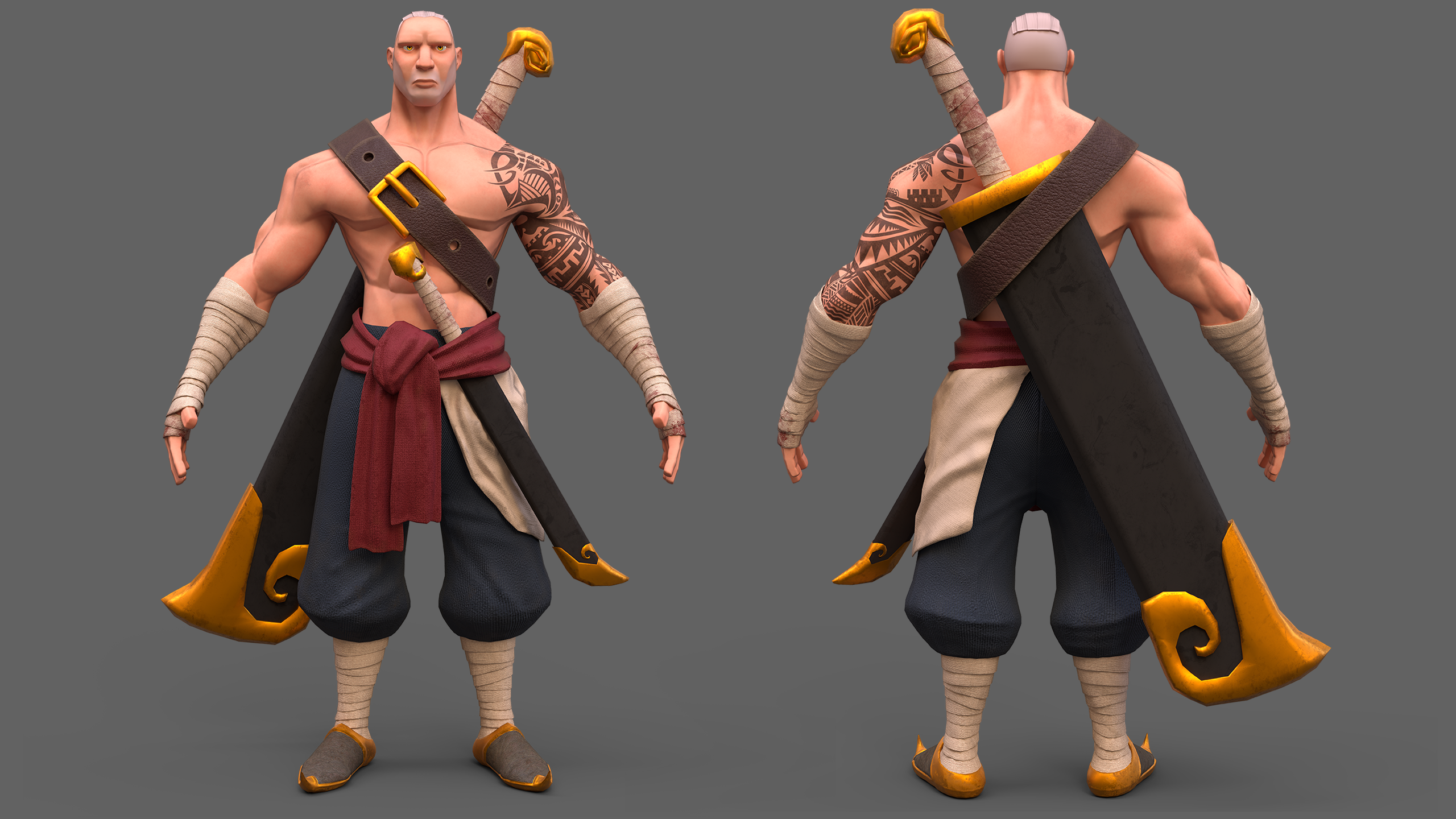
 Timothy_Feriandy
Re: The Bi-Monthly Environment Art Challenge | September - October (80)
As for me, I think this wraps up my submission for the challenge. Hard to believe I spent so much time on such a small scene! I'm no VFX artist either but here I am making fire and animated materials. I think I hit all the bases I wanted to hit with this one. If you'd like to see more I posted some other things about it here https://www.artstation.com/artwork/qQr6zy
 squarebender
Re: LANDNAV simulation game development
overhauled UI so there is full gamepad support.
UI work is really slow for me, but I was able to use Epics new CommonUI plugin to build a much quicker to setup system than I had. It wasn't worth reworking the UI for this game on its own, but I figured I could reuse the system for my next project, and this would give me chance to work out the kinks.
Just a bit more work to finalize the game loop then I'll start actually doing some promotional videos.
I took an evening off to dink around with the art a bit. Mostly messed with post process and also try to get more interesting colors going on.
I also developed a pretty fun skiing mechanic - I think halfway through the mountain map I'll change it to snow and let players use the skis.


 Alex_J
Re: Recently hired in AAA? Show us your portfolio
Super excited that I can finally post in this thread! I recently got hired as Environment Artist at Turn 10 to work on Forza! This is my first AAA job!
Here is my small background: After I graduated from the university, I have been working at Miliarty Simulation for the USA Airforce for a couple of years. And then, I worked on the unannounced tv show at BRON for almost a year.
Thank you, everyone on Polycount, for all of the advice, feedback, and support!
https://www.artstation.com/tythomas

 tythomas063
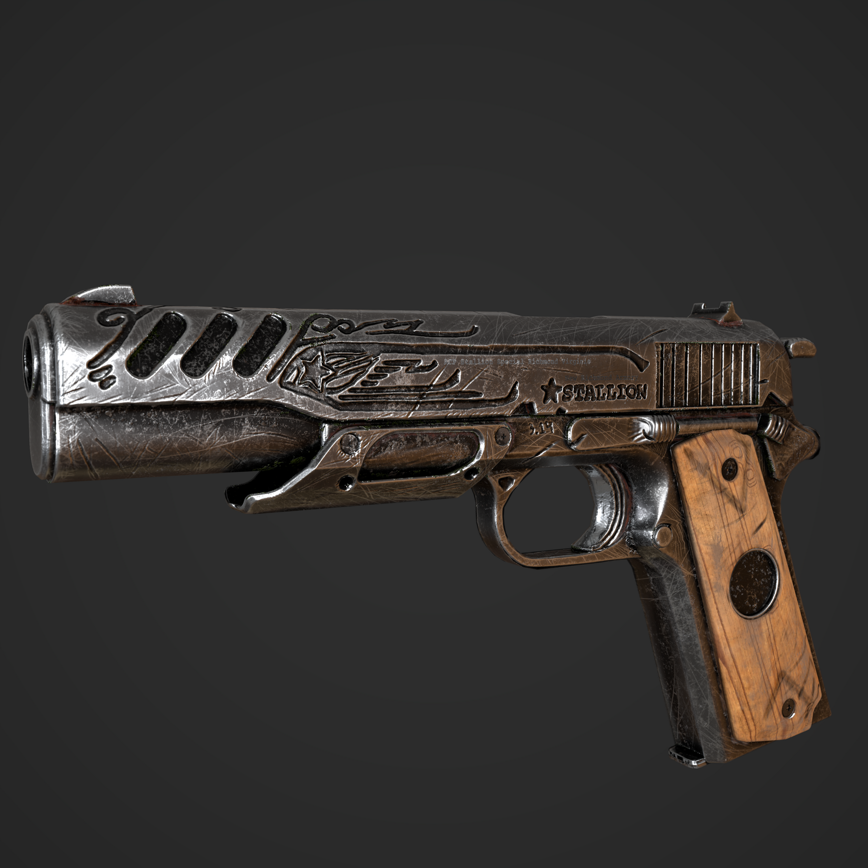
Re: What Are You Working On? (3D) 2022
New self project, game-ready model of "Kolya" gun from Metro Exodus, that based on Colt 1911
https://www.instagram.com/kesenkaiart/

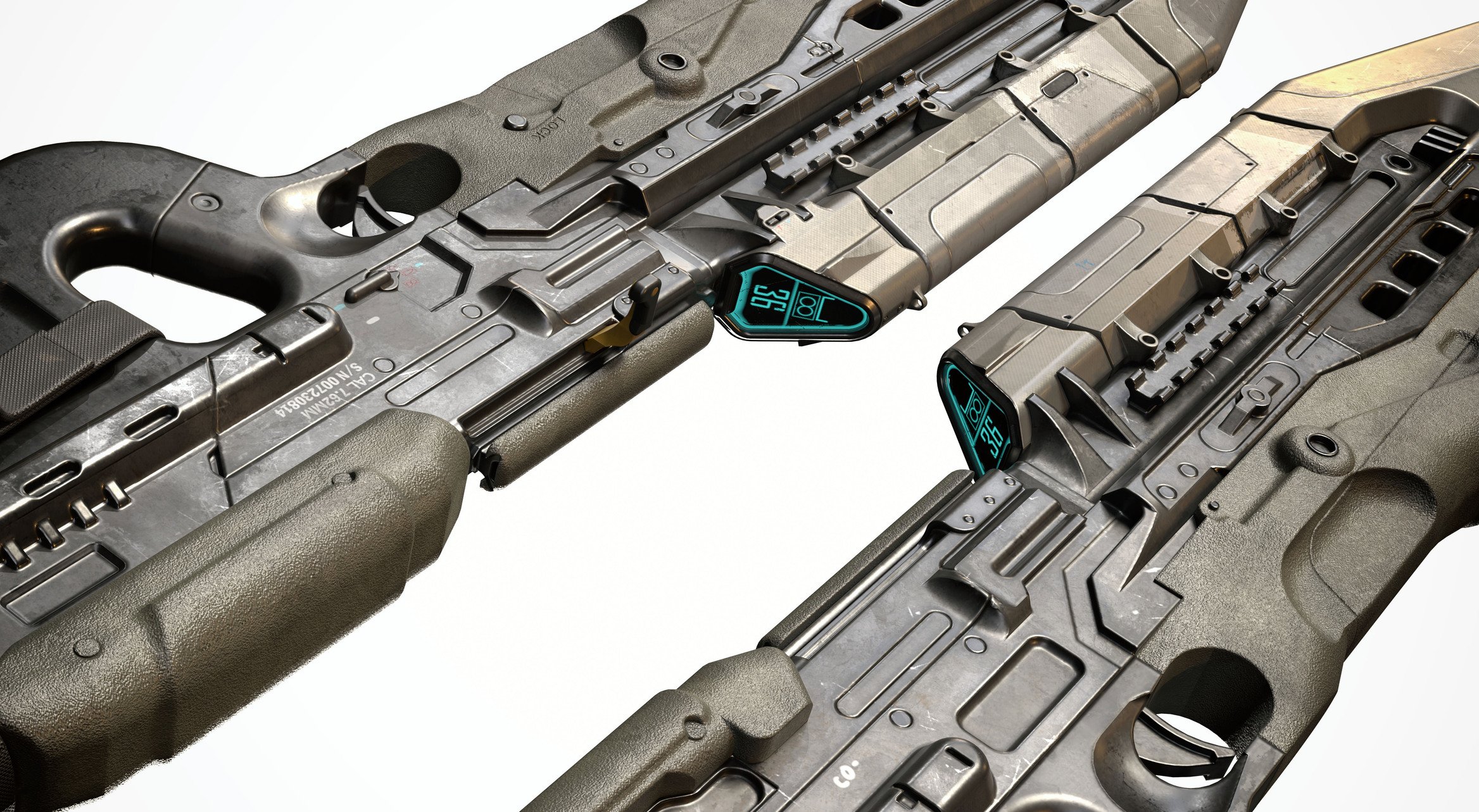
Re: What Are You Working On? (3D) 2022
Something I am working on right now. Another tankhead by concept artist Emmerson Tung. This concept has two variations for different turret, this is the type A version and I am planning to upload soon on my progress about the type B variations.

 np1094
Re: (3DCoat) What is 3DCoat and is it worth it? Who is using it? Do i need it?
That's apples with oranges. 3D Coat and ZBrush are sculpting apps. Blender is a general 3D package. It compares with Maya, not with 3D Coat and ZBrush.
Blender quits where sculpting starts. In the megapoly range. In Blender turn on dyntopo, turn on the fps counter by hitting play, and watch the screen stutter with a 500k mesh already. At the same pc i sculpt happily and stutter free in ZBrush at a 50 megapoly mesh. Blender is simply no sculpting software. Even when it has sculpting features.
Comparing 3D Coat with ZBrush, well, when it comes to pure sculpting, then Zbrush wins. But it has quite a few other really neat options. The retopology is miles ahead of ZBrush. You can do texture painting at a high level. I would even say it's comparable to Substance Painter. You can do uv mapping and so on. It is more a complement to ZBrush than a replacement. Even compared to Blender 3D Coat has the better texture painting, better UV mapping and better retopo.
All in all 3D Coat is a good complement to both, Blender and ZBrush. The only real downside of 3D Coat is that it is a bit unstable to some. For me it works stable enough though.