Best Of
Re: Riggers having less of jobs
If we're talking about the most basic rig/animation, then maybe... But the second the model has more than just 2 arms and 2 legs, the auto rigger goes poof. And the auto weight painting goes poof too. Oh, you want two big scarves hanging behind the character ??? Need a custom rig for that. Oh, what, your biomech has 4 arms and 8 legs ? Custom rig. You want facial rig ? Custom rig. Want fingers to wrap around a sword and can cast a spell from either a fist or from your palm ?? custom rig. You want her butts to jiggle more and her assets swinging sideway as she runs ? Guess what.... Custom Rig.
 PyrZern
1 ·
Re: Need guidance: As junior, where should I start to improve my skills ?
Scott Eaton:
+ PC wki - Character creation
should be enough to get a general idea of what's in front of you
 sacboi
1 ·
Re: High-fidelity pixelated futuristic character models for a GoldSrc game in development
Thank you for this feedback, appreciate it. Yes, the backgrounds would be darkened, a bit later, fixing all the edges, in all models. As for the eyes, we would try to improve them, at least one other person complained about them as well. You gave good suggestions, good examples we could use for reference. We'll try different things, see what gives the best result. Btw, this face is just a placeholder, done rather quickly so not much effort went into the eyes. You can even see some bad skin pixels on the upper nose area, left and right. We'll do a proper face for the protagonist and all other humans in the game a bit later. For now these quickies would suffice.pior said:Absolutely.Now a few remarks on these two models :- While the raw unfiltered look is excellent, the in-engine footage reveals that the grey backgroud of the texture sheets is bleeding at the edges. I suppose that you are well aware of it, and It is actually somewhat of an interesting happy accident in the case of the robots as it looks a bit like worn edges ; but I feel like it needs to be adressed regardless, as it definitely cheapens the look especially on the human character.- Also about the human character : I think it would be worth exploring various options for the eyes. As it currently stands, the sclera and the pupil being represented by three pixels (white-black-white) is IMHO bit off-putting especially compared to the quality of everything else. Whereas texture artists from the PS1 era where able to suspend disbelief under similar constraints by either completely skipping the representation of the eyeball in favor of the bigger shape of the eye socket (MGS1), or by barely suggesting the values of the sclera and pupils, but keeping the sclera within the same value and color range as the flesh (Vagrant Story). The same can be seen in traditional paintings (Zorn).
I hope this helps !
(on a side note : would it be accurate to say that you are working at about 192pix/m ?)


1 ·
Re: LOW-POLY ART
Here are a few more low poly models I have recently been working on. Does anyone have any helpful tips or tricks when creating topology or rigging low poly models? Any feedback or advice would be appreciated!

3 ·
1986 Lancia Delta S4 - WRC (Group B Class) Rally Car
An absolute monster of an off-road rally high performance twincharged all wheel drive masterpiece fabricated by one of Italy's iconic marques, leaving an indelible impression on those who had witnessed it's racing prowess whilst piloted by equally incredible drivers, way back in the day.
Was really supposed to be just a 'little' exploration into implementing alternative methods of generating large assets i.e. Hybrid Trim sheet atlas workflow over the christmas break, mainly vehicular props specifically via OSS & free/paid/trial tools however this project seems to have taken on a life of it's own and rather spamming WAYWO with updates, prudence dictates opening a dedicated WIP.
Anyhow progress thus far, finally settled on something I can live with, after multiple revisions plus worth noting I'm also on the clock due to probable upcoming commissioned work later in the year so other than wrapping up this Delta S4 in a 'timely manner' I've got other...well basically zombie projects littering PC that will have to be finalised before then as well, especially my sig linked King Tiger tank of circa: 8yrs vintage...OMG!
Allrighty here we go...
PROPOSED WORKFLOW:
Hybrid Trim Sheet - One 2048*2048 texture set at 512px/m texel density
TOOLS:
Blender 3.6.1
- Textools
- PBR Painter
- Ezy Baker (optional)
- Zen UV
- UVPackmaster 3
Bakers:
- xNormal and/or
- Handplane
Engine:
- UE 4.27
REFS:

NOTE:
If you're fortunate enough to stumble across further resources, like highly detailed relevant content without resorting to ripping models off of games for research purposes (...actually find a real pita) either sketchfab or elsewhere, then yeah by all means use 'em.
eg:
EARLY INITIAL TESTS:
Baked Normals
1048*1048 Texture
TD - 250px/m
2.1k - Tris

Wires


Source Mesh

Additionally, modeled using custom normals (smoothed 30° Weightednormals) technique, personally I've found much more suited to rapid iteration when compared working within a sub division paradigm.
Normal Mapped UV Layout

REVISIONS:
Final updated (mid poly) source mesh, couple of minor touch-ups to come although overall good to go as is

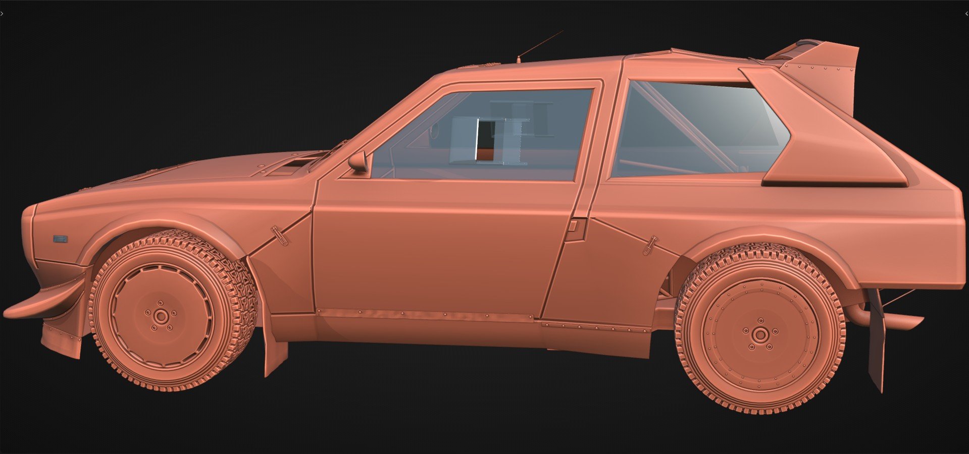
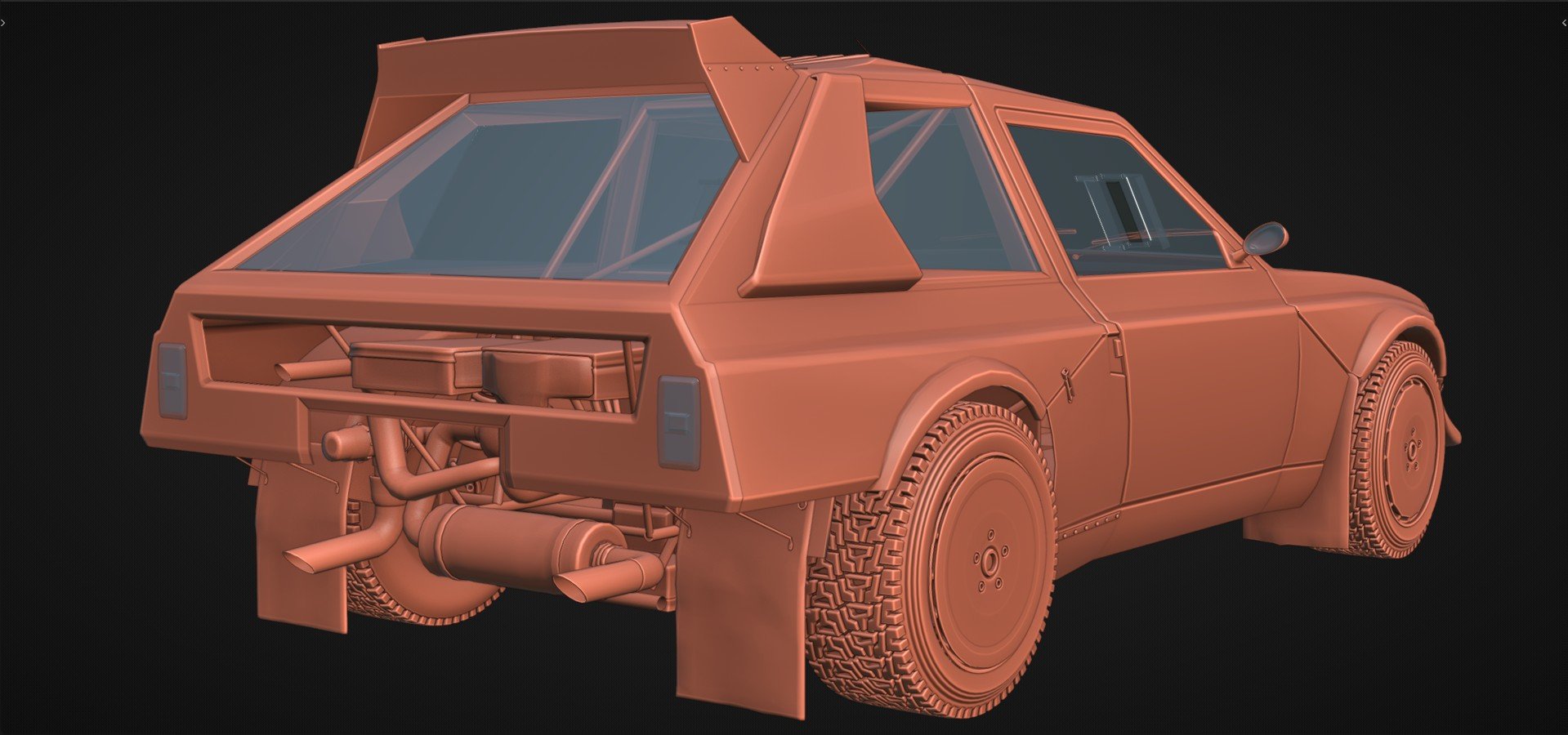
By the way in object mode these clay mats, also denote which elements will be unique, whilst alongside others assigned to trims eg; light grey erstwhile brown for uniquely baked textures, as well as opacity decals/alpha maps to represent transparent materials - glass. Essentially a kind of template guide I think should prove particularly helpful, attributing an optimized layout as to whether shells are either mirrored, stacked overlapped etc


Lastly important to mention, that this project is inspired by Hamish Ames tutorials outlining his approach working with trims painting large props.
sacboi
2 ·


Re: LOW-POLY ART
Whoa, it’s been years - last time I was here was back in 2019 or 2020. So many awesome projects! Low poly’s still going strong and popular from what I see, that’s really cool 😄


 SamLoboda
4 ·
Re: The Bi-Monthly Environment Art Challenge | March - April (95)
Wow great thread :-B
@cturbo I think currently some surfaces have a pretty intense normal map. Some more subtle/micro details might be a better fit for the roughness map, so they reflect differently. For example, currently the parquet floor looks like it has grouts between the different wood panels, I think that's more a trait of brick wall, while parquet floors in reality are pretty even/ smooth.
@rafiii Nice blockout! I think the ivy overgrowth looks perhaps a bit too artificial in the way it's distributed. Did you base the placement on reference images? I would do so. I would imagine plants growing in through openings and then spreading from there. Perhaps you're doing so already and switched it off for the render, but I think its handy to have person in the scene to check against, so everything is to scale.
@Iribree Sweet sculpting! I think on hard surface elements the edges could be less sharp/ more beveled. Depending on the texture resolution you're going to use, bevels that are too tight might not show well in the normal map. I think the one organic element, the big fish, unfortunately looks facetted. This happens when remeshing low poly geometry. You can avoid this by applying a subdiv modifier first (support/ crease edges to keep shape). With Blenders modifier stack you can chain a subdiv modifier with a remesh modfier (smooth modifier if needed) and adjust the settings until you got a nice smooth mesh at the desired resolution.
Keep it up
 Fabi_G
1 ·
Re: The Bi-Monthly Environment Art Challenge | January - February (94)
@Dmorgan A good example of what I mean is klamante's post earlier in the thread. Much of the detail in their finished piece doesn't come from the 3D
model itself but instead the texture applied to it that they then
painted the details onto manually.
 Pinkfox
1 ·